Categories
Let’s assume you need to analyze the economic trends impacting your industry. Or you need to plan your business’s finances for the long term. In this case, you need financial data analysis to succeed.


Therefore, reports on financial analysis are crucial.
Both corporate and investment finance can benefit from this analysis. You can learn about the business’s financial health with this. It will allow you to evaluate its viability, profitability, and solvency.
An entrepreneur pitching potential partnerships can use this analysis. You can communicate the financial health of your firm with the help of financial reporting analytics. Investors will see the value in your company and be more likely to put money into it if it is viable.
This article will walk you through creating a financial report in Excel.
Let’s get started.
Definition: A financial analysis report is a structured document that reviews and evaluates a company’s financial health and overall performance. It provides insights into profitability, liquidity, cash flow, and long-term stability, helping readers understand how well the business is doing financially.
These reports are valuable for management, investors, and creditors because they turn raw financial data into meaningful insights that guide smart decision-making. A good financial report often includes a summary of key findings, detailed breakdowns of financial statements, and recommendations for future strategies.
A financial report analysis usually includes four main parts:
Financial analytics reports provide clear insights that help management and investors make smart choices about expansion, investments, or strategic planning.
They track financial performance over time, highlighting strengths and revealing areas that need improvement.
By uncovering vulnerabilities like cash flow gaps or rising debt, these reports help businesses take proactive steps to reduce risks.
With accurate financial insights, companies can set realistic goals, allocate resources effectively, and build long-term stability.
This report assesses a company’s capacity to meet its urgent financial obligations.
It aids potential lenders and investors in understanding a company’s financial status. They can learn about the risks of lending to or investing in the company.
It also offers an in-depth examination of the business’s liquidity status. This refers to its cash generation capabilities, current debt-to-equity ratio, and debt servicing capacity.
An individual’s, company’s, or organization’s budget analysis report analyzes their financial operations. Expenses, income, and projected gains are all summarized for easy reference.
It also provides insights into the entity’s financial health. This allows for informed decision-making by stakeholders.
The results of a budget analysis report are commonly used to make spending and funding decisions.
Trend analysis reports are a key component of financial reporting analytics. They give a general idea of the market developments that have occurred. This report is used to discover potential market openings and identify customer needs.
A trend analysis report considers a variety of things. These include the economic atmosphere, market state, customer choices, competitors, and industry advancements.
A competitive analysis report is a tool firms use to analyze their market rivals. By doing this, they can recognize their competitive benefits.
It assists with identifying potential areas of success and figuring out your opponent’s strong points and flaws through competitive analysis. Then, create plans to remain ahead of the competition.
It is usually used when formulating a market entrance strategy and identifying potential partners and customers.
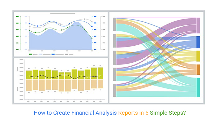
We use some graphs for creating Financial report samples:
A Sankey Chart shows the movement of money from one location to another.
This can make the financial report appealing and easy to read. You can use it to monitor cash flow and identify areas where it is being used inefficiently. You can also use it to identify areas where money is being saved or squandered.
Different nodes make up the Sankey visualization, representing various financial sources, for example, data from the Excel or Power BI income statement. Arrows connect the nodes, symbolizing the movement of money.
The nodes’ size and the arrows indicate how much money is at stake. This makes tracing the flow of money’s origins and destinations easy.

The use of Sentiment Trend Charts in financial reporting analytics is paramount. It explains how people feel about a certain topic or product.
These visuals aid in determining public perception and opinion of a specific stock or industry. You can use it to gauge the market’s mood and make informed investment decisions. The sentiment trend chart can also pinpoint possible market entrance and exit points.
Additionally, you can determine the intensity of the market trend and the likelihood of a reversal.
It leads to informed trade and investment decisions based on market momentum rather than speculation.
Below is the visualization

A Multi-Axis Line Chart can help companies and organizations see their financial achievements.
Users can contrast different financial data points and pinpoint areas for development thanks to the chart.
This can provide a more comprehensive view of the company’s finances than a single-line chart.
It can examine financial data sets and find potential trends or correlations.

Excel is an excellent tool for managing and interpreting financial reports. However, this technology doesn’t have the best visualizations. And that is where third-party add-ins come in.
ChartExpo is an add-in for Excel for interpreting financial reports. You only have to install it to incorporate it into your spreadsheet. After that, your visualization will be ready to use in a few clicks. Here is the best part! Even those without coding knowledge can use it.
Here are some of the perks of ChartExpo:
ChartExpo aims to make data visualization simple while accommodating users with more complex requirements. Do you wish to learn how to create a financial report? So here we go!
This article shows you how to make financial reports in Excel using ChartExpo. After that, you will learn how to do it in Excel.
How to Install ChartExpo in Excel?
ChartExpo financial charts are available both in Google Sheets and Microsoft Excel. Please use the following CTA’s to install the tool of your choice and create beautiful visualizations in a few clicks in your favorite tool
How to write a financial analysis report?
Sankey diagrams are useful for visualizing the financial flow data between different levels. They can help identify areas for improvement or inefficiencies and can be easily understood by a wide audience.
Here we will track financial flow data using the Sankey Diagram.
| Earnings Source | Revenue | Expenses | Departments | Categories | Amount |
| Providing services | Revenue | Expenses | Managerial | Training Sessions | 10,000 |
| Providing services | Revenue | Expenses | Managerial | Office rental | 16,000 |
| Providing services | Revenue | Expenses | Managerial | Wages | 9,400 |
| Providing services | Revenue | Expenses | Commercial | Wages | 11,300 |
| Sales of products | Revenue | Expenses | Commercial | Travel allowance | 10,000 |
| Sales of products | Revenue | Expenses | Commercial | Advertising | 12,000 |
| Sales of products | Revenue | Expenses | Production | Material Payment | 25,000 |
| Sales of products | Revenue | Expenses | Production | Loan Payment | 8,500 |
| Sales of products | Revenue | Expenses | Production | Wages | 19,500 |
| Loans | Revenue | Gross Profit | Taxes | 11,000 | |
| Loans | Revenue | Gross Profit | Net Profit | 13,000 |


| Aspect | Financial Statements | Financial Reports |
| Definition | Formal records of a company’s financial position and performance. | Comprehensive documents that include financial statements plus analysis. |
| Content | Balance sheet, income statement, cash flow statement, and statement of equity. | Financial statements along with commentary, charts, trends, and recommendations. |
| Purpose | Provide accurate, standardized financial data for compliance and auditing. | Explain what the data means, highlight risks, and guide decision-making. |
| Usage | Used by accountants, auditors, and regulators. | Used by management, investors, and stakeholders for strategic insights. |
| Scope | Narrower – focuses only on financial records. | Broader – combines data with analysis and interpretation. |
A financial analytics report provides insights into the financial health of the company. It takes an in-depth look at its financial health, investors, and other stakeholders.
It also includes an overview of the company’s assets, liabilities, and income statement.
An examination of your finances can reveal chances for success. Exploiting these opportunities can help your business become more stable and profitable in the long run.
Moreover, this analysis can also detect threats that may negatively influence your business’s performance. From this, you can take the necessary steps to avert the risk these hazards present.
The information in the financial analytics report can help you make wise decisions. These decisions cover operations, investments, and other business-related activities.
A thorough examination of the company’s financial status encourages transparency. This builds a foundation of trust and responsibility.
Concentrate on essential figures such as revenue growth, profit margins, cash flow, and debt levels. These core financial metrics give a reliable picture of business health without overwhelming the reader.
Compare financial data across different periods or against industry benchmarks. This helps identify trends, strengths, and weaknesses that may not be obvious in a single report.
Incorporate graphs and tables to simplify complex information. Visuals make the report easier to interpret and highlight critical findings more effectively.
Go beyond presenting numbers. Offer recommendations and highlight opportunities or risks so stakeholders can use the analysis to make informed decisions.
To create a financial analytic report, you typically:
The process usually involves:
Financial analysis involves a thorough review of the company’s financial statements. It comprises cash flow analysis, solvency analysis, financial statement analysis, market analysis, and financial ratios.
Financial analysis and reporting involve examining an organization’s financial progress and position. This includes evaluating its income statement, balance sheet, and cash flow statements.
It also includes evaluating other financial documents, such as budgets and forecasts.
Reports on financial analysis are crucial for businesses of all sizes. They give information about a business’s financial health. You can use this information to make informed decisions on operations, investments, and other business-related issues.
They provide key information that lets people understand your business better, its markets, and even its competitors. Also, it offers additional information, such as the company’s growth prospects and potential risks or opportunities.
They are also ideal for letting stakeholders know how financially sound your business is. It is important to ensure that your report is comprehensive. Otherwise, it will not serve its purpose efficiently.
Do you need a quick and efficient method for producing financial analytics reports?
Try ChartExpo
It makes it possible to make a variety of financial analytics report visualizations. It has a range of charts and graphs you can use to analyze your company’s financial status.
How much did you enjoy this article?


Calculate accounts receivable turnover ratio to measure credit collection speed, improve cash flow, and strengthen your financial strategy. Read on!

Change Management KPIs are the key to tracking adoption, performance, and ROI during transitions. Find out which metrics matter. Read on!

Data collection methods and techniques determine the quality of every insight you act on. Explore key approaches for gathering reliable data. Read on!


