Categories
Are you looking to leverage the power of data for your business? Let’s talk about the Power BI income statement.
Imagine this scenario: you’re in a meeting and have to illustrate your company’s financial performance quickly and easily. With Power BI income statements, you can easily, accurately, and promptly visualize data.


Traditional financial reports can be quite daunting, with endless rows of numbers, complex columns, and calculations. By using Power BI income statements, you can convert unprocessed financial data into engaging visual narratives. It’s more than just showcasing numbers. It’s about delivering a compelling, data-driven story that engages your audience.
Now think about this: companies that utilize data analytics are 3 times more likely to improve their decision-making. The figures speak the truth – making data-based decisions is the way. Power BI income statements will help you access valuable insights from your financial data.
Why bother creating Power BI revenue reports? They’re not only about displaying numbers. They’re about giving your business the ability to make strategic decisions informed by real-time financial insights, which is a significant development in the current data-focused business environment.
First…
Definition: The Power BI income statement is a financial report created using Microsoft Power BI software. It presents a company’s revenues, expenses, and net income over a specific period, typically a quarter or a year. Integrated within the Power BI financial dashboard, the statement is designed to clearly and visually represent financial performance. This allows you to analyze trends and make informed decisions.
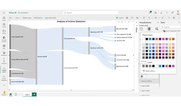
Power BI allows customization, enabling you to tailor the income statement to your needs. For instance, you can add custom calculations or visualizations. With its interactive features, you can drill down into data, compare performance across different periods, and identify key drivers.
The Power BI income statement is a powerful financial analysis and reporting tool. It helps businesses gain insights into their financial performance.
Creating an income statement in Power BI offers a dynamic way to dive into your financial data. Let’s explore why it’s worth taking the plunge:
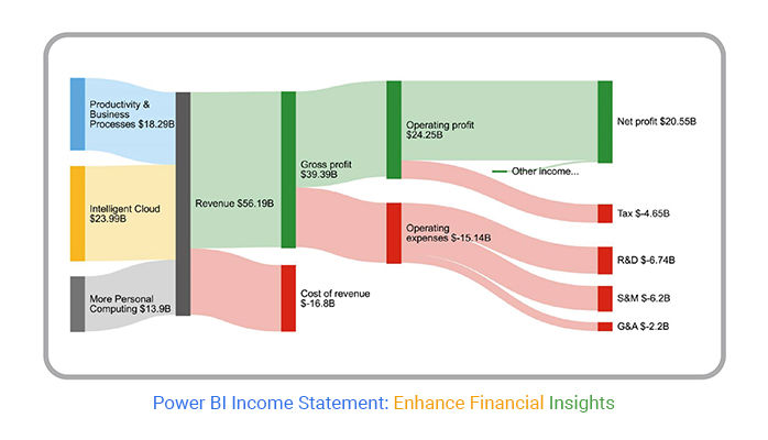
The total income generated from sales of products or services. In Power BI, revenue can be segmented by time, product category, or location for detailed insights.
Direct costs related to production, such as raw materials or labor. Tracking COGS ensures accurate calculation of profitability.
Calculated as Revenue – COGS, this highlights how effectively a business manages production and pricing.
Covers costs like rent, salaries, utilities, and marketing. Power BI helps visualize expense breakdowns to control overhead.
The bottom-line profit is after deducting all expenses, taxes, and other costs. Net income reflects overall financial performance.
A simple template that organizes revenue, expenses, and net income into a clear structure. Ideal for small businesses that want a straightforward financial summary.
This template allows comparison across months, quarters, or years. It’s useful for tracking financial performance trends and seasonal variations.
Breaks down financial results by department or business unit. Helps identify which areas of the business are most profitable and which need improvement.
Includes budget vs. actual comparisons, showing where the business is overspending or underperforming. Perfect for finance teams focused on cost control and forecasting.
Presents an income statement Power BI dashboard using charts, KPIs, and visuals instead of just a tabular format. Great for executives who want quick insights without digging into numbers.
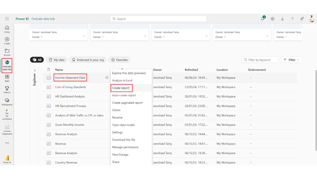
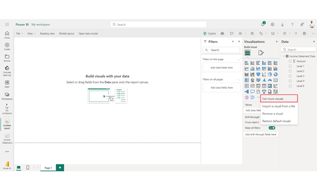
Creating an income statement in Power BI involves preparing your financial data, modeling it correctly, and designing a Power BI income statement visual that presents the information clearly. Here’s a step-by-step process:
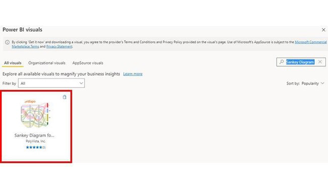
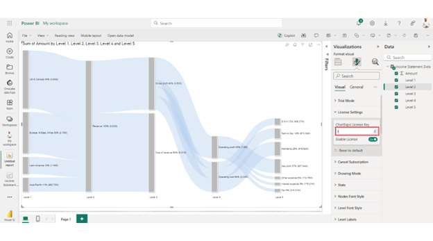
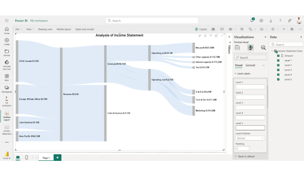
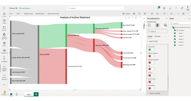
An income statement Power BI dashboard with ChartExpo lets you visualize revenue, expenses, and profit in a clear, interactive format. Using a Sankey diagram maker within Power BI can further enhance this view by illustrating how income flows through various cost and profit categories.
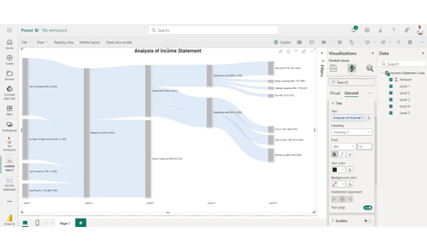
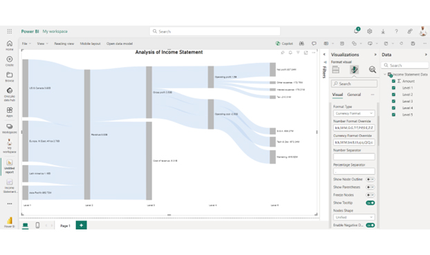
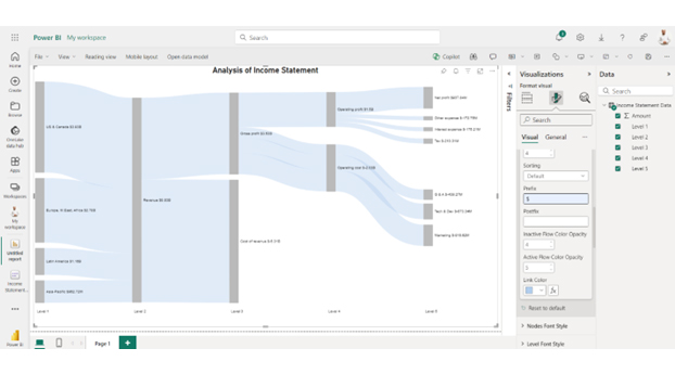
The Power BI income statement visual is easy to set up and customize, helping businesses simplify financial analysis and make smarter decisions.


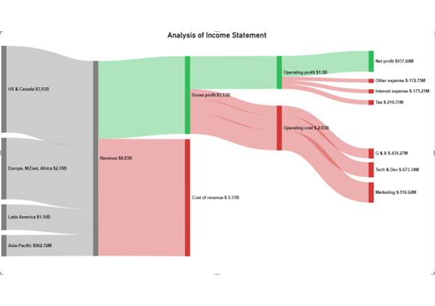
| Level 1 | Level 2 | Level 3 | Level 4 | Level 5 | Amount |
| US & Canada | Revenue | 3,930,557,000 | |||
| Europe, M. East, Africa | Revenue | 2,783,530,000 | |||
| Latin America | Revenue | 1,156,023,000 | |||
| Asia-Pacific | Revenue | 962,715,000 | |||
| Revenue | Gross profit | 3,525,340,000 | |||
| Revenue | Cost of revenue | -5,307,485,000 | |||
| Gross profit | Operating profit | 1,496,109,000 | |||
| Operating profit | Net profit | 937,838,000 | |||
| Operating profit | Interest expense | -175,212,000 | |||
| Operating profit | Tax | -210,312,000 | |||
| Operating profit | Other expense | -172,747,000 | |||
| Gross profit | Operating cost | Marketing | -916,617,000 | ||
| Gross profit | Operating cost | Tech & Dev | -673,341,000 | ||
| Gross profit | Operating cost | G & A | -439,273,000 |
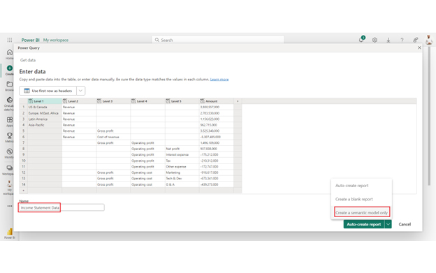


Ensure your income statement data is accurate and trustworthy by connecting Power BI to reliable data sources through the Power BI connector.
Focus on key financial metrics like revenue, expenses, and net income that are crucial for your analysis.
Create intuitive and easy-to-navigate dashboards with clear labels and consistent layouts.
Allow users to explore detailed data behind summary figures to understand the root causes of financial trends.
Set up automatic data refresh schedules to keep your income statement up-to-date with minimal manual intervention.
Leverage features like slicers, filters, and bookmarks to enhance interactivity and user experience in your reports.
Power BI offers real-time connectivity to various data sources, ensuring your income statements are always up-to-date. This allows for dynamic and interactive visualization, making it easier to analyze financial performance instantly.
With Power BI, you can create interactive and customizable reports. Users can drill down into specific data points, filter results, and view detailed insights with just a few clicks, providing a comprehensive understanding of the company’s financial health.
Automating data integration and report generation in Power BI reduces the risk of human error, ensuring more accurate and reliable income statements. This leads to better decision-making based on precise financial information.
Power BI facilitates easy sharing and collaboration among team members and stakeholders. Reports can be shared via cloud services, ensuring everyone has access to the latest financial data and insights, fostering a collaborative approach to financial analysis.
Automating the creation and updating of income statements with Power BI saves significant time and reduces costs associated with manual data entry and report generation.
You can create an income statement in Power BI by following these steps:
Yes, you can use Power BI to make financial statements. It enables dynamic visualization of income statements, balance sheets, and cash flow statements. Power BI’s interactive features and data integration capabilities enhance financial analysis and reporting.
Yes, Power BI is useful for income statement analysis. It offers dynamic visualizations, real-time updates, and interactive features. These capabilities help in detailed financial analysis, trend identification, and informed business decisions.
Creating a Power BI income statement offers numerous benefits. It transforms raw financial data into insightful visualizations. This enhances the understanding of a company’s financial health. You can quickly grasp key metrics and trends.
Interactive analysis is a significant advantage. Power BI allows you to drill down into specific data points. This provides a detailed view of revenue, expenses, and profits. Such interactivity aids in uncovering hidden insights.
Data integration is seamless with Power BI. It pulls data from various sources into one platform. This creates a unified view of financial performance. It eliminates the hassle of switching between multiple data sources.
Real-time reporting keeps information current. Power BI updates data automatically. This ensures the income statement reflects the latest financial activities. Real-time insights are crucial for timely decision-making.
Visualization capabilities are robust. Power BI offers diverse chart types and layouts. This helps in presenting financial data intuitively. Visualizations make complex data easier to understand and analyze.
Customization and collaboration are key features. You can tailor reports to your needs. Sharing these interactive reports fosters teamwork. Different stakeholders can explore the data and provide input. This collective approach enhances decision-making.
In summary, creating an income statement in Power BI is highly beneficial. Power BI transforms financial data into actionable insights, leading to better financial management and strategic planning.
How much did you enjoy this article?


Discover diverse and high-quality Power BI report examples for inspiration and insights. Elevate your reporting with strategic visualization techniques.

A Customer Relationship Management Dashboard centralizes data, tracks key metrics, and drives smarter business decisions. Discover now!

Explore Healthcare Dashboard Examples and learn how to turn complex healthcare data into clear, actionable insights for better decision-making.


