Power BI Custom Visuals
Craft Captivating Charts.
Communicate Clearly.
Conquer Complexity.
With ChartExpo’s Power BI custom visuals, you're not just visualizing
data; you're telling a story. Experience the art of visual storytelling.
Imagine having the power to convey your data story visually, effortlessly.
That's the power of ChartExpo’s Power BI custom visuals.
It is simple. There is no coding, scripting or complicated steps —
just click and create.


Enhance Power BI Custom Visuals with ChartExpo
Power BI chart types are good, but ChartExpo makes them better.
Creating custom visuals is a breeze with ChartExpo.
Anyone can excel with ChartExpo.
Perfect your data storytelling with the best Power BI visuals by ChartExpo.
Why settle for ordinary when you can have extraordinary?
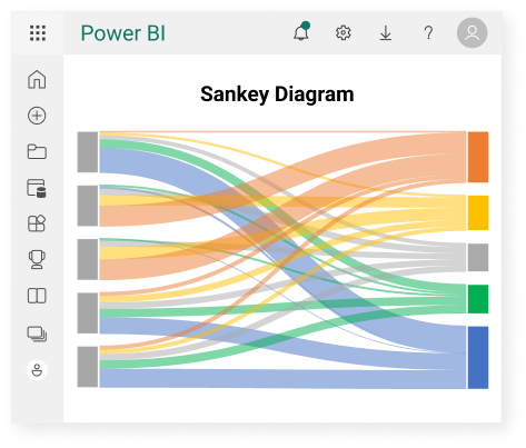
Sankey Diagram for Power BI
ChartExpo offers a Sankey Diagram with up to 8 levels. More levels help you visualize intricate relationships, identify bottlenecks, optimize resource allocation, and improve efficiency.
You can enter data into our Sankey Diagram using the row-column layout. Row-column layouts are simple. They resemble spreadsheets. This makes them easy to understand and familiar to users.
You can strike a balance between customization options and ease of use with our Sankey Diagram. It is user-friendly and offers advanced customization when you need it, making it suitable for both beginners and advanced users.
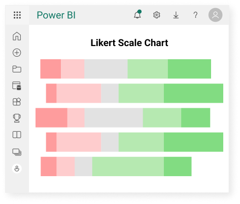
Likert Scale Chart for Power BI
You can instantly visualize your survey results with ChartExpo Likert Scale chart.
This chart is designed to help you effectively communicate your survey findings and insights.
It focuses on delivering key findings and insights without unnecessary complexity, using appropriate scaling, informative colors, and labels.
Our Likert Scale chart is designed to be clear and easy to understand Power BI chart.
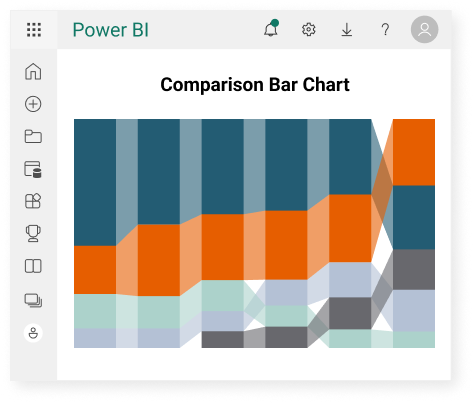
Comparison Bar Chart for Power BI
A Comparison Bar Chart is a fusion of a sorted stacked column chart and a stacked area chart.
But it is way more powerful Power BI graph.
It goes from left to right. The columns next to each other are linked.
It excels at displaying rank changes, and it always displays the highest value at the top.
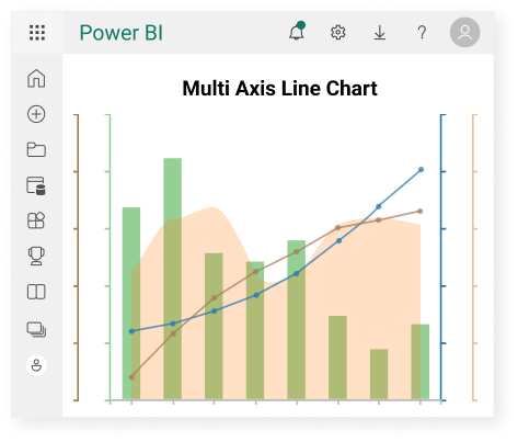
Multi Axis Line Chart
for Power BI
Effortlessly compare multiple data sets on a single graph, giving you a comprehensive view of the trends.
No more toggling between charts - it's all in one place.
Save time on deciphering data. The intuitive nature of Multi Axis Line Chart streamlines the analysis process, ensuring efficient decision-making.
Sankey Diagram for
Power BI Pricing
$10*
per month
(no purchase necessary)
*pricing starts at $10
per user per month.
Only in-app purchase available
Likert Scale Chart
for Power BI Pricing
$10*
per month
(no purchase necessary)
*pricing starts at $10
per user per month.
Only in-app purchase available
Comparison Bar Chart
for Power BI Pricing
$10*
per month
(no purchase necessary)
per user per month.
Only in-app purchase available
Multi Axis Line Chart
for Power BI Pricing
$10*
per month
(no purchase necessary)
*pricing starts at $10
per user per month.
Only in-app purchase available
Custom Pricing
ChartExpo provides custom Power BI charts, Power BI graphs, and an array of Power BI chart types, enabling you to craft captivating data narratives.
Make your dashboards and reports engaging, informative, and visually striking.