Categories
In many business meetings, the real challenge is not the data itself, but how it is presented.
Long spreadsheets and static charts often fail to communicate insights clearly, especially when dealing with large, detailed datasets.
This is where Power BI Report Builder becomes useful.
It is designed for creating paginated, print-ready reports that present data in a structured and easy-to-read format.
Instead of focusing on interactive dashboards, it helps you build detailed reports that are ideal for invoices, financial statements, and operational reporting.
Whether you are working with complex datasets or need to present information in a formal reporting format, Report Builder gives you the control to design precise layouts that communicate data clearly and consistently.
Microsoft Power BI Report Builder is a Microsoft tool used to create paginated, print-ready reports with a fixed layout.
It is designed for presenting detailed data in a structured format that can be easily exported or printed, such as invoices, financial statements, and operational reports.
Use Power BI Report Builder when the final output needs to be printed or exported in a fixed format like PDF or Excel.
It works best for structured documents such as invoices, statements, and official reports.
It is ideal when you need to present large volumes of data in an organized way.
Unlike dashboards, it can display detailed records across multiple pages without losing structure.
Use it when report formatting must remain the same every time, such as regulatory or compliance reports, where layout accuracy is important.
Choose Report Builder when interactivity (like drill-downs or filters) is not required, and the focus is on delivering fixed, structured reports.
Avoid using Power BI Report Builder if your goal is real-time interaction, like filters, Power BI slicers, or drill-down analysis.
Power BI Desktop is better for dynamic dashboards.
It is not suitable for exploring patterns over time using highly visual, interactive charts.
Line charts and dashboard visuals in Power BI work better for trend analysis.
If end users need to explore data on their own, change views, or apply custom filters, Report Builder is not the right choice due to its fixed-layout nature.
Avoid it for quick insights or presentation-style dashboards. It is designed for structured reporting, not storytelling or executive-level visual summaries.
Power BI Report Builder is built for paginated reports that maintain a fixed layout across multiple pages.
Why it matters:
Ensures your reports look consistent when printed or exported, making them reliable for invoices, financial statements, and official documents.
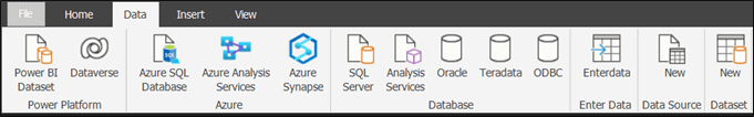
It supports multiple data sources, including Power BI datasets, SQL Server, Azure SQL Database, Oracle, and other enterprise systems.
Why it matters:
Allows you to combine data from different systems into one structured report without manual consolidation.
You can fully control report structure, including headers, footers, page size, margins, and alignment.
Why it matters:
Gives you pixel-level control, which is essential when reports must follow strict formatting standards or compliance requirements.
It provides tools to create tables, matrices, and basic charts, along with support for parameterized reports.
Why it matters:
Helps you organize large datasets into clear, structured formats while allowing controlled filtering without changing the layout.
| Feature | Power BI Report Builder | Power BI Desktop |
| Primary Purpose | Creates paginated, print-ready reports | Builds interactive dashboards and reports |
| Report Type | Fixed layout | Dynamic and interactive reports |
| Interactivity | Limited (no drill-down or real-time interaction) | High interactivity with filters, slicers, and drill-down |
| Output Format | PDF, Word, Excel, printed reports | Power BI service dashboards and reports |
| Data Exploration | Focuses on structured data presentation | Focuses on data analysis and exploration |
| Layout Control | High precision control (headers, footers, page design) | Flexible but less print-focused layout control |
| Best Use Case | Invoices, financial statements, compliance reports | Business dashboards, KPI tracking, data analysis |
Report Builder is mainly used to create structured, reports that present detailed business data in a clear and printable format. Below are common report types where it is most effective.
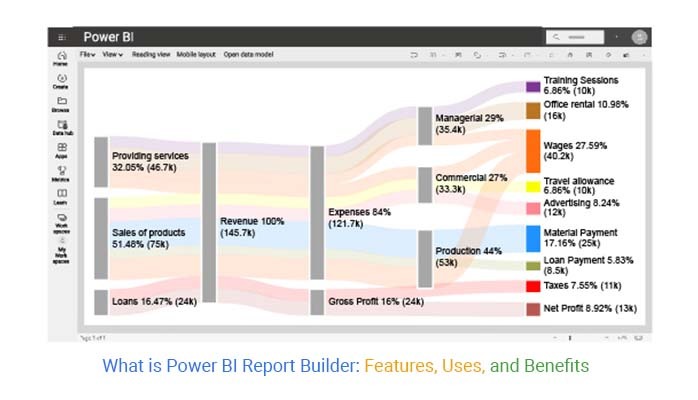
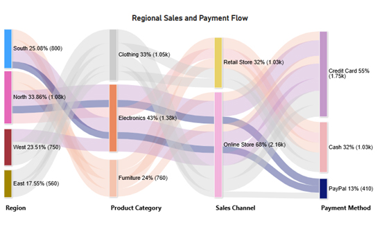
A sales report summarizes overall sales performance across products, regions, or time periods.
It typically includes:
This type of report helps businesses understand sales trends and evaluate performance over time using structured, detailed data views.
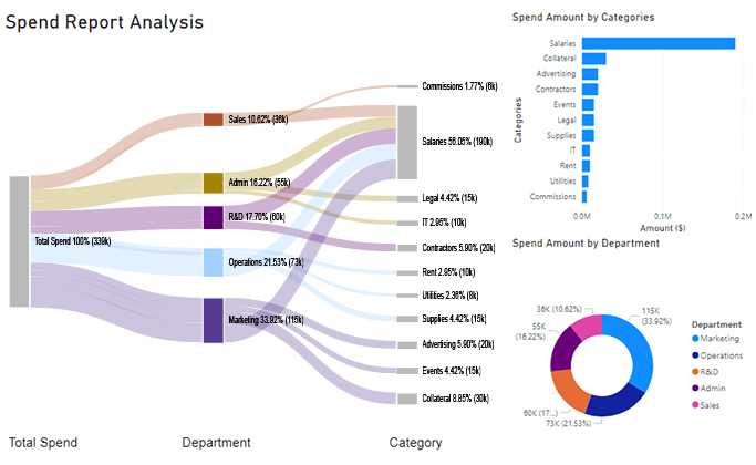
An expense report provides a clear breakdown of company spending within a specific period.
It usually includes:
This helps finance teams track cost control and maintain financial discipline through consistent reporting formats.
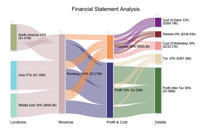
A financial statement report presents structured financial data such as income, expenses, and profit.
It is commonly used for:
This format ensures accuracy and consistency in financial reporting.
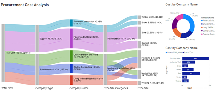
An operational report focuses on day-to-day business activities and performance metrics.
It may include:
These reports help managers monitor operations in a structured and detailed format.
Enter connection details such as:
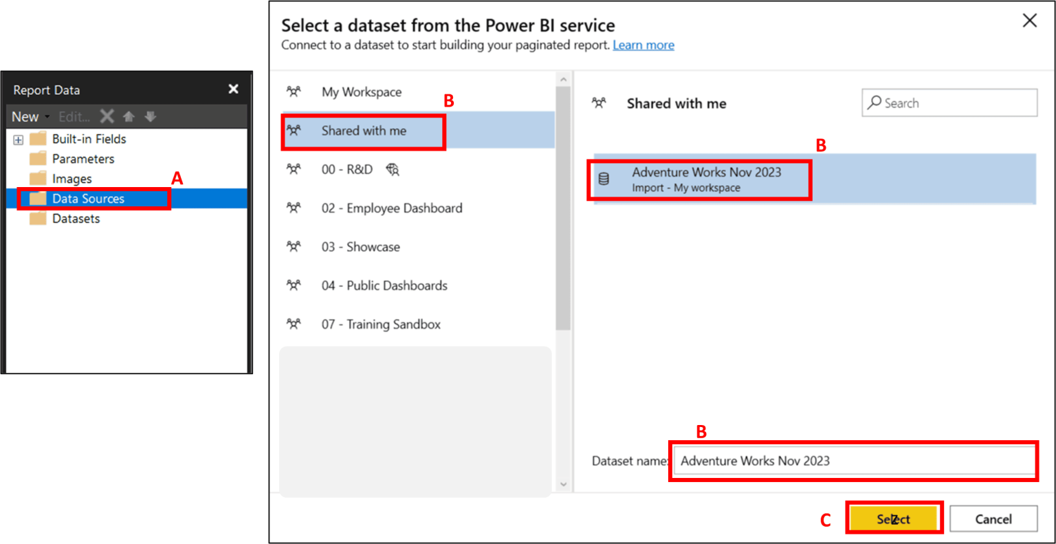
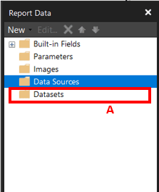
Once connected, you can create datasets and start building structured reports.
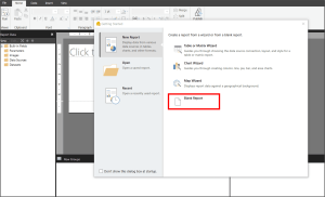
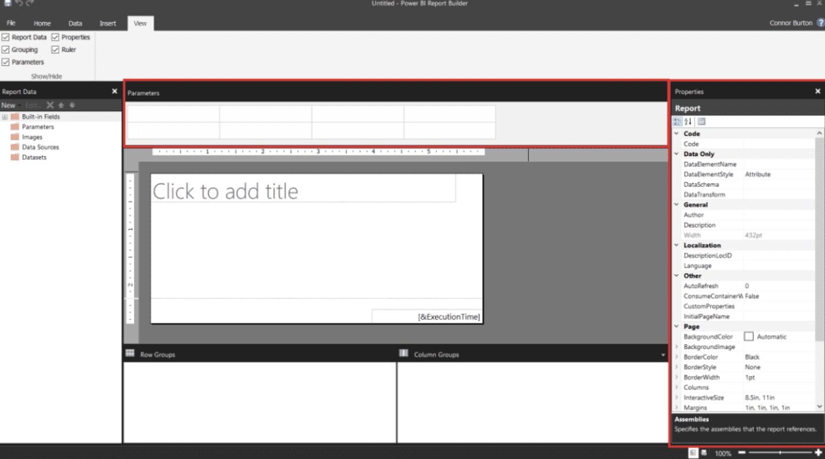
Open the report builder from your system and create a new blank report. This is where you’ll design your paginated layout.
For more advanced visual storytelling alongside structured reports, tools like ChartExpo can help create clearer and more comparison-focused charts for dashboards.
Yes, it supports data refresh when reports are connected to live or updated data sources.
Refresh behavior depends on the data connection and the Power BI environment setup.
Yes, it is highly effective for creating structured, print-ready reports. It works best when you need precise formatting and detailed, multi-page reporting.
Power BI Report Builder is designed for creating structured reports where layout accuracy and consistency matter most.
Instead of focusing on interactive dashboards, it helps you present detailed data in a fixed, print-ready format.
This makes it a strong choice for reports like invoices, financial statements, and operational documents that require clear structure and precision.
Its real value lies in handling large datasets while maintaining a clean and organized layout across multiple pages.
This ensures that information is easy to read, share, and export without losing formatting.
When your goal is structured reporting rather than data exploration, BI Report Builder becomes the right tool for the job.
For more visually focused comparisons and dashboard-style insights, tools like ChartExpo can complement your reporting workflow.
How much did you enjoy this article?


Discover diverse and high-quality Power BI report examples for inspiration and insights. Elevate your reporting with strategic visualization techniques.

A Customer Relationship Management Dashboard centralizes data, tracks key metrics, and drives smarter business decisions. Discover now!

Explore Healthcare Dashboard Examples and learn how to turn complex healthcare data into clear, actionable insights for better decision-making.


