• Home
  • Tools dropdown img
    • Spreadsheet Charts

      • ChartExpo for Google Sheets
      • ChartExpo for Microsoft Excel
    • Power BI Charts

      • Power BI Custom Visuals by ChartExpo
    • Word Cloud

  • Charts dropdown img
    • Chart Category

      • Bar Charts
      • Circle Graphs
      • Column Charts
      • Combo Charts
      • Comparison Charts
      • Line Graphs
      • PPC Charts
      • Sentiment Analysis Charts
      • Survey Charts
    • Chart Type

      • Box and Whisker Plot
      • Clustered Bar Chart
      • Clustered Column Chart
      • Comparison Bar Chart
      • Control Chart
      • CSAT Survey Bar Chart
      • CSAT Survey Chart
      • Dot Plot Chart
      • Double Bar Graph
      • Funnel Chart
      • Gauge Chart
      • Likert Scale Chart
      • Matrix Chart
      • Multi Axis Line Chart
      • Overlapping Bar Chart
      • Pareto Chart
      • Radar Chart
      • Radial Bar Chart
      • Sankey Diagram
      • Scatter Plot Chart
      • Slope Chart
      • Sunburst Chart
      • Tornado Chart
      • Waterfall Chart
      • Word Cloud
    • Google Sheets
      Microsoft Excel
  • Services
  • Pricing
  • Contact us
  • Blog
  • Support dropdown img
      • Gallery
      • Videos
      • Contact us
      • FAQs
      • Resources
    • Please feel free to contact us

      atsupport@chartexpo.com

Categories
All Data Visualizations Data Analytics Surveys
Add-ons/
  • Google Sheets
  • Microsoft Excel
  • Power BI
All Data Visualizations Data Analytics Surveys
Add-ons
  • Google Sheets
  • Microsoft Excel
  • Power BI

We use cookies

This website uses cookies to provide better user experience and user's session management.
By continuing visiting this website you consent the use of these cookies.

Ok

ChartExpo Survey


Home > Blog > Power BI

Skyrocket Your Analytics: A Deep Dive into Power BI Cloud

Power BI Cloud stands as a beacon in the realm of data analytics, empowering businesses to transform raw data into actionable insights seamlessly. This innovative cloud-based platform, developed by Microsoft, redefines the landscape of business intelligence.

Power BI Cloud

This guide will walk you through creating captivating charts in the BI cloud. From importing data from various sources to transforming raw information into insightful visuals, we’ll leave no stone unturned.

Moreover, we’ll explore the collaborative nature of the BI cloud, where teams can collaborate in real-time.

Say goodbye to the days of waiting for your computer to catch up with your charting ambitions. With Power BI cloud, you’ll have the power of a thousand turbocharged processors at your fingertips.

Table of Contents:

  1. What is Power BI Cloud?
  2. Why Power BI Cloud is Important?
  3. Benefits of Power BI Cloud
  4. Key Features of Power BI Cloud
  5. Use Cases for BI Cloud
  6. How to Extract Insights from Data in Power BI Cloud?
  7. Optimizing Chart Generation in Power BI Cloud
  8. Future of BI Cloud
  9. Wrap Up

First…

What is Power BI Cloud?

Definition: Power BI on Cloud is a dynamic data visualization and business intelligence platform offered by Microsoft. It allows users to create, share, and collaborate on interactive reports and dashboards in a cloud-based environment.

By harnessing the power of the cloud, you can access and analyze your data from anywhere. As a result, this makes data-driven decision-making faster and more accessible than ever. As well as in Power BI For Mac, these features are also crucial.

Why Power BI Cloud is Important?

Power BI Cloud is crucial for business intelligence due to its accessibility, real-time updates, scalability, reduced IT burden, enhanced security, cost-effectiveness, and seamless integration with other cloud services.

It also simplifies calculating the no. of days between two dates, enabling organizations to efficiently analyze data, make informed decisions, and stay competitive in today’s dynamic business landscape.

Benefits of Power BI Cloud

  1. Enhanced Accessibility:  Power BI Cloud guarantees your information is open whenever, anyplace, cultivating an adaptable and portable workplace.
  2. Real-time Collaboration: Collaborate seamlessly with team members in real-time, breaking down silos and enhancing collective data-driven decision-making.
  3. Scalable Storage: Scale your data storage needs effortlessly with the cloud, accommodating growing datasets and ensuring optimal performance.
  4. Automated Updates: Stay current with the latest features and improvements through automated updates, ensuring your analytics tools are always cutting-edge.
  5. Robust Security Measures: BI Cloud focuses on information security, executing vigorous measures to defend your significant data and keep up with consistence guidelines.
  6. Seamless Cloud Integration:  Integrate Power BI consistently with other cloud services, improving the flexibility and usefulness of your general cloud-based environment.
  7. Cost-effective Solutions: Partake in the advantages of a practical arrangement with Power BI Cloud, paying just for the assets you use and avoiding unnecessary upfront investments.

Key Features of Power BI Cloud

  • Cloud-based Accessibility

Power BI Cloud ensures global accessibility, allowing users to access reports and analytics in real time from anywhere with an internet connection.

  • Scalable Storage and Processing

Adapting to growing data volumes, Power BI Cloud offers scalable storage and powerful cloud-based processing for swift analysis.

  • Automatic Updates and Feature Releases

Keeping up-to-date is effortless with automatic updates and continuous feature releases, fostering an environment of ongoing innovation, bolstered by a streamlined Power BI deployment pipeline.

  • Enhanced Security Measures

Prioritizing security, Power BI Cloud features robust measures like data encryption, strict access controls, and compliance with industry standards.

  • Mobile Responsiveness

Designed with mobile responsiveness, Power BI Cloud offers a consistent and user-friendly experience across devices, enhancing productivity on the go.

Use Cases for BI Cloud

  • Power BI Cloud Sales Data

Power BI Cloud is instrumental in optimizing sales strategies. It gives continuous experiences into sales performance, local patterns, and client ways of behaving. Sales teams can utilize it to follow leads, break down change rates, and go with information-driven choices to support income.

Power BI Cloud Sales Performance Use Case
  • Power BI Cloud Healthcare Data

In the healthcare sector, Power BI Cloud helps with overseeing patient data, tracking clinical records, and visualizing key health indicators. It improves functional effectiveness, upholds data-driven decision-making for medical professionals, and guarantees consistency with medical care guidelines.

Healthcare Performance Use Case
  • Power BI Cloud Finance Data

Finance professionals benefit from Power BI Cloud’s ability to navigate complex financial data effortlessly. It offers a comprehensive view of budget allocations, tracks expenditures, and provides real-time insights into financial performance, enabling informed decision-making and financial planning.

Finance Flow Use Case
  • Power BI Cloud Marketing Agency Clients Data

Power BI Cloud serves marketing agencies by showcasing campaign successes, conversion rates, and return on investment. With analytics for agencies, it offers real-time visibility into advertising influence, enabling organizations to engage directly with clients and demonstrate the effectiveness of their campaigns.

Marketing Agency Use Case

How to Extract Insights from Data in Power BI Cloud?

Power BI Cloud data analysis involves a series of steps transforming raw data into meaningful insights:

  1. Connect data sources: Connect to various data sources, such as databases, Excel files, cloud services, and more. Power BI supports a wide range of data connectors to access your data from different platforms.
  2. Data transformation: Cleanse and shape your data using Power Query, a powerful data transformation tool within Power BI. You can filter, merge, pivot, and transform data to suit your analysis needs.
  3. Create data models: Design data models by establishing relationships between tables. This is the foundation for analysis, allowing you to combine data from multiple sources and create meaningful connections.
  4. Design visualizations: Select from a rich library of visualizations like charts, graphs, maps, and tables to represent your data. Choose visuals that effectively communicate the insights you want to convey.
  5. Create reports and dashboards: Develop interactive reports using Power BI Report Builder by adding visuals onto report pages. Dashboards are a collection of different reports’ visuals, providing a consolidated data view.
  6. Apply filters and slicers: Implement filters and slicers to enable users to focus on specific subsets of data. By leveraging Power BI cross-filter direction, interactivity is enhanced, allowing users to dynamically change data visualizations based on their selections.
  7. Implement measures and calculations:  Create calculated columns and measures using Data Analysis Expressions (DAX format). These calculations allow you to perform complex operations and derive new insights from your data.
  8. Implement drill-down and drill-through: Enable users to drill down into details or drill through different levels of data. This feature allows users to explore data hierarchies and uncover hidden insights.
  9. Data refresh: Keep your data up-to-date by configuring automatic data refresh. Scheduled refreshes ensure that your reports and dashboards always reflect the latest data.
  10. Collaboration and sharing: Collaborate with team members by sharing reports and dashboards. You can control access permissions and collaborate in real time using Power BI’s cloud-based collaboration features.

Optimizing Chart Generation in Power BI Cloud

Let’s divide this process into bite-sized stages for easier digestion.
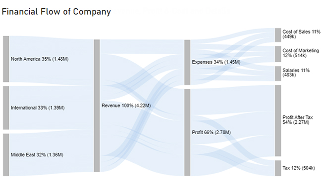
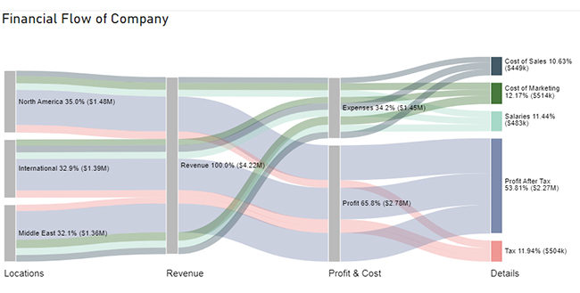
Stage 1: Logging in to Power BI

  • Log in to Power BI.
  • Enter your email. Click the “Submit” button.
Enter email to login to Power BI
  • You are redirected to your Microsoft account.
  • Enter your password and click “Sign in”.
Enter Password to login to Power BI
  • Choose whether to stay signed in.
Click on stay signed in
  • Once done, the Power BI home screen will open.

Stage 2: Creating a Data Set and Selecting the Data Set to Use in Your Sankey Chart

  • Click on the “Create” option on the left-side menu.
  • Select ”Paste or manually enter data“.
select Paste or manually enter data in Power BI
  • We’ll use the following cash flow data for this example.
Locations Revenue Profit & Cost Details Amount
North America Revenue Expenses Cost of Sales 132000
North America Revenue Expenses Salaries 159000
North America Revenue Expenses Cost of Marketing 170000
North America Revenue Profit Tax 182000
North America Revenue Profit Profit After Tax 834000
International Revenue Expenses Cost of Sales 162000
International Revenue Expenses Salaries 158000
International Revenue Expenses Cost of Marketing 145000
International Revenue Profit Tax 171000
International Revenue Profit Profit After Tax 753000
Middle East Revenue Expenses Cost of Sales 155000
Middle East Revenue Expenses Salaries 166000
Middle East Revenue Expenses Cost of Marketing 199000
Middle East Revenue Profit Tax 151000
Middle East Revenue Profit Profit After Tax 685000
  • Paste the above data table into the “Power Query” window.
  • Select the “Create a dataset only” option.
Create Dataset in Power BI ce436
  • Click on the “Data Hub” option on the left-side menu.
  • Power BI populates the data set list. (If you have not created a data set, refer to the Error! Reference source not found section.)
Click on Data Hub ce436
  • Choose a data set for the Sankey chart.
  • PBI populates the screen as shown below:
Workspace in Power BI ce436
  • Click on the “Create a report” dropdown.
  • Select “Start from scratch“.
Create Report and start from scratch ce436
  • A Report Canvas screen appears as below:
Report Canvas screen in Power BI ce436

Stage 3: Adding the Power BI Sankey Diagram Extension by ChartExpo

  • Creating the Sankey Diagram requires us to use an add-in or Power BI visual from AppSource.
  • Navigate to the right side of the Power BI dashboard.
  • Open the Power BI Visualizations panel.
  • Click the ellipsis symbol (…) as highlighted in the diagram below. This will import the Power BI Sankey Diagram extension by ChartExpo.
get more visuals in Power BI ce409
  • The following menu opens:
  • Select the “Get more visuals” option.
click on to get more visuals ce351
  • The following window opens.
  • Enter “Sankey Diagram for Power BI by ChartExpo” in the highlighted search box.
  • You should see the “Sankey Diagram for Power BI by ChartExpo”, as shown in the image below.
Sankey Diagram for Power BI by ChartExpo
  • Click the highlighted “Add” button.
Click the Add button
  • Power BI will add the “Sankey Diagram for Power BI by ChartExpo” icon in the visualization panel.
Click on Sankey Diagram Icon

Stage 4: Drawing a Sankey Diagram with ChartExpo’s Power BI extension

  • Select the “Sankey Diagram for Power BI by ChartExpo” icon in the visualization panel.
  • The following window opens in the report section of your dashboard:
Report Section in Dashboard
  • You can resize the visual as needed.
  • Navigate to the right side of your Power BI dashboard.
  • You should see “Fields” next to “Visualizations.”
Fields next to visualizations ce436
  • You’ll select the fields to use in your Sankey chart here.
  • The ChartExpo visual needs to be selected, though. Select the fields in the following sequence:
    • Locations
    • Revenue
    • Profit & Cost
    • Details
    • Amount
Select fields for Sankey diagram ce436
  • You’ll be asked for a ChartExpo license key or email address.
enter email for ChartExpo license

Stage 5: Activate your ChartExpo Trial or Apply a Subscription Key

  • Select the ChartExpo visual.
  • You should see three icons below “Build Visual” in the Visualizations panel.
Build visual panel in Power BI
  • Select the middle icon, “Format visual.”
  • The visual properties will be populated as shown below.
visual properties in Power BI
  • To begin using ChartExpo as a new user;
    • Enter your email address in the textbox under the “Trial Mode” section. ChartExpo will send the License key to this email upon subscribing to the add-in.
    • Ensure you provide an accurate and up-to-date email address.
    • Toggle “Enable Trial” to activate your 7-day trial.
enter email id
  • You should receive a welcome email from ChartExpo.
  • If you do not find the email in your inbox, kindly check your spam folder.
  • The Sankey Diagram you create under the 7-day trial contains the ChartExpo watermark.
Power BI Cloud 1
  • If you have obtained a license key:
    • Enter your license key in the “ChartExpo License Key” textbox in the “License Settings” section (see below).
    • Slide the toggle switch next to “Enable License” to “On“.
enter license key
  • Your Sankey Diagram will then appear without a watermark.
Power BI Cloud 2
  • Let’s add colors to each node. Expand the “Level Colors” properties and select the colors.
Coloring Sankey Diagram ce409
  • Automatically all changes will be saved.
Final Power BI Cloud

Future of Power BI Cloud

  1. AI Integration Boost: Expect more advanced AI for data analytics capabilities in analytics and predictive modeling.
  2. Wider Data Connectivity: Power BI Cloud will expand data connectors for seamless integration with diverse sources.
  3. Deeper Collaboration: Enhanced real-time collaboration features for effective teamwork.
  4. Mobile Optimization: Improved mobile experiences to cater to on-the-go analytics demands.
  5. Advanced Security Measures: Continued focus on advanced security measures to protect sensitive data.
  6. Microsoft 365 Integration: Strong integration with Microsoft 365 for unified user experiences.
  7. Continuous Updates: Regular feature releases to keep analytics strategies cutting-edge.
  8. Customization Options: Extended customization features for tailored dashboards and reports.
  9. Industry Applications: Broader industry-specific solutions for manufacturing, retail, education, and more.
  10. Global Data Center Expansion: Continued expansion of global data centers for enhanced performance and accessibility.

Insights

  • North America contributes 35% of the company’s revenue, amounting to $1.48 million. The Middle East has the lowest revenue contribution at 32%, equivalent to $1.36 million.
  • The company’s total revenue stands at $4.22 million.
  • Out of the $4.22 million revenue, $1.45 million was allocated for expenses, resulting in a profit of $2.78 million.
  • From the $2.78 million profit, $2.27 million went towards taxes, leaving $504,000 as net profit.
  • The expenses were divided into three categories: cost of sales ($449,000), salaries ($483,000), and marketing costs ($514,000).

FAQs

How is data stored in Power BI on the Cloud?

Power BI Cloud stores data in datasets. Datasets are collections of tables, each representing different data sources. Power BI connects to data sources and transforms the data using Power Query. Then, it stores it in these datasets for analysis, reporting, and visualization.

Is Power BI on the Cloud secure?

Yes, Power BI Cloud prioritizes security. It employs encryption for data transmission and storage, access controls, and compliance certifications to safeguard data. Microsoft, the provider, invests in stringent security measures to protect user information and ensure a secure analytical environment.

How does Power BI on the Cloud work?

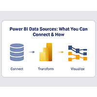
Power BI Cloud lets you create, share, and analyze data. It connects various data sources, transforms and models data, and designs visualizations. These elements are combined into reports and dashboards, accessible globally. Moreover, real-time collaboration, automation, and integration with other cloud services enhance its functionality.

Wrap Up

Creating charts in the Power BI cloud isn’t just about data representation. It’s about wielding the energy of scalability, real-time updates, and global accessibility.

BI cloud transforms raw data into captivating visual narratives with its feature-rich arsenal. Connecting data sources, molding data with finesse, and crafting intricate models fortify your analytical arsenal.

The artistry of design then takes center stage as you conjure visualizations that transcend the ordinary. From sleek scatter plots to attention-commanding bar graphs, your creativity knows no bounds.

The real-time updates, scalability, and global accessibility elevate your data presentation to the next level. Collaboration becomes a crescendo, and decision-making transforms into an informed concerto with filters, slicers, and dynamic calculations.

But this symphonic journey doesn’t end here. Power BI ensures your insights remain harmoniously synchronized through data refreshes, automated backups, and top-tier security measures.

Elevate your data-driven narratives today. Transform information into captivating visual stories with ChartExpo and Power BI Cloud.

How much did you enjoy this article?

PBIAd2
Start Free Trial!
129515

Related articles

next previous
Power BI12 min read

Power BI Group By Guide for Effective Data Insights

Learn how Power BI Group By helps you aggregate data, clarify trends, and create reports by grouping values to make large datasets manageable & insightful.

Power BI12 min read

How to Create Sankey Diagram in Microsoft Power BI?

Learn How to Create Sankey Diagram in Microsoft Power BI using Desktop & Web Service. What they are and how to use them effectively.

Power BI8 min read

Power BI Artificial Intelligence: Insights Using Visuals

Discover all there is to know about the Power BI artificial intelligence. You'll also discover how AI is used in Power BI, and how to use it for analysis and more.

Power BI9 min read

Budgeting in Healthcare: Use Visuals to Spot Budget Gaps

This guide helps you discover what budgeting in healthcare is. You'll also discover the factors that affect hospital budgets and types of budgeting in healthcare.

Power BI9 min read

Predictive Analytics in Power BI for Making Insightful Visuals

This guide shows you everything you need to know about Predictive Analytics in Power BI. It also shows you how it works, and how to interpret the results.

ChartExpo logo

Turn Data into Visual
Stories

CHARTEXPO

  • Home
  • Gallery
  • Videos
  • Services
  • Pricing
  • Contact us
  • FAQs
  • Privacy policy
  • Terms of Service
  • Sitemap

TOOLS

  • ChartExpo for Google Sheets
  • ChartExpo for Microsoft Excel
  • Power BI Custom Visuals by ChartExpo
  • Word Cloud

CATEGORIES

  • Bar Charts
  • Circle Graphs
  • Column Charts
  • Combo Charts
  • Comparison Charts
  • Line Graphs
  • PPC Charts
  • Sentiment Analysis Charts
  • Survey Charts

TOP CHARTS

  • Sankey Diagram
  • Likert Scale Chart
  • Comparison Bar Chart
  • Pareto Chart
  • Funnel Chart
  • Gauge Chart
  • Radar Chart
  • Radial Bar Chart
  • Sunburst Chart
  • see more
  • Scatter Plot Chart
  • CSAT Survey Bar Chart
  • CSAT Survey Chart
  • Dot Plot Chart
  • Double Bar Graph
  • Matrix Chart
  • Multi Axis Line Chart
  • Overlapping Bar Chart
  • Control Chart
  • Slope Chart
  • Clustered Bar Chart
  • Clustered Column Chart
  • Box and Whisker Plot
  • Tornado Chart
  • Waterfall Chart
  • Word Cloud
  • see less

RESOURCES

  • Blog
  • Resources
  • YouTube
SIGN UP FOR UPDATES

We wouldn't dream of spamming you or selling your info.

© 2025 ChartExpo, all rights reserved.