• Home
  • Tools dropdown img
    • Spreadsheet Charts

      • ChartExpo for Google Sheets
      • ChartExpo for Microsoft Excel
    • Power BI Charts

      • Power BI Custom Visuals by ChartExpo
    • Word Cloud

  • Charts dropdown img
    • Chart Category

      • Bar Charts
      • Circle Graphs
      • Column Charts
      • Combo Charts
      • Comparison Charts
      • Line Graphs
      • PPC Charts
      • Sentiment Analysis Charts
      • Survey Charts
    • Chart Type

      • Box and Whisker Plot
      • Clustered Bar Chart
      • Clustered Column Chart
      • Comparison Bar Chart
      • Control Chart
      • CSAT Survey Bar Chart
      • CSAT Survey Chart
      • Dot Plot Chart
      • Double Bar Graph
      • Funnel Chart
      • Gauge Chart
      • Likert Scale Chart
      • Matrix Chart
      • Multi Axis Line Chart
      • Overlapping Bar Chart
      • Pareto Chart
      • Radar Chart
      • Radial Bar Chart
      • Sankey Diagram
      • Scatter Plot Chart
      • Slope Chart
      • Sunburst Chart
      • Tornado Chart
      • Waterfall Chart
      • Word Cloud
    • Google Sheets
      Microsoft Excel
  • Services
  • Pricing
  • Contact us
  • Blog
  • Support dropdown img
      • Gallery
      • Videos
      • Contact us
      • FAQs
      • Resources
    • Please feel free to contact us

      atsupport@chartexpo.com

Categories
All Data Visualizations Data Analytics Surveys
Add-ons/
  • Google Sheets
  • Microsoft Excel
  • Power BI
All Data Visualizations Data Analytics Surveys
Add-ons
  • Google Sheets
  • Microsoft Excel
  • Power BI

We use cookies

This website uses cookies to provide better user experience and user's session management.
By continuing visiting this website you consent the use of these cookies.

Ok

ChartExpo Survey


Home > Blog > Power BI

Format DAX Explained: Crafting Compelling Insights

Learning when and how to use the FORMAT DAX function is essential for effective data modeling and visualization. This function plays a crucial role in formatting and presenting data accurately within Power BI reports and dashboards.

Format DAX

Imagine this: you’re tasked with creating a compelling financial presentation. You need the numbers to speak clearly and persuasively. FORMAT DAX can help you transform raw financial data into powerful insights in no time.

Now, picture a scenario where you’re building a dynamic sales dashboard. With FORMAT DAX, you can seamlessly tailor the display of sales figures, percentages, and other vital metrics. This will help you ensure your dashboard communicates effectively and leaves a lasting impact.

Consider another situation where you’re preparing a comprehensive operational report. FORMAT DAX will help you to apply custom formats to your data effortlessly. This will elevate its readability and make complex information more accessible.

This blog post explores when, why, and how to leverage FORMAT DAX in your reports. So, grab a cup of coffee and buckle up; let’s inject some excitement back into data analysis.

Table of Contents:

  1. What is DAX Format Function?
  2. Syntax and Return Value of the Format Function
  3. Why is Power BI Format Function Important?
  4. When Do We Use DAX Format Function?
  5. How to Use Format Function in Power BI?
  6. Using The Format Function Dynamically
  7. Custom Numeric Formats for the FORMAT Function
  8.  DAX Format Examples
    1. Example 1:
    2. Example 2:
  9. How to Analyze Format Dax Function in Power BI?
  10. Advantages of Using Power BI DAX Format Function
  11. FAQs About Dax Format 
  12. Wrap Up

First…

What is DAX Format Function?

Definition: The DAX FORMAT function is a versatile data analysis tool designed to manipulate and transform data formats. With its simple yet powerful syntax, it allows precise formatting of values within Power BI or Excel reports.

Need to display numbers as currency, dates in a particular format, or percentages with precision? The FORMAT function has got you covered. It allows for customization of formatting rules, offering flexibility to tailor visualizations to suit diverse needs. From specifying decimal places to adding currency symbols, its flexibility knows no bounds.

Moreover, it enables users to adhere to specific regional formatting conventions, ensuring consistency across diverse datasets.

Syntax and Return Value of the Format Function

The syntax for the FORMAT function in Power BI (DAX) is as follows:

FORMAT(value, format_string)

  • value: The value you want to format (this can be a number, date, or other supported data types).
  • format_string: A string that defines the format of the value, such as a date or numeric format.

The return value of the format function

The FORMAT function returns the formatted value as a text string. It converts the input value into a text string based on the specified format. The result will always be in string format, regardless of the original data type.

Why is Power BI Format Function Important?

In the bustling world of data analysis, presenting information effectively is often just as important as the analysis itself. The Power BI FORMAT function is a powerhouse tool that elevates the visual appeal and clarity of your reports. Here are reasons why this function is an indispensable asset for any data analyst.

  • Visual consistency: The Power BI FORMAT function ensures that all elements of your data visualizations adhere to a uniform style. Maintaining visual consistency creates a cohesive and polished look throughout your reports, enhancing readability and professionalism.
  • Improved interpretation: Data can be complex, but the FORMAT function simplifies it. Clear and intuitive data formatting makes it easier for stakeholders to understand and interpret your insights. Actions like axis label customization bridge the gap between raw data and actionable insights.
  • Enhanced user experience: User experience matters in data-driven decision-making. The FORMAT function allows you to tailor your reports to the preferences and needs of your audience. Presenting data in a user-friendly format engages your audience and encourages a more profound exploration of the insights you’ve uncovered.
  • Accessibility compliance: Accessibility is an increasingly important aspect of data reporting. The FORMAT function enables you to ensure your reports are accessible to all users, including those with disabilities. It offers options for accessibility features so you can create reports that are inclusive and compliant with accessibility standards.
  • Professional presentation: Professionalism sets you apart in a competitive landscape. The FORMAT function allows you to add those finishing touches that elevate your reports from good to great. For instance, you can align visuals with corporate branding guidelines or fine-tune the appearance of charts and graphs. When comparing a Power BI dashboard vs. reports, these details become crucial in creating a polished and effective presentation.

When Do We Use DAX Format Function?

Navigating through the complexities of data analysis requires more than just raw numbers ”“ it demands clarity. The FORMAT DAX function is a guiding light amidst the data wilderness. Let’s unravel the enigma of when and why we harness the power of this indispensable tool.

  • Data presentation: At the heart of its utility lies the ability of FORMAT DAX to refine data presentation. You can format dates to follow a specific convention, align numerical values for consistency, or style text for enhanced readability. This is ideal for crafting compelling data narratives.
  • Customized visualizations: FORMAT DAX excels in customized visualizations, where standard formats may fall short. Analysts harness its power to tailor visual elements precisely to their requirements. This ensures that charts, graphs, and reports convey information accurately and resonate effectively with the intended audience.
  • Regional preferences: Accounting for regional formatting preferences is crucial for effective communication in a globally connected world. FORMAT DAX offers a solution that allows you to adapt your data representations to different locales seamlessly. Whether it’s adjusting currencies or language conventions, it ensures reports remain relevant and accessible across diverse geographical contexts.
  • Data interpretation: The clarity of data interpretation can make or break decision-making processes. FORMAT DAX plays a vital role in enhancing data interpretability by refining the presentation and context of information. Consistent formatting standards and highlighting key insights empower stakeholders to derive actionable conclusions confidently.
  • Aesthetic appeal: Beyond its functional utility, FORMAT DAX adds a layer of aesthetic appeal to data presentations. The customizable formatting options can elevate the visual allure of your reports, leaving a lasting impression on the audience.

How to Use Format Function in Power BI?

Harnessing the power of formatting in Power BI can elevate your data visualizations from mundane to mesmerizing. Here’s a guide on how to wield the FORMAT function in Power BI Desktop.

  1. Open Power BI Desktop: Launch Power BI Desktop to access the robust suite of tools for data analysis and visualization.
  2. Create a New Calculated Column or Measure: Navigate to the modeling tab and select “New Column” or “New Measure”. This will create a new calculated field where you’ll apply the FORMAT function.
  3. Enter the DAX formula: In the formula bar, input the desired DAX formula. Incorporate the FORMAT function to format your data according to your specifications.

The syntax of the FORMAT function is as follows:

         FORMATTING = FORMAT(<value>, <format_string>)

         Replace <value> with the column reference, measure, or expression you want to format and <format_string> with

         the desired format pattern.

  1. Apply formatting: Specify the formatting options you wish to apply, such as date formats, number precision, or currency symbols. For example:
  • “0.00” formats numerical values with two decimal places.
  • “$#,##0.00” formats numerical values as currency with two decimal places.
  • “dd/mm/yyyy” formats date values as day/month/year.
  • “hh:mm: ss tt” formats time values as hour:minute: second AM/PM.
  1. Press Enter: Once you’ve defined your formula and formatting preferences, press Enter. This will execute the calculation and create the new calculated column or measure.
  2. Use in visualizations: Now that your formatted data is available, incorporate it into your visualizations. How? Drag the calculated column or measure into the desired visualizations.
  3. Adjust formatting as needed: Fine-tune your formatting as needed by revisiting the DAX formula. Then, make adjustments to suit the requirements of your analysis or the preferences of your audience.

Using The Format Function Dynamically

In Power BI, the FORMAT function can be used dynamically to adjust the output based on certain conditions or values. By combining it with other DAX functions like SWITCH, IF, or logical operators, you can format values based on specific scenarios.

For example, if you want to format numbers based on dynamic conditions:

FormattedValue =

SWITCH(

[Value] >= 1000000, FORMAT([Value], “0.0,, M”),      // Format large numbers as millions

[Value] >= 1000, FORMAT([Value], “0.0, K”),            // Format thousands

FORMAT([Value], “0”)                                                    // Default Formatting

)

Custom Numeric Formats for the FORMAT Function

The FORMAT function in Power BI allows you to apply custom numeric formats to your values. Here are some commonly used custom formats:

Thousands (K):

FORMAT([Value], “0.0, K”)

  • Displays values in thousands, e.g., 12,000 becomes 12.0 K.

Millions (M):

FORMAT([Value], “0.0,, M”)
  • Displays values in millions, e.g., 2,500,000 becomes 2.5 M.

Percentage:

FORMAT([Value], “0.00%”)
  • Displays values as percentages, e.g., 0.75 becomes 75.00%.

Currency:

FORMAT([Value], “$#,##0.00”)

  • Displays values as currency, e.g., 1234.5 becomes $1,234.50.

Custom Decimal Places:

FORMAT([Value], “0.000”)
  • Ensures three decimal places, e.g., 3.1 becomes 3.100.

DAX Format Examples

Example 1:

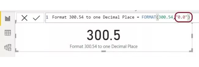
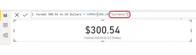
Here’s a simple example of the DAX format function in use.

  • Let’s use Format to show 300.54 limited to one decimal place.
Format DAX Example 1
  • Let’s look at the example above and use one of these predefined formats.
Format DAX Example 2

Example 2:

EVALUATE

{

( “Percent”,      FORMAT (  0.742, “Percent” )        ),

( “Currency (1)”, FORMAT (  1234.567, “$#,0.00” )        ),

( “Currency (2)”, FORMAT (   1234.567, “””US$”” #,0.00″ ) ),

( “Date (1)”,     FORMAT ( DATE ( 2024, 3, 28 ), “yyyy-mm-dd” )     ),

( “Date (2)”,     FORMAT ( DATE ( 2024, 3, 28 ), “m/d/yy” )         ),

( “Date (Q)”,     FORMAT ( DATE ( 2024, 3, 28 ), “\QQ yyyy” )       )

}

Value1 Value2
Percent 74.20%
Currency (1) $1,234.57
Currency (2) US$ 1,234.57
Date (1) 2024-03-28
Date (2) 3/28/24
Date (Q) Q1 2024

How to Analyze Format Dax Function in Power BI?

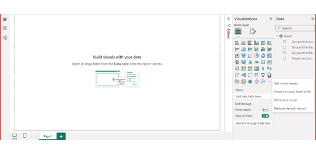
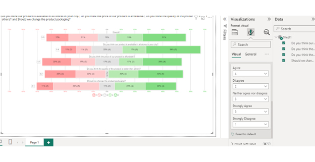
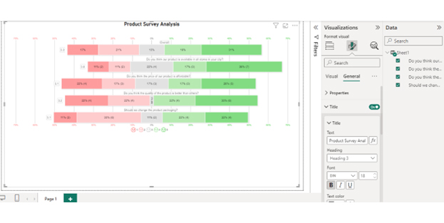
Follow these steps to harness the robust features of Power BI for effective data visualization.

Stage 1: Logging in to Power BI

  • Log in to Power BI.
  • Enter your email address and click the “Submit” button.
Enter email to login to Power BI
  • You are redirected to your Microsoft account.
  • Enter your password and click “Sign in“.
Enter Password to login to Power BI
  • You can choose whether to stay signed in.
Click on stay signed in
  • Once done, the Power BI home screen will open.

Stage 2: Creating a Data Set and Selecting the Data Set to Use in Your Chart

  • Go to the left-side menu and click the “Create” button.
  • Select “Paste or manually enter data“.
select Paste or manually enter data in Power BI ce487
  • We’ll use the sample data below for this example.
Do you think the price of our product is affordable? Do you think the quality of the product is better than that of others? Should we change the product packaging? Do you think our product is available in all stores in your city?
Neither agree nor disagree Strongly Disagree Agree Strongly Agree
Strongly Agree Agree Disagree Neither agree nor disagree
Neither agree nor disagree Strongly Disagree Disagree Strongly Agree
Disagree Agree Neither agree nor disagree Neither agree nor disagree
Strongly Disagree Strongly Disagree Strongly Agree Disagree
Agree Strongly Agree Disagree Strongly Agree
Strongly Disagree Agree Strongly Agree Agree
Agree Disagree Strongly Agree Neither agree nor disagree
Strongly Agree Strongly Agree Disagree Agree
Strongly Agree Strongly Agree Strongly Disagree Strongly Agree
Neither agree nor disagree Disagree Agree Strongly Disagree
Strongly Agree Strongly Disagree Neither agree nor disagree Strongly Agree
Strongly Disagree Disagree Disagree Neither agree nor disagree
Strongly Agree Strongly Agree Strongly Agree Strongly Agree
Agree Agree Agree Agree
Neither agree nor disagree Disagree Agree Strongly Disagree
Strongly Agree Strongly Agree Strongly Agree Strongly Agree
Disagree Strongly Agree Strongly Disagree Strongly Agree
Strongly Disagree Strongly Agree Agree Disagree
Disagree Disagree Disagree Strongly Disagree
  • Paste the above data table in the Power Query Window.
  • Select the “Create a dataset only” option.
Add Data Sets After Doing Format DAX
  • On the left-side menu, click “Data Hub“.
  • Power BI populates the data set list. (If you have not created a data set, refer to the Error! Reference source not found section)
  • Click on the “Create a report” dropdown.
Create Report After Doing Format DAX
  • Click the “Expand All” button.
  • You can see your chart metrics:
  • Click on “Get more visuals“.
Report Page After Doing Format DAX
  • Search for ChartExpo and select the Likert Scale Chart:
Power BI Chart Page After Doing Format DAX
  • Click the “Add” button.
Click Add Button After Doing Format DAX
  • You can now see the Likert Scale Chart in the visualizations list.
Click Likert Scale Chart Icon After Doing Format DAX
  • In Visual, click License Settings, add the key, and enable the license.
  • After adding the key, you can see the Likert Scale Chart.
Select Fields for Chart After Doing Format DAX
  • Set the scale of the chart as follows:
Create Chart After Doing Format DAX
  • You can add the header text on top of the chart as follows:
Add Header to Chart After Doing Format DAX
  • Your Likert Scale Chart final look in Power BI:
Final Format DAX

Insights

  • Price Affordability: Strongly Agree: Diverse viewpoints indicate differing perceptions regarding the affordability of the product.
  • Product Quality: Strongly Agree: Overall, customers perceive the quality to exceed that of competitors.
  • Packaging Change: Disagree: There’s no definitive consensus on the necessity for a packaging revamp.
  • Availability in Stores: Mixed: It’s unclear whether the product is universally accessible in stores across the city.

Advantages of Using Power BI DAX Format Function

The Power BI DAX FORMAT function offers a plethora of advantages to those who wield it. Let’s dive into the benefits of harnessing this function and discover how it transforms data visualization and interpretation.

  • Customization: The Power BI DAX FORMAT function allows for unparalleled customization. It enables you to tailor data representations to your specific needs and preferences.
  • Improved readability: The FORMAT function enhances readability by formatting data clearly and intuitively. This makes it easier for stakeholders to understand and interpret the insights presented.
  • Consistency: Consistency is key in professional reporting. The FORMAT function ensures all data visualization elements adhere to a uniform style, from colors to fonts to spacing.
  • Enhanced visualization: With the FORMAT function, you can create visually appealing visualizations that effectively convey information and engage audiences. This, as a result, enhances the impact of your reports.
  • Standardization: Standardizing data presentation across reports and dashboards is made effortless with the FORMAT function. It ensures uniformity and coherence in data representation.
  • Localization: In a globalized world, catering to regional formatting preferences is essential. The FORMAT function facilitates localization by allowing you to adapt data representations to different locales seamlessly.

FAQs About Dax Format

What is the format in DAX?

In DAX, FORMAT is a function used to customize the appearance of data values. It allows you to define how numbers, dates, and text are displayed in Power BI or Excel. FORMAT enables precise control over formatting options for improved data visualization.

What tools do I need to format a DAX?

To format DAX expressions, you primarily need Power BI or Excel, where you’ll write your DAX formulas. Additionally, familiarity with DAX syntax and formatting options is essential. These tools empower you to customize the appearance of your data effectively.

Wrap Up

The FORMAT DAX function is pivotal in data analysis. Its versatility empowers you to refine data presentation with precision and finesse. Whether enhancing readability, ensuring consistency, or catering to regional preferences, it proves invaluable in transforming raw data into actionable insights.

By customizing visualizations and standardizing data representations, FORMAT DAX facilitates clearer interpretation and decision-making. Its role in improving the aesthetic appeal of reports cannot be overstated, leaving a lasting impression on audiences.

Moreover, FORMAT DAX enables seamless adaptation to diverse regional formatting preferences. This ensures inclusivity and accessibility across geographical boundaries.

In the ever-evolving landscape of data analytics, the significance of FORMAT DAX extends beyond mere functionality. It embodies the artistry inherent in presenting data effectively, elevating the impact of reports and dashboards.

As organizations strive for data-driven excellence, mastering the nuances of FORMAT DAX becomes imperative. Its integration into Power BI and Excel workflows empowers you to unlock the full potential of your data. This fosters deeper insights and informed decision-making.

Conclusively, FORMAT DAX is more than just a tool; it’s a catalyst for innovation and excellence in data visualization. Harnessing its capabilities will help you navigate the complexities of data analysis with confidence.

How much did you enjoy this article?

PBIAd2
Start Free Trial!
134454

Related articles

next previous
Power BI12 min read

Power BI Group By Guide for Effective Data Insights

Learn how Power BI Group By helps you aggregate data, clarify trends, and create reports by grouping values to make large datasets manageable & insightful.

Power BI12 min read

How to Create Sankey Diagram in Microsoft Power BI?

Learn How to Create Sankey Diagram in Microsoft Power BI using Desktop & Web Service. What they are and how to use them effectively.

Power BI8 min read

Power BI Artificial Intelligence: Insights Using Visuals

Discover all there is to know about the Power BI artificial intelligence. You'll also discover how AI is used in Power BI, and how to use it for analysis and more.

Power BI9 min read

Budgeting in Healthcare: Use Visuals to Spot Budget Gaps

This guide helps you discover what budgeting in healthcare is. You'll also discover the factors that affect hospital budgets and types of budgeting in healthcare.

Power BI9 min read

Predictive Analytics in Power BI for Making Insightful Visuals

This guide shows you everything you need to know about Predictive Analytics in Power BI. It also shows you how it works, and how to interpret the results.

ChartExpo logo

Turn Data into Visual
Stories

CHARTEXPO

  • Home
  • Gallery
  • Videos
  • Services
  • Pricing
  • Contact us
  • FAQs
  • Privacy policy
  • Terms of Service
  • Sitemap

TOOLS

  • ChartExpo for Google Sheets
  • ChartExpo for Microsoft Excel
  • Power BI Custom Visuals by ChartExpo
  • Word Cloud

CATEGORIES

  • Bar Charts
  • Circle Graphs
  • Column Charts
  • Combo Charts
  • Comparison Charts
  • Line Graphs
  • PPC Charts
  • Sentiment Analysis Charts
  • Survey Charts

TOP CHARTS

  • Sankey Diagram
  • Likert Scale Chart
  • Comparison Bar Chart
  • Pareto Chart
  • Funnel Chart
  • Gauge Chart
  • Radar Chart
  • Radial Bar Chart
  • Sunburst Chart
  • see more
  • Scatter Plot Chart
  • CSAT Survey Bar Chart
  • CSAT Survey Chart
  • Dot Plot Chart
  • Double Bar Graph
  • Matrix Chart
  • Multi Axis Line Chart
  • Overlapping Bar Chart
  • Control Chart
  • Slope Chart
  • Clustered Bar Chart
  • Clustered Column Chart
  • Box and Whisker Plot
  • Tornado Chart
  • Waterfall Chart
  • Word Cloud
  • see less

RESOURCES

  • Blog
  • Resources
  • YouTube
SIGN UP FOR UPDATES

We wouldn't dream of spamming you or selling your info.

© 2025 ChartExpo, all rights reserved.