Categories
Data is the currency of insight, and Power BI is the alchemist’s tool of choice. But before you can turn your data into gold, you need data to begin with.
That’s where sample data for Power BI comes in.


Sample data is the lifeblood of effective Power BI analysis. It’s the fuel that powers your dashboards and reports, allowing you to explore, visualize, and glean insights. But where do you get this sample data, and how do you import it into Power BI?
The internet has a feast of sample data to sink your teeth into.
There’s an array of options, from sales and returns to artificial intelligence. These samples are also available in various formats, including content packs and downloadable Excel workbooks.
Don’t know where to start? No problem. Microsoft has made it easy to access and connect to the sample data. You’ll explore the full range of Power BI’s features with just a few clicks.
Power BI has never been more fun.
Power BI sample data is a subset used for practice and testing within the Power BI analytics platform. It typically consists of mock or simplified data that resembles real-world information. Discover the significance of Sample Data for Power BI, an essential subset facilitating a deeper understanding of Power BI’s features, aiding in report building, and exploring advanced visualization techniques. This resource is pivotal for the learning and development of Power BI enthusiasts and professionals, ensuring proficiency in analytics skills
There are several sources and methods to obtain Power BI sample datasets:
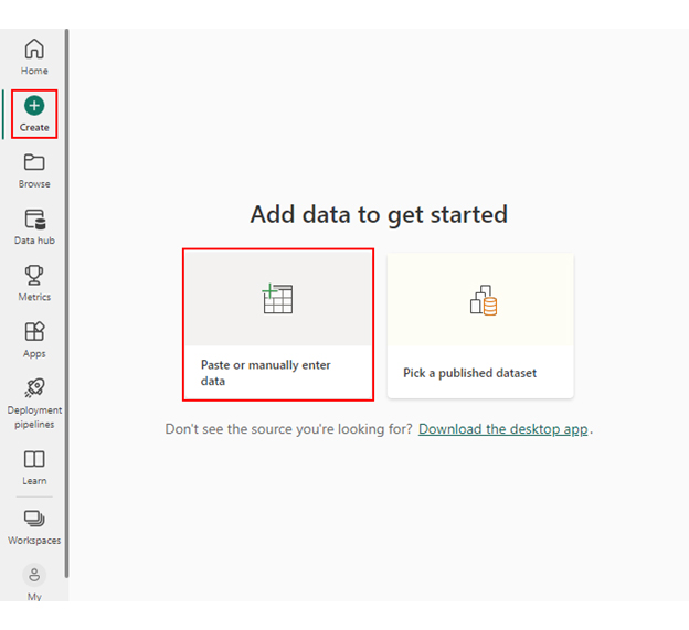
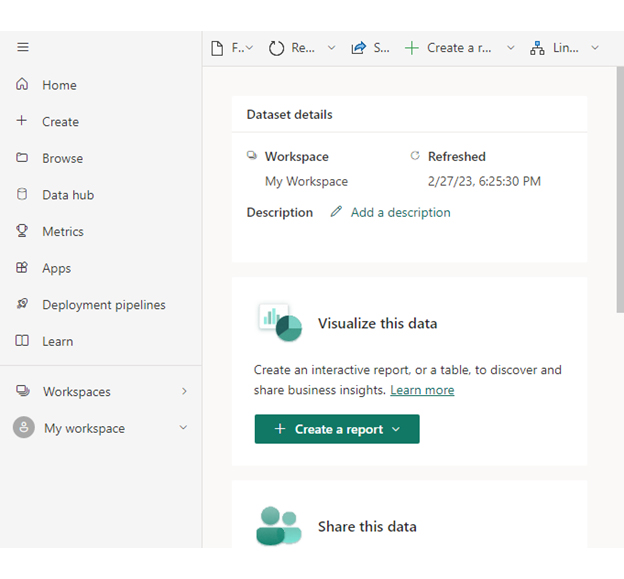
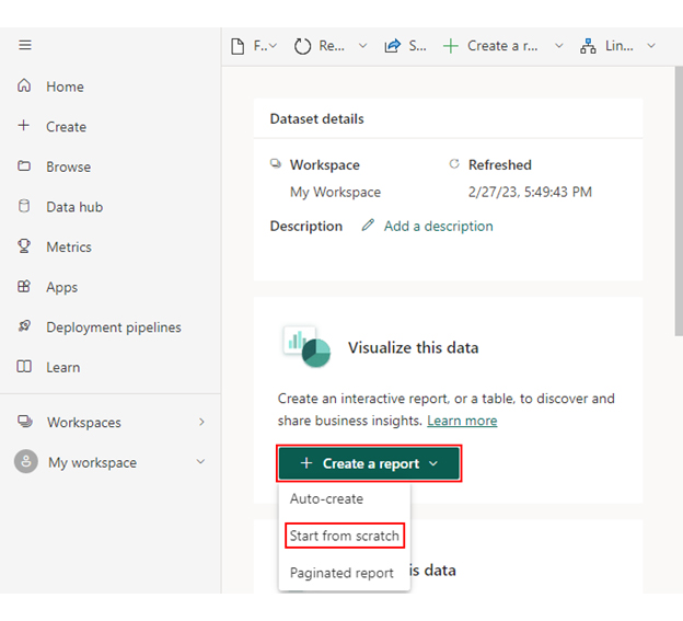
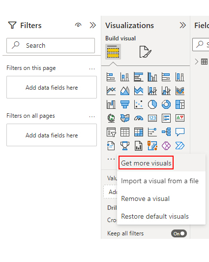
Power BI Desktop includes a built-in sample data generator. You can create tables, input data manually, and customize it to your needs for practicing and testing. Click the “Get Data” button and select “Samples” to access the data samples.
Power BI Service offers sample data packs and templates to import directly into your workspace. These packs cover various industries and scenarios, making starting easy. Click the “Get Data” or “Connect to Data” buttons to access them.
The Power BI Community is a valuable resource. You can find templates and sample datasets shared by the community members. These datasets often cater to specific business cases and can be downloaded for free.
Visit the Power BI Community website (https://community.powerbi.com). Then, check the “Data Stories Gallery” or the “Themes, templates, and apps” sections for downloadable sample datasets.
Many organizations and government websites provide access to public datasets on various topics, such as demographics and economics. You can download these datasets used in Power BI.
Some third-party platforms and data marketplaces offer sample datasets for free or purchase. These datasets cover diverse industries and can be a rich source for Power BI.
Embrace the wizardry of Power BI sample data with enchanting best practices. Discover how to wield Sample Data for Power BI wisely to unlock its magical potential and optimize your analytics experience:
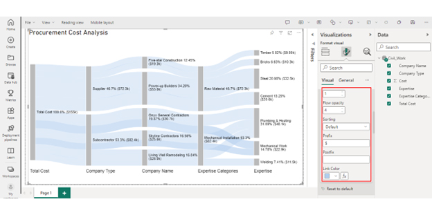
You can use a Sankey chart to evaluate sample data and visualize how values move between different categories.


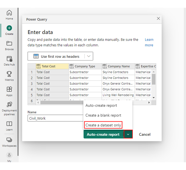
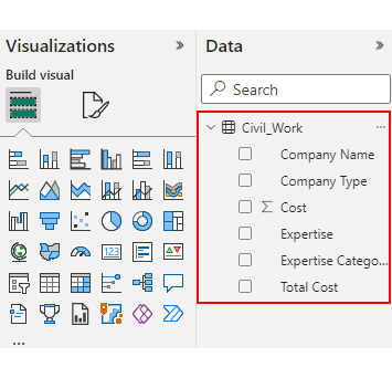
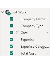
| Total Cost | Company Type | Company Name | Expertise Categories | Expertise | Cost |
| Total Cost | Subcontractor | Skyline Contractors | Mechanical Installation | Plumbing & Heating | 15456 |
| Total Cost | Subcontractor | Skyline Contractors | Mechanical Installation | Mechanical Work | 10159 |
| Total Cost | Subcontractor | Onyx General Contractors | Mechanical Installation | Plumbing & Heating | 18045 |
| Total Cost | Subcontractor | Onyx General Contractors | Mechanical Installation | Mechanical Work | 12695 |
| Total Cost | Subcontractor | Living Well Remodeling | Mechanical Installation | Plumbing & Heating | 14589 |
| Total Cost | Subcontractor | Living Well Remodeling | Mechanical Installation | Welding | 11456 |
| Total Cost | Supplier | Power-up Builders | Raw Material | Cement | 20561 |
| Total Cost | Supplier | Power-up Builders | Raw Material | Steel | 32456 |
| Total Cost | Supplier | Five-star Construction | Raw Material | Bricks | 10253 |
| Total Cost | Supplier | Five-star Construction | Raw Material | Timber | 9000 |


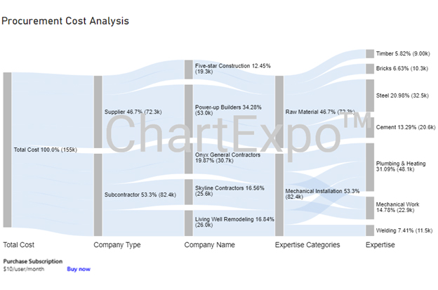

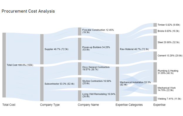
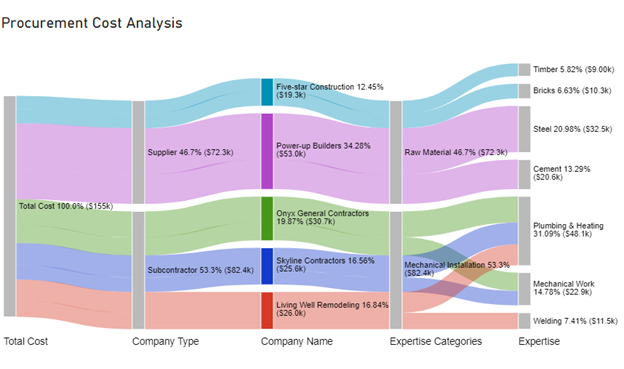
Subcontractors are the main beneficiaries of the “Total Cost.” To better understand the distribution, calculate the precise allocation of the total cost to subcontractors and suppliers.
‘Mechanical Installation’ has the highest expertise expenses, with notable costs attributed to the ‘Plumbing & Heating’ and ‘Mechanical Work’ subcategories.
The performance of subcontractors and suppliers is evaluated based on the total cost they receive. The sub-contractors, Skyline Contractors, Onyx General Contractors, and Living Well Remodeling charged $25.6K, $30.7K, and $26.0K, respectively. The suppliers, Power-up Builder and Five-star Construction charged $53.0K and $19.3K, respectively.
Sample Data for Power BI is a collection of pre-made datasets available within the Power BI platform. These datasets resemble real-world scenarios but use simplified data, making them perfect for learning, practicing, and testing your Power BI skills without needing complex data configurations.
Sample data is readily available within Power BI Desktop itself. You can access it by:
Harnessing sample data for Power BI is akin to sharpening a sword before battle, essential for success. It empowers you to experiment, learn, and innovate within this dynamic data ecosystem. Understanding its purpose and using official sources ensures you’re on the right track.
We’ve unraveled the mystery of generating and importing Sample Data for Power BI, offering insights into diverse methods and best practices. Documenting the data schema and practicing data modeling prepares you for real-world scenarios where data can be messy.
Cleaning and transforming data, creating meaningful visualizations, and exploring diverse business scenarios refine your skills. Learning DAX adds a potent tool to your data analysis arsenal. Don’t forget the importance of performance optimization and meticulous documentation to navigate your data journey successfully.
To supercharge your Power BI journey, consider leveraging the innovative ChartExpo. With ChartExpo, you can access an extensive library of pre-built sample datasets tailored for Power BI. This integration lets you focus on what truly matters – analyzing and visualizing data to uncover meaningful insights.
How much did you enjoy this article?


Discover diverse and high-quality Power BI report examples for inspiration and insights. Elevate your reporting with strategic visualization techniques.

A Customer Relationship Management Dashboard centralizes data, tracks key metrics, and drives smarter business decisions. Discover now!

Explore Healthcare Dashboard Examples and learn how to turn complex healthcare data into clear, actionable insights for better decision-making.


