• Home
  • Tools dropdown img
    • Spreadsheet Charts

      • ChartExpo for Google Sheets
      • ChartExpo for Microsoft Excel
    • Power BI Charts

      • Power BI Custom Visuals by ChartExpo
    • Word Cloud

  • Charts dropdown img
    • Chart Category

      • Bar Charts
      • Circle Graphs
      • Column Charts
      • Combo Charts
      • Comparison Charts
      • Line Graphs
      • PPC Charts
      • Sentiment Analysis Charts
      • Survey Charts
    • Chart Type

      • Box and Whisker Plot
      • Clustered Bar Chart
      • Clustered Column Chart
      • Comparison Bar Chart
      • Control Chart
      • CSAT Survey Bar Chart
      • CSAT Survey Chart
      • Dot Plot Chart
      • Double Bar Graph
      • Funnel Chart
      • Gauge Chart
      • Likert Scale Chart
      • Matrix Chart
      • Multi Axis Line Chart
      • Overlapping Bar Chart
      • Pareto Chart
      • Radar Chart
      • Radial Bar Chart
      • Sankey Diagram
      • Scatter Plot Chart
      • Slope Chart
      • Sunburst Chart
      • Tornado Chart
      • Waterfall Chart
      • Word Cloud
    • Google Sheets
      Microsoft Excel
  • Services
  • Pricing
  • Contact us
  • Blog
  • Support dropdown img
      • Gallery
      • Videos
      • Contact us
      • FAQs
      • Resources
    • Please feel free to contact us

      atsupport@chartexpo.com

Categories
All Data Visualizations Data Analytics Surveys
Add-ons/
  • Google Sheets
  • Microsoft Excel
  • Power BI
All Data Visualizations Data Analytics Surveys
Add-ons
  • Google Sheets
  • Microsoft Excel
  • Power BI

We use cookies

This website uses cookies to provide better user experience and user's session management.
By continuing visiting this website you consent the use of these cookies.

Ok

ChartExpo Survey


Home > Blog > Power BI

How to Create Business Intelligence Analytics in Power BI?

If knowledge is power, then business intelligence is the ultimate superpower.

Business intelligence analytics has become crucial to decision-making in today’s competitive business landscape. With the abundance of data available, businesses need effective tools and techniques to extract meaningful insights.

This is where Microsoft Power BI comes into play.

Business Intelligence Analytics

Power BI offers a range of capabilities to create sophisticated analytics solutions. It enables you to transform raw data into visually engaging and interactive reports, dashboards, and data visualizations.

Moreover, it offers real-time data viewing, top-notch security, and adequate storage options.

In this guide, we will explore the process of creating business intelligence analytics in Power BI. From data preparation and modeling to building impactful visualizations and generating actionable reports, we’ll leave no stone unturned.

Forget dull spreadsheets and mind-numbing charts; it’s time to add charm to your business strategies.

Let’s bewitch those numbers and unlock the secrets of business success.

Table of Content:

  1. What is BI Analytics?
  2. Why Use Business Intelligence Analytics?
  3. Cons of Using BI Analytics
  4. How to Create Business Intelligence Analytics in Power BI?
  5. Wrap Up

What is BI Analytics?

BI analytics, short for business intelligence analytics, entails extracting meaningful insights and valuable knowledge from raw business data. It involves collecting, analyzing, and transforming data into actionable reports vs dashboards in Power BI, and visualizations. BI analytics empowers businesses to make informed decisions, identify trends, and discover opportunities. Ultimately enhance their overall performance and competitiveness in the market.

Why Use Business Intelligence Analytics?

Business intelligence analytics offers many benefits that drive organizations to embrace its power and potential. Below are the pros of using analytics for business intelligence.

  • Data-Driven Decision Making

BI analytics empowers you to base decisions on concrete data and insights rather than intuition or gut feelings. Analyzing historical and real-time data helps you identify trends, customer behavior, and market changes. This data-driven decision-making process ensures that actions are well-informed, reducing the risk of costly mistakes.

  • Improved Performance

BI analytics gives a comprehensive view of performance across various departments and processes. Monitoring key performance indicators (KPIs) helps identify improvement areas and take timely corrective actions. As a result, this increases operational efficiency, streamlines workflows, and enhances overall performance.

  • Competitive Advantage

Staying ahead of the curve is crucial in today’s highly competitive business landscape. BI analytics enables you to spot emerging trends, market opportunities, and potential threats. This foresight allows you to respond swiftly to changing market conditions, adapt strategies, and maintain a competitive edge.

  • Strategic Planning

BI analytics serves as a powerful marketing analytics tool for strategic planning and goal-setting. Analyzing historical data and market trends helps you set realistic and achievable objectives. You can also track progress towards these goals, making the necessary adjustments to ensure long-term success.

  • Enhanced Efficiency

Efficiency is the cornerstone of any successful business. BI analytics, whether through Looker vs Power BI or other platforms, identifies inefficiencies, bottlenecks, and areas of wastage within processes.

Consequently, this knowledge helps to optimize operations, allocate resources more effectively, and reduce costs, leading to improved profitability.

  • Customer Insights

Understanding customer behavior and preferences helps to tailor products and services to meet market demands. A web analytics dashboard and BI analytics allow you to gather and analyze customer data, such as buying patterns and feedback. This, in turn, helps create personalized marketing strategies and foster stronger customer relationships.

  • Real-time Visibility

BI analytics tools offer real-time or near-real-time data visualization, enabling you to monitor real-time performance. This immediate visibility into key metrics allows for quick decision-making. Consequently, it enables you to seize opportunities or address issues as they arise.

Cons of Using BI Analytics

While business intelligence and analytics offer numerous advantages, it’s essential to acknowledge their potential drawbacks. Let’s explore some of the cons of using BI analytics:

  1. Cost and complexity: Implementing BI analytics systems can be expensive, especially for smaller businesses. Licensing fees, hardware, and specialized personnel contribute to the initial and ongoing costs. Moreover, the complexity of integrating data from various sources and configuring the analytics tools can pose challenges. It requires substantial time and resources.
  2. Data quality issues: BI analytics relies heavily on data accuracy and reliability. If the underlying data is incomplete, outdated, or inconsistent, the insights derived may be misleading or erroneous. Ensuring data quality demands rigorous data cleansing and validation processes, which can be time-consuming and resource-intensive.
  3. Learning curve: Effective use of BI analytics tools demands a certain level of expertise. Employees may need training to interpret data, create meaningful visualizations, and navigate the BI platform. As a result, this learning curve can slow adoption and limit the tool’s potential impact.
  4. Data security concerns: Handling large volumes of sensitive data poses security risks. BI analytics systems may be vulnerable to data breaches, unauthorized access, or internal misuse. Therefore, it is crucial to ensure robust data security measures, such as encryption and access control.
  5. Over-reliance on data: Relying solely on data-driven insights can have its pitfalls. While data is valuable, it may not capture every aspect of a complex business decision. Consider the human element, intuition, and experience alongside data analysis to make all-rounded decisions.
  6. Bias and interpretation: Biases present in the data or how it’s analyzed can influence BI analytics outcomes, including visual analytics. Misinterpretation of data or drawing incorrect conclusions may lead to misguided decisions. Therefore, it’s essential to be cautious, critically evaluate results, and validate findings through multiple perspectives.

How to Create Business Intelligence Analytics in Power BI?

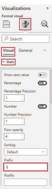
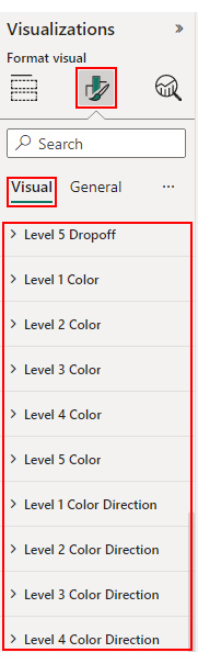
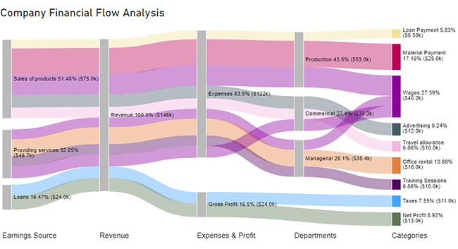
Let’s embark on a data-driven adventure sliced into five delectable stages of guaranteed success.
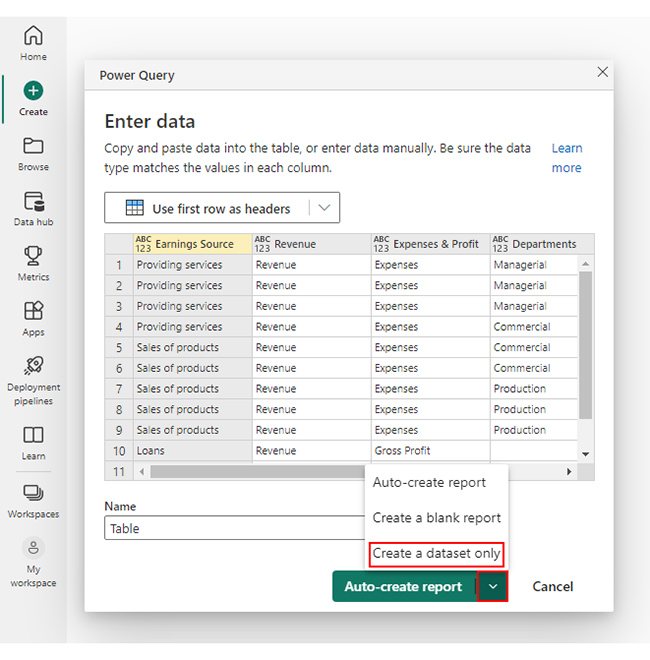
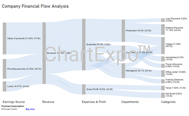
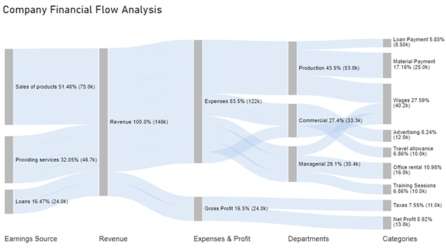
Stage 1: Logging in to Power BI

  • Log in to Power BI.
  • Enter your email. Click the “Submit” button.
Enter email to login to Power BI
  • You are redirected to your Microsoft account.
  • Enter your password and click “Sign in”.
Enter Password to login to Power BI
  • Choose whether to stay signed in.
Click on stay signed in
  • Once done, the Power BI home screen will open.

Stage 2: Creating a Data Set and Selecting the Data Set to Use in Your Sankey Chart

  • Click on the “Create” option on the left-side menu.
  • Select ”Paste or manually enter data“.
select Paste or manually enter data in Power BI
  • We’ll use the following cash flow data for this example.
Earnings Source Revenue Expenses & Profit Departments Categories Amount
Providing services Revenue Expenses Managerial Training Sessions            10,000
Providing services Revenue Expenses Managerial Office rental            16,000
Providing services Revenue Expenses Managerial Wages              9,400
Providing services Revenue Expenses Commercial Wages            11,300
Sales of products Revenue Expenses Commercial Travel allowance            10,000
Sales of products Revenue Expenses Commercial Advertising            12,000
Sales of products Revenue Expenses Production Material Payment            25,000
Sales of products Revenue Expenses Production Loan Payment              8,500
Sales of products Revenue Expenses Production Wages            19,500
Loans Revenue Gross Profit Taxes            11,000
Loans Revenue Gross Profit Net Profit            13,000
  • Paste the above data table into the “Power Query” window.
  • Select the “Create a dataset only” option.
Create Dataset in Power BI ce391
  • Click on the “Data Hub” option on the left-side menu.
  • Power BI populates the data set list. (If you have not created a data set, refer to the Error! Reference source not found section.)
Click on Data Hub ce391
  • Choose a data set for the Sankey chart.
  • PBI populates the screen as shown below:
Workspace in Power BI ce391
  • Click on the “Create a report” dropdown.
  • Select “Start from scratch“.
Create Report and start from scratch ce390
  • A Report Canvas screen appears as below:
Report Canvas screen in Power BI ce390

Stage 3: Adding the Power BI Sankey Diagram Extension by ChartExpo

  • Creating the Sankey Diagram requires us to use an add-in or Power BI visual from AppSource.
  • Navigate to the right side of the Power BI dashboard.
  • Open the Power BI Visualizations panel.
  • Click the ellipsis symbol (”¦) as highlighted in the diagram below. This will import the Power BI Sankey Diagram extension by ChartExpo.
click on to get more visuals
  • The following menu opens:
  • Select the “Get more visuals” option.
click on to get more visuals ce351
  • The following window opens.
  • Enter “Sankey Diagram for Power BI by ChartExpo” in the highlighted search box.
  • You should see the “Sankey Diagram for Power BI by ChartExpo”, as shown in the image below.
Sankey Diagram for Power BI by ChartExpo
  • Click the highlighted “Add” button.
Click the Add button
  • Power BI will add the “Sankey Diagram for Power BI by ChartExpo” icon in the visualization panel.
Click on Sankey Diagram Icon

Stage 4: Drawing a Sankey Diagram with ChartExpo’s Power BI extension

  • Select the “Sankey Diagram for Power BI by ChartExpo” icon in the visualization panel.
  • The following window opens in the report section of your dashboard:
Report Section in Dashboard
  • You can resize the visual as needed.
  • Navigate to the right side of your Power BI dashboard.
  • You should see “Fields” next to “Visualizations.”
Fields next to visualizations ce391
  • You’ll select the fields to use in your Sankey chart here.
  • The ChartExpo visual needs to be selected, though. Select the fields in the following sequence:
    • Earnings Source
    • Revenue
    • Expenses & Profit
    • Departments
    • Categories
    • Revenue
Select fields for Sankey diagram ce391
  • You’ll be asked for a ChartExpo license key or email address.
enter email for ChartExpo license

Stage 5: Activate your ChartExpo Trial or Apply a Subscription Key

  • Select the ChartExpo visual.
  • You should see three icons below “Build Visual” in the Visualizations panel.
Build visual panel in Power BI
  • Select the middle icon, “Format visual.”
  • The visual properties will be populated as shown below.
visual properties in Power BI
  • To begin using ChartExpo as a new user;
    • Enter your email address in the textbox under the “Trial Mode” section. ChartExpo will send the License key to this email upon subscribing to the add-in.
    • Ensure you provide an accurate and up-to-date email address.
    • Toggle “Enable Trial” to activate your 7-day trial.
enter email id
  • You should receive a welcome email from ChartExpo.
  • If you do not find the email in your inbox, kindly check your spam folder.
  • The Sankey Diagram you create under the 7-day trial contains the ChartExpo watermark.
Looker vs. Power BI 1
  • If you have obtained a license key:
    • Enter your license key in the “ChartExpo License Key” textbox in the “License Settings” section (see below).
    • Slide the toggle switch next to “Enable License” to “On“.
enter license key
  • Your Sankey Diagram will then appear without a watermark.
Looker vs. Power BI 2
  • Let’s add a Prefix (such as a $ sign) with the numeric values in the chart.
  • Expand the “Stats” properties and include the Prefix value.
Add The Prefix Value ce391
  • Let’s add colors to each node. Expand the “Level Colors” properties and select the colors.
Coloring Sankey Diagram ce390
  • Automatically all changes will be saved.
Final Looker vs. Power BI

Insights

  • Product sales are the company’s primary revenue source, making up 51.48% of the total.
  • At the second level, the company’s overall revenue amounts to $146K.
  • Out of the total revenue, $122K is allocated to expenses, which accounts for 83.5%. This results in a gross profit of $24K, equivalent to 16.5%.
  • At the fourth level, there are three categories of expenses: managerial, commercial, and production. Managerial expenses amount to $35.4K, commercial expenses to $33.3K, and production expenses to $53K.
  • The gross profit is then divided into taxes and net profit, with $11K allocated for taxes and $13K as net profit.
  • The managerial section is divided into three subsections: training sessions, wages, and office rental, with costs of $10K, $9.4K, and $16K, respectively.
  • The commercial section is divided into travel allowance, advertising, and wages, with travel allowance being the highest expense category.

FAQs

What is BI analytics?

Business intelligence (BI) analytics is the process of analyzing data collected through BI tools and systems. It focuses on understanding historical and present data to identify trends, patterns, and correlations for improving business performance.

Why is BI used?

BI is used to leverage data insights to make informed decisions to optimize business performance. It empowers businesses to unlock valuable information, enhancing strategic planning and overall efficiency in their operations.

What is the limitation of business intelligence?

The limitations of business intelligence include the following;

  • High implementation costs.
  • Data quality issues affecting accuracy.
  • Potential biases in data interpretation.
  • The risk of overreliance on data without considering other factors in decision-making.

Wrap Up

Business intelligence analytics opens a realm of possibilities for businesses seeking to harness the power of data. It helps to make well-informed decisions, improve performance, gain a competitive edge, and strategize with clarity and confidence.

Follow the enchanting journey we’ve laid out and unlock the secrets to data-driven success.

While the path may have its challenges, the rewards of this mystical journey are undeniable. Overcoming the limitations, such as cost and biases, is crucial to unleashing the full potential of BI. Moreover, emphasizing the human element alongside data insights ensures a harmonious balance of wisdom and magic.

With the alchemy of ChartExpo, you can transcend conventional BI tools, unleashing the true potential of their data.

So, venture forth with curiosity and courage, wielding the Power BI and ChartExpo wand with skill and finesse. Embrace the art of weaving data spells to conjure unparalleled insights and propel your business to success.

The realm of data awaits your magical touch.

How much did you enjoy this article?

PBIAd2
Start Free Trial!
128568

Related articles

next previous
Power BI12 min read

Power BI Group By Guide for Effective Data Insights

Learn how Power BI Group By helps you aggregate data, clarify trends, and create reports by grouping values to make large datasets manageable & insightful.

Power BI12 min read

How to Create Sankey Diagram in Microsoft Power BI?

Learn How to Create Sankey Diagram in Microsoft Power BI using Desktop & Web Service. What they are and how to use them effectively.

Power BI8 min read

Power BI Artificial Intelligence: Insights Using Visuals

Discover all there is to know about the Power BI artificial intelligence. You'll also discover how AI is used in Power BI, and how to use it for analysis and more.

Power BI9 min read

Budgeting in Healthcare: Use Visuals to Spot Budget Gaps

This guide helps you discover what budgeting in healthcare is. You'll also discover the factors that affect hospital budgets and types of budgeting in healthcare.

Power BI9 min read

Predictive Analytics in Power BI for Making Insightful Visuals

This guide shows you everything you need to know about Predictive Analytics in Power BI. It also shows you how it works, and how to interpret the results.

ChartExpo logo

Turn Data into Visual
Stories

CHARTEXPO

  • Home
  • Gallery
  • Videos
  • Services
  • Pricing
  • Contact us
  • FAQs
  • Privacy policy
  • Terms of Service
  • Sitemap

TOOLS

  • ChartExpo for Google Sheets
  • ChartExpo for Microsoft Excel
  • Power BI Custom Visuals by ChartExpo
  • Word Cloud

CATEGORIES

  • Bar Charts
  • Circle Graphs
  • Column Charts
  • Combo Charts
  • Comparison Charts
  • Line Graphs
  • PPC Charts
  • Sentiment Analysis Charts
  • Survey Charts

TOP CHARTS

  • Sankey Diagram
  • Likert Scale Chart
  • Comparison Bar Chart
  • Pareto Chart
  • Funnel Chart
  • Gauge Chart
  • Radar Chart
  • Radial Bar Chart
  • Sunburst Chart
  • see more
  • Scatter Plot Chart
  • CSAT Survey Bar Chart
  • CSAT Survey Chart
  • Dot Plot Chart
  • Double Bar Graph
  • Matrix Chart
  • Multi Axis Line Chart
  • Overlapping Bar Chart
  • Control Chart
  • Slope Chart
  • Clustered Bar Chart
  • Clustered Column Chart
  • Box and Whisker Plot
  • Tornado Chart
  • Waterfall Chart
  • Word Cloud
  • see less

RESOURCES

  • Blog
  • Resources
  • YouTube
SIGN UP FOR UPDATES

We wouldn't dream of spamming you or selling your info.

© 2025 ChartExpo, all rights reserved.