Categories
Picture this: a corporate boardroom filled with analysts, marketers, and executives. The tension is palpable as they prepare to unveil their latest findings.
The projector hums to life, casting a glow that dances across eager faces.
But there’s a twist, Looker’s intuitive dashboards power half of the presentation. The data seems to waltz effortlessly into dazzling visualizations.


The other half? Power BI flexes its muscles to transform complex numbers into interactive stories.
As the battle of insights unfolds, quips and charts are thrown with equal fervor. Looker loyalists tout its data modeling prowess, claiming it can turn a spreadsheet into a Picasso. Power BI enthusiasts counter with seamless integration into the Microsoft ecosystem, arguing that its familiarity is its strongest suit.
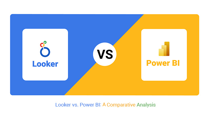
This comparative analysis dissects the strengths and quirks of Looker vs. Power BI. Grab your popcorn and a front-row seat because this is one analytics showdown you won’t want to miss.
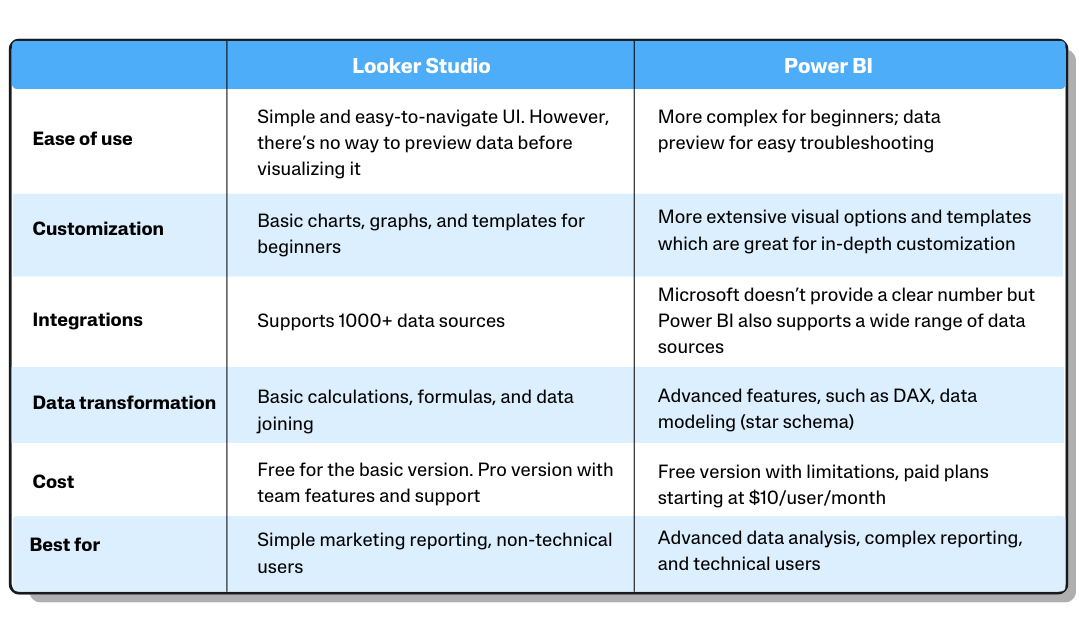
Choosing between Looker and Microsoft Power BI depends on your organization’s priorities. Looker is known for its user-friendly semantic modeling and collaborative data exploration.
It utilizes LookML for centralized data modeling. Meanwhile, Power BI offers robust data modeling, user-friendly interfaces, and seamless integration with the Microsoft ecosystem.
Power BI suits diverse organizations with pre-built connectors and accommodates both technical and non-technical users. Consider your team’s needs and technical expertise when making the decision.
Definition: Power BI is a powerful business analytics tool by Microsoft. It enables users to visualize and share insights from their data through interactive dashboards and reports. It has intuitive features that transform raw data into compelling visualizations, helping with informed decision-making. Moreover, its integration with Microsoft’s ecosystem and cloud services enhances its capabilities, making data analysis more impactful.
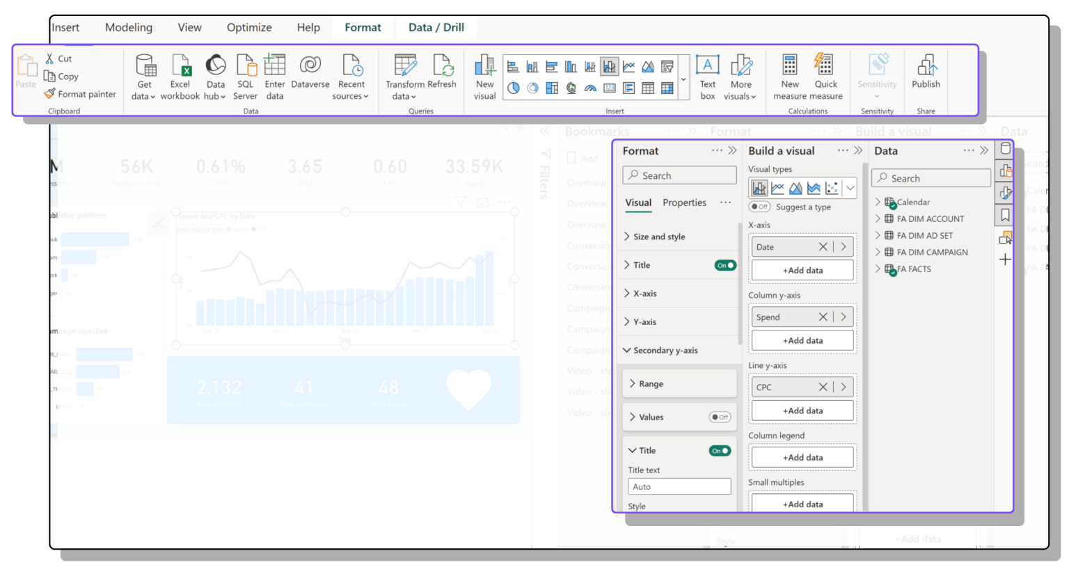
Power BI is designed to be user-friendly and accessible. Its intuitive drag-and-drop interface allows users to easily create and customize reports and dashboards without extensive technical knowledge.
With a range of pre-built templates and a straightforward integration process, Power BI simplifies data visualization and analysis, making it a practical tool for both beginners and experienced users.
Features: Power BI boasts an array of features that collectively facilitate extracting meaningful insights from data.
Power BI’s strength lies in its ability to connect to a wide range of data sources. It seamlessly integrates with various databases, spreadsheets, online services, and APIs. This connectivity ensures that your data is always up-to-date, enabling real-time analysis.
The heart of Power BI is its data visualization capabilities. It offers a plethora of visualization options allowing you to present complex data in a comprehensible manner. You can create dynamic visualizations customized to suit specific business needs. Consequently, enhances the understanding of data trends and patterns.
Power BI enables the creation of interactive dashboards and reports that provide a consolidated view of your data. Dashboards combine multiple visualizations into a single canvas, allowing you to monitor key metrics in one place. On the other hand, reports offer detailed insights with the flexibility to explore data at various levels.
You can securely share reports and dashboards with various stakeholders, controlling access levels to ensure data privacy. This fosters collaboration, as teams can work together, making decisions based on the latest information.
Definition: Looker is a business intelligence and data analytics platform. It provides a unique modeling language that simplifies complex data queries and transformations. Moreover, it supports various data sources and integrates with popular tools and databases.
Looker Studio is easy to use, thanks to its intuitive interface and powerful data visualization tools. Its drag-and-drop functionality allows users to quickly create and customize reports and dashboards.
Looker Studio also offers straightforward data integration and user-friendly features, making it accessible for both beginners and advanced users.
Features: Looker has a comprehensive suite of features that empowers organizations with efficient data exploration, modeling, visualization, and collaboration.
Looker facilitates in-depth data exploration through its intuitive interface. You can interactively query and filter data using its unique LookML modeling language. This language abstracts the complexities of SQL queries. Consequently, it enables users to delve into data and uncover insights without deep coding expertise.
A standout feature of Looker is its advanced data modeling capabilities. With LookML, you can define and maintain a centralized data model that ensures consistent definitions and calculations. This helps to reduce data inconsistencies, accelerating the process of generating accurate and actionable insights.
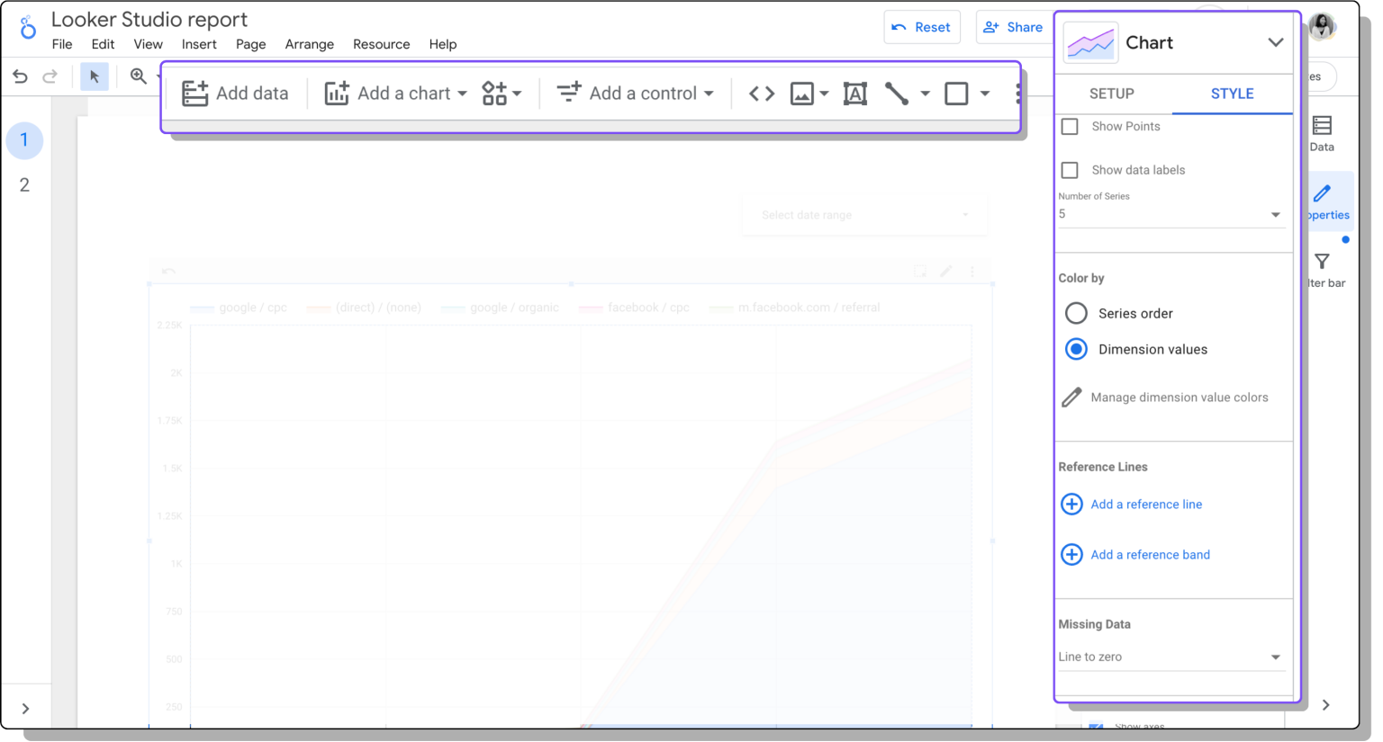
Looker enables the creation of highly customizable and interactive dashboards. You can design dashboards that cater to your needs, arranging visualizations to present insights better. The interactive nature of Looker’s dashboards allows you to drill down into details and dynamically explore different dimensions.
Looker offers a range of visualization options, including charts, graphs, and maps, to represent data insights effectively. These visualizations help ensure you present data in a format that resonates with the intended audience.
You can share reports, dashboards, and analyses with colleagues securely. Looker’s cloud-based architecture supports real-time collaboration, allowing multiple users to simultaneously work on the same project. Commenting, annotations and data discussion features further enhance teamwork and knowledge sharing.
You might avoid Looker or Power BI due to high costs, complexity for smaller businesses, a steep learning curve, performance issues with large datasets, and potential integration limitations with existing systems.
Let’s delve into the differences between Power BI and Looker across various dimensions:
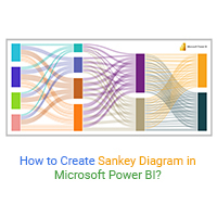
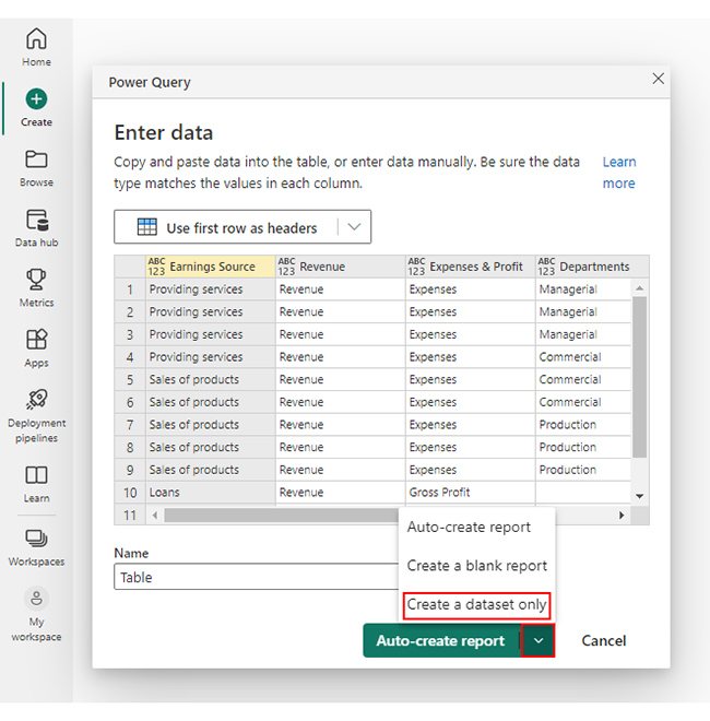
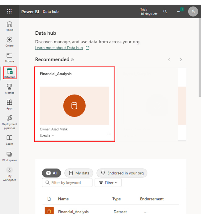
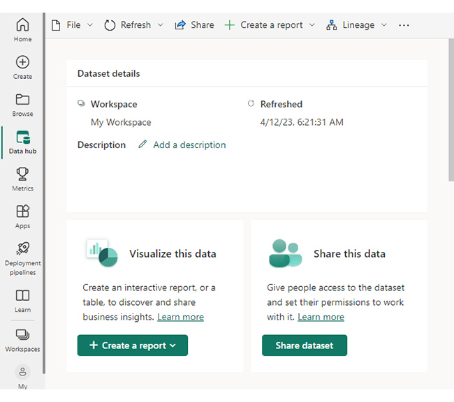
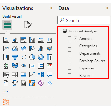
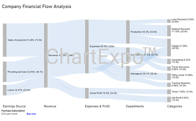
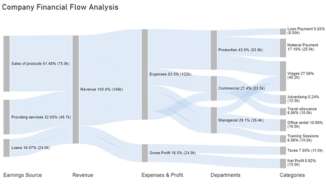
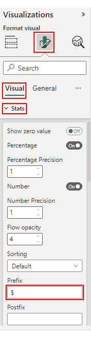
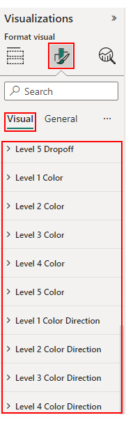
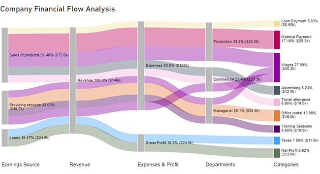
Let’s divide the process into 5 digestible stages. You can easily craft a Dashboard by using Sankey Diagram in Power BI.


| Earnings Source | Revenue | Expenses & Profit | Departments | Categories | Amount |
| Providing services | Revenue | Expenses | Managerial | Training Sessions | 10,000 |
| Providing services | Revenue | Expenses | Managerial | Office rental | 16,000 |
| Providing services | Revenue | Expenses | Managerial | Wages | 9,400 |
| Providing services | Revenue | Expenses | Commercial | Wages | 11,300 |
| Sales of products | Revenue | Expenses | Commercial | Travel allowance | 10,000 |
| Sales of products | Revenue | Expenses | Commercial | Advertising | 12,000 |
| Sales of products | Revenue | Expenses | Production | Material Payment | 25,000 |
| Sales of products | Revenue | Expenses | Production | Loan Payment | 8,500 |
| Sales of products | Revenue | Expenses | Production | Wages | 19,500 |
| Loans | Revenue | Gross Profit | Taxes | 11,000 | |
| Loans | Revenue | Gross Profit | Net Profit | 13,000 |


Best Choice: It depends on your needs. Opt for Looker Studio if you need advanced data modeling and custom reporting, and choose Power BI for a cost-effective option with strong integration within the Microsoft ecosystem.
The choice between Looker and Power BI depends on specific needs. Looker excels in advanced data modeling and centralizing data. On the other hand, Power BI integrates well within the Microsoft ecosystem, catering to users familiar with Microsoft tools.
The key difference between Looker and Power BI lies in their strengths and ecosystems. Looker emphasizes advanced data modeling using LookML, offering centralized governance. Power BI is tightly integrated into the Microsoft ecosystem, making it favorable for Microsoft-oriented environments and users.
Looker shines as a beacon of advanced data modeling prowess. Its advanced data modeling capabilities through LookML provide centralized control and complex data transformations. This empowers you to maintain data governance and perform complex transformations with precision.
On the other hand, Power BI stands tall as the embodiment of seamless integration within the Microsoft ecosystem. It has a user-friendly interface, and diverse data connectors and is familiar to Microsoft users. Thus, an attractive option for those who value cohesive experiences across their tools.
Choosing between Looker and Power BI hinges on organizational needs and preferences. Looker excels in scenarios requiring intricate data modeling and governance, thus ideal for data-centric enterprises. Meanwhile, Power BI’s strength lies in its compatibility with Microsoft infrastructure, catering to users seeking a familiar environment.
The narrative here isn’t about one being definitively better than the other. Rather, it is about choosing the contender that aligns with specific needs. Ensuring that data insights flow seamlessly and decision-making flourishes in the dynamic landscape of modern business.
What about ChartExpo?
It enhances the visualization capabilities of Power BI by providing additional features and support for more levels.
How much did you enjoy this article?


Learn how to create a Power BI sales dashboard to monitor revenue, sales KPIs, and trends with real-time interactive visuals and insights.
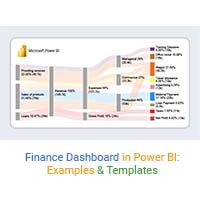
Learn how to create a Power BI finance dashboard and explore its key benefits for analyzing financial data, improving insights, and supporting better decisions.
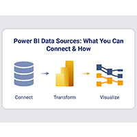
Power BI data sources connect reports to files, databases, and cloud services. Learn to configure, analyze, and optimize connections. Read on!