Categories
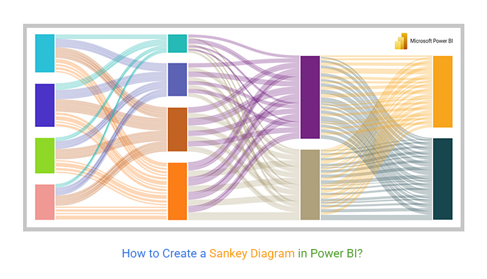
A Sankey Diagram in Power BI is used to visualize how data flows between different stages, categories, or processes. It highlights the movement of resources, information, or values by using links whose width represents the magnitude of each flow.
Named after Irish engineer Matthew Henry Phineas Riall Sankey, this chart makes it easy to identify major contributors, bottlenecks, and drop-offs in a process.
In Power BI, Sankey diagrams help turn complex flow data into clear, interactive insights for faster decision-making.
Let’s dive right in.
Definition: A Sankey Diagram in Power BI is a flow chart that connects a source and a target to show how values move between them. Each connection (flow) represents a relationship between two points, and its width indicates the size or quantity of that flow.
This helps users analyze distribution, track transitions, and understand how data is split or combined across multiple stages.
Power BI Sankey diagrams are valuable for analyzing flows and understanding how data moves across different stages. They help businesses and analysts:
To create a Sankey Diagram in Power BI, your data must be structured to show the flow between two points. Each connection requires three key components:
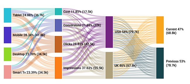
| Source | Target | Value |
| Tablet | Cost | 17.5K |
| Mobile | Conversions | 32K |
| Desktop | Clicks | 42.5K |
| Smart TV | Impressions | 55.5K |
| Cost | USA | 79.7K |
| Conversions | USA | 79.7K |
| Clicks | USA | 79.7K |
| Impressions | USA | 79.7K |
| Cost | UK | 67.8K |
| Conversions | UK | 67.8K |
| Clicks | UK | 67.8K |
| Impressions | UK | 67.8K |
| USA | Current | 68.8K |
| USA | Previous | 78.7K |
| UK | Current | 68.8K |
| UK | Previous | 78.7K |
This step-by-step guide shows how to build a clear and interactive Power BI Sankey Visual.
Tip: Ensure your data is clean, with consistent naming and no blank values, to avoid errors in the visual.
| Feature | Native Visuals | Custom Sankey Visuals |
| Availability | Built-in with Power BI | Must be added from AppSource |
| Supported Chart Types | Standard charts (bar, line, pie, matrix) | Sankey diagrams for flows between categories |
| Customization | Limited formatting | Node colors, flow thickness, labels, tooltips |
| Interactivity | Standard interactions | Interactive with hover effects and drill-through options |
| Maintenance | Fully supported by Power BI updates | Requires manual updates and compatibility checks |
| Use Case | Simple charts and reports | Visualizing complex flows and relationships |
The Power BI Sankey chart is ideal for visualizing complex data flows. Common use cases include:
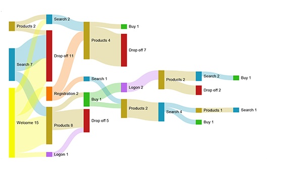
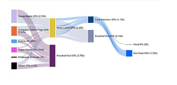
Track how customers move through marketing funnels, sales pipelines, or service stages to identify drop-offs and optimize experiences.

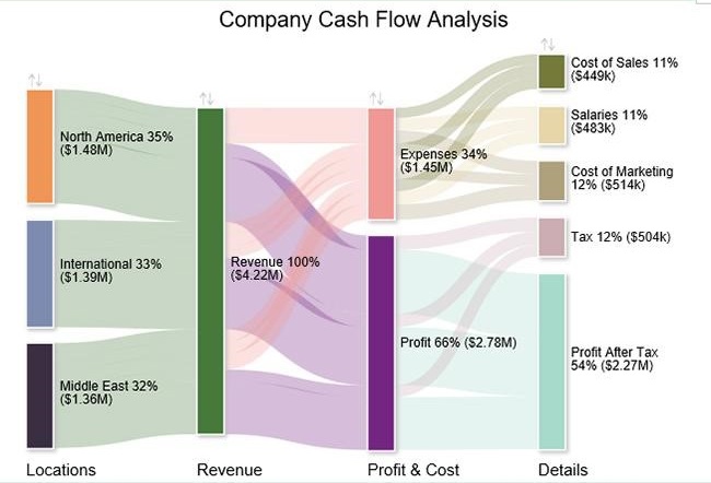
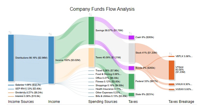
Show how money flows between accounts, departments, or projects to monitor inflows, outflows, and financial efficiency.
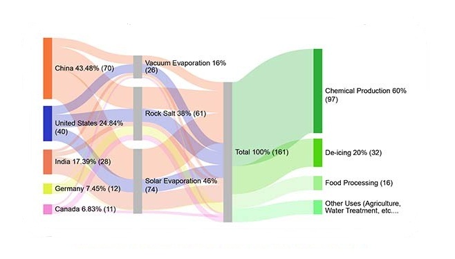
Visualize energy flow, consumption, and losses across systems to highlight inefficiencies and optimize usage.

Map the movement of materials from suppliers to delivery to identify bottlenecks and improve operational efficiency.
Analyze how users navigate websites, apps, or platforms to enhance user experience and engagement.
Track the allocation and usage of funds across multiple projects or departments for better transparency and control.
Trace the movement of data between systems, tables, or reports to ensure accuracy, compliance, and effective governance.
If your source and target names aren’t clean and consistent, the diagram will be inaccurate or fail to render properly.
Adding every possible category creates clutter and overlapping flows, making the chart hard to read.
Feeding raw transactional data without summarizing inflates connections and distorts the visual. Always aggregate flows at the right level.
Placing the wrong field in Source, Target, or Value causes misleading relationships and invalid visuals.
Without clear labels or tooltips, users can’t interpret what the flows represent, reducing their usefulness.
Using too many colors or inconsistent styles distracts viewers and masks insights. Stick to a simple, meaningful palette.
Large datasets without filtering or pre‑aggregation slow down Power BI, leading to lagging visuals or crashes.
Ensure your Source, Target, and Value fields are well-organized. Accurate mapping helps the chart display flows correctly and prevents errors.
Too many nodes can clutter the chart. Include only the key steps so the flow remains clear and easy to read.
Apply colors that correspond to categories or stages. Consistent coloring helps users follow the movement through the chart without confusion.
Adjust link thickness or colors to emphasize the most important flows. This makes insights easier to identify in dashboards and reports.
Structure your data into three columns: Source, Target, and Value. Each row should represent a connection between two points along with its flow size. Make sure the data is clean, consistent, and free of duplicates for accurate visualization.
Power BI does not support Sankey charts natively, but you can easily create them using custom visuals from AppSource. These visuals allow you to display flows between categories with interactive and customizable features.
Use a Power BI Sankey diagram when you need to visualize flows between categories, especially when tracking movement, transitions, or relationships in complex datasets.
Using the right visualization helps you communicate insights clearly, especially when you’re working with flows or connected stages. These charts are one of the most effective ways to show how values move across a process.
In this guide, we explored the Sankey diagram in Power BI from start to finish. We covered what it is, how it works, and how nodes and links represent the flow of data within a system.
We also looked at practical situations where this type of visual fits well, such as analyzing flows, relationships, and movement between stages.
To build a strong chart, the key points include:
Finally, we walked through how to create a Sankey chart in Power BI using custom visuals, along with best practices and common mistakes to avoid.
Related Articles:
How much did you enjoy this article?


Discover diverse and high-quality Power BI report examples for inspiration and insights. Elevate your reporting with strategic visualization techniques.

A Customer Relationship Management Dashboard centralizes data, tracks key metrics, and drives smarter business decisions. Discover now!

Explore Healthcare Dashboard Examples and learn how to turn complex healthcare data into clear, actionable insights for better decision-making.


