Categories
One of the strengths of the Power BI Web is its accessibility. This is because the Power BI Web application is cloud-based. You do need internet access, though. You do not need internet access for data visualizations already published on the web.
Power BI is a great option if you do not have Power BI installed on a device. You can still access your already published visualizations.


Power BI Web features make it a powerful tool for data visualization and analysis. You can share your Power BI Web reports with others and collaborate in real-time.
In this article, we define Power BI and the Power BI Web app. We then compare Power BI Desktop and Web. Eventually, we will learn how to create charts on Power BI Web and answer some FAQs.
Definition: Power BI Web Application is a cloud-based business intelligence platform. It allows users to create, view, and share interactive reports and dashboards with data from various sources. You can connect to different data sets, transform and model the data, and create visualizations.
Additionally, it has collaboration and sharing capabilities. This allows users to publish and distribute reports to colleagues or clients.
Power BI Web App is accessible from any web browser, including Power BI For Mac, making it convenient and accessible for users to access their data and dashboards from anywhere, anytime.
Power BI Web Application is essential for real-time data analysis, seamless collaboration, and easy accessibility. It enables users to share interactive dashboards, supports cloud integration for up-to-date insights, and ensures strong security. With its scalability and advanced visualizations, it’s a powerful tool for data-driven decision-making.
Power BI offers two main applications: The Power BI Desktop App and the Power BI Web version.
Power BI Desktop is a desktop application installed locally on a computer. The Power BI Web App is a web-based application accessed through a browser.
Here’s a comparison between the two:
The Power BI Desktop App is more powerful and flexible than the Power BI Web.
On the desktop version, you can create relationships between tables and calculate columns and measures. You can also use DAX (Data Analysis Expressions) to create complex calculations.
Power BI web version’s data modeling capabilities are more limited. You can create relationships between tables, but you cannot create calculated columns or measures. You can also use DAX. The functionality, however, is more limited than in the Power BI Desktop App.
The Power BI Desktop App supports a wider range of data sources. You access data from a variety of sources, including:
Power BI Web supports a narrower range of data sources. You can connect to relational databases and cloud-based data sources, but you cannot connect to Excel files.
The Power BI Desktop App can only be accessed from a computer.
Power BI Web is a cloud-based application. It does not require installation on your PC. It can be accessed from any device with an internet connection.
Some of the devices that you can use to access the Power BI Web App include:
Download the Power BI app from the App Store or Google Play on mobile devices. The Power BI app provides a more optimized experience for viewing reports on mobile devices.
The Power BI Desktop App is free for personal use. You need to purchase a Power BI Pro license for business use. A Power BI Pro license costs \$10 per user per month.
On the other hand, the Power BI Web App is free for personal and business use.
The Power BI Desktop App is more limited. You can share reports with others, but you cannot collaborate on data modeling or report creation.
The Power BI Web App allows for more collaboration. You can collaborate with others on data modeling and report creation.
Power BI Web App and Power BI Web Service are not the same. Power BI Web App is a web-based application for Power BI reports and dashboards. Power BI Web Service is a cloud-based service that hosts and delivers Power BI reports and dashboards.
Power BI Web App is a free tool for both personal and business use. Power BI Web Service is a paid service. It is available in three different capacities: free, pro, and premium.
Open Power BI, navigate to your report, and publish it to the Power BI service. Ensure the report is saved in a workspace that allows web embedding.
In Power BI Service, open the report, click on File > Embed Report > Publish to Web (Public), or use the Embed for Your Organization option for restricted access. Copy the generated embed code or URL.
Paste the embed code into your website’s HTML using a <iframe> tag. Adjust the height and width as needed to fit your layout.
Ensure the report’s access settings align with your security needs. If embedding within a private portal, use Power BI Embedded with authentication settings.
Preview the embedded report on different devices to check responsiveness. Optimize performance by limiting large datasets and unnecessary visuals.
The Power BI Web Data Source allows users to connect to and import data from web pages, APIs, and other online sources directly into Power BI. This feature is useful for retrieving real-time or periodically updated data for analysis and visualization.
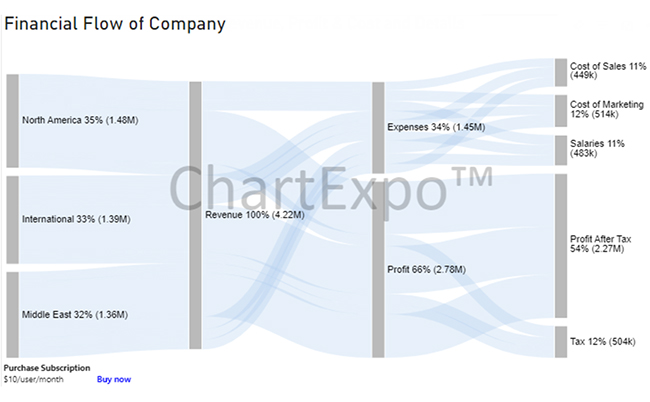
Learn more about the Sankey Chart app for Power BI.
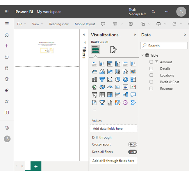
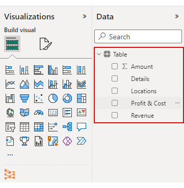
In this section, we learn how to create charts, including the Sankey chart in Power BI, for different Power BI projects using Power BI Report Builder.


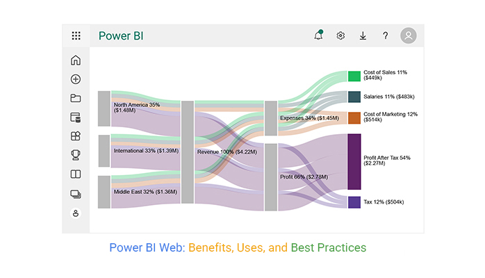
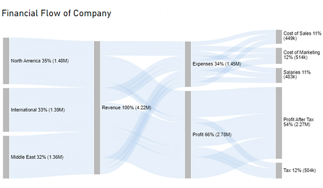
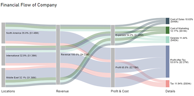
| Locations | Revenue | Profit & Cost | Details | Amount |
| North America | Revenue | Expenses | Cost of Sales | 132000 |
| North America | Revenue | Expenses | Salaries | 159000 |
| North America | Revenue | Expenses | Cost of Marketing | 170000 |
| North America | Revenue | Profit | Tax | 182000 |
| North America | Revenue | Profit | Profit After Tax | 834000 |
| International | Revenue | Expenses | Cost of Sales | 162000 |
| International | Revenue | Expenses | Salaries | 158000 |
| International | Revenue | Expenses | Cost of Marketing | 145000 |
| International | Revenue | Profit | Tax | 171000 |
| International | Revenue | Profit | Profit After Tax | 753000 |
| Middle East | Revenue | Expenses | Cost of Sales | 155000 |


Schedule automatic data refreshes in Power BI to ensure your reports and dashboards always reflect the most current data without manual intervention. This is especially useful for real-time reporting and keeping stakeholders informed with the latest updates.
To improve report performance, focus on using filters, aggregations, and summarized data. Reducing the amount of raw data that needs to be loaded at once can significantly enhance speed and responsiveness. Additionally, consider optimizing your data model by reducing columns and rows that are not necessary.
Implement Row-Level Security (RLS) to restrict access to specific data based on a user’s role or permissions. This ensures that sensitive data is only visible to authorized users, which is essential for compliance and protection of sensitive information in shared reports.
Pin important visuals, such as key metrics or trends, to custom dashboards to keep essential information at your fingertips. This allows for a quick overview and easy access to your most critical data without having to navigate through multiple reports.
Make sure your reports are optimized for mobile devices by using Power BI’s mobile view. This ensures that your reports look great and are easy to navigate on smartphones and tablets, providing a seamless experience for users on the go. Consider testing on different devices to ensure compatibility.
Yes, the Power BI Web App allows you to use Power BI online. You can access your Power BI reports dashboards, and data visualizations through a web browser.
This makes it possible to interact with your data from any location with an internet connection. Users can also exchange Power BI content and interact with other users.
Power BI has a cool web tool called the Power BI Service. It’s like a cloud-based hub you can visit in your web browser. This lets you easily share, team up, and show off your Power BI reports and dashboards.
You can play with interactive dashboards, keep your data up to date with scheduled refreshes, and even ask questions in plain English thanks to its natural language feature. Plus, it buddies up with the Power BI mobile app.
It’s not just fun; it’s safe too, with security features, connections to Microsoft 365, and all the tools for smooth teamwork with your data!
We have looked at the Power BI web app as a part of the Power BI suite. Power BI Web is a powerful tool that can be used to analyze and visualize data from anywhere.
We have also learned about its key features and functions.
Some of Power BI Web’s features include:
We then compared Power BI Web to Power BI Desktop. Power BI Web outshines its desktop counterpart in that it is free for personal and business use. It is also accessible anywhere and easier to use.
We also differentiated between Power BI Web and Power BI Service.
We hope that you are now ready to include Power BI Web in your data visualization arsenal.
How much did you enjoy this article?


Learn how to create a Power BI finance dashboard and explore its key benefits for analyzing financial data, improving insights, and supporting better decisions.
Power BI data sources connect reports to files, databases, and cloud services. Learn to configure, analyze, and optimize connections. Read on!

Learn how to create Sankey Diagrams in Power BI to visualize data flows, track relationships, and uncover insights with interactive visuals.