Categories
The majority of firms gather data from several sources. There is, therefore, a need for a central place to collect the data. This central place should be able to connect to a variety of sources.
That’s exactly what Power BI connectors do.


Power BI gives you a platform. Power BI data connectors enable the platform to connect to a variety of data sources. This empowers you to garner insights from the data quickly.
In this article, we explore Power BI connectors. We define them and learn how to add connectors to Power BI. We also look at their benefits and how to create a chart using BI connectors.
Eventually, we will answer some frequently asked questions.
Definition: Power BI connectors are integral to Microsoft’s Power BI platform. They are designed to facilitate the seamless integration of various data sources into your Power BI projects.
In essence, these connectors serve as bridges. They enable Power BI to connect to a wide range of:
It allows you to work with data in different formats and a variety of locations.
There are over 200 connectors available, including:
1. Open the Power BI Desktop app
2. Enable the Custom Data Connectors feature in Power BI Desktop:
3. Click OK and restart the Power BI Desktop app.
1. Download the Data Connector to your local machine and place it in C:\Users\yourname\Documents\Power BI Desktop\Custom Connectors
2. Confirm the Custom Connectors Folder exists.
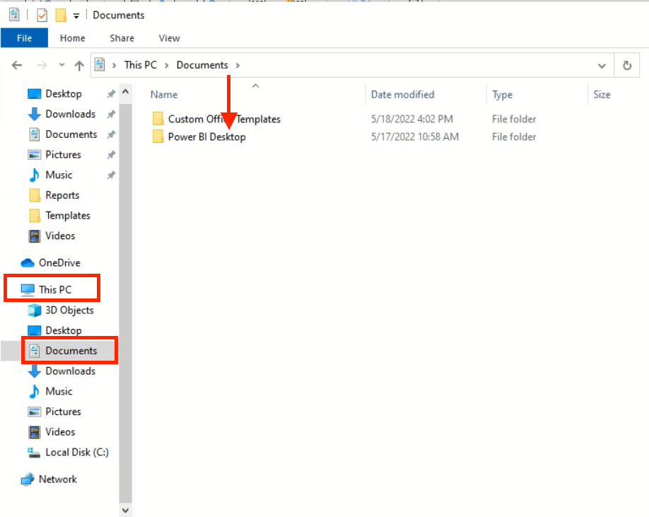
The Power BI Data Connector will require you to have an email during the setup.
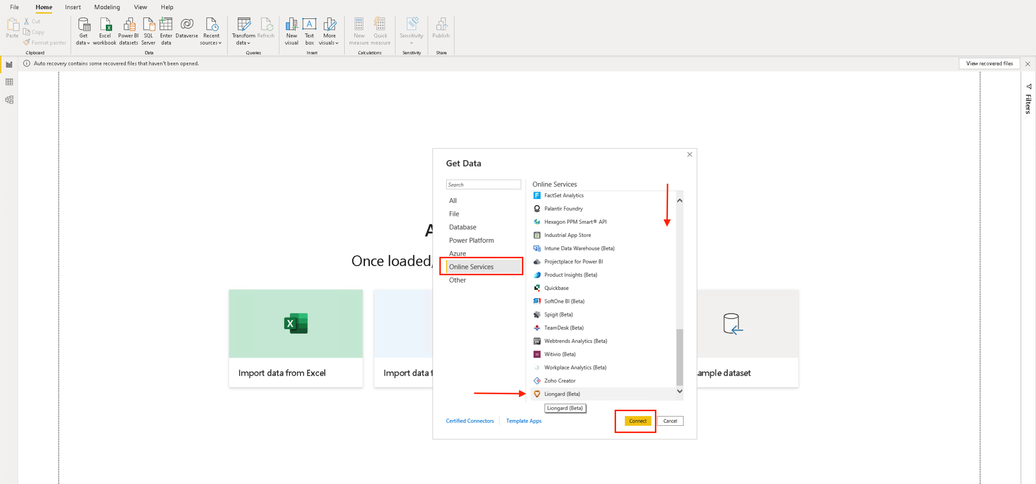
3. Select it and click on Connect.
Power BI data connectors offer several benefits, including:
Using Power BI connectors effectively involves adhering to Power BI best practices that ensure data accuracy, performance, and maintainability.
Here are some key guidelines to follow when working with Power BI connectors:
Select the appropriate connector that matches your data source. Power BI offers a wide range of connectors for different types of data sources.
Retrieve only the data you need. Avoid bringing in excessive amounts of data that may slow down performance and increase data processing requirements.
Perform data transformations, cleaning, and shaping within Power BI’s query editor before loading data into your report.
This enhances performance and ensures that your data is in the desired format for analysis.
Set up scheduled refreshes to keep your reports and data visualizations up to date if data changes frequently.
DirectQuery allows for real-time data retrieval from the source. It might, however, affect performance, especially for complex queries.
Use DirectQuery when necessary, and consider importing data for faster performance.
Configure appropriate data privacy settings to ensure sensitive information is protected. This is particularly important when connecting to cloud services and databases that require authentication.
Before finalizing your report, thoroughly test your connections and data retrieval. Validate that the data displayed in your visualizations accurately reflects the source data.
Document the details of your data connections, including connection strings, credentials, and any specific settings. This helps maintain data source access when others must work on the report.
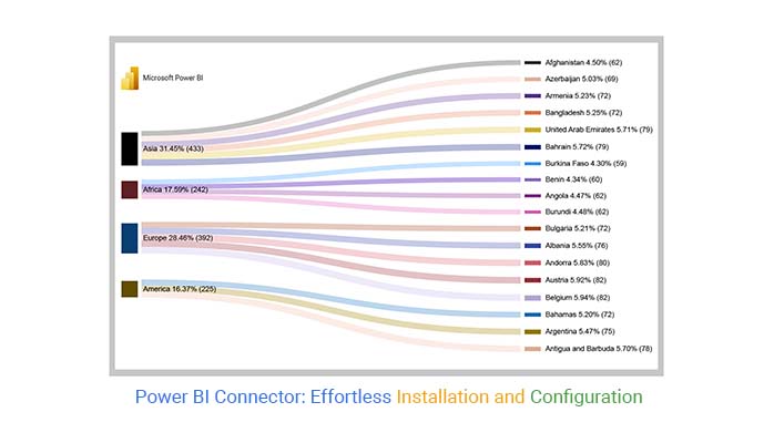
Explore the Sankey chart for Power BI app by ChartExpo here.
This section teaches how to invent a dashboard by using PBI connectors. We’ll use the Sankey Diagram in Power BI dashboard example.


| Country | Continent | Life Expectancy at Birth (2021) |
| Afghanistan | Asia | 61.9824 |
| Angola | Africa | 61.6434 |
| Albania | Europe | 76.4626 |
| Andorra | Europe | 80.3684 |
| United Arab Emirates | Asia | 78.7104 |
| Argentina | America | 75.3899 |
| Armenia | Asia | 72.0431 |
| Antigua and Barbuda | America | 78.4968 |
| Australia | Oceania | 84.5265 |
| Austria | Europe | 81.5797 |
| Azerbaijan | Asia | 69.3658 |
| Burundi | Africa | 61.6627 |
| Belgium | Europe | 81.8787 |
| Benin | Africa | 59.821 |
| Burkina Faso | Africa | 59.2696 |
| Bangladesh | Asia | 72.3811 |
| Bulgaria | Europe | 71.798 |
| Bahrain | Asia | 78.7605 |
| Bahamas | America | 71.5983 |


In Power BI, connectors are components that allow you to connect to various data sources.
Power BI provides a wide range of built-in connectors. These support connections to various types of data sources, including:
These connectors simplify the process of importing and transforming data in your Power BI reports and dashboards.
Power BI connectors are used to connect to different data sources. There are connectors available for a wide range of data sources, including
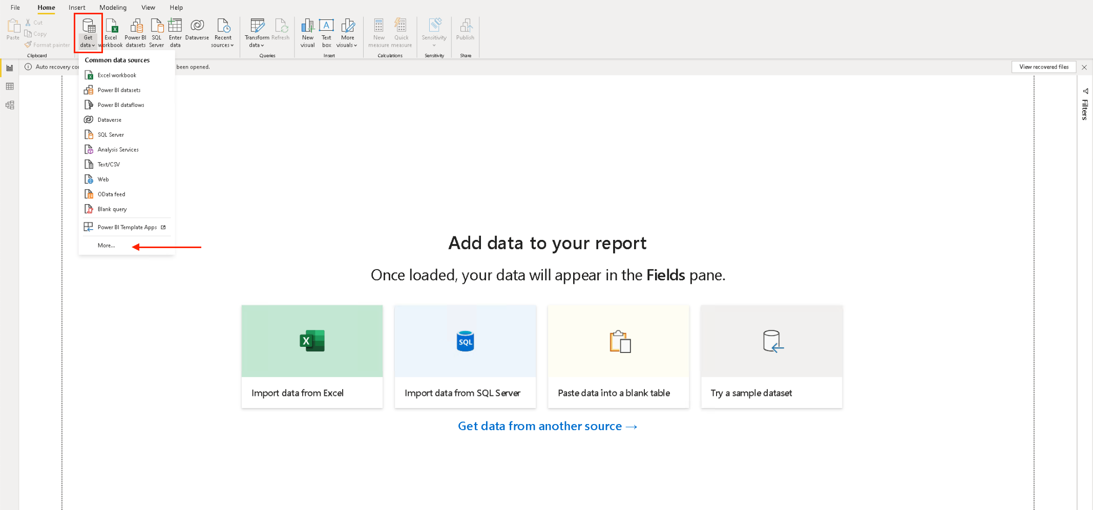
To use a Power BI connector, you first need to open the Power BI Desktop. Then, you can follow these steps:
Once the data is imported into Power BI, you can start creating reports and dashboards.
We have explored the dynamic world of Power BI data connectors. You can collate data from different sources and create visualizations.
We defined BI data connectors and their different types. We then learned how to add connectors to Power BI.
Built-in connectors are pretty straightforward to work with. There are also third-party connectors that you can use. Check the Power BI connectors list to find the best ones for your use case.
Depending on your use case, you might need to create a custom Power BI data connector.
We learned the benefits of using connectors, for example, making data integration easier. We also looked at some best practices to keep in mind when working with connectors. You might want to limit data retrieval, for instance, to ensure optimal performance.
Eventually, we delved into how to create a chart using Power BI Connectors. We used the Sankey Diagram as an example.
We hope that this prepares you to create some connectors of your own.
How much did you enjoy this article?


Discover diverse and high-quality Power BI report examples for inspiration and insights. Elevate your reporting with strategic visualization techniques.

A Customer Relationship Management Dashboard centralizes data, tracks key metrics, and drives smarter business decisions. Discover now!

Explore Healthcare Dashboard Examples and learn how to turn complex healthcare data into clear, actionable insights for better decision-making.


