• Home
  • Tools dropdown img
    • Spreadsheet Charts

      • ChartExpo for Google Sheets
      • ChartExpo for Microsoft Excel
    • Power BI Charts

      • Power BI Custom Visuals by ChartExpo
    • Word Cloud

  • Charts dropdown img
    • Chart Category

      • Bar Charts
      • Circle Graphs
      • Column Charts
      • Combo Charts
      • Comparison Charts
      • Line Graphs
      • PPC Charts
      • Sentiment Analysis Charts
      • Survey Charts
    • Chart Type

      • Box and Whisker Plot
      • Clustered Bar Chart
      • Clustered Column Chart
      • Comparison Bar Chart
      • Control Chart
      • CSAT Survey Bar Chart
      • CSAT Survey Chart
      • Dot Plot Chart
      • Double Bar Graph
      • Funnel Chart
      • Gauge Chart
      • Likert Scale Chart
      • Matrix Chart
      • Multi Axis Line Chart
      • Overlapping Bar Chart
      • Pareto Chart
      • Radar Chart
      • Radial Bar Chart
      • Sankey Diagram
      • Scatter Plot Chart
      • Slope Chart
      • Sunburst Chart
      • Tornado Chart
      • Waterfall Chart
      • Word Cloud
    • Google Sheets
      Microsoft Excel
  • Services
  • Pricing
  • Contact us
  • Blog
  • Support dropdown img
      • Gallery
      • Videos
      • Contact us
      • FAQs
      • Resources
    • Please feel free to contact us

      atsupport@chartexpo.com

Categories
All Data Visualizations Data Analytics Surveys
Add-ons/
  • Google Sheets
  • Microsoft Excel
  • Power BI
All Data Visualizations Data Analytics Surveys
Add-ons
  • Google Sheets
  • Microsoft Excel
  • Power BI

We use cookies

This website uses cookies to provide better user experience and user's session management.
By continuing visiting this website you consent the use of these cookies.

Ok

ChartExpo Survey


Home > Blog > Power BI

Best Business Intelligence Platform: A Comprehensive Review

In the ever-evolving world of business, information is power. And when it comes to harnessing that power, there’s no better tool than a Business Intelligence Platform. A good business intelligence platform transforms data into clear, concise dashboards that empower decision-making.

Best Business Intelligence Platform

But let’s face it: not all business intelligence platforms are created equal. Some are as dry as a desert, leaving you parched for meaningful insights. Others are as confusing as a Rubik’s cube, leaving you scratching your head in frustration. Looking for a business intelligence tool that’s lined up with your goals, business and budget?

But with so many options, how do you find the Best software for business intelligence?

It’s all about features: intuitive user interfaces, customizable dashboards, real-time data updates, and powerful visualization tools.

This best-in-class platform allows you to analyze, visualize, and explore your data like never before. You’ll uncover hidden patterns, identify trends, and make data-driven decisions with ease.

The journey to data nirvana starts here with the Best software for business intelligence.

Table of Contents:

  1. What is the Best Business Intelligence Platform?
  2. Understanding BI Tools from Microsoft
  3. How Microsoft Business Intelligence Works?
  4. Why Use Business Intelligence Tools For Business Purposes?
  5. Top 5 Business Intelligence (BI) Analytics Tools
  6. Which Business Intelligence Platform is Best For You?
  7. Criteria For Choosing a Business Intelligence Analytics Tool
  8. Benefits of Using the Best Business Intelligence Platforms
  9. Steps For Reporting in Business Intelligence Analytics Software
  10. Wrap Up

What is the Best Business Intelligence Platform?

Definition: Selecting the best business intelligence platform hinges on individual needs and preferences. Each platform has a distinct array of functionalities, encompassing dynamic visualizations, comprehensive data analysis, and user-friendly interfaces for the dashboard. Therefore, it is crucial to consider various factors like automation capabilities, data management proficiency, integration options, and usability.

A prudent approach involves carefully evaluating these aspects and conducting a comparative analysis of the available platforms. Doing so lets you ascertain the most suitable fit that aligns with your requirements and objectives.

When exploring the diverse landscape of business intelligence solutions, such as Looker vs Power BI, prioritize the features and capabilities that matter most to you. Ensure that the chosen business analytics software meets and exceeds your expectations.

Understanding BI Tools from Microsoft

Business Intelligence (BI) Analytics Tools are modern software applications and stages intended to accumulate, investigate, and visually represent data, empowering associations to remove significant experiences for data-driven decision-making. These tools are vital in transforming raw data into noteworthy data, cultivating an information-driven way to deal with forming business strategies.

The core features of BI analytics tools include consistent coordination of data from different sources, advanced abilities for information examination, easy-to-understand representation utilizing charts, predictive analysis for future projections, self-service analytics capabilities that empower non-technical users, adaptable responsiveness, robust security controls, and collaborative features for team engagement.

Striking instances of BI functionalities instruments incorporate:

  1. Microsoft Power BI
  2. Scene
  3. QlikView
  4. Looker
  5. IBM Cognos
  6. SAP Business Objects
  7. Domo
  8. Google Data Studio

These tools are flexible, taking care of many ventures and areas, helping associations outfit information to acquire an upper hand and encourage business achievement.

How Microsoft Business Intelligence Works?

Business intelligence involves collecting data from multiple resources and presenting it using visualizations like charts and dashboards. Power BI For Mac utilizes technologies that enable the processing of large datasets and data analysis, ensuring data integrity and consistency.

The derived insights can be used for business decisions as they’re based on accurate data. Here is a breakdown of how business intelligence works:

  • Data Collection

Data is imported from various relevant data sources. Some of the data sources include databases, web analytics, spreadsheets, ERP systems, financial data, and sales data.

  • Data Transformation

The collected data is then transformed and incorporated into a consistent format. This provides consistency and compatibility across several sources. This stage also involves data cleaning, validation, and transformation. This helps to maintain consistency, accuracy, and compatibility across several data sources.

  • Data Analysis

Once the data is transformed, it is analyzed to discover patterns, trends, relationships, and inconsistencies.BI techniques that may be used include statistical analysis, data visualization, and other analytical tools.

  • Data Visualization

The analysis results are then presented in an understandable format, such as charts, graphs, dashboards, and reports. This enables users to identify key insights at a glance.

  • Data Reporting and Interpretation

Here, trends, patterns, inconsistencies, and gaps are identified. The insights and analysis are shared with the appropriate parties via reports and dashboards. This provides insights to decision makers who then come up with solutions based on the data.

  • Decision Making

Decision-makers use the provided insights to make informed business decisions, develop strategies, and drive organizational success.

  • Monitoring and Evaluation

This involves implementing and monitoring the decisions made. It is necessary to have monitoring and feedback mechanisms to track Key Performance Indicators (KPIs). This shows whether the solutions proposed are effective and leaves room for future adjustments.

Why Use Business Intelligence Tools For Business Purposes?

The best analytics tools for business, particularly Business Intelligence (BI) solutions, offer numerous advantages that make them indispensable for modern enterprises. Here are some reasons why leveraging BI analytics tools is crucial:

  1. Data-driven decision-making: BI analytics tools enable you to base decisions on accurate and up-to-date information rather than intuition or assumptions. This leads to better strategic planning, improved resource allocation, and more informed choices.
  2. Enhanced visibility: BI analytics tools provide a comprehensive view of business operations by consolidating data from various sources. This visibility helps in trend analysis, outliers, and areas needing attention, fostering proactive management.
  3. Performance monitoring:  Business Intelligence Program allow real-time monitoring of key performance indicators (KPIs) and metrics across departments. This helps in tracking progress towards goals and promptly addressing deviations.
  4. Resource optimization: Analytics tools enable efficient allocation of resources by identifying areas of excess or shortage. Consequently, it helps with cost savings, improved productivity, and streamlined processes, including the cost of living comparison method.
  5. Predictive analytics:  Business Intelligence analytics tools can predict future trends and outcomes by analyzing historical data. This aids in forecasting demand, identifying potential risks, and exploiting opportunities before they arise.
  6. Competitive edge: Businesses that use Business Intelligence can swiftly adapt to market changes and emerging trends, gaining a competitive advantage. This agility ensures that decisions are aligned with the current business landscape.
  7. Data visualization: These analytics tools transform complex data into easy-to-understand visual formats like graphs, charts, and dashboards. Visual representation makes it simpler for non-technical users to comprehend and interpret data.
  8. Collaboration:  Business Intelligence analytics tools facilitate data sharing and collaboration across departments. This promotes cross-functional insights, enabling teams to work together towards common objectives.
  9. Long-term strategy: These tools help formulate long-term strategies by analyzing historical data and predicting future trends. Consequently, it aids in aligning business plans with long-term financial goals.

Top 5 Business Intelligence (BI) Analytics Tools

Here are five best business intelligence software that have gained significant traction in the industry:

  1. Tableau: Tableau has gained widespread recognition due to its impressive data visualization functionalities. It helps to establish connections with diverse data sources and produce enlightening reports. Its robust analytical tools, such as calculated fields and forecasting, empower businesses to uncover trends and patterns.
  2. Power BI: Developed by Microsoft, Power BI is a user-friendly tool that integrates seamlessly with other Microsoft products. It enables you to create interactive visualizations, reports, and dashboards. Moreover, Power BI also supports natural language queries and offers AI-driven insights.
  3. QlikView/Qlik Sense: QlikView and Qlik Sense by Qlik are known for their associative data model. This feature enables you to explore data from multiple perspectives. Moreover, these tools offer potent data discovery and visualization capabilities. Consequently, it makes it easy to uncover insights and relationships in data.
  4. Looker: Acquired by Google, Looker is a modern BI tool focusing on data exploration and collaboration. It allows you to create custom data models and provides a platform for sharing insights with non-technical stakeholders.
  5. Domo: Domo offers a cloud-based BI platform with real-time data visualization and collaboration features, providing comprehensive data and analytics services. It’s handy for businesses looking for agile and flexible data analytics solutions.

Which Business Intelligence Platform is Best For You?

Determining the best business intelligence platform depends on your specific needs, goals, and budget. Conduct thorough research, evaluate features, consider scalability, and test usability to find the platform that aligns best with your requirements.

Criteria For Choosing a Business Intelligence Tool

  1. Ease of Use: Opt for a tool that is user-friendly and intuitive, allowing users of varying technical skills to access, perform data wrangling, and analyze data efficiently.
  2. Data Integration: Choose a tool with robust data integration capabilities, enabling seamless connections to various data sources such as databases, cloud applications, and third-party systems.
  3. Advanced Analytics Features: Look for a tool that offers advanced analytics functionalities like predictive modeling, machine learning, and data mining to derive deeper insights from data.
  4. Visualization and Reporting: Prioritize tools with powerful visualization and reporting features, including customizable dashboards and interactive charts, to facilitate clear communication of insights.
  5. Data Security and Compliance: Ensure that the tool provides robust data security measures, such as encryption and access controls, to protect sensitive information and comply with regulatory requirements.

Benefits of Using the Best Business Intelligence Platforms

Business Intelligence Platforms are the superheroes you need to conquer the data-driven world. Utilizing these platforms offers a multitude of benefits, transforming how you operate and make decisions:

  1. Data-driven decision-making: BI platforms empower you to make informed decisions by providing access to accurate and timely data. Data-driven decision-making ensures that choices are based on evidence rather than intuition, leading to better outcomes.
  2. Improved efficiency: BI platforms streamline data collection and analysis processes, reducing manual data entry and spreadsheet management. This efficiency boost allows you to focus on more strategic tasks, ultimately improving overall operational efficiency.
  3. Real-time insights: Many BI platforms offer real-time or near-real-time data updates. Thus, you can react swiftly to changing market conditions, customer behaviors, or internal performance metrics.
  4. Data integration: BI platforms can connect to multiple data sources, including databases, spreadsheets, cloud services, etc. This data integration centralizes information, providing a comprehensive view of the organization’s data.
  5. Data visualization: BI platforms come equipped with powerful data visualization tools that transform complex data sets into easy-to-understand charts, graphs, and dashboards. These tools enhance data comprehension and aid in spotting trends and anomalies.
  6. Enhanced forecasting: BI platforms can leverage historical data to create accurate forecasts and predictive models. This capability, particularly when utilized within a marketing analytics platform, helps to anticipate market trends, demand fluctuations, and resource needs, enabling proactive planning.
  7. Improved compliance and security: Best BI platforms have robust security and compliance features to protect sensitive data and ensure regulatory compliance. This is crucial, especially in industries with strict data governance requirements.
  8. Cost reduction: BI platforms highlight inefficiencies and areas where you can optimize resources, which helps to identify cost-saving opportunities. As a result, this can lead to significant cost reductions over time.
  9. Better customer insights: BI platforms enable you to analyze customer data comprehensively. This allows for identifying customer preferences, behavior patterns, and segmentation. When considering options like Power BI dashboard vs report, you can choose the most effective format for presenting your findings. Consequently, you can tailor products and services for improved customer satisfaction and retention.

Steps For Reporting in Business Intelligence Analytics Software

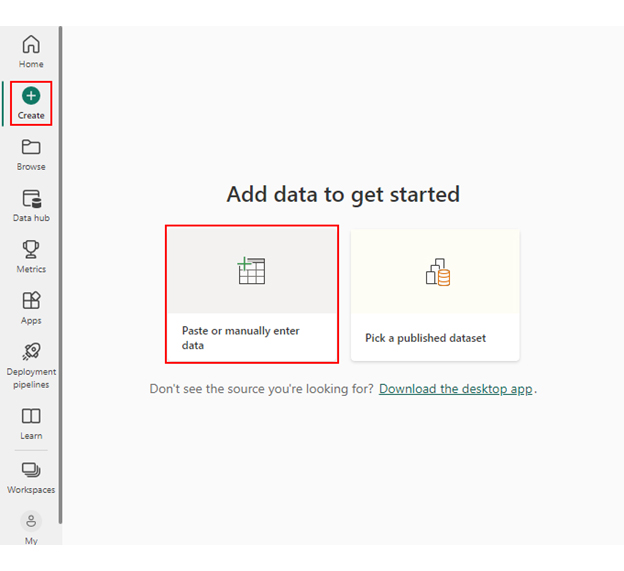
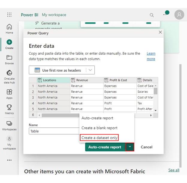
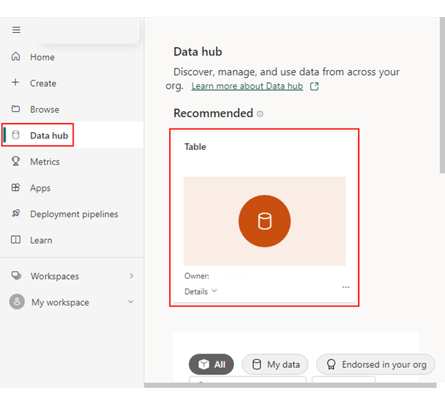
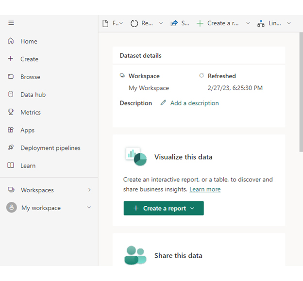
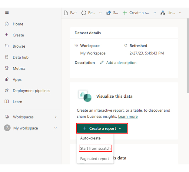
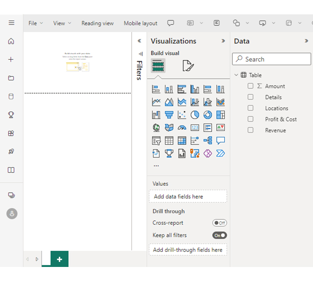
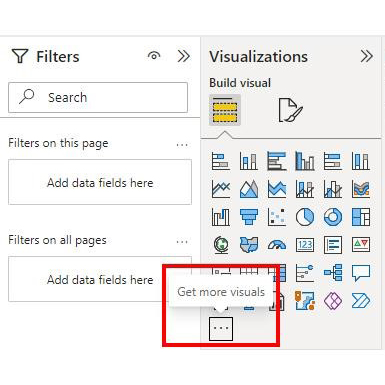
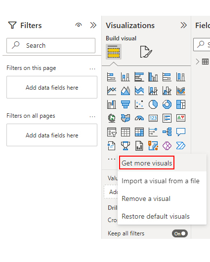
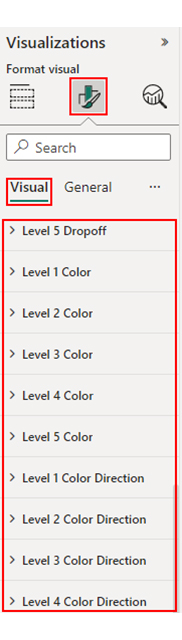
Follow the steps below to learn about the use of a business intelligence platform. We will divide the process into five stages to ensure ease of understanding.
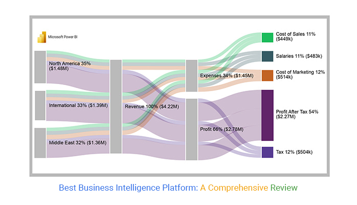
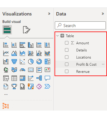
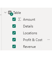
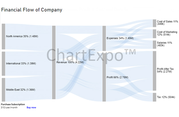
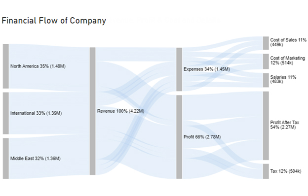
Stage 1: Logging in to Power BI

  • Log in to Power BI.
  • Enter your email. Click the “Submit” button.
Enter email to login to Power BI
  • You are redirected to your Microsoft account.
  • Enter your password and click “Sign in”.
Enter Password to login to Power BI
  • Choose whether to stay signed in.
Click on stay signed in
  • Once done, the Power BI home screen will open.

Stage 2: Creating a Data Set and Selecting the Data Set to Use in Your Sankey Chart

  • Go to the left-side menu and click the “Create” button.
  • Select “Paste or manually enter data“.
select Paste or manually enter data in Power BI ce453
  • We’ll use the following cash flow data for this example.
Locations Revenue Profit & Cost Details Amount
North America Revenue Expenses Cost of Sales 132000
North America Revenue Expenses Salaries 159000
North America Revenue Expenses Cost of Marketing 170000
North America Revenue Profit Tax 182000
North America Revenue Profit Profit After Tax 834000
International Revenue Expenses Cost of Sales 162000
International Revenue Expenses Salaries 158000
International Revenue Expenses Cost of Marketing 145000
International Revenue Profit Tax 171000
International Revenue Profit Profit After Tax 753000
Middle East Revenue Expenses Cost of Sales 155000
Middle East Revenue Expenses Salaries 166000
Middle East Revenue Expenses Cost of Marketing 199000
Middle East Revenue Profit Tax 151000
Middle East Revenue Profit Profit After Tax 685000
  • Paste the above data table in the Power Query Window.
  • Select the “Create a dataset only” option.
Create Dataset in Power BI ce455
  • On the left-side menu, click “Data Hub“.
  • Power BI populates the data set list. (If you have not created a data set, refer to the Error! Reference source not found section).
Click on Data Hub ce455
  • Choose a data set for the Sankey chart.
  • PBI populates the screen as shown below:
Workspace in Power BI ce453
  • Click on the “Create a report” dropdown.
  • Select “Start from scratch“.
Create Report and start from scratch ce453
  • A Report Canvas screen appears as below:
Workspace in Power BI ce455

Stage 3: Adding the Power BI Sankey Diagram Extension by ChartExpo

  • Creating the Sankey Diagram requires us to use an add-in or Power BI visual from AppSource.
  • Navigate to the right side of the Power BI dashboard.
  • Open the Power BI Visualizations panel.
  • Click the ellipsis symbol (…) as highlighted in the diagram below. This will import the Power BI Sankey Diagram extension by ChartExpo.
click on to get more visuals ce453
  • The following menu opens:
  • Select the “Get more visuals” option.
get more visuals in Power BI ce453
  • The following window opens.
  • Enter “Sankey Diagram for Power BI by ChartExpo” in the highlighted search box.
  • You should see the “Sankey Diagram for Power BI by ChartExpo”, as shown in the image below.
Sankey Diagram for Power BI by ChartExpo
  • Click the highlighted “Add” button.
Click the Add button
  • Power BI will add the “Sankey Diagram for Power BI by ChartExpo” icon in the visualization panel.
Click on Sankey Diagram Icon

Stage 4: Drawing a Sankey Diagram with ChartExpo’s Power BI extension

  • Select the “Sankey Diagram for Power BI by ChartExpo” icon in the visualization panel.
  • The following window opens in the report section of your dashboard:
Report Section in Dashboard ce441
  • You can resize the visual as needed.
  • Navigate to the right side of your Power BI dashboard.
  • You should see “Fields” next to “Visualizations“.
Fields next to visualizations ce455
  • You’ll select the fields to use in your Sankey chart here.
  • The ChartExpo visual needs to be selected, though. Select the field in the following sequence:
    • Locations
    • Revenue
    • Profit & Cost
    • Details
    • Amount
Select fields for Sankey diagram ce455
  • You’ll be asked for a ChartExpo license key or email address.
enter email for ChartExpo license ce430

Stage 5: Activate your ChartExpo Trial or Apply a Subscription Key

  • Select the ChartExpo visual.
  • You should see three icons below “Build Visual” in the Visualizations panel.
Build visual panel in Power BI
  • Select the middle icon, “Format visual“. The visual properties will be populated as shown below.
visual properties in Power BI
  • To begin using ChartExpo as a new user;
    • Enter your email address in the textbox under the “Trial Mode” section. ChartExpo will send the License key to this email upon subscribing to the add-in.
    • Ensure you provide an accurate and up-to-date email address.
    • Toggle “Enable Trial” to activate your 7-day trial.
enter email id
  • You should receive a welcome email from ChartExpo.
  • If you do not find the email in your inbox, kindly check your spam folder.
  • The Sankey Diagram you create under the 7-day trial contains the ChartExpo watermark.
Best Business Intelligence Platform 1
  • If you have obtained a license key:
    • Enter your license key in the “ChartExpo License Key” textbox in the “License Settings” section (see below).
    • Slide the toggle switch next to “Enable License” to “On“.
enter license key
  • Your Sankey Diagram will then appear without a watermark.
Best Business Intelligence Platform 2
  • Let’s add colors to each node. Expand the “Level Colors” properties and select the colors.
Coloring Sankey Diagram ce453
  • Automatically all changes will be saved.
Final Best Business Intelligence Platform

Insights

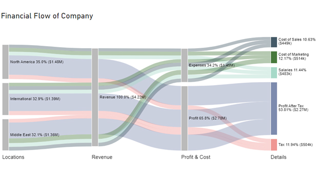
Regional Performance Comparison

  • North America boasts the highest profit after tax (PAT) at an impressive $834,000, making it the most profitable region.
  • Regarding revenue and profit, the International region closely follows North America.
  • The Middle East exhibits the lowest revenue and profit among the regions.

Cost Analysis

  • In all regions, the highest expense category is “Cost of Marketing”.
  • “Salaries” are also significant, especially in North America and the Middle East.
  • The “Cost of Sales” expense differs across regions, with the International region having the highest sales expenses.

Profit and Taxation

  • North America has the highest tax and profit values.
  • Following North America, the international region has the second-highest profit and tax values.
  • The Middle East region has the lowest profit and tax values.

FAQs

Is business intelligence better than business analytics?

Business intelligence (BI) and business analytics (BA) serve different purposes. BI focuses on reporting and historical data, while BA involves advanced statistical analysis and predictive modeling. The choice depends on specific business needs; neither is inherently “better” than the other.

What is a business intelligence system?

A business intelligence system is a software-driven solution that gathers, processes, and analyzes data from various sources. It provides insights through reports, dashboards, and data visualization, aiding in informed decision-making and improved performance.

Wrap Up

Information is power; the business intelligence platforms are the conduits to harness that power. They transform raw data into actionable insights, enabling informed decision-making to drive growth, efficiency, and competitiveness.

In the quest for the Best Business Intelligence Software, we’ve uncovered a powerful ally Power BI. With Power BI, you’re not merely deciphering numbers; you’re deciphering the future.

Like a virtuoso conductor, Power BI harmonizes disparate data sources into a symphony of insights. Its data transformation, modeling, and visualization prowess transforms mundane numbers into actionable wisdom.

We’ve witnessed how it catalyzes decision-making, offering real-time insights that empower organizations to adapt swiftly to ever-changing landscapes. Efficiency soars and productivity flourishes as manual data wrangling yields to automated precision.

Power BI’s ability to forecast and predict paves the way for proactive strategies. Moreover, its robust security and compliance features ensure data integrity and peace of mind.

Don’t miss out on data delight. Get started with ChartExpo and Power BI today and make data magic happen with the Best Business Intelligence Platform.

How much did you enjoy this article?

PBIAd2
Start Free Trial!
130276

Related articles

next previous
Power BI12 min read

How to Create Sankey Diagram in Microsoft Power BI?

Learn How to Create Sankey Diagram in Microsoft Power BI using Desktop & Web Service. What they are and how to use them effectively.

Power BI8 min read

Power BI Artificial Intelligence: Insights Using Visuals

Discover all there is to know about the Power BI artificial intelligence. You'll also discover how AI is used in Power BI, and how to use it for analysis and more.

Power BI9 min read

Budgeting in Healthcare: Use Visuals to Spot Budget Gaps

This guide helps you discover what budgeting in healthcare is. You'll also discover the factors that affect hospital budgets and types of budgeting in healthcare.

Power BI9 min read

Predictive Analytics in Power BI for Making Insightful Visuals

This guide shows you everything you need to know about Predictive Analytics in Power BI. It also shows you how it works, and how to interpret the results.

Power BI8 min read

Quarterly Business Review Template for Optimum Reports

Discover what the quarterly business review template is. This guide also shows you the best practices to consider when using the QBR template.

ChartExpo logo

Turn Data into Visual
Stories

CHARTEXPO

  • Home
  • Gallery
  • Videos
  • Services
  • Pricing
  • Contact us
  • FAQs
  • Privacy policy
  • Terms of Service
  • Sitemap

TOOLS

  • ChartExpo for Google Sheets
  • ChartExpo for Microsoft Excel
  • Power BI Custom Visuals by ChartExpo
  • Word Cloud

CATEGORIES

  • Bar Charts
  • Circle Graphs
  • Column Charts
  • Combo Charts
  • Comparison Charts
  • Line Graphs
  • PPC Charts
  • Sentiment Analysis Charts
  • Survey Charts

TOP CHARTS

  • Sankey Diagram
  • Likert Scale Chart
  • Comparison Bar Chart
  • Pareto Chart
  • Funnel Chart
  • Gauge Chart
  • Radar Chart
  • Radial Bar Chart
  • Sunburst Chart
  • see more
  • Scatter Plot Chart
  • CSAT Survey Bar Chart
  • CSAT Survey Chart
  • Dot Plot Chart
  • Double Bar Graph
  • Matrix Chart
  • Multi Axis Line Chart
  • Overlapping Bar Chart
  • Control Chart
  • Slope Chart
  • Clustered Bar Chart
  • Clustered Column Chart
  • Box and Whisker Plot
  • Tornado Chart
  • Waterfall Chart
  • Word Cloud
  • see less

RESOURCES

  • Blog
  • Resources
  • YouTube
SIGN UP FOR UPDATES

We wouldn't dream of spamming you or selling your info.

© 2025 ChartExpo, all rights reserved.