Categories
By ChartExpo Content Team
Tired of guessing your next move? Analytics tools for business can show you the way.
Every business faces questions. What’s driving sales? Where are the gaps? Analytics tools for business help you find the answers. They sift through data, revealing patterns and insights you can act on. Whether it’s understanding trends or planning your next strategy, these tools provide clarity.
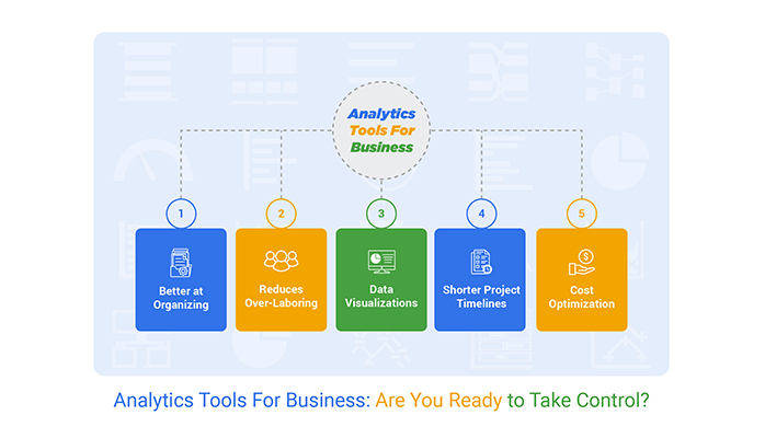


The beauty of analytics tools for business lies in their simplicity. They transform piles of data into straightforward insights, cutting out the noise. Want to know why customers are leaving or which marketing efforts pay off? These tools have your back.
No matter your business size, analytics tools for business can be your go-to resource for smarter decisions. From startups to established companies, they scale to match your growth, helping you stay ahead of the competition.
First…
So, what exactly are analytics tools for business? Think of them as your business’s best allies. They collect data from various sources and analyze it to help you understand complex scenarios. They can predict trends, improve your operations, and customize your offerings.
They make the invisible visible and the incomprehensible simple.
Why should you care about analytics tools for business? Well, imagine making decisions with a blindfold on. Sounds risky, right? Analytics tools remove that blindfold and give you a clear view of what’s happening in your business.
They help you make data-driven decisions by providing insights into customer behavior, market trends, and operational efficiency. This means you can reduce risks, optimize processes, and ultimately, boost your bottom line.
Let’s break down the types of analytics tools available. First up, descriptive analytics tells you what has happened in the past. Think of it as the hindsight that offers insights into past performances.
Predictive analytics takes it a step further by forecasting what might happen in the future. It’s like having a business crystal ball!
Lastly, prescriptive analytics suggests actions you could take to handle future scenarios. It’s like having a wise advisor right at your fingertips, helping you make smarter choices.
Diving into specific tools, let’s talk about the scatter plot. This simple yet powerful graph can show you patterns and trends in your business data. By plotting points on an X and Y axis, it helps you see relationships between two variables.
Are sales better in certain months? Does customer satisfaction affect your bottom line? Scatter plots can help you find answers to these questions with just a glance.
Setting clear business objectives is key to leveraging analytics effectively. Begin by asking, “What specific outcomes does my business aim to achieve through analytics?” Goals can range from increasing customer satisfaction, optimizing operational efficiency, to boosting sales.
Once the objectives are clear, align your analytics goals to support these outcomes. For example, if the goal is to boost sales, your analytics should focus on sales data, customer preferences, and market trends.
Choosing the right analytics tool requires careful consideration of several factors. First, assess the tool’s ability to integrate with your existing systems. Compatibility reduces technical hurdles and facilitates smoother operations. Next, evaluate the scalability of the tool. Can it grow with your business?
Also, consider the ease of use; tools that are simple to operate can lead to quicker adoption. Lastly, check for support and training resources to help your team make the most of the tool.
Deciding between free and paid analytics tools involves a balance between features and budget. Free tools often provide basic features that might suffice for small businesses or those new to analytics.
Paid tools, on the other hand, offer more advanced features and dedicated support but at a cost. Evaluate what features are essential for your business and determine if the investment in a paid tool will likely return value through improved insights and decision-making.
A radar chart is an effective visual tool used to assess various attributes of analytics tools, including compatibility and scalability. By plotting these attributes on a radar chart, businesses can visually compare several tools against their specific criteria.
This helps in identifying which tool aligns best with the business’s needs in terms of growth potential and seamless integration with current systems.
Setting up the right infrastructure is a key step in implementing analytics tools effectively. Start by assessing your current IT environment. Do you have the capacity to handle large data sets? Is your system compatible with new analytics software? These are vital questions.
Upgrading hardware or moving to cloud-based storage solutions might be necessary to meet the demands of complex analytics tools.
Next, consider data integration. Your analytics tools will need access to data from various sources within your organization. Establishing a data warehouse or using middleware can help consolidate data into a single, accessible repository. This simplifies the process for analytics tools to retrieve and process data efficiently.
Resistance to change is a common challenge when introducing new analytics tools. Address this by highlighting the benefits clearly and demonstrating how these tools can make everyone’s job easier and more impactful. Real-life examples and case studies can be particularly convincing.
Technical difficulties can also hinder adoption. Ensure robust IT support is in place to help users troubleshoot issues quickly. This reduces frustration and downtime.
Another challenge is data quality. Poor data quality can lead to inaccurate analyses, which could misinform business decisions. Implement stringent data management practices to maintain high-quality data. Regular audits and clean-ups should be part of your routine.
A funnel chart is an effective way to visualize the implementation progress of analytics tools. It helps you track the stages of adoption among your team, from awareness to full use.
At the top of the funnel, you have the initial engagement where team members learn about the tool. As you move down the funnel, the focus narrows down to frequent usage and, finally, to mastery.
This visualization helps identify where team members are struggling and allows managers to provide targeted support to move them through to the next stage. It’s not just a tracking tool—it’s a roadmap for successful implementation.
Distinguishing between structured and unstructured data is vital. Structured data is highly organized and easily searchable, usually stored in databases or spreadsheets. Unstructured data, on the other hand, is more free-form, found in emails, videos, or social media posts.
The best analytics tools can tackle both types by employing different algorithms and processing techniques, ensuring that businesses can derive value from all their data, not just the neatly formatted kind.
Big data is a term thrown around a lot, but managing it is a genuine challenge. The volume, variety, and velocity of big data require robust solutions.
Distributed systems, cloud storage, and scalable processing power are part of the arsenal needed to tame big data. Effective management ensures that the size of the data does not hinder a business’s ability to extract timely and relevant insights.
The Mekko chart, also known as a Marimekko chart, is a powerful tool for comparing data complexity across different sources. It provides a visual representation where both axes are variable, leveraging visual analytics to offer insights into market share, competition, and other dimensions.
This chart type is particularly useful when businesses need to analyze data segments in relation to each other, providing a clear picture of complex relationships.
Interactive dashboards are at the forefront of making data actionable. They allow users to manipulate data and view the results in real-time, providing a dynamic way to explore and interact with information.
Users can filter data, drill down into metrics, and monitor changes over time, all within a single dashboard. This immediacy not only empowers teams to perform their data analysis but also enhances their ability to spot opportunities for improvement and react promptly to emerging trends.
Customizable reports are important for businesses seeking insights tailored to their specific needs. These reports allow users to select only the data that matters most, presented in a format that suits their preferences and requirements.
Whether it’s a daily sales report, a monthly inventory analysis, or a yearly customer satisfaction review, customizable reports ensure that all stakeholders from executives to line managers receive relevant, actionable insights.
Automation in reporting marks a significant shift in how businesses handle data. By setting up automated report generation and distribution, companies save countless hours that would otherwise be spent on manual data compilation and analysis.
Automated reports ensure that all stakeholders receive timely updates, leading to faster decision-making and increased operational efficiency. Moreover, automation reduces the risk of human error, enhancing the accuracy of reports.
The Pareto chart is an effective tool for highlighting the most critical data points in a dataset. It is based on the Pareto principle, which suggests that 80% of problems are often due to 20% of causes.
By identifying and focusing on these key issues, businesses can more efficiently allocate resources to address the most impactful areas. This targeted approach not only saves time and money but also significantly enhances the effectiveness of problem-solving efforts.
The following video will help you to create a Sankey Chart in Microsoft Excel.
The following video will help you to create the Sankey Chart in Google Sheets.
Effective marketing is all about reaching the right audience with the right message at the right time. Analytics tools play a pivotal role in refining targeting strategies. They analyze customer data to identify patterns and preferences, which help in crafting personalized marketing messages.
By understanding customer behaviors, businesses can design campaigns that are more likely to resonate with their target demographics, thereby increasing engagement and conversion rates.
Financial forecasting is another critical area where analytics tools shine. These tools process historical financial data to predict future trends and outcomes. This predictive capability is vital for budgeting, planning, and risk management.
By foreseeing potential financial downturns or windfalls, businesses can better prepare themselves, ensuring they remain profitable and sustainable in the long run.
Personalization is key to enhancing customer experience. Analytics tools examine customer interactions and feedback to tailor services and products to individual preferences. This personalized approach not only boosts customer satisfaction but also fosters loyalty and repeat business.
Companies that excel in personalization can differentiate themselves from competitors, creating a strong competitive advantage.
A stacked area chart is an excellent tool for visualizing changes over time among multiple related data series. Each series stacks on top of the others, which shows not only the individual series trends but also the cumulative total.
This visualization is particularly useful for businesses to analyze components like sales from different products or performance across multiple regions. By breaking down complex multi-dimensional trends, decision-makers can grasp shifts in their business landscape more intuitively.
In any supply chain, bottlenecks can lead to delays and increased costs. Analytics tools shine a light on these problem areas by analyzing data from various points in the supply chain.
By pinpointing where delays happen, businesses can make targeted improvements, often leading to significant enhancements in overall efficiency. For instance, if data shows that a particular warehouse consistently slows down shipping times, measures can be taken to address this specific issue.
Effective inventory management ensures that a business has the right amount of product available to meet demand without overstocking. Analytics tools help by forecasting demand using historical sales data, trends, and seasonal fluctuations.
This predictive capability allows businesses to adjust their inventory levels proactively, reducing the costs associated with excess inventory and stockouts.
Reducing operating costs is a critical component of maintaining profitability. Analytics tools aid in identifying areas where expenses can be cut without compromising the quality of goods or services.
For example, they can analyze energy consumption patterns across operations to pinpoint opportunities for reducing energy use and, consequently, the utility costs.
Heatmaps are a visually intuitive way to understand complex data sets and identify inefficiencies across different business operations. By using heatmaps, companies can quickly see which areas require immediate attention and which are performing well.
This visual tool is particularly useful in large operations where data points are numerous and varied, helping managers make informed decisions quickly.
Imagine you could read the minds of your customers or follow them around as they interact with your brand. That’s what behavioral analytics tools do—figuratively, of course.
They track the paths customers take, from the first website visit to the final purchase and beyond. This tracking reveals critical drop-off points and elements that grab attention.
Businesses use this data to streamline the customer experience, ensuring that it’s as enjoyable and efficient as possible. By understanding the typical customer journey, companies can make precise adjustments to convert more browsers into buyers.
Segmentation is like organizing a messy room into neat, labeled boxes. Marketing segmentation strategies sort customers into groups based on shared characteristics, such as age, location, buying behavior, or interests, often visualized using a Segmented bar graph to make comparisons across groups clearer and more structured.
This approach allows businesses to customize marketing messages for each segment, increasing relevance and engagement. For instance, a sports apparel company might target running shoe ads to high school athletes and hiking gear to outdoor enthusiasts.
Effective segmentation leads to more personalized interactions, which can enhance customer satisfaction and loyalty.
Churn prediction models are the crystal balls of the business world, predicting which customers might soon say goodbye. Armed with this foresight, companies can act swiftly to re-engage at-risk customers with special offers, helpful reminders, or exciting news about product updates.
These proactive retention tactics can significantly reduce churn rates by addressing concerns and enhancing the customer experience before frustrations lead to departures. Effective churn prediction requires analyzing historical data to identify warning signs that a customer is likely to leave, allowing businesses to take timely, targeted action.
A mosaic plot might sound like an art project, but it’s actually a powerful visual tool used in data analytics. This plot displays data in a mosaic-like grid of colored rectangles, each representing different demographic segments of a customer base.
The size and color of each rectangle reflect the proportion and characteristics of each segment. For example, larger, brightly colored blocks might represent a high-revenue customer group that often purchases the latest products.
Mosaic plots help businesses visually digest complex demographic data, making it easier to identify trends and make data-driven decisions about where to focus marketing efforts.
Calculating the value of analytics investments involves more than just tallying up costs and gains. You need to consider both direct and indirect benefits.
Direct benefits include increased sales or reduced costs due to improved efficiencies. Indirect benefits might include enhanced customer satisfaction, which can lead to repeat business and referrals.
To calculate the value effectively, businesses should track specific metrics and KPIs before and after the implementation of analytics tools to see clear differences in performance.
Choosing the right metrics to monitor is key in linking analytics tools to business success. Metrics such as customer acquisition cost, customer lifetime value, and conversion rates are vital.
Businesses should also monitor engagement metrics like average session duration and bounce rates to gauge content effectiveness. Monitoring these metrics helps businesses make informed decisions that drive success.
Staying ahead of the competition is crucial, and benchmarking using analytics tools is a strategic way to do it. By analyzing competitors’ data, businesses can identify industry standards and set realistic performance goals.
Analytics tools provide insights into competitors’ strategies, helping businesses to innovate and improve their own strategies to stay competitive in the market.
A slope chart is an effective visual tool for evaluating ROI over time. It shows the progress between two points, making it easy to see how investments grow or decline. Businesses can use slope charts to track changes in ROI from various analytics tools, providing a clear picture of what’s working and what’s not.
This visual representation helps in making adjustments to strategies, ensuring continuous improvement in ROI.
When dealing with data discrepancies, quick and effective solutions are crucial. The first step is to verify the data sources. Errors often stem from incorrect data inputs, so it’s important to check the sources for accuracy. If discrepancies are found, correcting the source data can resolve the issue swiftly, especially when validating results used in a confidence interval graph.
Another quick fix involves checking for data processing errors. Sometimes, discrepancies arise during the data transformation stages. Reviewing the transformation logic and calculations can often reveal errors that, once corrected, resolve the discrepancies.
Data synchronization issues can also lead to discrepancies, especially in real-time data systems. Ensuring that all systems are synchronized can prevent data mismatch. This might involve setting up automated synchronization processes or manually checking sync status at regular intervals.
Lastly, implementing a robust error logging and notification system can help catch discrepancies early. By alerting the team to potential issues as they arise, it becomes easier to maintain clean and reliable data for analysis and visualization.
Integration of analytics tools can be streamlined by adopting platforms that are designed to work together. Choosing tools from the same vendor or ones that officially support integration can reduce compatibility issues.
Another strategy is to use a dedicated integration tool or platform. These tools are designed to connect different software systems without the need for extensive custom coding. They come with pre-built connectors and workflows that simplify the integration process.
For custom integration needs, developing APIs is a viable solution. APIs allow different systems to communicate with each other, sharing data and functionalities smoothly. Hiring skilled developers to build and maintain these APIs can ensure that integration issues are minimal.
To maintain high data quality, implementing strict data entry protocols is essential. This involves setting clear guidelines for how data should be entered and ensuring that these rules are followed meticulously. Regular training sessions for staff on the importance of data accuracy can help reinforce these protocols.
Automated data cleaning tools can also be invaluable in maintaining data quality. These tools scan through data, identify anomalies, errors, or duplicates, and correct them according to predefined rules. Setting up these tools to run regularly ensures that the data remains clean and usable.
Regular data audits are another effective strategy. These audits involve systematically reviewing the data for accuracy and consistency. Conducting these audits regularly helps catch issues that might have been missed during initial data entry or processing.
The co-occurrence chart is a powerful visual tool used to identify patterns and relationships between different problem areas. By mapping out how frequently certain issues co-occur, businesses can gain insights into underlying problems that might be contributing to multiple challenges.
Creating a co-occurrence chart involves collecting data on various problems and their occurrences. This data is then represented visually, often in a matrix format, where the frequency of co-occurrence is depicted. Analyzing this chart can help businesses identify which areas require more focused attention or a change in strategy.
Using this chart, teams can prioritize problem-solving efforts, focusing on areas that have the highest impact on operations. This targeted approach not only saves time but also resources, making problem-solving efforts more efficient and effective.
Data-driven strategies are critical in reducing human bias in decision-making. By relying on data, businesses can make decisions that are not influenced by personal feelings or opinions.
Consider a hiring process where data analytics tools assess candidate skills and match them to job requirements, ensuring that the selection is based solely on merit and fit rather than subjective impressions.
Accuracy in strategic planning is vital for any business. With analytics tools, companies can predict future trends based on historical data.
For example, a business can use data from past marketing campaigns to refine its strategies, ensuring better targeting and more effective spending. This precision helps in allocating resources more effectively, potentially increasing ROI.
Balancing speed and precision in decision-making is vital. Analytics tools streamline the decision-making process by quickly processing large volumes of data and providing actionable insights.
This speed does not compromise precision; the data processed is often accurate and detailed, enabling precise decisions at a faster rate. It’s like having a fast car that is also incredibly safe.
A Likert Scale Chart is a fantastic tool for capturing perceptions about the quality of decisions made. Typically, this chart will ask stakeholders to rate their agreement with various statements on a scale, providing clear metrics on how decisions are viewed within the company.
This feedback can be crucial for understanding areas needing improvement in decision-making processes.
Interactive dashboards are not just tools; they are the stage where data performs. Imagine clicking on a bar in a bar graph and watching as other parts of the dashboard adjust to show precisely relevant info. These dashboards respond to your interactions, offering tailored insights like a personal data detective.
This responsiveness not only saves time but also makes the analysis process more intuitive. Users can drill down into metrics that matter, see patterns emerge in real-time, and make decisions faster than ever before. It’s about getting the full picture with a few clicks, turning what could be a static display into a dynamic dialogue with data.
Data has a story to tell, and storytelling with data turns numbers into narratives that stick with the audience. It’s about framing the spikes, drops, and trends in a way that connects on a human level.
Think of it as translating the language of data into the language of decision-makers. This approach involves presenting data through a narrative structure that highlights causality, tension, and resolution. This not only captures attention but also aids memory, making it more likely that the insights will be acted upon.
By crafting a story arc, complex data becomes a compelling story that provides clarity and nudges stakeholders toward informed actions.
When data becomes complex, advanced visualizations step in to simplify understanding. These are not your standard charts and graphs. We’re talking about heat maps and tree maps that show layers of data in a digestible format.
These tools help in spotting correlations and patterns that might be missed in traditional formats. For example, a heat map could highlight the most profitable regions for a business with varying color intensities, making it instantly apparent where focus should be intensified.
Advanced data visualizations break down the barriers of complexity, making sophisticated data accessible to all users.
A matrix chart is ideal for dealing with multiple data variables. It allows you to plot data across two axes, making it possible to compare several variables at a glance. This can be pivotal for businesses that need to evaluate the interplay between different factors, such as price and sales volume across different regions.
By providing a grid-like representation, matrix charts condense complex data into a format that’s easy to understand and act upon. It’s about turning what could be an overwhelming data set into a clear matrix of possibilities, paving the way for insightful business decisions.
Analytics tools for business simplify decision-making. They take raw data and translate it into clear actions, saving you time and resources.
Whether you’re tracking sales, understanding customer behavior, or planning for growth, these tools are essential.
Choosing the right tool starts with understanding your goals. Identify what matters most to your business. From there, find tools that align with your needs and can grow alongside you.
Don’t let data overwhelm you. Use it to your advantage.
With analytics tools for business, you can move forward with clarity and confidence.
Data doesn’t have to be confusing—use it to make smarter moves every day.
How much did you enjoy this article?


Calculate accounts receivable turnover ratio to measure credit collection speed, improve cash flow, and strengthen your financial strategy. Read on!

Change Management KPIs are the key to tracking adoption, performance, and ROI during transitions. Find out which metrics matter. Read on!

Data collection methods and techniques determine the quality of every insight you act on. Explore key approaches for gathering reliable data. Read on!


