Categories
By ChartExpo Content Team
Selection bias sneaks in when your survey sample doesn’t represent the whole group you’re studying. It’s a common trap, and it can quietly distort your conclusions.
Think of it as asking a room full of chefs about favorite recipes and assuming their answers reflect everyone’s tastes. The outcome? Data that’s less about the big picture and more about a narrow view.


Why does selection bias matter so much? Because it doesn’t just skew your numbers—it skews your decisions. If you’re making choices based on incomplete or unbalanced data, you might be aiming at the wrong target. From missed business opportunities to flawed research, the consequences can ripple far and wide.
The good news? Spotting selection bias isn’t rocket science.
By understanding how it creeps into surveys and learning how to counteract it, you can ensure your data truly reflects the group you’re studying. That’s what this guide is all about—helping you identify and address selection bias so your insights lead to smarter, better-informed decisions.
First…
Imagine you’re running a survey to understand what the most popular ice cream flavor is in your town. You decide to ask this question only in a gym. Chances are, the answers might not represent the whole town’s opinion.
This scenario is a classic example of selection bias. It happens when the method of collecting samples causes some members of the intended population to be less likely included than others. This results in a sample that isn’t representative of the entire population.
Selection bias can twist the outcome of surveys and studies, leading us to believe something that might not be true for the whole population. For instance, if you concluded from your gym survey that “sugar-free” is the most popular ice cream flavor, you might end up with a lot of unsold regular ice cream in your shop!
When selection bias creeps into research, it doesn’t just stop at false conclusions about ice cream. It stretches its effects to more critical areas.
For example, a study on drug effectiveness might only consider younger, healthier people. The results could lead doctors to believe that the drug works well across all age groups, potentially putting older adults at risk who might not respond to the medication in the same way.
In marketing, if a company only gathers customer feedback on a product from existing customers and ignores the non-users, they might think the product meets the market needs perfectly. However, this could lead them to miss out on understanding why non-users are avoiding the product, which could be crucial for broadening the market base.
Avoiding selection bias is crucial for obtaining reliable data and making data-driven decisions that are truly beneficial for the entire community or target market. It’s about ensuring fairness and accuracy, not just in statistics but in the real impact those numbers have on lives and choices in society.
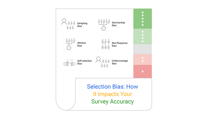
Imagine you’re planning a party and only invite friends who love dancing. You’d wrongly conclude everyone loves to dance, right? That’s Sampling Bias in a nutshell. When survey samples don’t reflect the broader population, results can lead us astray, painting a skewed picture of reality.
Ever noticed how some people are more eager to share their opinions? That eagerness can lead to Self-Selection Bias. Here, individuals who choose to participate in surveys might have different characteristics or stronger opinions than those who opt out. Thus, the final survey results might not truly represent the general sentiment.
Nonresponse Bias sneaks in when certain folks don’t respond to your survey. Think of it as throwing a party where the shy guests never RSVP. Their absence could mean you’re missing out on important viewpoints, which can significantly tilt your survey results, especially when graphing survey results to analyze trends and patterns.
Consider a marathon where some runners drop out halfway. If you only consider those who finish, you might conclude the race is easy.
Similar to a survey, Attrition Bias occurs when participants leave before completing it, potentially leaving out critical data from those who might have different views or experiences.
Ever thrown a teen party but forgot to invite any teens? That’s Undercoverage Bias for you. It happens when significant segments of the population are left out of the survey process, leading to results that fail to encompass the whole picture.
Survivorship Bias is like only counting those who won the lottery and thinking, “Hey, winning seems easy!” By only looking at those who ‘survived’ or succeeded, we ignore a vast amount of unseen but crucial information from those who didn’t make the cut. This can lead to overly optimistic beliefs or flawed decision-making based on incomplete data.
Ever wondered why some survey results seem a bit off? Well, one big culprit is convenience sampling. This happens when researchers pick survey participants just because they’re easy to reach.
Think about it like grabbing a snack from the first aisle at the grocery store instead of looking for the best options throughout the store. This method can skew results because it doesn’t represent everyone.
It’s like assuming that everyone loves pretzels just because the people near the pretzel stand said so!
Now, imagine you’ve whipped up a survey that’s only online. Sounds great, right? But what about folks who don’t have good internet or, heck, any internet at all?
If your survey’s a no-go for them, you’re missing out on their voices. It’s like hosting a party and only sending invites via email. What about the friends who only check snail mail? Yeah, you’ll end up with a less diverse crowd shaking up the dance floor.
Oh, and here’s a sneaky one: leading questions. These are those questions that nudge you towards a particular answer. Imagine asking, “Don’t you just love how refreshing soda is?” instead of “How do you feel about soda?”
It’s pretty clear which way the first question is trying to push you. Biased wording is another party crasher. It can steer the whole survey in a direction that the researcher might be rooting for, without even realizing it!
Lastly, let’s chat about the human element—researcher influence. Whether it’s on purpose or not, researchers can affect which participants get picked. Maybe they subconsciously choose participants who seem agreeable or those who might share their views.
It’s like a chef favoring certain ingredients without thinking about it. The result? A dish—that is, survey results—that might not be as balanced as it should be.
The following video will help you to create a Word Cloud Chart in Microsoft Excel.


The following video will help you to create a Word Cloud Chart in Google Sheets.
When businesses send satisfaction surveys solely to recent buyers, they’re unknowingly stepping into a selection bias pitfall.
Imagine this: A store sends out feedback forms only to customers who made purchases within the last month.
Sounds fair? Not quite!
This approach misses out on those who may have visited but chose not to buy or those who made purchases a long time ago. The feedback collected is overly positive, painting a skewed picture of overall customer satisfaction.
It’s like asking a classroom of kids if they want an extra recess and using their resounding “yes” to represent the views of the entire school!
Gyms often conduct health surveys among their members to gauge general fitness levels or satisfaction with gym facilities. However, here’s a twist: these surveys primarily capture the responses of regular gym-goers.
What about the members who seldom visit or have just stopped going? By not including the less frequent visitors, gyms get a biased view that everyone is getting fitter and happier, missing out on critical feedback from the less active members.
It’s like taking a cooking class to vote on the best cake recipe, but only from those who love chocolate!
Consider a company that advertises a new product using trendy, youthful language on social media platforms predominantly used by teenagers and young adults. The feedback and interest generated will naturally be skewed towards younger demographics.
Older potential customers who might access other media or prefer different communication styles are left out of the conversation. This scenario is akin to broadcasting a new jazz album only on classic rock stations and wondering why younger audiences haven’t tuned in.
Imagine picking names out of a hat. That’s random sampling for you! It’s all about giving everyone an equal shot at being part of the study, ensuring the results aren’t biased by any group.
By randomly selecting participants, we make sure that every individual, regardless of their background, has the same chance of being chosen. This method is like the lottery; it doesn’t see who you are or where you come from.
Think of a layered cake. Each layer represents a different demographic, like age or income.
Stratified sampling slices right through these layers to pick samples from each, ensuring all categories are represented. This way, we avoid leaning too heavily on one group and get a balanced view across the board. It’s a smart move to get a true taste of the whole cake, not just the icing!
This technique is like taking steps at regular intervals. You decide the step size—say, every 10th person on a list—and then select participants at these intervals. It adds a rhythm to the selection process and keeps things fair. Systematic sampling is your go-to for adding a beat to the randomness, making sure every nth individual gets a fair chance to contribute to your study.
Sometimes, even with the best sampling strategies, some groups might not get enough data presentation. That’s where weighting comes in.
Think of it as giving a little extra push on the scales to balance things out. By adjusting the responses from underrepresented groups, we ensure their voices aren’t just heard but are given appropriate importance. This technique fine-tunes the final results, making them more reflective of the entire population.
When it comes to reaching a broad audience effectively, Google Forms for survey is a standout choice. Its accessibility features ensure that everyone, regardless of ability, can participate without barriers.
Plus, the customizable templates allow you to create surveys that resonate with diverse groups, which is key to preventing selection bias. By designing questions that are clear and engaging, you increase the likelihood of capturing a wide array of responses, making your data collection as inclusive as possible.
Microsoft Forms provides a seamless integration with other Office tools, which can significantly enhance your survey distribution strategy.
For instance, embedding your survey in an Outlook email can boost visibility and participation rates. Additionally, utilizing the automatic survey data collection features in Excel can help you analyze responses quickly and efficiently, ensuring that you’re making decisions based on timely and comprehensive data insights.
To combat selection bias effectively, it’s crucial to distribute your survey across multiple platforms. This approach ensures you’re not limiting your data sample to users of a single service or demographic.
Consider employing a mix of social media channels, email newsletters, and even SMS to cover a broader spectrum of respondents. Each platform attracts different user groups, and tapping into these varied channels helps in gathering a more balanced set of responses.
When designing surveys, it’s vital to connect with everyone. Words matter. To avoid selection bias, frame questions that all demographic groups can relate to. This approach not only increases the response rate but also ensures that the data reflects a diverse population.
Always test your survey language for inclusivity, ensuring that no group feels alienated.
Questions should be a blank slate. They must not suggest any answer or sway the respondent’s opinion. This means avoiding phrases that hint at desirable responses or that prime a particular reaction.
For instance, instead of asking, “How great is our new product?” consider “How would you rate our new product?” Neutral phrasing helps gather genuine and unbiased data.
Before you roll out your survey to everyone, do a trial run. This pre-test, or pilot study, is your chance to catch any biases in your survey design. Analyze the responses from a small, varied group. Look for patterns that might indicate bias in question framing or content. Adjust accordingly to ensure your full survey is as fair and unbiased as possible.
Tech companies often face the challenge of selection bias in product feedback loops. This bias occurs when the feedback collected does not represent the full spectrum of users.
For instance, feedback might predominantly come from users who are either very satisfied or very dissatisfied with the product.
To address this issue, companies implement stratified sampling where feedback is collected equally from users across different usage frequencies, demographics, and user experiences. This approach helps in developing products that cater to a broader audience.
In healthcare, selection bias can significantly affect the validity of data collected through surveys.
If survey participants primarily consist of a certain demographic—say, older adults—the data might not accurately reflect the health needs or outcomes of younger populations.
To combat this, healthcare providers and researchers use techniques like quota sampling to ensure participation across various age groups, ethnic backgrounds, and genders, enhancing the accuracy of healthcare analytics.
This method supports the collection of health data that is more reflective of the entire population, leading to better healthcare policies and interventions.
Marketing teams must understand consumer sentiment across diverse socioeconomic groups to tailor their strategies effectively. Selection bias might crop up if data is only gathered from specific, accessible segments, like online platforms, potentially ignoring less tech-savvy consumers.
To mitigate this bias, marketers employ mixed-method approaches, combining online surveys with direct interviews or focus groups in varied locales. This blended approach helps in capturing a wide array of consumer insights, ensuring marketing strategies are well-informed and inclusive.
Selection bias happens when the process of choosing participants for a study or survey leads to an unbalanced sample. For example, imagine you’re surveying favorite ice cream flavors but only ask people at a gym. Your results might lean toward “sugar-free” options, even though that might not reflect everyone’s taste. This kind of bias skews the data and can lead to conclusions that don’t apply to the broader group you’re studying.
Selection bias matters because it distorts the truth. Whether you’re conducting research, analyzing customer feedback, or creating policies, biased data can lead you down the wrong path. For instance, if a drug trial only includes young, healthy participants, the results might not account for how older or less healthy individuals would respond. Avoiding this bias is crucial for making decisions that are fair and effective.
Spotting selection bias starts with examining how your data was gathered. Ask yourself: Who was included, and who was left out? If certain groups are missing or underrepresented, that’s a red flag. For example, if a customer survey only gathers responses from recent buyers, the results won’t reflect the opinions of people who didn’t make a purchase.
Mitigating selection bias starts with designing a fair and inclusive data collection process. Use random sampling to ensure every individual in your target group has an equal chance of being included. This avoids favoritism and creates a balanced representation. Stratified sampling can help further by dividing your population into relevant subgroups, like age or location, and sampling proportionately from each. Systematic sampling, where participants are selected at regular intervals, adds consistency while reducing unconscious biases. Another critical step is making your survey or study accessible to a wide range of participants. This includes using multiple distribution channels—such as email, social media, and offline methods—to reach diverse groups.
Researchers use strategies like random sampling, stratified sampling, and systematic sampling to reduce selection bias. For instance, random sampling ensures every individual has an equal chance of being chosen, while stratified sampling makes sure specific groups are proportionally represented. These methods help create balanced data sets that reflect the full population.
While it’s better to avoid selection bias from the start, there are ways to correct it after data collection. Statistical techniques like weighting can adjust for underrepresented groups, ensuring their responses carry appropriate influence. However, these fixes are not perfect, so it’s always best to address bias during the design phase.
A classic example is gym-based health surveys, which might suggest everyone is fit and active because the participants are gym-goers. Another is satisfaction surveys sent only to recent customers, ignoring those who didn’t buy or stopped using a service. These examples show how biased data leads to skewed conclusions.
Selection bias persists because it often sneaks in unnoticed. Convenience, assumptions, and limited resources can all contribute. For example, relying on easily accessible groups or online-only surveys might seem efficient but can exclude important voices. Overcoming it requires vigilance and deliberate effort in planning and execution.
Selection bias can lead to poor decisions by presenting an incomplete or inaccurate picture. Whether it’s a business misunderstanding its customers or a policymaker overlooking marginalized communities, the consequences of biased data can be significant. Awareness and proactive steps to reduce bias can prevent costly mistakes.
Technology offers tools like advanced survey platforms and data analysis software that help minimize selection bias. Features like randomization, accessibility options, and multi-platform distribution ensure a more inclusive approach. Platforms like ChartExpo also help visualize data clearly, making biases easier to identify and address.
Selection bias isn’t something to overlook. It shapes the way data is collected, interpreted, and used, often without anyone realizing the full impact. Ignoring it can lead to flawed conclusions, wasted resources, and misguided decisions.
Addressing selection bias requires intentional actions, from careful sampling to inclusive survey design. The tools and techniques shared here aren’t just steps—they’re essential practices for reliable results. When you prioritize accurate representation, your data becomes a true reflection of the group you’re studying.
The takeaway? Bias-free data isn’t an extra—it’s the foundation of good decisions. Don’t let selection bias skew your view. Make your surveys and studies count where it matters most.
How much did you enjoy this article?


Google Forms to Google Sheets keeps your data organized and current with every submission. Learn the steps, methods, and tips now!

Product survey questions reveal what customers truly think. Learn how to ask the right ones and act on the survey results. Read on!

Learn how the 5-Point Performance Rating Scale improves employee evaluations with clear, consistent, and fair performance reviews across teams.


