Categories
Survey analysis is one of the key phases of survey data storytelling and this is because it answers the question: “show me data”.
If you have just conducted a survey exercise and you’re somewhat stuck and do not know how to analyze and graph survey results. You truly don’t have the foggiest idea of how to continue.
On the other hand, you need to make a convincing data story using insights from your data, and you don’t have an idea where to start.
Continue reading because you have landed at the right place. We will answer all of the above questions and many more.
Survey data is complicated and may include both qualitative and numerical data. Besides, it requires an adjustment of methodology, particularly during the data analysis and visualization stage.
This is where specific graphs and charts, for example, the Likert Scale Chart and CSAT Score Survey Chart, come in. These charts are tailor-made explicitly to assist your business graph survey results faster for actionable answers.
Excel lacks survey-oriented charts and graphs. For some charts, you require a lot of customization to be able to make them presentable.
But you don’t need to get rid of Excel. You can get an instant and ready-made chart for graphing survey results by introducing a specific add-on to your Excel.
In this blog, you’ll discover:
Before jumping right into the blog’s core theme, we’ll address the following question: what is survey results graphing?
A survey analysis report provides hidden insights into your raw data. Thus, a report acts as the backdrop for your story.
Imagine you’re a tutor who needs to understand why science scores are poor compared to other subjects. To gather this information effectively, you could use a survey template in Excel to design questions that pinpoint specific challenges your students face. With this data, you can make a compelling case for funding to organize a summer camp to help your students overcome their poor performance in science.
To analyze longitudinal survey data, you collaborate with other tutors to design a pilot day camp. Additionally, you plan a pre- and post-survey to gauge how these students feel about science before and after the camp.
After everything, you conduct a survey. Imagine all the work put so far going to waste just because you can’t create a data story to convince the school administrator to finance your summer camp.
Data without easy-to-interpret graphs and charts can’t convey insights. You want an easy-to-interpret chart to act as a backdrop to your data story.
Also, a report can’t be convincing if it’s not created as a story with charts to augment clarity.
Likert Scale Chart in Power BI for Graphing Survey Results
Likert Scale Chart in Microsoft Excel for Graphing Survey Results
Likert Scale Chart in Google Sheets for Graphing Survey Results
So, how do you read survey results?
Choosing the correct measurement levels is likely to increase the reliability and accuracy of the insights generated.
Check out the measurement types you can deploy in your analysis below:
Nominal scales arrange data with no quantitative value, similar to labels. An example of this scale is, “Select your cell phone’s brand from the list below.”
Ordinal scales are used to portray the order of key data points. For this scale, there’s a numerical value since one position is higher than another.
An illustration of an ordinal scale is, “Rank your month-to-month needs.” Some necessities, like medical care, could rank higher than others, like a vacation.
You can investigate both mode and media using this scale.
This scale type has quantitative value since data intervals stay identical along the scale. Notwithstanding, this scale comes up short of a true zero point.
Furthermore, this implies research participants should record a response that falls within the scale.
An illustration of an interval scale is an IQ test.
The distinction between an IQ of 90 and 100 is equivalent to 100 and 110.
You can display mode, median, and mean using this scale type.
Unlike interval scales, a ratio scale has a true zero point. Also, it has quantitative value because the absence of an attribute can still provide information.
To conduct a survey analysis, you need the key question or hypothesis to set everything clear.
Let’s assume it’s “How do respondents rate our brand?”
Then, look into the survey questions that answer this question, for example, “How probably are you to prescribe our image to other people?” Segment your overview inquiries to confine insights applicable to your objectives.
Choosing solid exploration questions can assist you with choosing reasonably suitable charts for graphic survey results
Quantitative data is valuable since you can easily draw insights, especially when visualized using formats like a percentage bar graph for clearer comparisons.
While qualitative information can bring additional intriguing insights about a point, it’s subjective, making it unreliable.
Whenever data is visualized, it’s much easier to compare results and identify trends.
Charts for graphing survey results are decisively positioned to assist you with revealing noteworthy insights into your raw data.
One more basic part of the survey analysis is the exactness of your insights.
Think about data from a survey exercise that shows a relationship between frozen yogurt sales and vehicle theft in an area.
Over a month, as frozen yogurt sales expanded, so did reports of taken vehicles. While this information might recommend a connection between these factors, there’s presumably no relationship.
Since the two are associated doesn’t mean one causes the other. In cases like these, there’s generally the third factor – the independent factor – that impacts the two-way factors.
In the above case, it’s temperature.
As the temperature increases, more individuals purchase frozen yogurt. Furthermore, more individuals leave their homes and go out, which opens doors for wrongdoing.
You don’t want to draw wrong insights from your survey data. Thus, realizing the setting and context could spell the distinction between a disappointment and an effective survey results analysis.
There’s a simple to-decipher diagram for charting survey results that’s significant in helping other people comprehend the bits of insights you’re presenting.
The ensuing segment will explain how to present your survey results and share essential insights with other stakeholders.
Keep in mind that figuring out how to break down the overview results alone isn’t sufficient to toss you back into the fight. You should be outfitted with best practices to create strong credibility for the whole process.
In the coming section, we’ll take you through the best graphs for representing survey results.

A Likert Scale Chart is a one-dimensional visualization design you can use to collect the attitudes and opinions of your target market.
This psychometric scale can help you understand the views and perspectives of the market toward your brand. The Likert Scale Chart comes in different variants to help your business personalize its communication, among other benefits.
This chart measures the qualitative data (opinions and sentiments) by categorically assigning value. In other words, responses are measured based on their disagreement or agreement level.
The Likert Scale Chart is one of the proven tools for graphing survey results.
It’s based on the rationale that the strength and intensity of the respondents’ answers are linear. More so, they can be measured on a scale ranging from a complete agreement to a complete disagreement. You can use a wide variety of topics (general and specific questions) to probe respondents about their level of agreement, perceptions, or beliefs toward your brand.

Customer satisfaction (CSAT) metrics play a vital role in assessing service and product quality in businesses. It’s a more refined metric expressed as a percentage.
100% is a fantastic score, while 0% is disastrous to a brand.
The customer satisfaction concept is as simple as how satisfied customers are with your business.
CSAT score is one of the three most popular loyalty metrics contributing to a successful Voice of the Customer (VOC) program.
The tested and proven charts for displaying insights into customer satisfaction data is the CSAT Score Survey Chart and CSAT Score Bar Chart.
In the coming section, we’ll address how to create a Likert Scale Chart for graphing survey results.
Excel is one of the go-to data visualization tools for businesses and professionals.
However, the spreadsheet tool lacks charts for graphing survey results, such as a Likert Scale.
We’re not recommending you do away with the spreadsheet app.
You can turn Excel into a reliable data visualization tool loaded with ready-made and visually stunning Excel charts for graphing survey results by installing third-party apps, such as ChartExpo.
Why ChartExpo?
ChartExpo is an add-on you can easily install in your Excel.
With many ready-made and stunning visualizations, ChartExpo turns your complex, raw data into compelling, easy-to-digest visual renderings that tell the story of your data.
The application produces simple and clear visualization designs with just a few clicks.
Yes, ChartExpo generates ready-made survey charts for graphing survey results, such as Likert, that are amazingly easy to interpret, even for non-technical audiences.
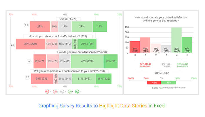
This section will use a Likert Scale Chart to display insights into the survey data below.
| Questions | Ratings | Responses |
| How do you rate our bank staff’s behavior? | 1 | 229 |
| How do you rate our bank staff’s behavior? | 2 | 76 |
| How do you rate our bank staff’s behavior? | 3 | 110 |
| How do you rate our bank staff’s behavior? | 4 | 50 |
| How do you rate our bank staff’s behavior? | 5 | 150 |
| How do you rate our bank staff’s behavior? | 6 | 167 |
| How do you rate our bank staff’s behavior? | 7 | 224 |
| How do you rate our bank staff’s behavior? | 8 | 170 |
| How do you rate our bank staff’s behavior? | 9 | 10 |
| How do you rate our bank staff’s behavior? | 10 | 147 |
| How do you rate our ATM services? | 1 | 71 |
| How do you rate our ATM services? | 2 | 73 |
| How do you rate our ATM services? | 3 | 85 |
| How do you rate our ATM services? | 4 | 238 |
| How do you rate our ATM services? | 5 | 91 |
| How do you rate our ATM services? | 6 | 152 |
| How do you rate our ATM services? | 7 | 51 |
| How do you rate our ATM services? | 8 | 18 |
| How do you rate our ATM services? | 9 | 20 |
| How do you rate our ATM services? | 10 | 148 |
| Will you recommend our bank services to your circle? | 1 | 233 |
| Will you recommend our bank services to your circle? | 2 | 46 |
| Will you recommend our bank services to your circle? | 3 | 144 |
| Will you recommend our bank services to your circle? | 4 | 246 |
| Will you recommend our bank services to your circle? | 5 | 129 |
| Will you recommend our bank services to your circle? | 6 | 126 |
| Will you recommend our bank services to your circle? | 7 | 234 |
| Will you recommend our bank services to your circle? | 8 | 228 |
| Will you recommend our bank services to your circle? | 9 | 182 |
| Will you recommend our bank services to your circle? | 10 | 190 |
To get started with ChartExpo add-on for Excel, follow the steps below:


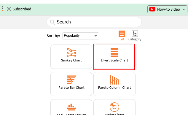

One of the tested and proven charts for displaying survey results is a Likert Scale Graph.
This psychometric scale can help you understand the views and perspectives of the market toward your brand. Besides, it has unique variants to help your business personalize its communication, among other benefits.
The survey analysis report is the most important part of the survey data storytelling because it addresses the question: Show me the data.
If you’ve just collected your survey data and you’re kind of stuck. You don’t know how to proceed. Or you want to craft a compelling data story using your survey analysis report, and you don’t know where to begin.
Survey data is complex and may involve both textual and numerical information. And this calls for a change in strategy, especially during the analysis phase.
This is where specialized graphic survey results tools, such as the Likert Scale and CSAT Score Charts, come in. These visualization designs are tailor-made specifically to help your business graph survey results faster for actionable insights.
How much did you enjoy this article?


Google Forms to Google Sheets keeps your data organized and current with every submission. Learn the steps, methods, and tips now!

Product survey questions reveal what customers truly think. Learn how to ask the right ones and act on the survey results. Read on!

Learn how the 5-Point Performance Rating Scale improves employee evaluations with clear, consistent, and fair performance reviews across teams.


