Categories
By ChartExpo Content Team
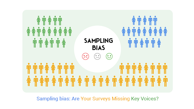
Sampling bias lurks behind surveys more often than you think. It sneaks into your data, distorting the truth, and throwing off your results.
Picture this: you’re making decisions based on survey data, only to find out later that your conclusions missed the mark. The culprit? Sampling bias. It’s like trying to guess what’s inside a gift box by shaking it—your assumptions might be way off.


Why does sampling bias happen? It often starts with who you’re asking. Maybe your survey only reaches tech-savvy respondents or excludes certain age groups. These small oversights snowball into big problems.
Sampling bias doesn’t just mislead—it undermines trust in your data, costing you time, money, and credibility. Without catching it, you’re navigating blind.
But here’s the good news: spotting sampling bias isn’t rocket science. You can fix it by understanding its root causes. By addressing these blind spots, your surveys can deliver results that truly reflect the voices you’re trying to hear. Sampling bias isn’t just a problem; it’s an opportunity to get better at capturing the big picture.
Imagine you’re throwing a pizza party and want to know everyone’s favorite topping. If you only ask your three best friends who love pineapple, you might end up thinking everyone loves pineapple on their pizza! This is a simple way to understand Sampling Bias.
In more formal terms, Sampling Bias occurs when some members of a population have a higher chance of being included in the sample than others. This can skew the survey results and give a misleading picture of the whole group. It’s like assuming everyone loves pineapple pizza just because your friends do!
When you’re looking at survey results, always think about who was asked the questions. This can help you decide how much to trust the findings. After all, knowing about Sampling Bias can keep you from making decisions based on skewed data, just like you wouldn’t order a hundred pineapple pizzas for a party without asking everyone first!
Isn’t it fascinating how a little awareness can make such a big difference?
Undercoverage bias happens when parts of a population aren’t well-represented in a sample. Think about a survey that mainly reaches people with internet access, missing out on those without it. This can skew the results because you’re not hearing from everyone.
Non-response bias occurs when the people who choose not to respond to a survey differ in significant ways from those who do. For example, busy professionals might skip survey emails, leading to an underrepresentation of this group in the results.
Voluntary response bias is seen when only the most passionate individuals respond to a survey those who have a strong opinion. This can lead to exaggerated results that don’t accurately reflect the general population’s views.
Convenience sampling bias occurs when samples are chosen just because they’re easy to access. Imagine polling people in a single university class to estimate the opinion of an entire campus. It’s simple, but the results might not be correct for everyone.
Survivorship bias involves focusing on the “survivors,” or those who made it through some process while ignoring those who didn’t. For instance, studying successful companies without considering failed ones can give a misleading picture of what makes a business thrive.
Ever heard of the saying “garbage in, garbage out”? Well, it fits perfectly when we talk about flawed sampling frames in surveys. A sampling frame is a list from which a sample is drawn. It’s the backbone of your survey. If this list is messed up, your whole survey will be too.
Think of it like baking a cake with the wrong ingredients listed. If you’re missing several key ingredients or have the wrong ones, your cake won’t come out right. Similarly, if your sampling frame is outdated or incomplete (say, using a phone book in the digital age), you’re already off to a bad start. You’ll end up with results that don’t reflect the true scenario.
Also, bias sneaks in if the frame overly represents certain groups. If your list includes more urban dwellers but few rural folks, your findings will tilt unfairly towards city life. It’s like trying to understand flavor preferences across the U.S. by only asking people in New York City. Doesn’t quite work, does it?
A poorly designed survey is like a row of dominoes set up incorrectly; one mistake can knock everything else down. If questions are confusing or leading, you can bet the answers won’t be reliable. It’s like asking someone, “Don’t you just love the refreshing taste of Brand X soda?” rather than “Which soda brand do you prefer?” The first question nudges them to favor Brand X, skewing your results.
Also, the order of questions can mess things up. If you ask detailed questions about a topic before a more general question on the subject, you can influence how they think about it moving forward. It’s like showing someone a scary movie scene before asking how they generally feel about horror movies. Their thoughts are tainted!
Complex questions are another pitfall. If respondents get confused, they might just pick any answer to move past it, which doesn’t help you get the true picture. Keep it simple and clear, or you’ll trip over your survey design.
Now, let’s chat about the impact of limited resources on survey accuracy. When time, money, or manpower is short, corners get cut. It’s tempting to do things on the cheap, but oh boy, does it cost in terms of quality.
For instance, using a smaller sample because it’s cheaper and quicker might seem like a good idea at the time, but it reduces the reliability of your results. It’s like trying to predict a movie’s success by only asking a handful of people who watched it. Not very convincing, right?
Or maybe there’s a rush to meet a deadline, so the survey is distributed quickly without proper testing or without reaching a diverse group of people. It’s akin to painting a room in a hurry and missing spots here and there. Sure, the job’s done, but the finish isn’t great.
Ever looked at your survey results and felt something was off? If everyone in your data set seems to be from the same age group, income bracket, or region, then you might have a case of skewed demographics.
This uniformity can be misleading. It’s like hosting a party and only folks from one neighborhood show up – does that give you a full picture?
Now, let’s talk about the folks who didn’t fill out your survey. High non-response rates can dramatically twist your survey results. Imagine throwing a huge bash but most invitees ghost you.
The opinions of the few who show up aren’t truly representative of the whole group. It’s the silent majority that might hold different views, and their silence can skew your survey outcomes.
Lastly, beware of the outliers. These are the extreme responses that can drag your data in misleading directions. Say you’re assessing average household spending on groceries, and a couple of millionaires toss in their weekly splurge. Suddenly, it looks like everyone’s spending a fortune on food each week when that’s not the case for most folks.
Random sampling is exactly what it sounds like: picking names out of a hat without looking. But here, the hat is huge, and every name from the population needs to be in there. It’s a fair way to ensure that every individual has an equal chance of being picked. No favorites, no biases.
Stratified sampling involves dividing the population into smaller groups, or strata, based on shared characteristics. This way, each group gets represented proportionally in the final sample. Think of it as organizing a party playlist so that everyone’s music taste gets a turn.
Quota sampling is about filling specific quotas from different groups within the population. It ensures diversity and balance in the sample. It’s like making sure both veggies and sweets are served at the table, catering to all preferences.
Pilot testing is like the dress rehearsal before the main event. It involves trying out the survey on a small scale to catch any issues before they can cause trouble in the full study. This step can save a lot of time and resources by fixing problems early on, ensuring the final results are solid and reliable.
Crafting questions for a survey? It’s an art and a science. To keep things balanced, focus on neutrality. Avoid leading questions that might nudge respondents towards a particular answer.
For example, instead of asking, “Don’t you think product X is amazing?” try “How would you rate product X?” Also, mix up the scale positions to avoid response patterns, like always choosing the first or last option. And here’s a fun tip: keep an eye on question order.
Sometimes, earlier questions can influence responses to later ones. Keep it fair, keep it square!
Visuals aren’t just for show; they’re crucial for spotting trends and gaps in surveys. By transforming survey data into charts, you can quickly see where satisfaction dips. CSAT Survey Chart can highlight how different segments feel about your service or product.
Notice a lot of neutral or dissatisfied customers? That’s your cue to dive deeper and find out why. Visuals help you catch these red flags early, turning data into action.
Likert scales are great for gauging opinions, but watch out for bias in the responses. When reviewing Likert scale data, look for patterns. Is there a trend towards the middle options, or are most responses at the extremes?
This could indicate central tendency bias or acquiescence bias. Charts can help here, too. Plotting responses on a graph can show if your data skews a certain way.
It’s a visual clue that maybe your questions or the scale itself might be leading respondents subtly. Don’t let bias tip the scales!
The following video will help you to create a Likert Scale Chart in Microsoft Excel.
The following video will help you to create a Likert Scale Chart in Google Sheets.
The following video will help you to create a Likert Scale Chart in Microsoft Power BI.
Sometimes, certain voices are quieter in the data, not because they have less to say, but because they are fewer in number. Oversampling steps into the spotlight of these underrepresented groups.
By intentionally including more individuals from these groups than their proportion in the overall population would suggest, you give them a microphone in the data chorus.
This isn’t about tipping the scales unfairly; it’s about adjusting the volume so everyone’s voice can be heard equally. Think of it as adjusting a group photo so everyone, whether in the front row or the back, is visible.
Weighting adjustments are your toolkit for fairness in survey data. When some groups are overrepresented and others are whispers in the wind, weighting comes to the rescue. It adjusts the influence of each response to match the actual demographics of the whole population.
If you’ve got a room full of tenors drowning out the altos, weighting is like turning down the microphone on the tenors and giving the altos a boost. This ensures that the final results are a true reflection of the community, giving everyone a fair say in the outcome.
Notice odd patterns in survey data? They might be signs of sampling bias. Say, if survey responses from a particular age group drastically differ from others, it could suggest overrepresentation.
These patterns often pop up as outliers or trends that don’t fit with other data you have. Spotting these can help you question whether the survey results are showing true preferences or just biased data.
What do you do when you spot potential bias? Don’t toss your data yet! First, see if you can adjust it. You might weight responses differently to better mirror the general population.
For instance, if older adults are underrepresented in your survey, you might give their responses more weight. Deciding when to adjust and when to trust your data can be tricky, but always aim for a balance that reflects a more accurate picture of the entire group you’re studying.
The broader your net, the more diverse your catch. When recruiting survey participants, use a variety of channels. Social media platforms can attract different demographics, as can email campaigns, website pop-ups, or in-store surveys.
Each channel reaches different segments of the population, enhancing the diversity of your sample. This varied approach helps in balancing out the over or underrepresentation of particular groups, leading toward more balanced insights.
Understanding who is taking your survey is crucial. Pre-screening helps in refining your sample group so that it truly reflects the population you’re studying. Implement a short set of questions to qualify participants before they take the main survey.
This might include demographic questions or queries about usage habits if you’re researching product use. Pre-screening ensures that the data you collect comes from a representative sample, boosting the validity of your insights.
Regularly check your survey processes and results for signs of bias. Are certain questions consistently skewing in one direction? Is a particular demographic overly represented? Auditing can uncover hidden biases and areas where the survey design might be influencing the results.
Address these issues by revising question structures or adjusting your sample recruitment strategy. Continuous monitoring is essential to maintain the integrity and accuracy of your survey data.
To evaluate a survey’s credibility, scrutinize its methodology section. Was the survey random, or did it invite only a certain group of respondents? This can heavily influence the results.
Also, check the survey’s date. Older data may not reflect current trends or attitudes, reducing its relevance.
Another key aspect is the survey’s funding source. If a candy company funds a survey showing their candy is the most popular, that’s a red flag. Transparency in disclosing conflicts of interest is crucial for trust.
Benchmarking is comparing one set of survey results against a standard or across different datasets to gauge where things stand.
For instance, if your customer satisfaction survey shows an 80% satisfaction rate, that sounds great—until you realize the industry average is 95%. This comparison not only puts your data in perspective but also pushes you to dig deeper into why your numbers might lag.
Don’t just look at the numbers; analyze what they imply about your processes, products, or services about others in your field.
Randomization is your first line of defense against sampling bias. When you randomize the selection of survey participants, you’re making sure that each member of your population has an equal chance of being chosen. This method plays fair with probability, keeping the survey results more representative of the entire group.
Think of it this way: if you’re picking teams for a game, you wouldn’t just pick your friends, right? You’d draw names from a hat to keep it fair. That’s randomization in a nutshell.
Don’t forget to double-check your demographics! It’s vital to ensure that all segments of your population are included. If your survey sample misses out on key demographics, the results might tilt in one direction.
For instance, if a survey about workplace satisfaction only reaches upper management and misses the entry-level employees, can you really trust the results? Make it a point to include everyone, from the interns to the CEO.
Document every step of your survey process. Why? Because bias hates a paper trail. By keeping detailed records, you can track back and identify if and where bias might have crept into the survey.
Recording your methodology also helps in maintaining consistency across different stages of the survey or in future surveys. It’s like keeping a diary for your survey process – every entry helps you stay clear and accountable.
It’s a common snag: you conduct a survey, crunch the numbers, and suddenly realize the results don’t make sense. The culprit? Often, it’s sampling bias—those pesky errors that sneak in when your survey sample doesn’t accurately represent the broader population.
It’s like throwing a party and only inviting people from one apartment block—sure, it’s easier, but does it give you a diverse perspective?
The fix is simpler than you might think: pilot testing. Think of it as your survey’s dress rehearsal. Before you roll out the red carpet for your main survey, bring in a diverse group to take it for a spin.
This step can catch bias red-handed, ensuring your sample mirrors the diversity of the whole population. It’s like checking the weather before a picnic; it doesn’t guarantee sunshine, but you’ll know if you need to pack an umbrella!
Budget constraints can be a real headache, especially when you’re told a larger sample size is your only ticket to reliable data. It’s like knowing you need a feast but only having the budget for a snack.
Here’s a savvy workaround: stratified sampling. Imagine you’re making a fruit salad. Instead of randomly grabbing fruits which could leave you with too many bananas and no kiwis stratified sampling ensures you pick just the right amount of each fruit, based on how much of each you need for the perfect mix.
Apply this to your survey by dividing your population into key groups (or “strata”) and sampling from each. This way, each group is fairly represented, giving you a balanced view without breaking the bank. It’s about being smart, not splashy!
Have you ever wondered why some products seem to miss what customers want? Often, it’s because not all customer voices are heard. Customer feedback surveys are vital, but if they only reach a certain group of people, they’re not as helpful as they could be. It’s like listening to a choir but only hearing the tenors!
For truly effective surveys, companies must reach a diverse population of their customer base. This includes different ages, genders, locations, and other demographic factors. By doing so, they gather a range of insights and can better understand the needs and desires of all their customers, not just a vocal few.
Getting the pulse of the market is crucial for any business looking to stay competitive. But what if the pulse you’re getting is not the right one? This is what happens when there’s sampling bias in your market research. You think you know the trends, the preferences, and the demands, but in reality, you’re seeing a distorted picture.
To capture accurate market data, it’s essential to use random sampling techniques and ensure your sample size is large enough to include various customer categories. This reduces the risk of bias and gives a clearer, more accurate picture of what the market truly demands.
By doing so, businesses can tailor their products and strategies effectively, meeting the real needs and expectations of their market.
Healthcare surveys are vital for improving service quality and patient care. The challenge is to include a diverse group of patients to avoid sampling bias. This means reaching out beyond the easy-to-contact patient population to include those who are often overlooked, such as non-English speakers or individuals without internet access.
For example, a hospital might use paper surveys in multiple languages or provide assistance for those who need help filling out a survey online. By making the extra effort to include every patient group, healthcare providers can obtain a more accurate picture of patient satisfaction and areas needing improvement.
Remember when political polls have missed the mark? Often, this is due to sampling bias. To avoid the next big blunder, pollsters must ensure their sample represents the diverse political spectrum. This includes people of all ages, locations, and political affiliations.
One effective strategy is to use stratified sampling, where the population is divided into subgroups and random samples are taken from each subgroup. This method helps to mirror the population’s diversity in the sample, which can lead to more accurate predictions and insights into public opinion.
By paying careful attention to sampling methods, pollsters can improve the reliability of their forecasts and avoid surprises come election day.
You might think grabbing the easiest group of people to answer your survey will save time and effort. Wrong move! This is called convenience sampling. Sure, it’s quick, but it’s like picking low-hanging fruit; it doesn’t represent the whole tree.
Imagine only talking to first-year college students about university reform. Their views might not match those of other years or faculties.
So, what’s the fix? Aim for a random sampling method. This way, every individual in your target population has an equal chance of being chosen. It requires more legwork but trust me, the results are worth it. You’ll get a clearer, more accurate picture of the overall opinions and experiences of the group you’re studying.
Ever sent out a bunch of survey invites only to hear crickets? Many make the mistake of just shrugging and moving on. However, non-responses can lead to significant biases. Those who don’t respond might have different opinions than those who do. Think about it: maybe the busiest people, who might think differently, just didn’t have time to answer.
To tackle this, first, make your survey as accessible as possible. Keep it short and sweet—people might not have time for a survey that looks like a time sink. Second, send gentle reminders. A little nudge can go a long way in boosting your response rates. Lastly, consider offering incentives. A small reward can motivate people to take time and share their thoughts.
By being aware of these pitfalls and actively working to avoid them, you’re on your way to collecting more reliable and meaningful data from your surveys.
Sampling bias can make or break your survey results. If your sample doesn’t reflect the full picture, you’re making decisions with incomplete data. That can lead to bad calls, wasted money, and lost trust. Sampling bias doesn’t care if it happens by mistake or poor planning—the damage is the same.
Fixing sampling bias isn’t a one-and-done task. It takes vigilance. Define your target audience clearly. Use fair sampling methods. Watch for red flags like missing demographics or inconsistent results. The more balanced your approach, the more accurate your data.
Good data leads to smart decisions. Ignoring sampling bias? That’s like shooting an arrow blindfolded. Take the blindfold off, and aim with confidence.
How much did you enjoy this article?


Google Forms to Google Sheets keeps your data organized and current with every submission. Learn the steps, methods, and tips now!

Product survey questions reveal what customers truly think. Learn how to ask the right ones and act on the survey results. Read on!

Learn how the 5-Point Performance Rating Scale improves employee evaluations with clear, consistent, and fair performance reviews across teams.


