Categories
By ChartExpo Content Team
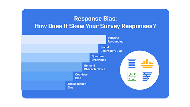
Ever wondered why surveys sometimes miss the mark? Response bias is a sneaky factor that can throw off your data, making results unreliable. It’s what happens when people’s answers aren’t entirely truthful or accurate.
Sometimes it’s intentional, but often it’s not—they might be influenced by how a question is framed or by their own desire to give a socially acceptable response.


Response bias doesn’t just skew your numbers; it reshapes the story your data tells.
Imagine asking someone about their eating habits. They might avoid admitting to late-night snacks because it feels embarrassing. The result? Your data ends up missing the full picture. That’s how response bias can quietly sabotage even the best-intentioned surveys.
But response bias isn’t unbeatable. By recognizing the types and causes, you can start designing surveys that encourage honest, balanced responses. Whether it’s adjusting question order or choosing neutral language, small changes can lead to more reliable data—and better decisions.
So, how are your surveys handling response bias?
First…
Let’s talk about response bias and why it’s a big deal for the accuracy of survey data. First off, many think it’s only about lying. Not true! It’s more about the subtle ways people might respond differently based on how questions are worded or who’s asking.
Another big myth? That it’s easy to fix. If only! In reality, spotting and correcting response bias is more like solving a tricky puzzle without all the pieces.
By understanding these missteps, we get better at designing surveys that really tell it like it is. And that’s a win for everyone relying on accurate data to make decisions.
Response bias refers to the tendency of survey participants to answer questions inaccurately or dishonestly, leading to skewed results. This bias often stems from external factors, such as how the questions are worded, the order in which they’re presented, or even the presence of an interviewer. It distorts the true intentions or beliefs of the respondents, making the collected data unreliable for decision-making or data analysis.
Surveys are a common method for gathering data, but they come with an inherent risk of response bias, which can skew results. By understanding various types of response bias, researchers can improve data interpretation, design better surveys, and ensure more accurate insights. Here, we’ll look at some common biases.
Acquiescence bias occurs when participants tend to agree with statements regardless of their content. Why do people do this? It’s often easier to agree than to think critically about each question, especially in long surveys.
This bias can lead researchers astray, making them believe there’s agreement on issues where there might be none.
Nobody wants to look bad, right? That’s the crux of social desirability bias. Here, respondents answer in a way they believe will be viewed favorably by others. Admitting to unpopular opinions or behaviors? Not likely if you’re worried about keeping up appearances.
This bias is particularly tricky in surveys about personal habits or opinions.
Some folks love the extremes; they’re the ones picking “strongly agree” or “strongly disagree” on surveys. Others prefer a more moderate stance, avoiding any strong commitment. Both extremes and moderate responding biases can distort the true sentiment of the survey population, pulling data toward either end of the scale.
First impressions matter, even in surveys for business. The anchoring effect, also known as anchoring bias, occurs when initial information or values provided in a survey influence how people respond to subsequent questions, potentially skewing their answers.
For example, if an early question suggests that most people engage in a behavior, respondents might be swayed to agree that they do too, impacting the accuracy of customer behavior analytic insights.
When crafting survey questions, the choice of words can heavily influence the responses. Neutral wording is key.
For instance, asking “What is your opinion on the moderate policy for recycling?” rather than “Isn’t the fantastic recycling policy great for our future?” keeps the query unbiased. This method encourages honest, natural responses, free from the push of leading or emotionally charged words.
The order in which questions are presented can subtly sway a participant’s answers. Surveys should flow logically from less sensitive to more sensitive topics, avoiding any sudden jumps that might skew responses.
Placing demographic questions at the end of the survey often prevents respondents from feeling pigeonholed or overly self-conscious about their answers throughout the survey, thus reducing response bias.
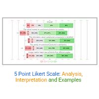
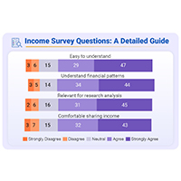
Likert Scale charts are incredibly effective for measuring attitudes or reactions in a nuanced way. These charts allow respondents to express the intensity of their feelings on a symmetrical scale of agreement or disagreement.
This format can capture the subtlety of opinion across a spectrum, from “strongly agree” to “strongly disagree,” making it easier to identify trends and patterns in attitudes.
Incorporating a Likert Scale chart into the survey design helps in obtaining more precise data while allowing respondents to reflect thoughtfully on their stances.


Pre-survey communication acts as the first handshake between researchers and participants. It sets the stage for how respondents perceive and interact with the survey. By crafting transparent and respectful pre-survey messages, researchers build trust. This trust is crucial in encouraging honest and thoughtful responses, minimizing response bias.
The secret sauce to effective pre-survey emails lies in their ability to make respondents feel valued and respected. A simple acknowledgment of the respondent’s time and effort can go a long way.
Moreover, ensuring confidentiality and clearly stating the purpose of the survey reassures participants that their responses serve a meaningful cause. Just like a well-constructed scatter graph reveals patterns in data, a thoughtfully crafted email can boost participation rates and enhance the quality of the data collected.
When it comes to setting the tone in pre-survey communications, think of it as striking the right chord on a guitar. Too tight, and the string snaps; too loose, and the note falls flat.
The tone should be neutral and professional, steering clear of persuasive language that might influence respondents’ answers. This neutrality helps in gathering data that truly reflects the respondents’ opinions and behaviors, free from the sway of leading or loaded questions.
When you’re knee-deep in survey data, spotting bias can be as tricky as finding a needle in a haystack. Here’s where visual tools step up to the plate. Forget the usual suspects like donut charts or the classic scatter plot vs. line chart debate; let’s talk about some less common heroes who bring those hidden biases into the spotlight.
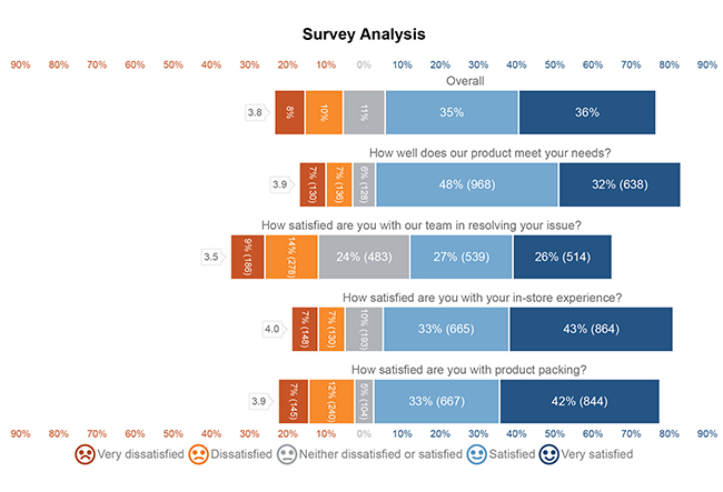
A CSAT Survey Bar Chart shows patterns that might otherwise be hidden, nudging you to dig into why certain responses dominate and helping you adjust for more balanced customer feedback. It’s like a spotlight on hidden survey trends.
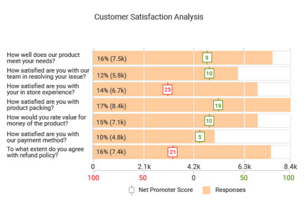
Now, let’s dig a bit deeper. The CSAT Survey Chart helps you focus on areas needing further review. You don’t need to comb through raw data—bias trends pop out clearly in the chart, saving time and making analysis straightforward.
Likert scales are the bread and butter of survey data. But how do you make sure you’re not just seeing what you want to see in those agree-disagree spectrums?
A Stacked Area Chart comes to the rescue. It layers the response levels, helping you visualize the distribution and intensity of responses. This makes it easier to spot any trends or biases, like central tendency bias where respondents might avoid extreme responses.
The following video will help you create a CSAT Score Survey Chart in Microsoft Excel.
The following video will help you to create a CSAT Score Survey Chart in Google Sheets.
When it comes to gathering data, the accuracy of the results hinges on the techniques used in survey data collection to sample the population.
One effective method is random sampling. This approach helps avoid voluntary response bias, a common pitfall where individuals with strong opinions are more likely to participate, potentially skewing the results.
In random sampling, every member of the target population has an equal chance of being selected. This randomness ensures that the sample represents a wide range of perspectives, reducing the likelihood of bias.
By incorporating individuals who might not have chosen to participate on their own, random sampling provides a more accurate reflection of the entire population’s attitudes and behaviors.
Diverse populations pose unique challenges in survey sampling. To address these, researchers must consider cultural, linguistic, and socioeconomic factors that could impact participation and responses. Tailoring survey methods to accommodate these differences is crucial for minimizing Sampling bias and response bias.
Using stratified sampling, researchers can divide the population into distinct subgroups or strata based on key characteristics like age, income, or ethnicity. Then, participants are randomly selected from each stratum.
This technique ensures that all segments of a diverse population are adequately represented, enhancing the reliability of the survey results.
Additionally, providing surveys in multiple languages and formats can improve accessibility and encourage participation among all demographic groups, further reducing potential biases.
Tailoring interactions to respect cultural norms and sensitivities also plays a vital role in encouraging honest and accurate responses.
When we talk about gathering data, how we collect responses plays a big role in the quality of information we get. Different survey methods can lead to different kinds of response biases.
For instance, online surveys often suffer from self-selection bias, where only those with strong opinions or particular characteristics may choose to respond.
On the other hand, offline methods, like mail-in surveys, might not catch the tech-savvy crowd, skewing results towards older demographics.
Think about this: when you’re tapping away on a keyboard, might you be more candid than face-to-face?
Online surveys provide anonymity, which can reduce social desirability bias—where people answer in a way they think is more socially acceptable.
However, offline surveys aren’t without their perks. They tend to have higher response rates, as some folks feel a stronger commitment to complete a survey when it’s handed to them by a real person.
But here’s a twist, they can also encourage acquiescence bias, where respondents might just agree with the survey items to please the interviewer.
Ever had a chat on the phone and found yourself agreeing just to wrap up the call? That’s acquiescence bias in action, and it’s rampant in phone surveys.
Respondents often agree with statements without fully engaging with the question content.
In-person surveys also have their pitfalls. The presence of an interviewer can lead to social desirability bias. People want to appear good or fit into socially acceptable norms, so they might tweak their true feelings.
Imagine being asked about your recycling habits in person—might you overstate your green efforts a bit?
By understanding these dynamics, we can choose the survey mode that best fits our research needs and mitigate potential biases. And remember, no method is perfect, but knowing their limitations helps us get closer to the truth!
When handling survey data, it’s essential to consider that responses may not always represent the true sentiments of the population. Response bias can skew results, leading to inaccurate conclusions.
To counter this, researchers apply statistical adjustments. These adjustments help in aligning the survey responses closer to what might be the actual scenario if there were no biases.
Propensity Score Matching (PSM) is a statistical technique used to adjust for response bias in survey data. It involves pairing respondents with similar characteristics but different exposure to the treatment condition. By doing so, PSM attempts to mimic a randomized control trial, often visualized using statistical graphs, thereby minimizing the effect of confounding variables.
For instance, if you’re analyzing a health intervention survey, PSM helps in matching individuals who received the intervention with those who didn’t but share similar health attributes. This method is crucial in studies where random assignment is not possible.
Regression models are another robust tool for adjusting response bias in survey data. These models estimate the relationships between the survey response (dependent variable) and one or more predictor variables, while accounting for bias.
For instance, logistic regression can be used to adjust for nonresponse bias by modeling the probability that a survey response is influenced by certain predictors.
This statistical approach helps in understanding how different factors contribute to the likelihood of response biases, providing more reliable results from the surveyed data.
When it comes to understanding how different people respond to surveys, demographics play a huge role. Think about it: age, gender, race, and education level can all affect how someone might answer a question.
This isn’t just a hunch—research shows that these factors can lead to response bias, which is when certain groups respond differently not just because of the question, but because of their background or social status.
For instance, older folks might answer questions about technology differently from teenagers, right?
That’s not because they misunderstand the question, but perhaps because their familiarity and comfort with tech vary wildly.
Gender can also influence responses, particularly on topics related to social norms or roles. Men and women might have different views that are deeply influenced by cultural expectations.
So, when you’re setting out to gather data from a broad audience, understanding these demographic influences is key. It’s not just about being fair—it’s about being accurate and making sure the data you collect truly reflects the views of all demographics.
Diving into the cultural and generational waters, we find that these factors are like the undercurrents that shape how people perceive questions and therefore, how they respond. Culture shapes our beliefs, values, and behaviors, so it naturally plays a big role in how we handle surveys.
For example, in some cultures, it’s common to avoid disagreeing directly, which can lead to more neutral or agreeable responses regardless of the respondent’s true feelings.
Similarly, generational differences can drastically change the way questions are interpreted. Baby Boomers might have a totally different take on workplace norms compared to Millennials, who have grown up in a digital, fast-paced environment.
This means that when you craft a survey, understanding the cultural and generational backgrounds of your audience can help you predict possible biases in their responses. It’s about asking the right questions in the right way to bridge the cultural and generational gaps.
Now, how do we ensure that our surveys resonate well across different audience groups? It’s all about customization. Tailoring surveys makes them relevant to everyone, regardless of their demographic background. This isn’t just about avoiding biased responses—it’s about inclusivity.
Start by considering the language and examples used in your questions. Are they universally understood, or could they be misinterpreted by someone from a different demographic?
Also, think about the survey format. Some groups might prefer digital methods, while others might respond better to paper-based surveys, depending on access to technology or digital literacy.
Another great tool is the use of diverse types of charts to present and clarify information, which can help in understanding complex data.
For instance, using a Mosaic plot or a Heatmap can provide visual summaries of data that are easy to understand, regardless of the respondent’s educational background.
By being mindful of these aspects, you can create surveys that are more effective in gathering accurate, unbiased data from a wide range of respondents. This approach doesn’t just improve the quality of your data—it builds trust and ensures that all voices are heard equally.
Have you ever felt your energy dip while taking a long survey? That’s fatigue bias sneaking in, and it can skew the results. To keep this at bay, let’s shorten the surveys or split them into manageable sections.
Imagine taking a break halfway through a marathon—it revitalizes you! Similarly, offering breaks or dividing the survey into distinct parts can help maintain high energy levels and sharp focus from respondents.
Keeping survey participants engaged is like keeping guests entertained at a party. Consider using varied types of questions and interactive elements. Why stick to the same old formats when you can spice things up?
Mixing multiple-choice questions with sliders, drag-and-drop rankings, or even clickable images can make the experience more interactive and less monotonous. Engaged participants are likely to provide more accurate responses, making your data gold!
Ever noticed how you remember the last items on a shopping list but forget the middle ones? That’s recency effect in action!
In surveys, this can make the last few questions influence the responses more than the earlier ones. A simple trick to fix this? Shuffle the order of questions. By randomizing, each participant gets a unique sequence, balancing out the recency and primacy effects across the data set. This way, every question gets its moment to shine!
Pilot testing surveys is like running a dress rehearsal before the big show. It’s your chance to catch any sneaky biases hiding in your survey questions.
Think of it as a detective game, where you’re the sleuth trying to outsmart those biases before they skew your results.
By testing your survey on a small group first, you can spot and fix any issues that could lead to inaccurate data. It’s all about making sure your survey is as clear and unbiased as possible, giving you the reliable data you need to make smart decisions.
Ever tried to fix a leaky faucet with the water still running? It’s a mess! Pre-testing surveys isn’t much different.
By ironing out the kinks beforehand, you avoid the mess of having to correct data after you’ve collected it. This approach saves you time and headaches. More importantly, it ramps up your data’s accuracy. You get to see how questions perform in the wild and tweak them to ensure respondents understand them the way you intended.
This means when it’s go-time, your survey is set to capture the most precise data possible.
Creating a checklist for pilot survey validation is like packing for a weatherproof vacation. You want to cover all bases to ensure nothing dampens your data collection trip.
This checklist should include language clarity, question relevance, and response consistency. Also, don’t forget to test the survey’s length; if it’s too long, you risk survey fatigue. Include a mix of question types to see how each performs, and throw in a few visual aids like a Likert Scale chart or a Crosstab chart to see if they help clarify questions.
This thorough prep helps ensure your survey tool is well-calibrated and ready to gather the high-quality data you aim for.
When you’re diving into survey data, spotting response bias is like finding a needle in a haystack. But hey, it’s not just about finding it; it’s about letting everyone know it’s there. So, how do you do that?
First up, get your numbers straight. Calculate the difference between expected responses (what you thought people would say) and actual responses (what they really said). This gives you a clear picture of the bias.
Next, don’t just keep these insights to yourself! Reporting these findings means everyone gets the real scoop. Be honest in your reports. If there’s a skew, say it. This honesty helps everyone make better decisions based on the data.
Imagine you’ve found some bias. What’s next? You gotta clean it up before it messes with your results.
Adjusting your data for bias can sound super techy, but it’s like tuning a guitar before a big concert; it ensures everything performs at its best.
When you adjust data, document every single step. Why? It helps anyone who reads your report understand how you went from a bumpy to a smooth dataset. Think of it as leaving breadcrumbs for folks to follow your thought process.
Now, let’s get visual! Forget your standard pie or bar charts; let’s spice things up.
Ever seen a heatmap or a Sankey Diagram? They’re perfect for showing how different factors flow and interact, highlighting where biases might be influencing your data.
Or try a dot plot chart for a straightforward, punchy way to show discrepancies. These visuals don’t just make your report look good; they make the biases jump out, begging to be noticed and dealt with.
So next time you’re reporting bias, bring out the big visual guns to make sure no one misses the point.
Response bias occurs when survey answers are influenced by factors that distort the true opinions or behaviors of respondents. This can happen due to question wording, the survey environment, or respondents’ desire to appear socially acceptable. These distortions can lead to unreliable data and flawed conclusions, making it crucial to identify and address response bias in surveys.
Imagine conducting a survey about recycling habits. If respondents feel judged by the surveyor or worry about giving socially undesirable answers, they might claim to recycle more frequently than they actually do. This is an example of social desirability bias, a common form of response bias, where individuals provide answers they think are expected or acceptable rather than truthful.
Respondent bias is a broader term that encompasses any systematic errors in how participants answer survey questions. It includes response bias as well as biases like acquiescence bias, where respondents agree with statements regardless of their content, or extreme responding, where participants only select the most extreme options. These biases arise from psychological tendencies, environmental factors, or survey design flaws, all of which can alter the integrity of survey results.
Response bias can often be spotted by analyzing patterns in survey results. For example, if a large number of respondents consistently choose the same response option regardless of the question, it could indicate acquiescence bias. Comparing responses across different question formats or analyzing response trends can help uncover potential biases.
Minimizing response bias starts with carefully crafting survey questions. Use neutral wording to avoid influencing answers, and arrange questions logically to reduce the impact of earlier questions on later ones. Pre-testing surveys on a smaller audience can also highlight potential biases, allowing you to make adjustments before full deployment.
While it’s challenging to eliminate response bias entirely, it can be reduced to a manageable level. Using random sampling techniques, neutral question design, and statistical adjustments helps minimize its impact. The goal is to design surveys that collect the most accurate and unbiased data possible.
Statistical methods such as regression models and propensity score matching can adjust for response bias in data analysis. Visual tools like heatmaps or Likert scale charts also help highlight patterns that may indicate bias, making it easier to interpret and adjust the data accordingly.
Random sampling ensures that every individual in the target population has an equal chance of being selected. This reduces voluntary response bias, which occurs when only highly opinionated individuals participate. A diverse and representative sample leads to more reliable and unbiased survey results.
Response bias can subtly undermine the accuracy of your survey data, distorting the insights you rely on. By recognizing its impact and understanding its various forms, you can design better surveys that capture honest, actionable responses. From neutral question wording to strategic sampling, small changes can make a big difference.
The journey doesn’t stop with designing surveys—ongoing analysis, real-time detection, and clear reporting ensure your findings remain reliable. Tools like Likert scales, random sampling, and visual aids add depth and clarity, helping to uncover hidden patterns and correct biases.
As you refine your approach, remember: reducing response bias isn’t about perfection; it’s about progress. With the right strategies, your surveys can paint a more accurate picture, empowering decisions based on truth rather than assumption.
Bias doesn’t have to be the end of the story—it’s the beginning of smarter surveys and stronger insights.
How much did you enjoy this article?


Learn how the 5-Point Performance Rating Scale improves employee evaluations with clear, consistent, and fair performance reviews across teams.

Fun Survey Questions can raise response rates, reveal patterns, and guide survey planning across teams, classrooms, and customer research. Read on!

Learn how to create, collect, and analyze data using a 4-point Likert scale. A complete guide with definition, examples, advantages, and practical applications.


 .
.