Categories
Picture yourself standing at the entrance of a bustling mall, armed with a clipboard and burning curiosity.
Your mission? To uncover the deepest desires, quirkiest preferences, and hidden opinions of the shoppers around you.


You approach your first potential participant – a quirky individual dressed head to toe in polka dots. You can’t help but wonder what insights lie beneath those spots. With each question you ask, you peel back the layers of their shopping habits. You uncover the secrets behind their eclectic wardrobe choices and unearth the truth about their favorite stores.
But it doesn’t stop there.
You venture further into the mall, encountering teenagers huddled together, eyes glued to their smartphones. Will they put down their gadgets long enough to share their thoughts on the latest fashion trends? Or their favorite social media platforms?
Only time will tell.
Survey research design is like being a detective, piecing together a puzzle of opinions and experiences. Each question is a clue, leading you closer to the truth. Join us on this thrilling journey as we unveil the power of survey research design. We’ll uncover insights that will leave you amazed and a little wittier.
Let’s get started.
A survey design in research is the methodological plan or framework used to collect data through surveys. It involves the following;
The design of a survey is crucial as it determines the quality and reliability of the survey data collected. A well-designed survey ensures the questions are clear, unbiased, and relevant to the research objectives. It also minimizes potential sources of error, such as non-response or measurement bias.
The juiciest discoveries are often hidden in the depths of a well-crafted survey. Below are some of the reasons why designing a survey in research is of paramount importance:
The cross-sectional design captures a vibrant moment in time, much like a customer journey map that outlines a snapshot of a consumer’s experience at a specific point. It gathers insights into a selected group’s unique characteristics, attitudes, or behaviors. Consequently, it provides a snapshot of the population, enabling you to explore connections and draw broad conclusions. However, it cannot establish causality or capture changes over time.
The longitudinal research design entails gathering information from the same individuals or groups over an extended duration. This approach, often referred to as a longitudinal survey, aims to examine shifts and patterns over time. Consequently, this enables you to gain insights into behavioral trends, developmental processes, and interconnections. Furthermore, this design offers a valuable understanding of long-term phenomena and aids in establishing cause-and-effect relationships.
The comparative research design compares and analyzes data from different groups or populations. It allows you to identify similarities and differences between groups. Then, conclude the variables under study. This design is widely used in social sciences and market research.
An exploratory research design gathers preliminary data and explores new topics or research questions. It allows you to gain insights, generate hypotheses, and identify trends or patterns in the data. It is instrumental in the early stages of research when little is known about the topic.
The case study research design acquires data that unravels the enigmatic threads of a situation. It unlocks the gateway to profound insights, delving into the tapestry of participants’ experiences, opinions, and behaviors.
Utilizing tools like a survey template in Excel can enhance this process, allowing researchers to efficiently gather and analyze both qualitative and quantitative data. This approach is particularly handy for studying unique or complex cases and can provide valuable insights.
Here are six essential steps to consider when designing a survey in research:
Excel, the trusty companion of data analysis, can crunch numbers like a pro. However, when it comes to data visualization, it falls short.
Are you tired of Excel leaving your survey data high and dry when it comes to visualization?
Well, fret no more.
ChartExpo, your knight in shining add-in armor, is here to rescue your survey data analysis in Excel. ChartExpo will turn those boring numbers into insightful, appealing charts that will leave your audience in awe.
Benefits of Using ChartExpo
How to Install ChartExpo in Excel?
ChartExpo charts are available both in Google Sheets and Microsoft Excel. Please use the following CTA’s to install the tool of your choice and create beautiful visualizations in a few clicks in your favorite tool.
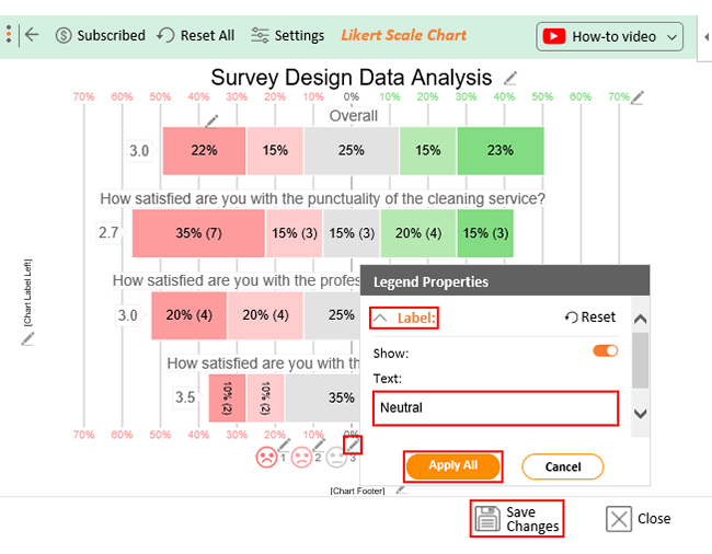
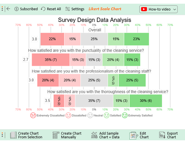
Let’s say you run a cleaning services business. You have created a survey using one of the survey research methods with the following questions.
Your survey design has the scale below mapped on each question
Let’s say your survey yields the results table below.
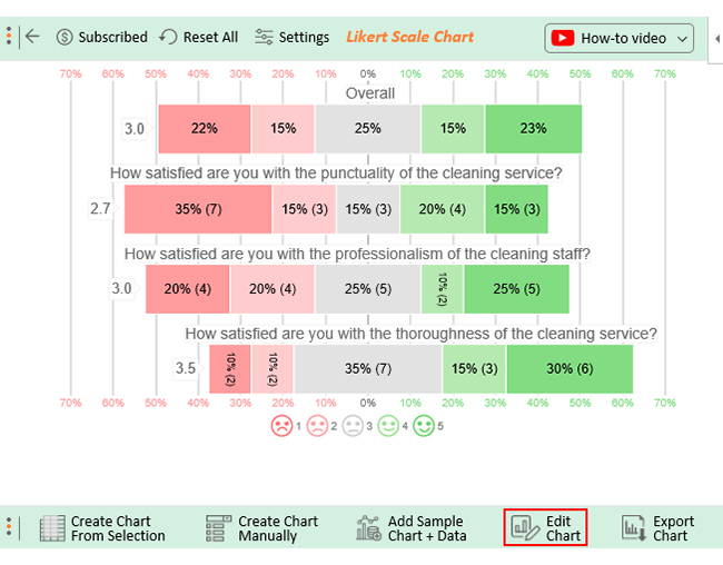
| How satisfied are you with the punctuality of the cleaning service? | How satisfied are you with the professionalism of the cleaning staff? | How satisfied are you with the thoroughness of the cleaning service? |
| Extremely Dissatisfied | Dissatisfied | Neutral |
| Dissatisfied | Extremely Dissatisfied | Extremely Dissatisfied |
| Extremely Satisfied | Extremely Satisfied | Neutral |
| Extremely Dissatisfied | Extremely Satisfied | Satisfied |
| Neutral | Satisfied | Neutral |
| Dissatisfied | Extremely Satisfied | Extremely Satisfied |
| Extremely Dissatisfied | Extremely Satisfied | Extremely Satisfied |
| Neutral | Neutral | Neutral |
| Extremely Satisfied | Dissatisfied | Extremely Satisfied |
| Dissatisfied | Neutral | Extremely Satisfied |
| Satisfied | Neutral | Satisfied |
| Satisfied | Extremely Dissatisfied | Extremely Satisfied |
| Extremely Dissatisfied | Dissatisfied | Neutral |
| Extremely Dissatisfied | Neutral | Extremely Dissatisfied |
| Extremely Dissatisfied | Extremely Satisfied | Neutral |
| Satisfied | Extremely Dissatisfied | Satisfied |
| Extremely Dissatisfied | Dissatisfied | Dissatisfied |
| Extremely Satisfied | Neutral | Extremely Satisfied |
| Satisfied | Extremely Dissatisfied | Dissatisfied |
| Neutral | Satisfied | Neutral |
This table contains example data. Expect many responses and questions in real life.


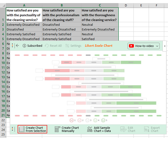
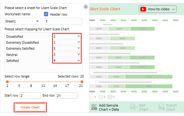
Once all is set, click the “Create Chart” button.

Surveys are commonly used in various research designs. These include cross-sectional, longitudinal, comparative, experimental, and case-study designs. Surveys provide a means to collect quantitative or qualitative data from participants. Consequently, address research questions and gather insights on specific topics of interest.
Survey research design refers to systematic data collection and analysis through surveys. Surveys involve gathering information from participants through a structured questionnaire or interview. The aim is to analyze the data to address specific research questions or objectives.
Surveys play a vital role in research for several reasons. They enable you to collect data directly from participants, providing insights into attitudes, behaviors, or opinions. Surveys facilitate data collection on a large scale, allowing for generalization and statistical analysis, leading to evidence-based decision-making.
Survey research design holds significant value and power in the realm of research. Through systematic data collection, surveys provide valuable insights into attitudes, behaviors, opinions, and more.
Survey research design allows for the collection of both quantitative and qualitative data. This offers flexibility in addressing research questions and objectives. Furthermore, the structured nature of surveys ensures consistency and comparability of the responses. Consequently enhancing the reliability and validity of the data collected.
Moreover, surveys enable you to conduct statistical analyses, uncover patterns, and draw evidence-based conclusions. Embracing survey research design allows you to make informed decisions, identify trends, and understand perspectives. Consequently, contribute to advancements in various fields.
It is crucial to design surveys thoughtfully. Consider clear objectives, appropriate question types, target population, and data analysis techniques. Well-designed surveys lead to high-quality data, yielding meaningful and actionable results.
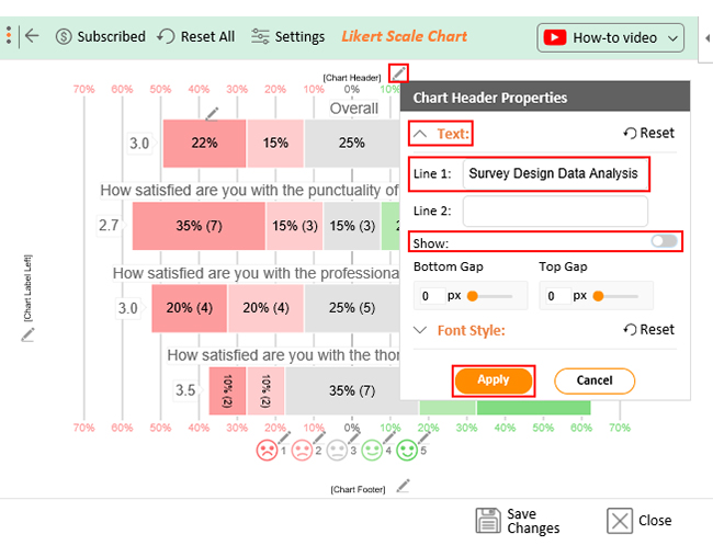
The integration of ChartExpo amplifies the value of survey research by transforming raw data into compelling visualizations. ChartExpo, allows you to communicate findings in an engaging and accessible manner. As a result, it facilitates data-driven insights and stakeholder engagement.
How much did you enjoy this article?


Google Forms to Google Sheets keeps your data organized and current with every submission. Learn the steps, methods, and tips now!

Product survey questions reveal what customers truly think. Learn how to ask the right ones and act on the survey results. Read on!

Learn how the 5-Point Performance Rating Scale improves employee evaluations with clear, consistent, and fair performance reviews across teams.


