Categories
Surveys play a crucial role in gathering information, and various types of surveys cater to specific needs across fields such as academia, business, and social sciences.


Survey data can help you retain the best talent, drive more profits”¦and grow your market share. Understanding the nuances of survey design is crucial for anyone seeking to extract meaningful information from participants.
Before we dive into the specific types, it’s essential to understand the fundamental categories that surveys fall into. Broadly, surveys can be categorized into two main types: Questionnaire Surveys and Interview Surveys.
Questionnaire surveys involve participants responding to a set of predefined questions, often distributed on paper or electronically. On the other hand, interview surveys entail direct interaction between the surveyor and the participant, allowing for more in-depth responses.
In this blog, you’ll learn:
Before jumping into the listicle, we’ll address the question: what is a survey type?
Definition: Survey type refers to the method you can use to conduct the survey. A survey comprises questions that aim to extract specific data from a particular group.
You can conduct a survey by phone, mail, via the Internet, etc. The tool can help you to assess thoughts, opinions, and feelings.
Psychologists and sociologists use surveys to assess behaviors. In other sectors, such as advertising and finance, surveys are widely used to probe the deeply felt needs of consumers (audiences).
In medical and surgical fields, surveys are critical in gathering data to improve medical outcomes and drive patient-led intervention.
So, what is survey data?
Survey data is the information you get from a target audience (or a group).
This data is usually about a specific topic or theme. There are multiple methods of gathering data via a survey.
However, most seasoned visualization gurus use freemium tools like Google and Microsoft Forms to collect survey data faster.
It gets better.
These survey-based applications are free and shareable via website embeds and social media.
In the ensuing section, we’ll address the following question: what are the main survey research methods?
There are several reasons why survey research is conducted:
Surveys facilitate survey data collection on opinions, attitudes, behaviors, preferences, and characteristics. This data offers valuable insights across diverse topics, aiding in understanding various phenomena.
Surveys allow for measuring trends and changes over time. You can track shifts in public opinion, market trends, or societal attitudes by conducting surveys periodically.
Survey research provides valuable data that can inform decision-making processes. Organizations, businesses, and policymakers use survey findings to guide strategies, develop products, improve services, or shape public policies.
Surveys help assess the needs and satisfaction levels of customers, employees, or the general population. This information is crucial for identifying areas of improvement and enhancing overall satisfaction.
You can use surveys to predict or forecast future outcomes. You can identify patterns and trends in the data indicative of future behaviors or trends.
Surveys are widely used to investigate hypotheses, test theories, and contribute to scientific knowledge. They provide a structured and systematic approach to gathering data for analysis.
Surveys gauge public opinion on politics, social matters, healthcare analytics, and more. This information helps policymakers understand the public’s sentiments and decide accordingly.
The main types of surveys are as follows:
Let’s discuss the types of surveys in detail:
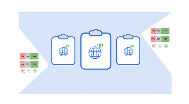
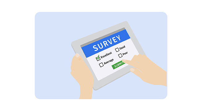
Online surveys are digital questionnaires distributed via email, websites, or social media. They are widely used due to their convenience and cost-effectiveness, allowing participants to respond at their convenience from any location.
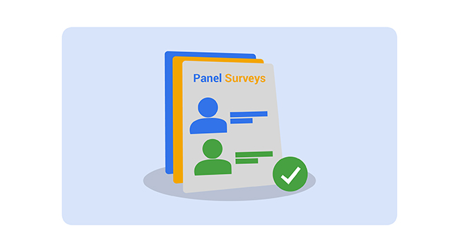
Panel surveys involve collecting data from a group of pre-selected respondents over some time. These surveys are effective for understanding changes in behavior or opinions over time.
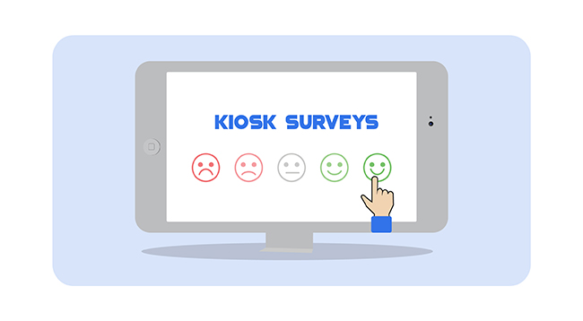
Kiosk surveys are set up in physical locations, typically in malls, airports, or stores. Respondents can use touchscreen devices to provide immediate feedback on services or products.
Telephonic surveys are conducted over the phone, where an interviewer asks the respondent questions. They are particularly useful when seeking detailed responses or for targeting specific demographics.

Pop-up surveys appear on websites or applications while a user is browsing. These are commonly used for gathering real-time feedback on user experience and website performance.
Paper surveys are traditional questionnaires distributed in physical form. They are effective in locations with limited internet access and are still used in various industries like healthcare and education.

Intercept surveys are conducted in person by intercepting people in public places, such as malls or events. These surveys capture immediate reactions to products, services, or experiences.
Mobile app surveys are conducted through applications on smartphones. These are particularly useful for gathering feedback from users on the go, offering flexibility and convenience.

Mail-in surveys are sent to respondents via postal services. Participants fill out the survey and return it by mail. These surveys are effective for reaching a broader, often less tech-savvy audience.

Mail surveys are similar to postal surveys but focus on receiving feedback through electronic or physical mailing lists. These are commonly used for long-form feedback where respondents need time to provide detailed answers.

In-person surveys or one-on-one interviews involve a personal interaction between the interviewer and the respondent. These surveys provide deeper insights and allow for follow-up questions, making them ideal for qualitative research.

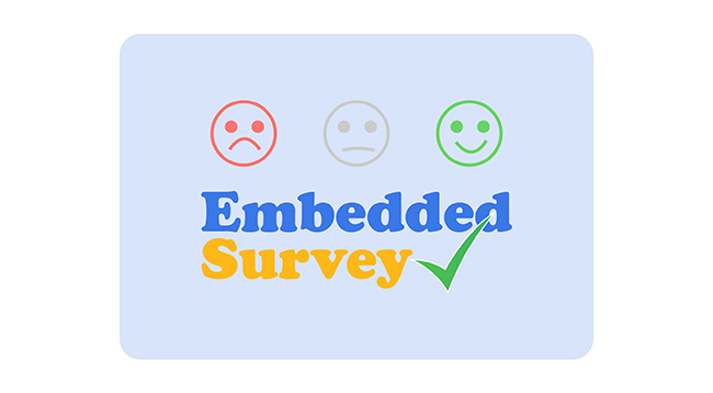
Embedded surveys are integrated into a website, app, or email content, allowing respondents to answer directly without leaving the page. This makes it easier to gather quick feedback without disrupting the user experience.
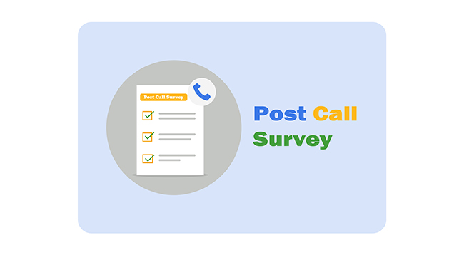
Post-call surveys are conducted immediately after a customer service call. These surveys measure the customer’s satisfaction with the interaction and the resolution provided.
Focus group surveys involve gathering feedback from a group of individuals, typically in a moderated discussion. This method is used to gain insights into collective opinions or attitudes toward products or services.

Social media surveys are conducted through platforms like Facebook, Twitter, or Instagram. These surveys are excellent for targeting specific audiences and engaging with a broad user base in a casual, interactive format.

Google Sheets is one of the spreadsheet applications you can use to store, organize, and analyze data.
However, it lacks visualizations designed purposely to visualize survey data, such as the CSAT Score Bar and Sentiment Trend Charts.
We’re not advising you to do away with it. There’s an add-on you can easily install in your Google Sheets to access survey-based visualizations.
The application is called ChartExpo.
What is ChartExpo?
ChartExpo is an add-on you can easily install in your Microsoft Google Sheets to access charts for visualizing survey questions.
Features and Benefits
This section will use one of the top 5 types of survey graphs to visualize the tabular data below.
Let’s dive in.
| Questions | Scale | Responses |
| The friendliness of teaching staff. | 0 | 4 |
| The friendliness of teaching staff. | 1 | 7 |
| The friendliness of teaching staff. | 2 | 3 |
| The friendliness of teaching staff. | 3 | 8 |
| The friendliness of teaching staff. | 4 | 5 |
| The friendliness of teaching staff. | 5 | 9 |
| The friendliness of teaching staff. | 6 | 11 |
| The friendliness of teaching staff. | 7 | 5 |
| The friendliness of teaching staff. | 8 | 7 |
| The friendliness of teaching staff. | 9 | 25 |
| The friendliness of teaching staff. | 10 | 27 |
| The approachability of teaching staff. | 0 | 3 |
| The approachability of teaching staff. | 1 | 7 |
| The approachability of teaching staff. | 2 | 2 |
| The approachability of teaching staff. | 3 | 9 |
| The approachability of teaching staff. | 4 | 4 |
| The approachability of teaching staff. | 5 | 6 |
| The approachability of teaching staff. | 6 | 12 |
| The approachability of teaching staff. | 7 | 3 |
| The approachability of teaching staff. | 8 | 6 |
| The approachability of teaching staff. | 9 | 27 |
| The approachability of teaching staff. | 10 | 31 |
| The concern shown when you have a problem. | 0 | 7 |
| The concern shown when you have a problem. | 1 | 8 |
| The concern shown when you have a problem. | 2 | 6 |
| The concern shown when you have a problem. | 3 | 14 |
| The concern shown when you have a problem. | 4 | 9 |
| The concern shown when you have a problem. | 5 | 13 |
| The concern shown when you have a problem. | 6 | 9 |
| The concern shown when you have a problem. | 7 | 14 |
| The concern shown when you have a problem. | 8 | 11 |
| The concern shown when you have a problem. | 9 | 15 |
| The concern shown when you have a problem. | 10 | 8 |
| The competence of staff. | 0 | 5 |
| The competence of staff. | 1 | 16 |
| The competence of staff. | 2 | 8 |
| The competence of staff. | 3 | 13 |
| The competence of staff. | 4 | 13 |
| The competence of staff. | 5 | 6 |
| The competence of staff. | 6 | 10 |
| The competence of staff. | 7 | 6 |
| The competence of staff. | 8 | 6 |
| The competence of staff. | 9 | 14 |
| The competence of staff. | 10 | 15 |
| The availability of staff. | 0 | 1 |
| The availability of staff. | 1 | 3 |
| The availability of staff. | 2 | 2 |
| The availability of staff. | 3 | 5 |
| The availability of staff. | 4 | 8 |
| The availability of staff. | 5 | 1 |
| The availability of staff. | 6 | 7 |
| The availability of staff. | 7 | 8 |
| The availability of staff. | 8 | 7 |
| The availability of staff. | 9 | 27 |
| The availability of staff. | 10 | 39 |


From this CSAT Score Bar Chart, you can identify how students viewed your organization.
In the coming section, we’ll learn how to present survey results with the help of a video tutorial.
In the following video, you will learn how to visualize and present survey results with the help of one of the best survey graphs.
In the coming section, we’ll address the following question: what are the main objectives of a survey?
You don’t want to miss this.
Ensure that the chosen survey method, whether it’s a longitudinal survey or another type, aligns closely with your research objectives and the insights you aim to gather. Whether you’re seeking quantitative data for statistical analysis or qualitative insights for in-depth understanding, the survey method should cater to your specific research goals.
Consider the accessibility of your target audience to the survey method. Choose a method that accommodates the preferences and characteristics of your audience, including their technological literacy, language proficiency, and availability.
Evaluate the resources available for conducting the survey, including budget, time, and personnel. Opt for a survey method that maximizes efficiency and cost-effectiveness while meeting the research requirements within the specified timeframe.
Determine the desired level of interaction with respondents based on the complexity of the research questions and the depth of insights required. Select a survey method that allows for the appropriate level of interaction, whether it’s through face-to-face interviews, online surveys, or focus groups.
Strike a balance between the reach of the survey and the accuracy of the data collected. Consider the trade-offs between broader reach and deeper insights when choosing between survey methods. Ensure that the chosen method optimizes both reach and accuracy based on the research objectives and constraints.
The two main forms of surveys are:
The most common type of survey is the web survey, conducted online through websites or survey platforms. It’s widely used for its accessibility, cost-effectiveness, and ability to reach a large audience quickly.
Web surveys offer flexible design and administration, various question formats, and targeted demographic options. They efficiently collect and analyze data, providing valuable insights for informed decision-making.
To create compelling survey data stories, you need charts designed purposely for that.
Why?
A dense spreadsheet of survey responses probably isn’t the best way to sell your points or push a recommendation.
Besides, Microsoft PowerPoint slides with just a few data points are unlikely to persuade some of your more analytical stakeholders.
This is where survey-oriented charts come in. You can use these charts as backdrops for your data stories.
Some of the survey-based charts we recommend include:
Google Sheets lacks charts (mentioned above) for visualizing survey data.
We’re not advising you to do away with the Google Sheets.
So, what’s the solution?
We recommend you install an add-on, such as ChartExpo, to access survey-based charts.
How much did you enjoy this article?


Google Forms to Google Sheets keeps your data organized and current with every submission. Learn the steps, methods, and tips now!

Product survey questions reveal what customers truly think. Learn how to ask the right ones and act on the survey results. Read on!

Learn how the 5-Point Performance Rating Scale improves employee evaluations with clear, consistent, and fair performance reviews across teams.


