Categories
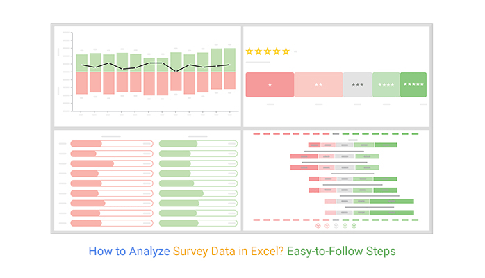
Unlock the power of survey data analysis with the versatile capabilities of Excel as we explore “How to Analyze Survey Data in Excel”.


You’ll agree that nothing can help tell a story for how to summarize survey results in Excel?.
Why?
It can lend credibility and impact to any argument, especially with an easy-to-interpret chart as the backdrop.
A massive spreadsheet of numbers probably isn’t the best way to drive your point in your presentation. A PowerPoint slide with just a few data points won’t be able to persuade everyone in your audience.
This is where visualization charts and graphs, such as Likert, CSAT Score Bar, and CSAT Survey Charts, come in.
These visualization designs are tailor-made specifically to help your business visualize survey data faster for actionable insights.
Yes, you read that right.
Excel lacks ready-to-use charts for survey data storytelling. You don’t have to avoid Excel, which is free, in favor of expensive data visualization tools.
You can supercharge it by installing third-party apps (add-ins) to access ready-made graphs for survey data storytelling.
In this blog, you’ll discover:
Before jumping right into the how-to guide, we’ll address the following question: What is survey data analysis?
Definition: Survey data analysis entails separating signal from noise in the data collected. For example, longitudinal survey data, which tracks the same respondents over time, can provide valuable insights into trends and changes.
As we said, data can help you achieve a lot. But, turning your survey data into compelling and insight-driven analysis is not always as straightforward as it seems.
Whether you’re dealing with hard percentages or qualitative statements, analyzing data and identifying patterns, including those revealed through longitudinal surveys, can help you gain actionable insights into key metrics of interest.
For instance, imagine you run a restaurant, and you notice a sudden influx of complaints about the food.
How can you deal with this?
For starters, you can leverage a feedback survey to collect data for analysis to correct the issue.
Survey analysis is critical to your business because it allows you to draw broader conclusions about your market (or audience). Numbers on their own are meaningless.
It’s the hidden trends and patterns you uncover that allow you to make actionable and reliable decisions promptly. Using a survey template in Excel can streamline the process, making it easier to organize and analyze your data efficiently. Remember, you can increase survey response rates by having engaging subject lines if using email as a mode of communication.
In the following video, we will show you how to analyze Survey Data in Excel in a few clicks without any coding.
There are a huge number of survey data analysis methods you can leverage to extract actionable answers. And they include:
This methodology entails using data from your survey responses that are arranged into rows and columns, facilitating cross-tabulation in Excel, which makes it easier to understand and analyze the relationships between different variables.
On the other hand, the aforementioned methodology leverages statistical models and charts to extract insights into key data points. We’ll focus on this methodology throughout the blog post.
In the coming section, we’ll address the significant types of survey data. You don’t want to miss it.
There are two main survey data types you can work with during analysis. While both can provide you with insights, they differ in their approach. So, awareness of these approaches can help you construct a reliable analysis framework.
Check them out below.
Quantitative data is any information that can be quantified and measured.
Besides, this methodology requires a different approach and data collection strategies. You can easily use this data to test causal relationships among key variables. Some of the common quantitative survey data collection strategies include:
For questionnaires to be effective, they’ve got to have a multiple-choice format to generate countable answers, which can be turned into numerical data.
Keep reading to discover how to analyze survey data in Excel.
Qualitative data is non-numerical data. You can collect this data type using the strategies highlighted below:
To collect data that are missing in existing documents or records, conducting interviews or focus groups is essential. These strategies can be unstructured or semi-structured, providing the freedom for varied or unexpected answers.
An unstructured or semi-structured format allows you to pose open-ended questions and follow where the responses lead, enabling you to gain a comprehensive perspective on your respondents’ experiences. This approach is crucial when you aim to visualize qualitative data effectively, as it helps capture the nuances of individual insights.
When presenting your survey data story, remember that you have a limited space to capture the reader’s attention. Use various techniques to engage your audience and make your findings resonate
In the coming section, we’ll cover the three key survey analysis goals. You don’t want to miss this.
So, what are the key goals of survey data analysis?
Your key objectives are the primary aims of your survey. They provide broad statements that explain what you’re looking to achieve with your survey exercise.
You need answers from respondents. So, your survey data analysis goals convey why you need answers.
Survey analysis goals are important because they help you ask the right questions. Besides, they protect you from ‘scope creep.’
Survey goals put your business on the right track, which is aligned with market sentiments and changing preferences.
How?
Setting goals provides you with an opportunity to define your strategy, allocate resources, and minimize your chances of problems.
Remember, it becomes easier to track your progress if you have goals. The end goal is the target. You can easily track the progress made versus the end-point using tools like the Progress Bar in Excel, which visually represents how far you’ve come.
Keep reading to discover how to analyze survey data in Excel spreadsheets. Also, we’ll take you through the best charts for representing survey data in Excel.
Some of the tested and proven charts for visualizing survey data include the following:

The Star Rating Chart is a visualization design you can use to display insights into rating data. The graph is segmented into five colored sections calibrated with both percentiles and actual rating counts.
For instance, according to the Star Rating Chart above, 54% of the ratings are either one or two stars. 31% of the ratings are either 4 or 5 stars.
The overall rating is 2.6/5
Keep reading if your goal is to learn how to analyze survey data in Excel.
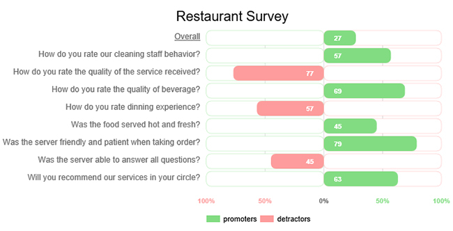
A Customer Satisfaction Chart is a graph you can use to visualize a simple yes-no questionnaire for actionable insights. It displays whether the respondents agree or disagree with a particular question associated with operations in your business.
Additionally, using a Box And Whisker plot can provide a more detailed view of satisfaction levels by illustrating the distribution and variability of responses.
The chart is segmented into two colors (red and green), which represent no and yes, respectively.


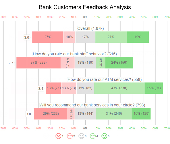
You can use a Sentiment Trend Chart to show insights into the opinions of the respondents under the study. The green color shows the proportion of respondents satisfied with various aspects of your operations.
On the other hand, the red color shows the proportion of respondents who disagree with some of your brand aspects.
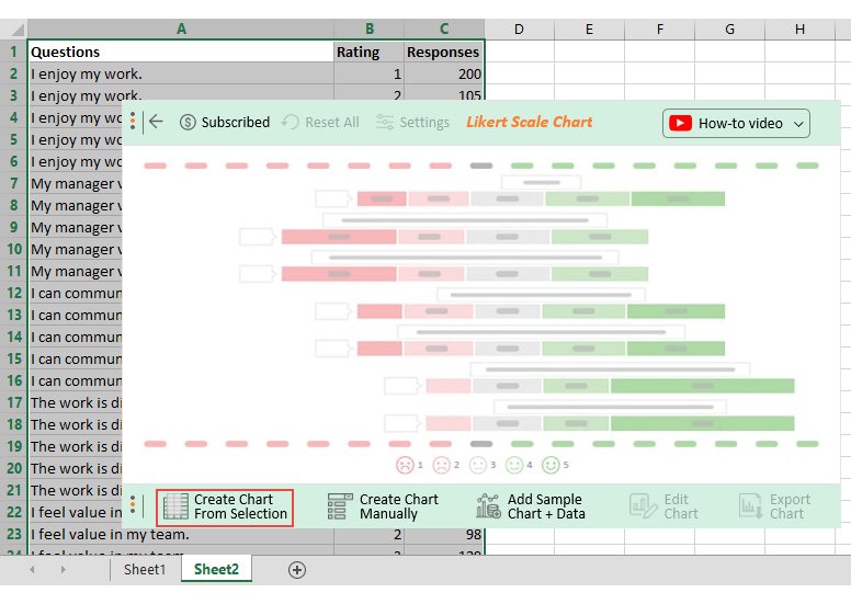
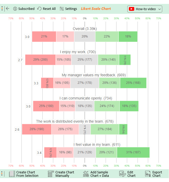
A Likert Scale Chart is a one-dimensional chart you can leverage to visualize the respondents’ attitudes and opinions.
This psychometric scale comes in handy if your goal is to understand the views and perspectives towards a brand, product, or target market.
In the coming section, we’ll address how to analyze survey data in Excel using a Likert Scale Chart (step-by-step).
Excel is one of the most used visualization tools. However, the spreadsheet application lacks ready-made survey charts, such as Likert, or specialized visualizations like the Tornado Chart, which provides unique insights into comparative data sets with their distinctive shape and visual impact.
We’re not advising you to do away with Excel in favor of other expensive tools.
This is because there’s an affordable visualization tool you can add to Excel to access insightful, ready-to-use charts after calculating survey results in Excel. The tool is called ChartExpo.
So, what is ChartExpo?
ChartExpo is an easy-to-use Excel add-in designed for calculating survey results in Excel and turning them into clear, actionable charts without needing complex tutorials.
With many ready-to-go and insightful charts, graphs, and maps, ChartExpo turns your complex, raw data into easy-to-interpret and visually appealing survey-based charts in Excel that tell data stories in real-time.
In the coming section, we’ll take you through how to analyze survey data in Excel. You don’t want to miss this if your goal is to take your survey data storytelling to the next level.
This section will use a Likert Scale Chart to visualize the survey data below.
| Questions | Rating | Responses |
| I enjoy my work. | 1 | 200 |
| I enjoy my work. | 2 | 105 |
| I enjoy my work. | 3 | 177 |
| I enjoy my work. | 4 | 140 |
| I enjoy my work. | 5 | 78 |
| My manager values my feedback. | 1 | 82 |
| My manager values my feedback. | 2 | 105 |
| My manager values my feedback. | 3 | 178 |
| My manager values my feedback. | 4 | 136 |
| My manager values my feedback. | 5 | 168 |
| I can communicate openly. | 1 | 180 |
| I can communicate openly. | 2 | 110 |
| I can communicate openly. | 3 | 135 |
| I can communicate openly. | 4 | 174 |
| I can communicate openly. | 5 | 135 |
| The work is distributed evenly in the team. | 1 | 190 |
| The work is distributed evenly in the team. | 2 | 175 |
| The work is distributed evenly in the team. | 3 | 75 |
| The work is distributed evenly in the team. | 4 | 184 |
| The work is distributed evenly in the team. | 5 | 54 |
| I feel valued in my team. | 1 | 76 |
| I feel valued in my team. | 2 | 98 |
| I feel valued in my team. | 3 | 129 |
| I feel valued in my team. | 4 | 121 |
| I feel valued in my team. | 5 | 187 |


Survey analysis is a crucial component of research and data-driven decision-making. However, like any method, it has its pros and cons. Here’s a breakdown:
Here are some pros of survey analysis:
Surveys generate quantifiable data, providing numerical insights into respondents’ opinions, preferences, and behaviors.
Surveys, including those using a 4-point Likert scale, allow for the collection of data from a large number of participants, providing a broad perspective on the target population.
Structured questions in surveys lead to standardized responses, making it easier to analyze and compare data systematically.
Surveys are often more efficient and cost-effective than other data collection methods, especially when dealing with large populations.
Respondents often feel more comfortable providing honest and unbiased feedback in surveys, especially when responses are kept anonymous.
Here are some cons of survey analysis:
Surveys may provide quantitative data, but they often lack the depth and context that qualitative methods such as interviews or focus groups can offer.
Respondents may provide socially desirable answers or be influenced by the wording of questions, leading to biased data.
Obtaining a high response rate can be challenging, and low response rates may introduce selection bias, affecting the generalizability of findings.
Surveys might miss dynamic or rapidly changing contexts, and some issues may be better addressed through real-time or observational methods.
Survey data relies on self-reporting, and respondents may not always accurately recall or report their experiences or opinions.
Start by removing duplicates and incomplete responses to keep your data accurate. Use clear labels for each column, and apply Excel tools like “Text to Columns” to maintain consistent formatting for smoother analysis.
Pivot Tables help you quickly summarize survey responses, count selections, and break down data by categories. They make it easy to spot trends and patterns without manual calculations.
Turn your survey data into visuals like bar charts or stacked bar charts to display your findings clearly. Charts make your insights easier to share in reports and presentations.
Use conditional formatting to highlight trends and outliers in your data. Color scales and data bars help you quickly see patterns, making your survey analysis more effective.
Survey data comes in two forms, namely qualitative and quantitative.
Quantitative data type is any information that can be quantified. Some of the common quantitative survey data collection strategies include surveys and reviews.
Qualitative data is non-numerical data. You can collect this data type using strategies such as focus groups.
Survey analysis is critical to your business because it allows you to draw broader conclusions about your market (or audience).
Remember, numbers are meaningless. It’s the hidden trends you uncover that allow you to make actionable decisions. You can harness these insights using survey-based charts.
How to summarize survey results in Excel?
You’ll agree that nothing can help tell a story like refined survey data.
Why?
It can lend credibility and impact to any argument, especially with an easy-to-interpret chart as the backdrop.
A massive spreadsheet of numbers probably isn’t the best way to drive your point in your presentation. A PowerPoint slide with just a few data points won’t be able to persuade everyone in your audience.
This is where visualization charts and graphs, such as Likert, CSAT Score Bar, and CSAT Charts, come in.
These visualization designs are tailor-made specifically to help your business visualize survey data faster for actionable insights.
How much did you enjoy this article?


Learn how to use sparklines in Excel to quickly visualize trends inside cells. Discover types, creation steps, customization, use cases, benefits, and best practices.

Learn what a confidence interval graph is, how to create it in Excel, and how to interpret results to make more reliable, data-driven decisions.

A correlation matrix in Excel helps identify relationships between variables. Learn how to create, read, and use it for effective data analysis.


