Categories
Tracking data over time is common—but explaining trends, patterns, and future projections can be challenging without the right visualization.
A time series chart in Excel is one of the most effective ways to analyze time-based data. It helps you identify trends, spot outliers, and understand how values change across consistent time intervals.
Whether you’re analyzing sales growth, website traffic, or financial performance, this chart makes complex data easier to interpret and act on.
In this guide, you’ll learn what a time series chart is, how to create one in Excel, and how to use it to uncover meaningful insights from your data.
Definition: A time series chart in Excel is a data visualization that displays values at consistent time intervals to show how data changes over time.
It plots time on the horizontal axis (such as days, months, or years) and the corresponding values on the vertical axis. This makes it easy to identify trends, patterns, and fluctuations in the data.
Graph time series are commonly used to track metrics like sales growth, website traffic, stock prices, or performance over a specific period. By presenting data in chronological order, they help users understand past behavior and make informed predictions.
Understanding the core elements that help you read and analyze data more effectively. Here are the key aspects to focus on:
A time series chart always uses time as the foundation. Data is plotted in chronological order (daily, monthly, yearly), ensuring a continuous flow for accurate analysis.
It typically displays numerical data that changes over time. Connecting data points with lines makes it easier to visualize trends and patterns clearly.
One of its main strengths is showing overall direction—whether the data is increasing, decreasing, or remaining stable over a period.
This helps uncover repeating patterns, such as seasonal spikes or cyclical behavior, which are important for forecasting and planning.
Sudden spikes or drops stand out clearly, helping you detect anomalies, unusual events, or performance shifts.
While line charts are most common, time series data can also be visualized using area charts, bar charts, or dual-axis charts, depending on the analysis needs.
Follow these simple steps to graph time series in Excel:
Organize your dataset into two columns: one for time (e.g., dates, months, or years) and one for the values you want to analyze. Ensure the data is clean, consistent, and sorted in chronological order.
Highlight the entire dataset, including both the time column and the corresponding values. This ensures Excel correctly maps the data to the chart.
Go to the Insert tab and choose a Line Chart from the chart options. Excel will automatically plot your data, showing how values change over time.
Ensure the horizontal axis represents time intervals clearly. Adjust date formatting if needed, and label both axes to improve readability and context.
Add a descriptive title, adjust colors, and refine gridlines or markers. Keep the design clean so trends and patterns are easy to understand.
To analyze patterns more deeply, insert a trendline. This helps identify overall direction and can support basic forecasting.
For more advanced and visually engaging time series charts, you can use tools like ChartExpo. It provides ready-made chart designs that simplify complex data visualization without requiring manual customization.

Interpreting helps you understand how data changes over time and uncover meaningful insights. Follow these key steps:
Start by identifying what each axis represents. The horizontal axis shows time (days, months, or years), while the vertical axis displays the values being measured.
Look at the general direction of the data. An upward trend indicates growth, a downward trend shows decline, and a flat line suggests stability.
Check for repeating patterns or cycles in the data. These may indicate seasonal behavior, such as increased sales during specific months.
Identify the highest and lowest points in the chart. These highlight periods of strong performance or significant drops.
Notice any sharp spikes or dips that don’t follow the usual pattern. These anomalies may signal important events or unexpected changes.
If the chart includes more than one line, analyze how they move relative to each other to understand relationships or correlations.
Use your observations to make decisions. For example, you can forecast future trends, identify problem areas, or adjust strategies based on patterns.
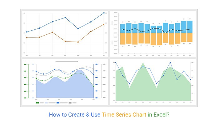
Time series data can be visualized in different ways depending on your analysis goals. Here are four common types of time series graph examples used in Excel:
Let’s discuss these charts in detail.
A dual-axis line chart compares two variables with different scales on the same timeline. It’s useful when analyzing relationships, such as revenue vs. profit or traffic vs. conversions.

The Multi-Axis line chart displays multiple data series in a single view, making it ideal for tracking several metrics over time. It helps identify trends, patterns, and relationships across different datasets.

A Sentiment trend chart shows how opinions or feedback change over time. It’s commonly used in marketing and customer analysis to track positive, negative, or neutral sentiment.
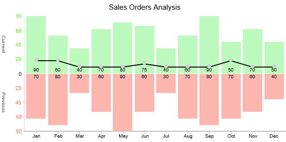
An Area line chart highlights trends while also emphasizing the magnitude of values using a filled area. It’s effective for showing growth, volume, or cumulative data over time.

A time series graph makes it easy to identify whether data is increasing, decreasing, or remaining stable across a period. This helps in understanding overall performance at a glance.
It reveals recurring patterns, such as seasonal spikes or cyclical trends, which are essential for planning and forecasting.
By analyzing historical data, you can predict future outcomes more accurately. This makes it valuable for business planning and decision-making.
Unusual spikes or drops stand out clearly, helping you detect anomalies, risks, or unexpected events in your data.
Large datasets become easier to understand when visualized over time, allowing users to quickly extract meaningful insights without going through raw numbers.
Avoiding common mistakes ensures your chart is clear, accurate, and easy to interpret. Here are the key pitfalls to watch out for:
Time series charts require data in chronological order. Unsorted or irregular time intervals can distort trends and lead to incorrect analysis.
Not all charts are suitable for time-based data. Using bar or pie charts instead of line or area charts can make trends harder to understand.
Improper axis scaling or unclear labels can misrepresent the data. Always use consistent intervals and clearly label both axes.
Adding too many lines makes the chart cluttered and difficult to read. Focus on the most important metrics to maintain clarity.
Failing to emphasize key trends, seasonality, or changes reduces the chart’s effectiveness. Use trendlines or annotations where needed.
Excessive colors, gridlines, or markers can distract from the data. Keep the design simple and focused on insights.
Gaps or extreme values can mislead interpretation if not handled properly. Always review and clean your data before visualization.
There are 4 key charts you can use to display time series insights. They include:
The charts mentioned above are straightforward to read and interpret. Besides, they’re easy to plot if you use third-party add-ins, such as ChartExpo.
A line chart is generally the best choice for time series data. It connects data points over time, making it easy to identify trends, patterns, and fluctuations in a simple, readable format.
A time series graph is useful for tracking changes over time, identifying trends and patterns, and making forecasts based on historical data. It helps businesses and analysts understand performance and make data-driven decisions.
Tracking data over time and explaining trends—while also providing forecasts—can be challenging.
The best way to visualize this is with a time series graph. These charts are ideal for continuous time-based data because they clearly highlight trends, patterns, and outliers in a way that’s easy to understand. Simplicity is key—overloading your audience with complex visuals reduces impact.
While Excel doesn’t offer ready-to-use graph time series, third-party tools like ChartExpo provide pre-built, visually appealing options. With such tools, you can create insightful charts like Area Line Charts without any coding, making your dashboards more effective and easier to interpret.
Start using ready-made time series charts today to transform raw data into actionable insights.
How much did you enjoy this article?


Learn how to use sparklines in Excel to quickly visualize trends inside cells. Discover types, creation steps, customization, use cases, benefits, and best practices.

Learn what a confidence interval graph is, how to create it in Excel, and how to interpret results to make more reliable, data-driven decisions.

A correlation matrix in Excel helps identify relationships between variables. Learn how to create, read, and use it for effective data analysis.


