Categories
Working with large datasets in Excel can quickly become overwhelming. Rows and columns of numbers often make it difficult to identify patterns, trends, or meaningful insights.
This is where cross-tabulation in Excel becomes useful. It helps you organize and summarize data in a structured format, making analysis faster and more effective.
Why does this matter?
Cross tabulation allows you to compare multiple variables at once, uncover relationships in your data, and make informed decisions with confidence. Instead of manually analyzing data, you can quickly turn raw information into clear, actionable insights.
So, how do you create a cross-tab in Excel?
In this guide, you’ll learn what cross-tabulation analysis is, how it works, and how to create it step by step. By the end, you’ll be able to analyze your data more efficiently and extract valuable insights with ease.
Definition: Cross tabulation in Excel is a data analysis method used to summarize and compare the relationship between two or more variables in a table format. It organizes data into rows and columns, making it easier to identify patterns, trends, and insights.
In Excel, cross-tabulation is commonly created using Pivot Tables, which automatically group and calculate data to provide a structured view for analysis.
| Gender | Product A | Product B |
| Male | 50 | 30 |
| Female | 40 | 60 |
Explanation:
This table shows how different customer groups interact with products. It helps identify preferences and trends for better decision-making.
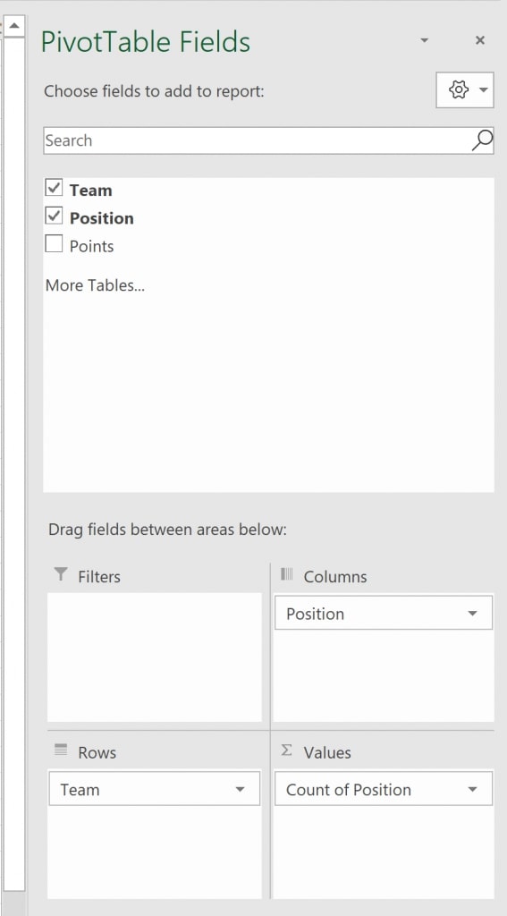
Rows represent one of the categorical variables in your dataset. Each unique value in this variable gets its own row, allowing you to compare data across categories.
Columns represent another categorical variable. Like rows, each unique value of the column variable occupies its own column, forming the table’s horizontal axis.
The values section contains the data to be summarized. This can be numeric data (sum, average) or counts/frequencies, depending on what you want to analyze.
Filters allow you to focus on specific segments of your data without changing the structure of the crosstab. You can filter rows, columns, or values to analyze subsets.
Most crosstabs include totals for rows and columns, helping you quickly see overall sums, counts, or averages. Subtotals can further break down grouped data for detailed insights.
Clear headers, readable formatting, and consistent labeling are crucial for easy interpretation. Well-formatted crosstabs make it simple to identify patterns and trends.
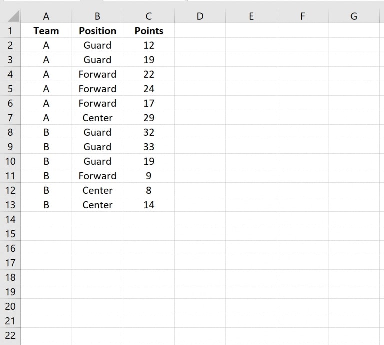
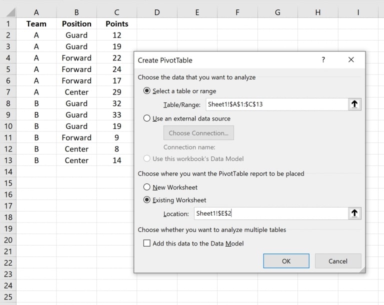
Start by inputting your dataset into Excel. Make sure your data has clear headers for each column, as these will become the variables in your crosstab.
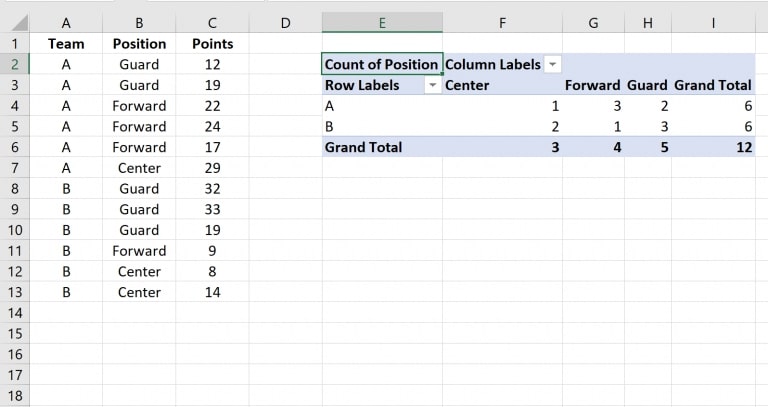
Once these steps are complete, your crosstab will appear in the designated cell. The table will now summarize the data, showing counts or totals for each combination of Team and Position.
Ensure your dataset is well-organized, with each column having a clear header and each row representing a single record. Clean your data to remove empty cells or inconsistent entries, as this ensures accurate analysis.
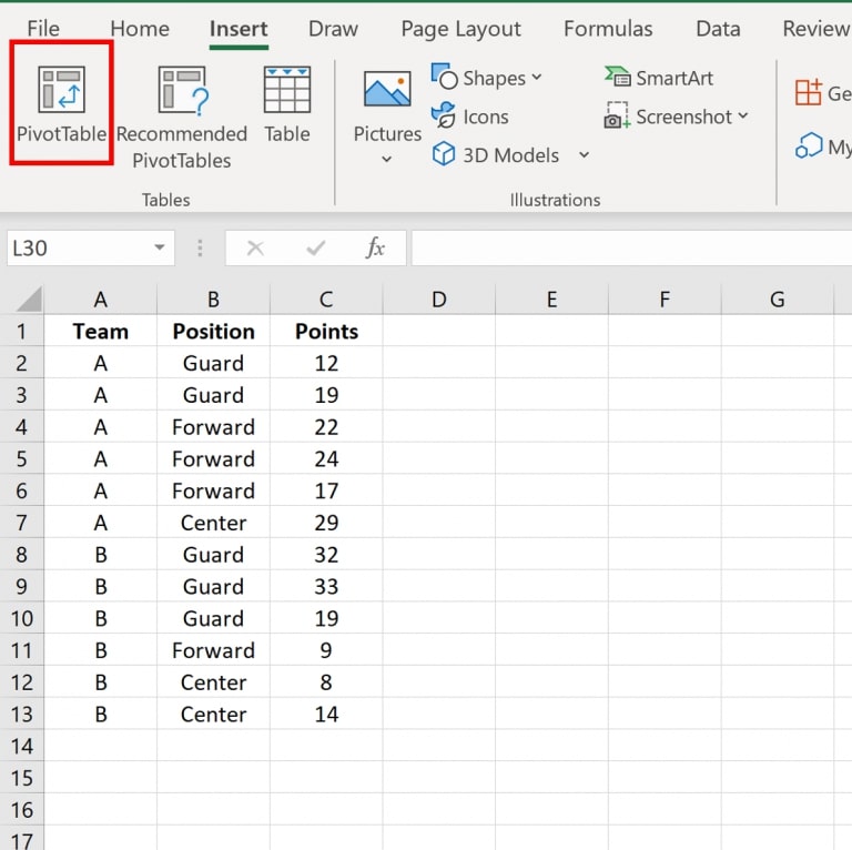
Highlight the full dataset you want to analyze. Include headers, as these will become the variables in your crosstab.
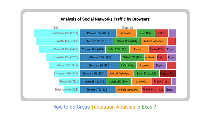
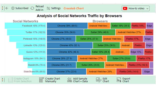
For a more visual analysis, you can export the PivotTable data to ChartExpo in Excel to create interactive charts that make patterns and trends easier to interpret.
Examine the cross-tabulated data to identify relationships, trends, or anomalies between your variables. This is the stage where insights are drawn for decision-making.
Once your analysis is complete, export the table or Excel chart to a report, presentation, or dashboard to communicate findings to stakeholders effectively.
Cross-tab condenses large datasets into a structured table, making it easier to compare multiple variables without manually scanning rows of data.
Organizing data into rows and columns helps uncover trends, correlations, and hidden relationships between variables.
Clear summaries allow businesses and analysts to make informed decisions based on accurate insights rather than assumptions.
Cross-tabulated data is easy to read and share, making it ideal for reports, dashboards, and presentations.
Using Pivot Tables in Excel automates calculations like counts, sums, and averages, significantly reducing manual effort and improving efficiency.
Cross-tabulation works best with well-organized datasets. Inconsistent, missing, or unclean data can lead to inaccurate results and require additional preprocessing.
As data size increases, cross-tabs can become difficult to manage and interpret. Large PivotTables may also slow down performance in Excel.
Cross-tab Excel is ideal for comparing two variables, but analyzing multiple variables at once can make the table overly complex and hard to read.
Excel cross-tabs primarily provide summaries like counts, sums, or averages. They lack advanced statistical analysis features without additional tools or formulas.
Although PivotTables automate calculations, setting them up correctly and updating them with new data still requires manual effort and user knowledge.
Ensure your dataset has no empty rows, duplicate entries, or inconsistent labels. Clean data is essential for accurate cross-tab results.
Column names should be simple and descriptive, as they become the fields used in your PivotTable. Clear labels make analysis easier.
Select relevant row and column variables that provide meaningful comparisons. Avoid adding too many variables, as it can make the table complex.
Decide whether to use Count, Sum, Average, or Percentage based on your analysis goal. The right calculation ensures accurate insights.
Use PivotTable filters to focus on specific data segments without changing the entire dataset. This helps in deeper analysis.
Adjust column widths, use number formatting, and apply conditional formatting to highlight key trends and patterns.
If your data updates, remember to refresh the PivotTable to ensure your cross-tab Excel reflects the latest information.
Missing values, duplicates, or inconsistent labels can lead to inaccurate results. Always clean and validate your dataset before creating a crosstab.
Selecting unrelated or too many variables can make your cross-tab confusing and less meaningful. Focus on variables that provide useful comparisons.
Using the wrong calculation (e.g., Sum instead of Count) can distort your analysis. Always choose the appropriate aggregation based on your data type and goal.
Adding too many rows, columns, or categories can make the table difficult to read. Keep your crosstab simple and focused on key insights.
Failing to refresh your PivotTable after updating the dataset can result in outdated analysis. Always refresh to reflect the latest data.
Unclear headers, cluttered layouts, or inconsistent formatting can confuse users. Use clear labels and proper formatting for better readability.
No, cross tabulation and Pivot Tables are not the same, but they are closely related. Cross-tabulation is a method of summarizing data by comparing variables, while a Pivot Table is the tool in Excel used to create cross-tabulated tables.
To interpret cross-tab results, read the table by comparing values across rows and columns. Look for patterns, trends, or differences between categories. The numbers (counts, sums, or averages) show the relationship between the variables being analyzed.
Yes, you can easily create cross-tabs in Excel using Pivot Tables. By placing one variable in rows, another in columns, and adding values, Excel automatically summarizes the data into a cross-tabulated format.
Cross-tabulation in Excel is a powerful method for analyzing and summarizing data. Organizing information into rows and columns allows you to quickly identify patterns, relationships, and trends within your dataset.
Using Pivot Tables, you can transform raw data into a structured format with just a few steps—making analysis faster, more accurate, and easier to understand. From preparing your data to customizing and interpreting results, cross-tab Excel helps turn complex datasets into actionable insights.
To maintain accuracy, always ensure your data is clean and refresh your PivotTable whenever updates are made. This keeps your analysis relevant and reliable.
Whether you’re working on business reports, research, or performance analysis, cross-tab Excel simplifies decision-making and improves data clarity.
Start using cross-tabulation analysis in Excel to unlock meaningful insights and make smarter, data-driven decisions.
How much did you enjoy this article?


Learn how to use sparklines in Excel to quickly visualize trends inside cells. Discover types, creation steps, customization, use cases, benefits, and best practices.

Learn what a confidence interval graph is, how to create it in Excel, and how to interpret results to make more reliable, data-driven decisions.

A correlation matrix in Excel helps identify relationships between variables. Learn how to create, read, and use it for effective data analysis.