Categories
Refresh a Pivot Table in Excel—have you ever needed to do it and weren’t sure what changed? You’re not alone. Every week, professionals across various industries rely on PivotTables to make sense of large datasets. Yet many forget a simple fact: if your data changes, your Pivot Table doesn’t update on its own.


No one wants to sit in a meeting defending stale data. Updating your table is the first step. The second? Presenting that refreshed data visually using a Pivot Chart. Why? Because visuals work. Studies show the brain processes images faster than numbers. A clear chart tied to live data tells the story in seconds.
Still, many users overlook the full power of this combo. They create Pivot Tables but never connect them to charts. Or they add charts without refreshing the data first. Both mistakes lead to confusion.
Learning how to stay updated isn’t about flash. It’s about trust. A well-timed refresh of a pivot table in Excel keeps your work sharp and decisions smart. Add a Pivot Chart, and you turn raw data into a compelling message.
This guide will help you refresh with confidence, present with clarity, and elevate your pivot reporting. And without further ado, let’s get started.
Definition: Refreshing a pivot table in Excel means updating your table to reflect new or changed data. Excel doesn’t do this automatically unless told to. If your source data changes or grows, your Pivot Table won’t update until it is refreshed. This can lead to outdated insights.
By learning how to sort a table in Excel, you also improve readability after each refresh. Pairing this with a frequency chart in Excel helps track how often values appear, making your reports more accurate and reliable.
Have you ever opened a report and thought, “Wait, this isn’t right”? You’re not the only one. Many people build solid Pivot Tables—and then forget to update them. Data changes fast, and if your table doesn’t reflect those changes, it’s useless.
Here’s why keeping your Pivot Table updated really matters:
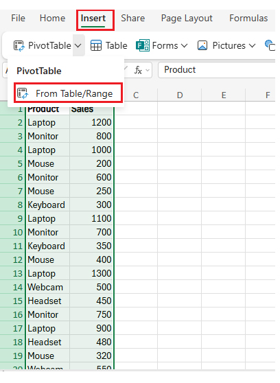
So you’ve built your Pivot Table. The formulas are tight, and the layout looks great. But the numbers? They’re stuck. That’s because Excel doesn’t constantly update PivotTables on its own. Don’t worry—there are two easy ways to fix that:
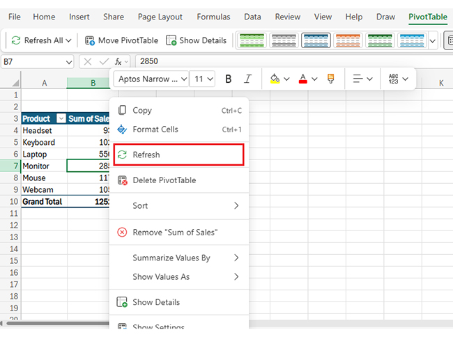
Manual refresh: Right-click anywhere inside the Pivot Table, then click “Refresh”. Excel pulls the latest data instantly. This method is excellent if you want to double-check everything before making an update. But don’t forget—it’s all on you to remember to do it.
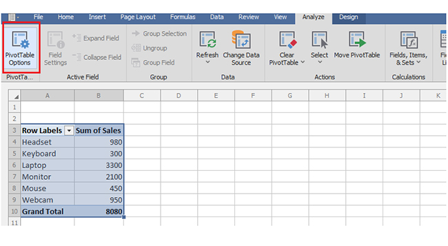
Automatic refresh: Want Excel to handle it for you? You can set it up to refresh every time the file opens. Right-click the Pivot Table, go to PivotTable Options, and under the “Data” tab, check “Refresh data when opening the file”.
This is perfect for pivot reporting dashboards shared with teams. It also helps if your file pulls data from dynamic tables in Excel, where the data is often updated.
Pro tip: Whether you refresh manually or automatically, both methods keep your data and reports up to date.
You’ve set up your Pivot Table, but now what? Keeping it updated is simple if you know the steps. As we have seen above, you can refresh it yourself or let Excel handle it automatically.
Here’s how to refresh your Pivot Table like a pro. This also helps ensure your analysis stays accurate and prevents misleading patterns, such as box plot outliers, from affecting your interpretation of the data.
Want to skip the manual step every time?

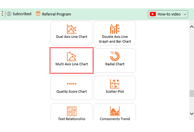
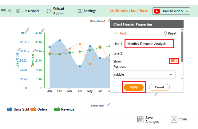
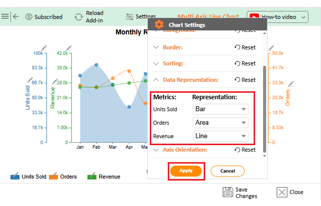
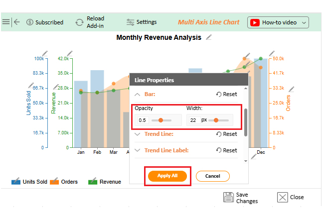
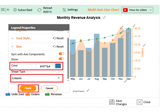
Check out these top five charts you can use to refresh a Pivot Table. These charts were created using ChartExpo, a tool that excels in dynamic pivot reporting.
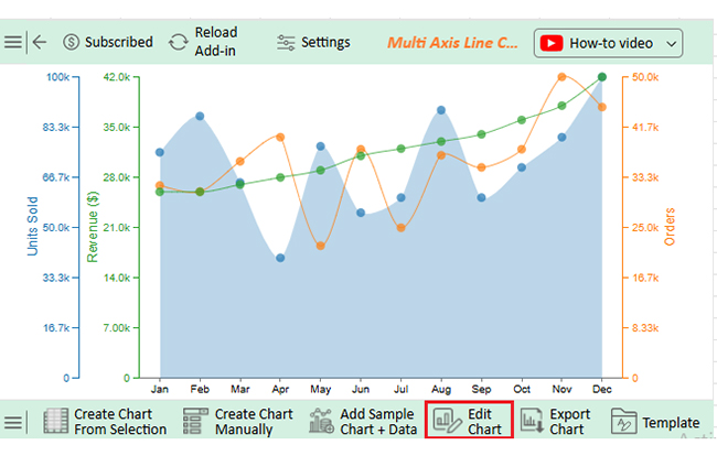
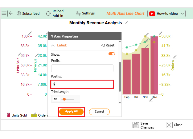
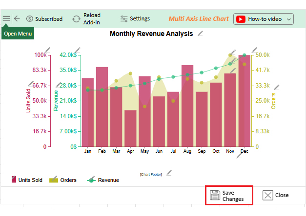
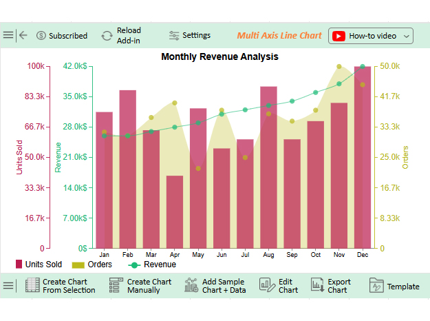
This chart shows multiple data series on separate Y-axes in one chart. It is perfect for comparing different scales, such as revenue and units shipped, without cluttering the data.

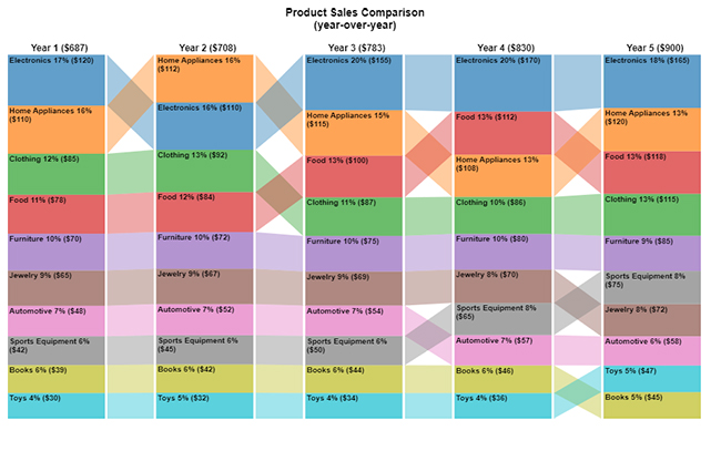
A Comparison Bar Chart makes it easy to compare multiple values side by side. It is ideal for quickly spotting differences in sales or performance.
This one visualizes current results against targets using colored bars. It helps track goals and business performance in real time.

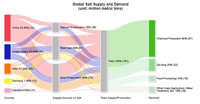
A Sankey Chart displays data flow and proportional distribution. It is great for simplifying complex relationships in updated Pivot Tables.
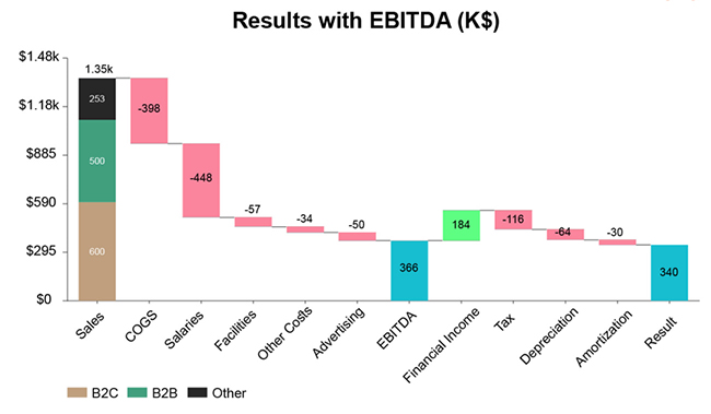
It breaks down cumulative changes, showing increases and decreases. A Stacked waterfall chart in Excel is perfect for reviewing totals and detailed Pivot Table summaries.
Think Excel is the king of data analysis? It’s powerful, sure—but when it comes to data visualization, it sometimes drops the ball. Charts can appear basic and fail to convey the entire story.
And what’s the fuss about data visualization? Data visualizations simplify complex data, highlight trends, reveal patterns, enhance understanding, and support faster, clearer, and more effective decision-making.
We have the ideal tool for refreshing a pivot table in Excel with advanced charting: ChartExpo. With ChartExpo, you can create Scatter plot visuals and other advanced charts to keep your data fresh and elevate your insights. It fills the gaps Excel leaves behind, turning ordinary charts into compelling storytelling tools.
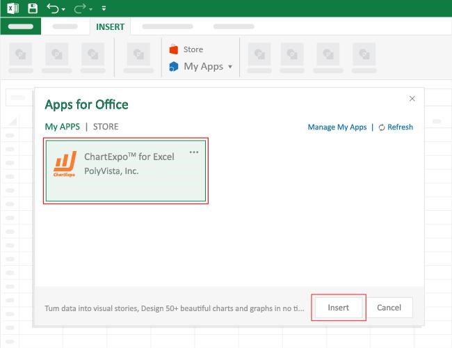
How to Install ChartExpo in Excel?
ChartExpo charts, including advanced Excel charts, are available in both Google Sheets and Microsoft Excel. Please use the following CTAs to install the tool of your choice and create beautiful visualizations with a few clicks in your favorite tool.
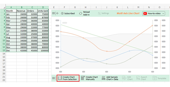
Let’s visualize and analyze this sample data in Excel using ChartExpo.
| Month | Revenue | Orders | Units Sold |
| Jan | 26000 | 32000 | 75000 |
| Feb | 26000 | 31000 | 87000 |
| Mar | 27000 | 36000 | 65000 |
| Apr | 28000 | 40000 | 40000 |
| May | 29000 | 22000 | 77000 |
| Jun | 31000 | 38000 | 55000 |
| Jul | 32000 | 25000 | 60000 |
| Aug | 33000 | 37000 | 89000 |
| Sep | 34000 | 35000 | 60000 |
| Oct | 36000 | 38000 | 70000 |
| Nov | 38000 | 50000 | 80000 |
| Dec | 42000 | 45000 | 100000 |

Are you tired of having to hit “Refresh” every time your data changes? You’re not alone. Many Excel users forget to update their Pivot Tables—until it’s too late. That’s where auto-refresh comes in. It’s a small setting with significant benefits; Excel does the work while you focus on insights.
Here’s why auto-refreshing your Pivot Table is a game-changer:
Have you ever opened a Pivot Table and realized the numbers were outdated? It happens more than you’d think. Setting up auto-refresh is excellent—but doing it right is even better.
These quick tips make sure your Pivot Table stays accurate without surprises. Less stress, more confidence, and it also helps when building advanced visuals like a confidence interval graph in Excel based on updated data.
Here’s how to make Excel’s auto-refresh work smarter:
To refresh all PivotTables, press Ctrl + Alt + F5. This shortcut updates all Pivot Tables in the workbook simultaneously. It’s faster than refreshing them one by one. Ensure your data source is up to date for accurate results.
Refreshing your Pivot Table is more than a habit—it’s a must. Outdated data leads to poor decisions. A simple refresh keeps everything on point. It’s the first step toward accuracy.
But don’t stop there. Advanced charting tools transform raw data into meaningful insights. Excel’s default charts work, but they often fall flat. ChartExpo fills the gap with visuals that pop and provide clear explanations.
Once your table is up to date, learn how to use a data table in Excel. It helps manage your inputs and assumptions. It also strengthens forecasting and makes your reporting more flexible.
Working with summaries? Try using a Contingency Table in Excel. It helps you break down relationships between variables, making it great for understanding patterns or behavior in large datasets.
Want to stay organized? Know how to move a table in Excel without breaking links. A clean layout makes analysis faster and keeps your workbook easy to navigate.
Finally, use GETPIVOTDATA in Excel to pull exact values from your Pivot Table. It adds precision to your reports. Then, combine that with bright visuals and timely refreshes – your data will always speak with clarity.
And don’t hesitate to install ChartExpo to unlock powerful charting features that enhance your Excel experience.
How much did you enjoy this article?


Learn how to use sparklines in Excel to quickly visualize trends inside cells. Discover types, creation steps, customization, use cases, benefits, and best practices.

Learn what a confidence interval graph is, how to create it in Excel, and how to interpret results to make more reliable, data-driven decisions.

A correlation matrix in Excel helps identify relationships between variables. Learn how to create, read, and use it for effective data analysis.


