Categories
By ChartExpo Content Team
You’ve been there. The clock is ticking, and the pressure to make the right decision is mounting. In those moments, the quality of your pivot reporting can make or break your strategy. If your data isn’t clear and accurate, you risk steering the business in the wrong direction.
So, why does pivot reporting matter? It’s not just about collecting data; it’s about making that data work for you. In fast-paced environments, a poor report can lead to missed opportunities. You need a system that helps you act quickly without sacrificing clarity. Pivot reporting is your solution. It helps you turn raw data into clear insights, even when time is tight.
But, here’s the catch: setting up pivot reporting is tricky. It’s not as simple as dragging and dropping numbers. It requires thoughtful planning, accurate data, and a well-structured system. In this guide, we’ll break down how to set up effective pivot reports and avoid common pitfalls.
Ready to see how pivot reporting can transform your decision-making process? Keep reading!
When deadlines are tight, reporting becomes your ally or nemesis. The clock ticks faster, and the pressure mounts. Reports need to be concise yet comprehensive enough to inform decisions. Oversimplifying these reports can be a trap, leaving out vital details that could steer decisions in the wrong direction. It’s like trying to navigate a map with half the roads missing. You might think you’re headed the right way until you hit a dead end, or worse, fall off a metaphorical cliff.
We’ve all been there, staring at a report that seemed straightforward until it wasn’t. I remember a project where the data looked perfect until we realized important metrics were buried deep, unseen. That’s when the reality hit: simplification isn’t always a friend. It’s about balance, enough detail to inform but not overwhelm. Learning from these moments means setting up reports that stand up to scrutiny, even when time is short.
Oversimplification in reports can turn a tool meant for clarity into a source of confusion. Imagine handing over a report that’s too bare-bones, missing those little details that could change everything. Suddenly, what seemed like a decision-making asset becomes a liability. Real-life examples abound where such missteps led to costly business blunders. It’s not just about numbers; it’s about context, understanding the full story.
The consequences of oversimplification are serious. Data needs to be robust and reflective of the real situation, not just a sanitized version. I once worked with a team that relied on a simplified report, only to find out too late that a crucial trend was missed. It was a hard lesson, but one that taught us the importance of digging deeper, ensuring every pivot tells a complete story. Those moments of clarity are worth their weight in gold.
Crafting reports that deliver under pressure isn’t an art; it’s a necessity. You need data accuracy, fast refresh capabilities, and clear visuals. It’s about setting up a system that supports swift decisions, not one that bogs you down with endless questions. The goal is to make the data work for you, not against you.
Let’s talk about actionable tips. Start with ensuring the data source is reliable, then move on to visualizations that speak volumes without saying too much. Remember, clarity is key. In high-pressure situations, a clear visualization can mean the difference between a confident decision and a hesitant one. The right setup leads to reports that don’t just inform but empower, turning those high-stakes moments into opportunities for success.
Reports can lead you down the wrong path. A simple mistake in filter settings or data normalization can ruin your day. Think of it like this: a minor tweak can make a major impact without you noticing until it’s too late. This isn’t just annoying, it’s risky when decisions depend on accuracy.
Misleading trends can cause havoc in business. They might seem minor at first, but they can snowball into bigger issues. Take a company that relied on a flawed sales trend analysis. They ended up overstocking products that didn’t sell. It was all because of a small filter error. It’s a classic case of “what could go wrong, did.”
If you’re spending more time on reports than reaping the benefits, that’s a red flag. Reports should help, not hinder. If they’re just numbers on a screen with no real insight, it’s time to rethink. The goal is to make quick, informed decisions, not get stuck in analysis paralysis.
Signs of a time-wasting report include complexity without clarity and endless adjustments that don’t yield better insights. If you’re constantly tweaking reports and getting nowhere, it’s a problem. Focus on simplicity and relevance. The best reports are those that inform, not confuse.
Quick fixes can make a big difference. Start with data cleanliness. Ensure your data is accurate and up-to-date. A clean dataset is the foundation of a reliable report. Without it, you’re building on shaky ground.
Next, consider the layout and structure of your reports. Are they clear and to the point? A well-organized report can save time and reduce errors. It should tell a story without needing a decoder ring. By addressing these common mistakes, you can regain control and make your reports work for you, not against you.
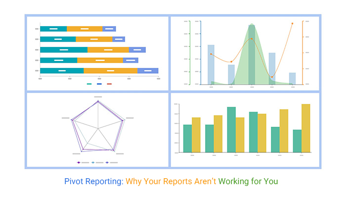
The following video will help you create the Multi-Axis Spider Chart in Microsoft Excel.
The following video will help you create the Multi-Axis Spider Chart in Google Sheets.
Ever had the heart-stopping moment when numbers stop making sense midway through a crisis? The supply chain hiccups, financial mismatches arise, and suddenly everyone turns to you for answers. This is where reports shine. They cut through the noise, presenting the facts you need to steer the ship back on course. It’s about acting swiftly, not sinking into analysis paralysis.
But what if the data freezes right when you need it most? We’ve all felt that dread. Having a contingency plan is key. Keep a hard copy of essential data or an alternative software ready to roll. It’s not just about having a solution but having the nerve to implement it without faltering. When the pressure mounts, being prepared keeps you ahead.
Your worst nightmare: the screen freezes. You can’t access the numbers that hold the key to your next move. The clock’s ticking, and every second lost feels like an eternity. The feeling of helplessness is overwhelming, but there’s a way to manage it. Have a backup plan. Maintain an offline copy of critical data or use a secondary tool that’s ready to step in. The key is to anticipate and have resources in place before disaster strikes.
Staying calm is your best ally. When panic sets in, clear thinking goes out the window. Train your team to handle these situations with mock drills. It’s about muscle memory, knowing exactly what to do without the need to think. With practice, you’ll be ready to face any data freeze head-on, turning potential chaos into organized action.
Think of reports as your early warning system. They’re not just for after-the-fact analysis. By regularly monitoring these reports, you can detect unusual patterns and trends before they spiral into full-blown crises. It’s about being proactive, not reactive. Recognizing these signals early can save time, money, and stress.
Of course, spotting risks is only half the battle. You need to know how to respond. Develop a response playbook, steps to take when certain triggers are met. This way, you’re not scrambling for solutions during a crisis. Instead, you’re executing a well-thought-out plan. Reports provide the foresight; your strategy provides the action. Stay ahead by using the data to guide your decisions, not just inform them.
The complexity of setting up pivot tables is often underestimated. It’s not just a drag-and-drop affair. You’ve got to deal with data cleanliness, appropriate filters, and correct normalization. It’s like baking a cake; get one ingredient wrong, and it’s a disaster. You need all the ingredients in the right amounts and sequence to get that perfect bake.
And let’s talk about the hidden traps. Formulas that seem right but throw your data into a tailspin. Connections that look solid but falter under pressure. You think you’ve got it, but then your report freezes mid-meeting. It’s a wake-up call that gets your heart racing. The trick? Anticipating the pitfalls and setting up safeguards from the get-go. You want a system that holds strong, even when the going gets tough.
When you’re in a hurry, quick fixes are tempting. But here’s the kicker: they usually lead to more trouble. A patch here, a tweak there, and suddenly you’ve got a Franken-report on your hands. It might work, but it’s not reliable. You’ve essentially built a house on sand, and it’s only a matter of time before it collapses.
Long-term consequences are no joke. That quick fix might save you a few minutes now, but it’ll cost you hours of rework later. We’ve all been there, watching as a hurried decision comes back to bite. The solution? Slow down. Take the time to build a solid foundation. It’s about investing upfront so you don’t pay dearly later.
Building a scalable pivot table is like planting a garden. You need to think about growth. Set it up right, and it’ll flourish as your needs evolve. Structure your data thoughtfully, choose flexible formats, and keep your layouts intuitive. Think of it as future-proofing your work. A small upfront investment in planning saves a fortune in future headaches.
Let’s not forget maintenance. It’s not enough to set it and forget it. Regular reviews ensure your setup remains relevant as business needs change. Keeping a tight ship means fewer surprises and more confidence in your reports. The goal is a pivot table that stands the test of time, adapting gracefully to whatever comes next.
Sometimes, the data doesn’t tell the whole story. It can paint a picture that’s too rosy or too grim, depending on what’s missing or misrepresented. Imagine a sales report that looks like a win, but misses the returns data. Suddenly, that victory lap becomes a walk of shame. You’ve got to dig deeper, ensuring each piece of data is solid before trusting the visuals they create.
Strategies for maintaining integrity include cross-checking data sources and validating those visuals with real-world outcomes. Ask questions like, “Does this trend match what we’re experiencing?” If not, time for a deeper dive. It’s about being a detective, not just an observer, in the world of data.
Data inconsistencies are like potholes on the road to smooth decision-making. They’re easy to miss until you’re in the middle of a presentation, watching your credibility take a nosedive. Missing data points or conflicting entries? They’re not just annoyances, they’re red flags.
Addressing these requires a proactive approach. Regular audits can highlight discrepancies before they become problems. Create a checklist: Are all data points accounted for? Do numbers align across different reports? Consistency is key. It’s like ensuring all the puzzle pieces fit before you frame the picture.
Data bias lurks in every corner, waiting to twist your insights. It’s those hidden assumptions that can lead your decisions astray. Maybe the data collection method favored certain demographics, or the reporting period missed a major event. These biases shape conclusions and, ultimately, actions.
To tackle this, ask the hard questions: Is every perspective considered? Are there gaps in the data set? Reports can spotlight these biases if you know where to look. It’s about questioning the story the data tells, ensuring it’s not just a fairy tale. Engaging with your data critically helps uncover those narratives that might otherwise remain hidden.
Aligning reports with your strategy isn’t as simple as it sounds. It requires a deep dive into what your business truly values and then ensuring your reports reflect those priorities. This means going beyond the surface to understand the nuances of your business needs. The goal is to craft reports that don’t just inform but empower decision-makers to take actions that drive success.
Reports that align with strategy are like a well-oiled machine. They work seamlessly to support your business goals, providing insights that are directly tied to your objectives. This alignment ensures that every piece of data serves a purpose, helping leaders make informed decisions that propel the company forward. It’s about creating a direct line from data to strategy, ensuring every decision is backed by relevant insights.
When presenting reports to leadership, the goal is clarity. You want to cut through the noise and deliver insights that are immediately actionable. This means focusing on what truly matters, leaving out any fluff. Leaders don’t have time to sift through endless data points; they need clear, concise insights that guide their decisions.
Think of your presentation as a spotlight. It should highlight key insights, allowing leadership to see the path forward clearly. By focusing on the most important data, you ensure that your reports aren’t just informative but transformative. This approach allows leaders to make swift, informed decisions that can significantly impact the business’s trajectory.
Customizing reports isn’t just a nice-to-have; it’s essential. Different stakeholders have different needs, and your reports should reflect that. A one-size-fits-all approach doesn’t work when you’re dealing with diverse teams and objectives. Each stakeholder group requires specific insights that are relevant to their roles and responsibilities.
Imagine you’re crafting a story for different audiences. Analysts might want the nitty-gritty details, while executives need the big picture. By tailoring your reports to meet these varied needs, you ensure that every stakeholder receives the information they need to act effectively. This customization not only enhances the relevance of your reports but also builds trust and engagement across the organization.
Data silos. They’re the worst. Each department hoards data like it’s gold, refusing to share. But pivot reports? They’re the peace offering that gets everyone to the table. By distilling complex data into digestible insights, reports empower teams to see the bigger picture. No more “us vs. them.” Just a unified front working towards common goals.
It’s not just about sharing data. It’s about sharing understanding. When every team operates from the same set of facts, decisions become clearer and more cohesive. Reports eliminate the guesswork, allowing teams to act with confidence and precision. It’s like switching from a fuzzy old TV to high-definition. Suddenly, everything makes sense.
Change is hard. Especially when it involves altering how people work. Many resist reports because they think it means more work. Spoiler alert: It doesn’t. It means smarter work. The trick is to show them how reports lighten the load. Highlight how they cut through the noise and provide clarity, not confusion.
The secret sauce? Demonstrate value early. Quick wins matter. Show a team how a single report can save them hours of manual data wrangling. Watch as skeptics turn into advocates. It’s about shifting perceptions from “extra task” to “essential tool.” Once they see the time saved, the buy-in follows naturally.
Once upon a time, in a bustling tech company, the marketing and sales teams were at odds. Marketing blamed sales for not converting leads, while sales claimed the leads were weak. By analyzing lead quality and conversion rates, they identified the disconnect. Marketing adjusted its strategy, and sales fine-tuned its approach. The result? A harmonious alliance with targets smashed beyond expectations.
In another scenario, a retail company found its supply chain and finance teams clashing over inventory levels. Reports highlighted discrepancies in stock records versus sales data. By aligning their reports, both departments quickly synced up, reducing unnecessary stock and freeing up capital. The lesson? A well-placed report can turn chaos into cooperation, making every department a hero in its own story.
Data insights aren’t just a one-time thing. They’re a continuous process of learning and adjusting. With reports, you can identify trends that matter. It’s like seeing the shoreline before anyone else, positioning your business to ride the wave smoothly. Forecasting becomes less of a guessing game and more of a reliable activity.
This approach offers a dynamic view of business health. Leaders can make informed decisions, not based on hunches, but on solid, evolving evidence. Your strategy becomes proactive, not reactive. You’re not just surviving; you’re setting the pace, ensuring that the business is always ahead of the curve.
Imagine having a tool that helps you foresee potential hurdles. Pivot reports do just that. By analyzing data patterns over time, they can highlight emerging risks before they become full-blown crises. It’s like having an early warning system, allowing you to tackle issues head-on, keeping operations smooth and stakeholders happy.
These reports transform how decisions are made, turning data into actionable insights. Business leaders aren’t just reacting to changes; they’re anticipating them. This foresight provides a competitive edge, making reports a key asset in navigating business landscapes effectively.
Integrating reports into your business strategy ensures decisions are data-driven. It’s not just about having reports ready; it’s about embedding them into every layer of decision-making. This alignment ensures that all departments speak the same data language, reducing miscommunication.
By embedding these reports, you create a culture of transparency and accountability. Everyone knows what’s happening and why. It’s not just about having data; it’s about understanding and using it to drive the business forward. This approach not only boosts confidence but also builds a cohesive strategy that aligns with long-term goals.
Trust isn’t given; it’s earned. And in the world of reports, it’s earned through accuracy. If your data’s off, your credibility takes a hit. People trust what they can rely on, and that means your reports need to be spot-on. No room for error here.
Start by setting up a process. Double-check everything. It’s tedious, but the payoff is peace of mind. Use tools and software that make it easier, but don’t rely on them completely. Human oversight is still key. When your reports are consistently reliable, people notice. They start to trust you and what you bring to the table.
When you’re under the microscope, accuracy isn’t just a goal; it’s a necessity. Stakeholders need to know they can rely on the data they’re seeing. Trust can make or break relationships, especially in business. Accurate reports are your best defense against skepticism.
So, how do you get stakeholders on your side? Show them the numbers, but make sure they’re right. Prove that your reports can withstand scrutiny. It’s about building a reputation for reliability. Over time, you’ll find that people start to trust your insights without hesitation.
Consistency is the name of the game. When your reports deliver the goods every time, you’re golden. It’s not about getting it right once; it’s about getting it right every time. Consistent results mean everyone knows what to expect, and they can plan accordingly.
Achieving this level of reliability takes effort. It’s not a one-and-done deal. You have to stay on top of things, but the rewards are worth it. Reliable data leads to reliable decisions. And in business, that’s invaluable. When you get to this point, you’re not just providing reports, you’re providing peace of mind.
Pivot reporting is a key tool for transforming complex data into clear, actionable insights. However, it’s not just about throwing numbers together; it’s about ensuring your reports are both meaningful and accurate. Too often, the pressure to simplify leads to missed trends and inaccurate conclusions. When pivot reports fail to capture the full picture, the result can be costly mistakes.
But there’s good news: getting pivot reporting right doesn’t have to be overwhelming. By paying attention to the details and avoiding common pitfalls, you can build reports that are both reliable and informative. Start by ensuring your data is clean, your filters are correct, and your visualizations are clear. It’s about setting up systems that work for you, not against you.
Remember, in high-pressure environments, pivot reporting can be the difference between informed decisions and costly errors. You can improve your reports, and with the right tools and mindset, make them an asset to your decision-making process.
With the right approach, pivot reporting can empower you to navigate even the most complex data with confidence. Make sure your reports are working for you, not against you.
How much did you enjoy this article?


Calculate accounts receivable turnover ratio to measure credit collection speed, improve cash flow, and strengthen your financial strategy. Read on!

Change Management KPIs are the key to tracking adoption, performance, and ROI during transitions. Find out which metrics matter. Read on!

Data collection methods and techniques determine the quality of every insight you act on. Explore key approaches for gathering reliable data. Read on!


