Categories
By ChartExpo Content Team
Numbers alone don’t tell a story. They need structure, context, and a way to reveal patterns. Pivot Charts make this possible by turning raw data into clear visuals.
Pivot Charts connect directly to Pivot Tables, allowing users to filter, sort, and adjust data without creating new charts. This flexibility makes them an essential tool for business reports, financial analysis, and performance tracking.


Choosing the right chart type is critical. A bar chart compares categories, a line chart shows trends over time, and a pie chart breaks down proportions. With Pivot Charts, switching between these formats is quick and easy.
Businesses rely on Pivot Charts to track trends, compare results, and make informed decisions. They save time, reduce errors, and improve clarity. Whether analyzing sales, monitoring inventory, or measuring performance, these charts simplify complex data and provide insights at a glance.
First…
A pivot chart is a graphical tool that extends the functionality of pivot tables. While a pivot table highlights the essence of data in a tabular format, a pivot chart translates this information into a visual diagram. This duality allows users to switch between numerical data and graphical representations effortlessly, making both detailed data analysis and high-level data interpretation accessible in a single interface.
Pivot charts and pivot tables are two peas in a pod! When you create a pivot table in spreadsheet software, you can easily generate a corresponding pivot chart. This chart dynamically updates as you adjust the pivot table’s structure, such as filtering data or reorganizing fields. This connection means that any insight you glean from the pivot table is immediately visually represented in the pivot chart, enhancing both comprehension and presentation.
Opt for a pivot chart when dealing with multifaceted data that requires frequent adjustments or when you need to provide an interactive data exploration tool. Unlike static charts, pivot charts let viewers manipulate variables to see different slices of the data. This dynamic capability is invaluable for in-depth data analysis sessions during team meetings, data presentations, or reports where viewer engagement and data-driven decision-making are crucial.
Each of these elements showcases the robust capabilities of pivot charts, emphasizing their importance in data analysis and decision-making processes. By integrating these tools into your data review practices, you significantly enhance both the understanding and the communication of complex information.
When formatting your data for pivot charts, common pitfalls can hinder your progress. First, ensure consistency in data formatting, especially with dates and numbers. Mixed formats can disrupt your data’s integrity, causing confusing results in your charts. Use the same date and number formats throughout your dataset.
Second, avoid merging cells in your data table. While merged cells might improve visual appeal in traditional tables, they complicate data manipulation in pivot tables. Keep each piece of data in its own cell to maintain clarity and functionality.
Lastly, always use descriptive and concise column headers. Ambiguous or overly complex headers can confuse during pivot chart setup. Clear, direct headers assist in easier field identification and faster chart creation.
A well-structured pivot table is the foundation of a versatile pivot chart. Start by placing your most significant category in the Rows area. This placement helps in breaking down data hierarchically, enhancing your chart’s clarity. Common practice is to place time elements, like months or years, in this area.
Next, use the Columns area for secondary categories. This method offers a cross-sectional analysis of the data, providing a broader view of trends and patterns. For instance, placing product categories here could show how different products perform over time.
Lastly, always place your data values in the Values area. This section calculates data based on your chosen aggregate function, such as sums or averages. Adjusting these calculations changes your chart’s focus, allowing for flexible data exploration and more tailored insights.
Cleaning your data involves more than removing duplicates or empty cells. It includes standardizing data entries to avoid discrepancies. For example, ensure that terms or names are consistently spelled. Consistency is crucial for accurate categorization and analysis in pivot charts.
Sorting your data can also reveal patterns or issues not immediately obvious. Sort data in meaningful ways before charting to understand better the underlying trends. Logical sorting by date, for instance, provides a chronological flow, lending insight into time-based trends.
Organizing data effectively often involves categorizing similar data types. Grouping related data together in your table facilitates more effective analysis and data visualization. It allows the pivot chart to reflect a clearer segmentation of the data, making the chart not only more informative but also easier to interpret.
Creating a basic Pivot Chart in Excel is straightforward. Start by selecting your Pivot Table. Next, navigate to the “Insert” tab and click on “PivotChart.” Select your preferred chart type. For beginners, a column chart offers clear insights. Once selected, Excel generates the chart linked to your Pivot Table data. This real-time link means that any update in the Pivot Table instantly updates the chart. Thus, it serves as a dynamic visual tool for your data analysis.
Choosing the right chart type is key to effective data presentation. Consider what you need to communicate. Bar charts work well for comparing quantities across categories. Line charts are ideal for showing trends over time. Column charts, similar to bar charts, offer a clear comparison but with a vertical orientation, ideal for spotting patterns in data over intervals. A Scatter chart is perfect for visualizing correlations between two variables. Each chart type presents data distinctively, catering to specific analytical needs. Selecting the appropriate type enhances your data’s visual impact, making insights clearer and decisions easier.
Modifying data selection in your Pivot Chart without breaking it is simple. Start by adjusting your Pivot Table since your chart mirrors this data. In your Pivot Table, add or remove data fields, or filter data as needed. These changes automatically reflect in your Pivot Chart, maintaining its integrity. This dynamic connection ensures that your chart remains functional and accurate as you tweak data inputs, providing flexibility in data analysis without the risk of ‘breaking’ the visual representation.
A Pivot Chart in Excel is directly linked to a Pivot Table. They share the same data source and field areas, making it vital to understand how each area functions. The four main areas are Filters, Columns, Rows, and Values, each playing a distinct role in how data is displayed in both the chart and the table.
Filters allow you to include or exclude data points, refining what data appears in the chart. Columns and Rows organize data horizontally and vertically, respectively, helping you view data from different perspectives. Values are data points that are calculated or summarized, providing the numerical backbone of the chart.
Grasping these areas enables you to tailor your Pivot Chart and Table to meet specific data analysis needs. For instance, placing a time field in the Row area and sales data in the Values area can show how sales have changed over time.
Grouping data in a Pivot Chart simplifies complex data sets into themes or clusters, making the data easier to analyze. For example, you could group data by months, quarters, or years to see performance over time. Categorizing involves assigning data to predefined categories, such as by product type or region, which helps in comparing data across different segments.
Rearranging data involves moving fields between different Pivot Chart areas to explore various perspectives. This could mean moving a sales field from the Values area to the Rows area to see a detailed breakdown of sales by product.
These strategies transform raw data into structured insights, allowing for quick decision-making. They make it easier to spot trends, identify performance gaps, and make informed business decisions.
One common mistake when working with Pivot Charts is adding too many fields to the Values area, which can clutter the chart and confuse the viewer. Fix this by limiting the number of metrics analyzed at one time, or use Filters to narrow down the data.
Another issue is placing inappropriate fields in the Rows or Columns areas, which can distort the data representation. Ensure that only categorical data, like names or regions, are used in these areas, not numerical values. Numerical values should typically go into the Values area, where they can be summed, averaged, or counted effectively.
Lastly, not using the Filters area can lead to overwhelming amounts of data being displayed. Use Filters to focus on more relevant data subsets, enhancing your chart’s clarity and effectiveness. This approach keeps your Pivot Chart clean and your data analysis sharp.
The following video will help you to create a Clustered Stacked Bar Chart in Microsoft Excel.


The following video will help you to create a Clustered Stacked Bar Chart in Google Sheets.
Sometimes, the default chart isn’t the best choice for your data. Switching up the chart type can transform your data’s presentation, making it more intuitive and impactful. For instance, if you’re tracking sales over time, a line chart might display trends more clearly than a bar chart. Always match the chart type to the data’s nature and the story you want to tell.
Clear legends, labels, and titles are crucial for understanding an Excel chart. They guide viewers through the data, showing what each element represents. Adjust these elements to avoid confusion and make your charts straightforward. For example, ensure that your axis titles are descriptive enough to explain what the numbers represent, like “Monthly Sales in USD.”
Proper number formatting in Excel pivot charts is vital for accurate data interpretation. Whether it’s currency, percentages, or plain numbers, the right format provides clear insights. If you’re dealing with financial data, formatting numbers as currency can immediately indicate to the viewer that the data involves monetary values, aiding quicker comprehension and decision-making.
Each of these customization steps ensures that your pivot charts not only represent your data accurately but also make it much easier for others to understand and act upon. Keep these tips in mind to effectively communicate through your Excel visuals!
Slicers offer a dynamic way to filter pivot charts in Excel. These visual tools allow users to quickly refine data sets with a simple click. Slicers make dashboards interactive, providing a user-friendly means of displaying key metrics. They are especially powerful in collaborative settings, enabling team members to explore data points independently.
Excel allows users to filter pivot graph data by various criteria such as date, category, or custom fields. This flexibility supports targeted analysis. For instance, a business can examine sales data from specific periods or compare performance across different product categories. These filters help pinpoint trends and patterns, aiding strategic planning.
Using multiple filters in pivot graphs can refine data without sacrificing clarity. Excel manages several layers of filters efficiently, ensuring that each added criterion sharpens the focus on relevant data. This capability is crucial in complex analyses where understanding multifaceted relationships within the data is key to uncovering valuable insights.
Each section presented here delves into the functionalities and implementations of filtering in pivot charts, demonstrating their versatility and power in data management and decision-making processes. This focused approach reveals the depth and utility of pivot charts in professional settings.
Sorting data in pivot charts reveals patterns that are not immediately obvious. This sorting can be by quantity sold, customer ratings, or any other metric that might provide valuable insights. By reordering the data, hidden trends come to the forefront, offering new perspectives.
The process of sorting data in a pivot chart is simple yet powerful. Users can sort data ascendingly or descendingly with just a few clicks. This flexibility allows for quick comparisons and faster decision-making.
Moreover, sorting data helps identify outliers and anomalies. This is essential for businesses looking to optimize their operations or correct course when something doesn’t align with their objectives.
Grouping data in pivot charts enhances comparative analysis. For instance, grouping sales data by month allows businesses to assess seasonal impacts on sales. This temporal grouping helps in planning marketing strategies and stock management.
Grouping by region can highlight geographical trends in sales or customer preferences, guiding regional marketing strategies. Similarly, product-based grouping can help identify bestsellers and underperformers, informing product development and promotional efforts.
The ability to switch between different groupings quickly makes pivot charts extremely useful for multidimensional analysis. This flexibility ensures that businesses can adapt their strategies based on specific insights drawn from the data.
Calculated fields in pivot charts allow for the creation of new data from existing datasets. For example, calculating the profit margin by subtracting costs from sales directly within the chart provides immediate insights into financial performance.
These fields are customizable, enabling users to define and refine metrics that are specific to their business needs. Whether it’s calculating average purchase value or customer lifetime value, pivot charts adapt to the user’s requirements.
Additionally, calculated fields can be used to forecast future trends based on historical data. This predictive capability is crucial for strategic planning and staying ahead in competitive markets.
Excel Pivot Charts excel in displaying data visually. The ability to compare multiple data sets in one graph enhances their utility. This feature allows for simultaneous analysis of diverse data sets, making it easy to spot trends and outliers. For instance, a sales manager can view regional sales, costs, and profits side-by-side, gaining a comprehensive overview without switching between charts.
The visualization of different data sets in a single Pivot Chart adds significant value. It supports better decision-making by providing a holistic view. Key decisions can be made quicker when all relevant data is presented together, reinforcing the decision-making process with solid data backing.
Secondary axes transform a Pivot Chart into a more dynamic tool. They allow for the comparison of variables that differ vastly in scale without losing the granularity of smaller data sets. For example, comparing revenue in thousands with units sold, which might range in millions, becomes feasible on a single graph.
This dual-axis arrangement clarifies relationships between different units of measure. It offers a clearer understanding of how different metrics interact, such as how changes in units sold might affect revenue figures. This feature directly enhances strategic planning and operational adjustments by providing clear, actionable insights.
Pivot Charts combined with conditional formatting push data presentation to new heights. This integration highlights critical data points, trends, and exceptions using color codes, icons, or data bars, making the significant details stand out at just a glance.
The added visual cues from conditional formatting make Pivot Charts not just tools of data presentation but also instruments of analysis and discovery. They help identify patterns and anomalies that might go unnoticed in traditional chart formats. This method is particularly valuable in scenarios where quick data assessment leads to immediate business actions, such as adjusting marketing strategies based on real-time sales data visualizations.
Linking multiple charts to a single pivot table creates a cohesive reporting environment. This setup allows changes in the pivot table to update all connected charts instantly. It ensures consistency in data reporting and simplifies the management of large datasets.
For example, a pivot table tracking sales data can link to bar charts showing sales by region and line charts displaying trends over time. Adjusting the data range in the pivot table instantly reflects in all linked charts. This feature is crucial for dynamic reports where real-time data updates are necessary.
The synchronization of data across multiple visual elements helps stakeholders compare and contrast different data aspects easily. It supports quick decision-making and enhances the report’s overall utility and readability.
Timelines are pivotal in tracking performance metrics over specified periods. They offer a chronological visualization of data, making it easier to observe trends, cycles, and growth rates. Creating a timeline in a pivot chart involves setting a time dimension as the primary axis.
This visual arrangement helps viewers quickly identify peak performance periods and possible declines. For businesses, this is crucial for strategic planning and performance evaluation. Timelines also support predictive analysis by highlighting historical trends that may forecast future outcomes.
Incorporating a timeline in performance tracking encourages a time-focused analysis of data. It provides a straightforward representation of how metrics have evolved, emphasizing changes and their implications over time.
Embedding pivot charts in PowerPoint presentations or Word documents enhances business reports. It allows for the seamless integration of interactive data visualizations within a narrative format. This integration helps communicate complex data in a digestible and engaging manner.
In PowerPoint, a pivot chart can illustrate key points in a slide show, making each slide data-driven and impactful. In Word, these charts support textual analysis by providing visual breaks and aiding in data interpretation. This makes reports more persuasive and easier to understand.
Embedding these charts in business documents is straightforward. It involves copying the chart from Excel and pasting it into PowerPoint or Word. This process maintains the chart’s functionality, allowing for further manipulation and analysis within the document.
By using pivot charts in presentations and reports, data storytelling becomes more compelling. It aligns detailed data analysis with strategic narratives, enhancing the overall impact of business communications.
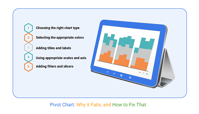
Cluttered or poorly formatted pivot charts do more harm than good. They confuse rather than clarify. Start by simplifying the design. Limit the use of colors to a few that contrast well. This makes the chart easier to read. Ensure text sizes are large enough to be readable but not so large they overwhelm the visual. Align labels correctly to prevent overlapping, which can obscure data points. These steps help maintain the visual integrity of your data.
Blank values in pivot charts create misleading gaps in data visualization. Tackle this by checking source data for blanks before creating your chart. Replace blank cells with zeros or appropriate placeholders. This adjustment keeps the integrity of your dataset intact. For unexpected errors, verify data ranges and pivot table settings. Errors often stem from incorrect data inputs or mismatched field settings in the pivot table. Regular checks prevent these issues from distorting your chart’s accuracy.
Pivot charts need current data to be effective decision-making tools. Set your pivot charts to refresh automatically whenever the underlying data changes. This can be done through your spreadsheet settings. Automatic updates save you time and reduce the risk of making decisions based on outdated information. Ensure your data source is always linked correctly to your pivot chart to facilitate seamless updates. This practice keeps your data fresh and your analyses relevant.
These detailed steps help you avoid common pitfalls in pivot charts, enhancing their clarity, accuracy, and reliability. By implementing these strategies, your pivot charts will better serve their purpose of making data understandable at a glance.
Pivot charts play a vital role in finance, especially in sales forecasting and budget analysis. They turn complex data sets into clear visual insights, helping finance professionals spot trends and variances. A pivot chart displays historical sales data effectively, revealing trends that support accurate forecasts. This visual tool allows for quick adjustments and scenario planning. By visualizing various budget scenarios, decision-makers can allocate resources more efficiently and react swiftly to financial discrepancies.
Finance teams rely on pivot charts to monitor fiscal performance against forecasts. This aids in maintaining control over budgets and improving financial accuracy. The chart simplifies complex financial data, making it easier to share and discuss insights during financial reviews or presentations. The capacity to drill down into specifics, like quarterly expenses or revenue streams, transforms strategic planning and reporting.
In essence, pivot charts serve as a financial compass. They guide companies through the complexities of financial planning, ensuring that businesses stay on a profitable course. Their visual nature and dynamic capabilities make them indispensable in the financial toolkit.
In marketing, understanding customer segments is crucial, and pivot charts are incredibly effective in this area. These charts sort and display marketing data, making it easy to identify different customer demographics and behaviors. Marketers can analyze which segments are most profitable or more engaged, tailoring campaigns to meet specific needs and preferences.
Pivot charts also enhance campaign tracking by visually representing campaign results. They help marketers monitor various metrics such as engagement rates, conversion rates, and ROI across different channels. This visual tracking aids in quickly pinpointing what works and what doesn’t, allowing for rapid adjustments to marketing strategies.
Furthermore, the ability to combine and compare data from past and current campaigns offers marketers a strategic advantage. They can forecast trends and adjust upcoming campaigns to better meet their targets. Pivot charts not only simplify complex data but also highlight correlations and patterns that might not be apparent in raw data.
Operations managers find pivot charts essential for inventory management and performance monitoring. These charts provide a clear visualization of inventory levels across multiple categories. Managers can anticipate stock needs and adjust orders to prevent both overstock and stockouts. By analyzing historical inventory data, pivot charts help predict seasonal fluctuations, ensuring optimal inventory levels throughout the year.
For performance monitoring, pivot charts display operational metrics like production speeds, downtime, or defect rates across different shifts or departments. This visualization supports quick identification of bottlenecks or inefficiencies in the production process. Managers use these insights to implement corrective actions, boosting operational efficiency and productivity.
Pivot charts also facilitate performance comparisons over time or between different operational areas, fostering a competitive spirit and encouraging performance improvement. Their dynamic nature allows for real-time data updates, which is critical for timely decision-making in fast-paced operational environments.
When handling pivot charts, keeping data fresh matters. Automatic updates save you manual refresh efforts. You set this once, and the system handles the rest. Imagine your pivot chart always displaying the latest info without extra clicks from you. It’s about efficiency and accuracy, which are key in data management.
Power Query transforms how your pivot charts access and use live data. This tool pulls fresh data into your spreadsheet as it changes. No more outdated info. Your pivot charts reflect real-time data, offering insights that are always up to date. This integration is seamless, enhancing how you interact with your data sets.
Macros can be your best tool for instant pivot chart creation. With a simple macro setup, you can generate these charts with a single command. It saves time and reduces repetitive steps. Set your parameters once, and let the macro do the rest every time you need a new pivot chart. It’s about making your data work faster and smarter for you.
Each of these techniques introduces a new level of efficiency and automation to working with pivot charts. By implementing automatic updates, integrating Power Query, and utilizing macros, you streamline the process. This allows more time for analysis rather than data management tasks.
Ever noticed your pivot chart isn’t reflecting recent data changes? It’s likely due to refresh issues. First, manually refresh your pivot chart by right-clicking within the chart and selecting ‘Refresh’. If this doesn’t solve the problem, check your data source settings. Ensure your pivot chart points to the correct range or table in your data set. Regular updates keep your charts insightful and accurate.
Adding new data can sometimes lead to errors in pivot charts. To avoid this, always ensure that new data aligns with the existing format and structure of your data set. For instance, if your original data includes four columns, maintain this structure when adding new rows. Consistency prevents many common data integration errors, keeping your charts clean and functional.
Expanding your data set should enhance your pivot chart, not break it. When adding more data, always extend your data source range or update the table your pivot chart is referencing. This is crucial for maintaining the integrity of the chart’s layout and functionality. Remember, a well-maintained data source translates to a more robust and reliable pivot chart.
Each of these steps ensures your pivot charts function smoothly, providing valuable insights from your data without unnecessary stress or confusion.
Pivot charts make data analysis faster and more effective. They bring numbers to life, turning raw figures into clear, actionable insights. With the right setup, they help you spot trends, compare categories, and refine your decision-making.
The key to getting the most from pivot charts? Start with clean data. Remove duplicates, format fields consistently, and organize your table correctly. Once your foundation is solid, structuring a pivot table for flexibility ensures you can adjust views without breaking your chart.
Customization matters. Choosing the right chart type, adjusting labels, and formatting numbers keep your visuals sharp and easy to read. Filters, slicers, and calculated fields add depth, helping you drill into details without clutter.
Avoid common mistakes. Too many fields create confusion. Blank values lead to gaps. A chart that doesn’t update properly skews analysis. Regularly refresh data and fine-tune field placements to keep your charts accurate and useful.
When used effectively, pivot charts do more than display data—they tell a story. Whether analyzing sales, tracking inventory, or fine-tuning marketing campaigns, these charts help turn raw numbers into meaningful insights.
Data is only as useful as your ability to interpret it. Build clear, structured pivot charts, and let them work for you.
How much did you enjoy this article?


Calculate accounts receivable turnover ratio to measure credit collection speed, improve cash flow, and strengthen your financial strategy. Read on!

Change Management KPIs are the key to tracking adoption, performance, and ROI during transitions. Find out which metrics matter. Read on!

Data collection methods and techniques determine the quality of every insight you act on. Explore key approaches for gathering reliable data. Read on!


