• Home
  • Tools dropdown img
    • Spreadsheet Charts

      • ChartExpo for Google Sheets
      • ChartExpo for Microsoft Excel
    • Power BI Charts

      • Power BI Custom Visuals by ChartExpo
    • Word Cloud

  • Charts dropdown img
    • Chart Category

      • Bar Charts
      • Circle Graphs
      • Column Charts
      • Combo Charts
      • Comparison Charts
      • Line Graphs
      • PPC Charts
      • Sentiment Analysis Charts
      • Survey Charts
    • Chart Type

      • Box and Whisker Plot
      • Clustered Bar Chart
      • Clustered Column Chart
      • Comparison Bar Chart
      • Control Chart
      • CSAT Survey Bar Chart
      • CSAT Survey Chart
      • Dot Plot Chart
      • Double Bar Graph
      • Funnel Chart
      • Gauge Chart
      • Likert Scale Chart
      • Matrix Chart
      • Multi Axis Line Chart
      • Overlapping Bar Chart
      • Pareto Chart
      • Radar Chart
      • Radial Bar Chart
      • Sankey Diagram
      • Scatter Plot Chart
      • Slope Chart
      • Sunburst Chart
      • Tornado Chart
      • Waterfall Chart
      • Word Cloud
    • Google Sheets
      Microsoft Excel
  • Services
  • Pricing
  • Contact us
  • Blog
  • Support dropdown img
      • Gallery
      • Videos
      • Contact us
      • FAQs
      • Resources
    • Please feel free to contact us

      atsupport@chartexpo.com

Categories
All Data Visualizations Data Analytics Surveys
Add-ons/
  • Google Sheets
  • Microsoft Excel
  • Power BI
All Data Visualizations Data Analytics Surveys
Add-ons
  • Google Sheets
  • Microsoft Excel
  • Power BI

We use cookies

This website uses cookies to provide better user experience and user's session management.
By continuing visiting this website you consent the use of these cookies.

Ok

ChartExpo Survey


Home > Blog > Microsoft Excel

How to Sort Table in Excel to Arrange Data?

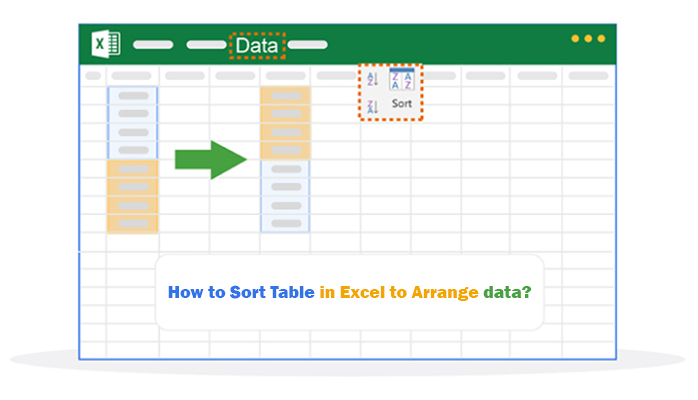
How to sort a table in Excel? Countless professionals and students have asked this question. Why? Sorting data is a key skill. It helps with managing a list of customers, tracking expenses, analyzing sales, etc.

Sorting isn’t just about arranging data alphabetically or numerically. It’s about finding patterns, making sense of information, and driving decisions. Sorting is vital in exploratory data analysis. It helps uncover trends and insights from raw data.

How to Sort Table in Excel

Imagine a spreadsheet with hundreds of rows. Identifying the top-performing product or organizing tasks by deadlines can be daunting without sorting. Sorting tables in Excel simplifies the process and saves time.

Excel is essential for productivity in a small business or a large corporation. Mastering table sorting is crucial for boosting efficiency. It’s also a great way to eliminate duplicates in Excel, ensuring clean and accurate datasets.

You can arrange data by a single column or create custom orders across multiple fields. From sorting A to Z, largest to smallest, or even by color, Excel gives you unmatched flexibility. These tools also inspire graph design ideas, allowing you to present sorted data visually for better communication.

Mastering how to sort a table in Excel isn’t reserved for data analysts. It benefits anyone aiming to work smarter with spreadsheets. The simplicity of sorting can transform raw data into meaningful insights.

Ready to explore the possibilities? Let’s dive into the details.

Table of Contents:

  1. What is Sorting a Table in Excel?
  2. Why to Sort a Row in Excel?
  3. When to Sort Tables in Excel?
  4. How to Sort Tables in Excel?
  5. How to Analyze Sorted Data in Excel?
  6. Pros and Cons of Column Sorting in Excel
  7. FAQs
  8. Wrap Up

What is Sorting a Table in Excel?

Definition: Sorting a table in Excel organizes data in a specific order. It can be alphabetical, numerical, or based on custom criteria.

Sorting helps make large datasets easier to read and analyze. It also complements the Analysis ToolPak in Excel, which provides advanced data analysis capabilities.

Sorting allows you to rearrange rows based on values in one or more columns. For example, you can sort a list of names alphabetically or arrange sales data from highest to lowest. Sorting tables in Excel ensures clarity and improves data management for better decision-making.

Understanding the Process of Sorting Tables in Excel with Comparison Bar Charts in Microsoft Excel to Organize Data Efficiently

Understanding the Process of Sorting Tables in Excel with Comparison Bar Charts in Google Sheets to Organize Data Efficiently

Understanding the Process of Sorting Tables in Excel with Comparison Bar Charts in Power BI to Organize Data Efficiently

Why to Sort a Row in Excel?

Sorting rows in Excel isn’t just a tool but a game-changer for managing data. It cuts through information overload by organizing your data into a clear structure. It simplifies the way you view and interact with information. Here’s why sorting rows matters:

  • Enhanced data organization: It transforms scattered data into an organized format, allowing you to locate and group related information.
  • Improved analysis and comparison: When rows are sorted, identifying trends becomes simpler. Therefore, comparing values and drawing insights is easier without sifting through random entries.
  • Time efficiency: Sorting eliminates the need for manual searches. You can organize rows in seconds and focus on more critical tasks with one action.
  • Data integrity and consistency: Sorted data reduces the risk of duplication and errors. It ensures your dataset remains clean, consistent, and reliable.
  • Facilitates reporting and presentation: Well-sorted rows make reports more logical and easier to follow. They also give your tables a polished, professional look for presentations.

When to Sort Tables in Excel?

Sorting tables in Excel isn’t just useful—it’s essential for working smarter. Whether tackling a small list or a massive dataset, sorting helps make sense of your information. It also lays the groundwork for visual analytics, turning organized data into meaningful insights. Here’s when you should use it:

  • Organizing data for analysis: Sorting arranges data logically, making analysis easier and more effective. It ensures related information is grouped, providing clarity for deeper insights.
  • Preparing data for reporting: Reports require clean, structured data that’s easy to follow. Sorting creates an organized flow, helping to present information professionally and accurately.
  • Comparing data efficiently: Sorting aligns rows in a specific order, simplifying comparisons. It enables you to analyze similarities and differences without unnecessary searching.
  • Identifying outliers and trends: Sorting helps you find unusual values or key performers in your dataset. By ordering the data, patterns and trends become more visible and actionable.
  • Data cleanup: A sorted table quickly highlights duplicates, blank cells, or errors. This simplifies the process of fixing inconsistencies and refining your dataset.

How to Sort Tables in Excel?

Sorting tables in Excel can make your data easier to read and analyze. It’s a key step toward data-driven decision-making, helping you turn raw information into actionable insights. Let’s break it down step by step—you’ll organize like a pro in no time.

  1. Select the data: Click anywhere in your table or highlight the rows and columns you want to sort. Excel knows you’re about to work some magic.
  2. Open the sort dialog: Head to the Data tab on the ribbon and click Sort. A box will pop up, giving you all the options you need.
  3. Choose sort criteria: Decide how you want your data sorted. Sorting alphabetically? Numerically? By color? Pick a column, select a sort order (A-Z, Z-A, smallest to largest), and you’re halfway there.
  4. Add additional sort levels (optional): Click “Add Level” to sort by multiple columns. For example, you could sort by “Region” first and then by “Sales Amount.”
  5. Apply the sort: Click OK and watch Excel work its magic. Your data is now sorted and ready for action.

How to Analyze Sorted Data in Excel?

Sorting tables in Excel is like tidying up a cluttered desk—it’s a simple way to make sense of your data. However, Excel can feel a bit basic compared to specialized data visualization tools. Sure, it organizes numbers, but making those numbers tell a story? That’s where it struggles.

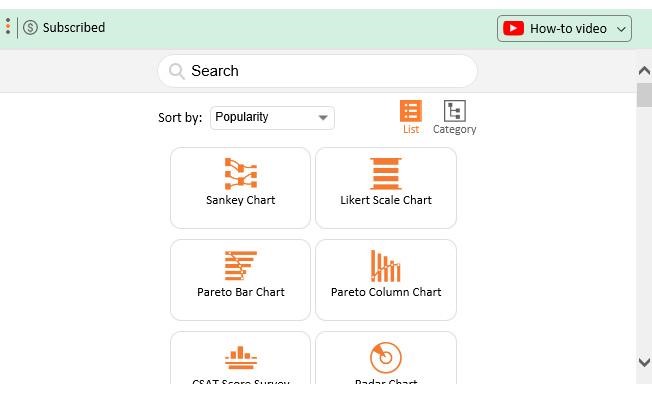
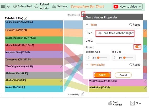
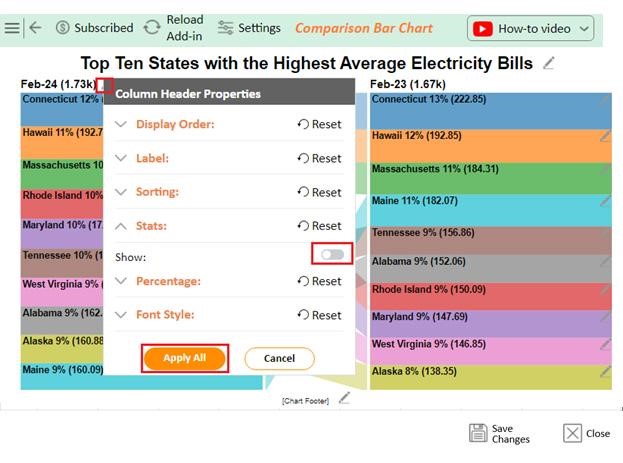
Enter ChartExpo. This powerful add-on turns dry data into insightful bar and line graphs in Excel. It bridges the gap, making Excel a more complete tool for presenting and understanding data.

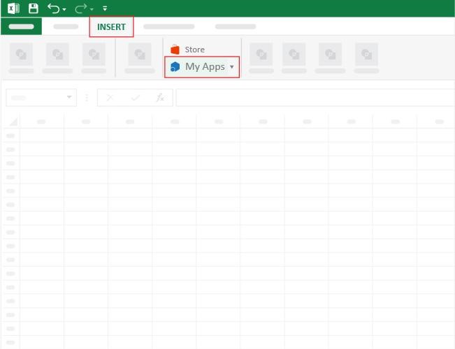
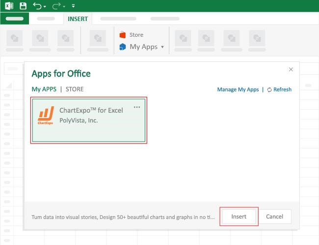
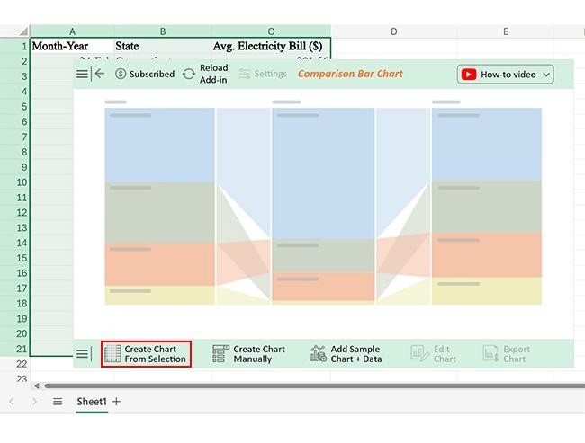
How to Install ChartExpo in Excel?

  1. Open your Excel application.
  2. Open the worksheet and click the “Insert” menu.
  3. You’ll see the “My Apps” option.
  4. In the Office Add-ins window, click “Store” and search for ChartExpo on my Apps Store.
  5. Click the “Add” button to install ChartExpo in your Excel.

ChartExpo charts are available both in Google Sheets and Microsoft Excel. Please use the following CTAs to install the tool of your choice and create beautiful visualizations with a few clicks in your favorite tool.

Example

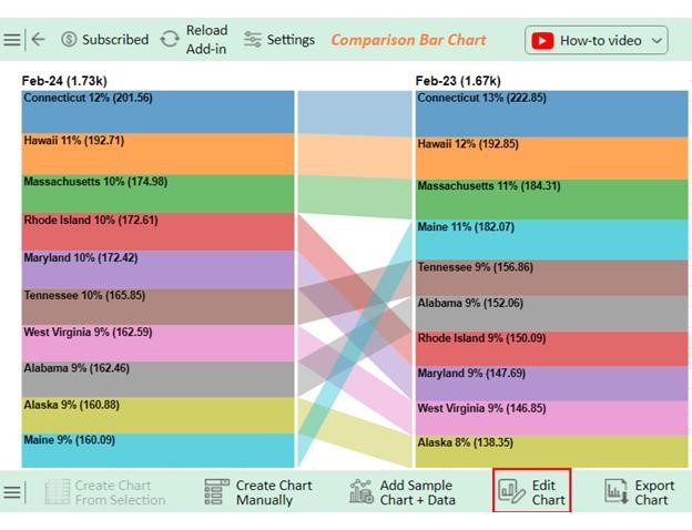
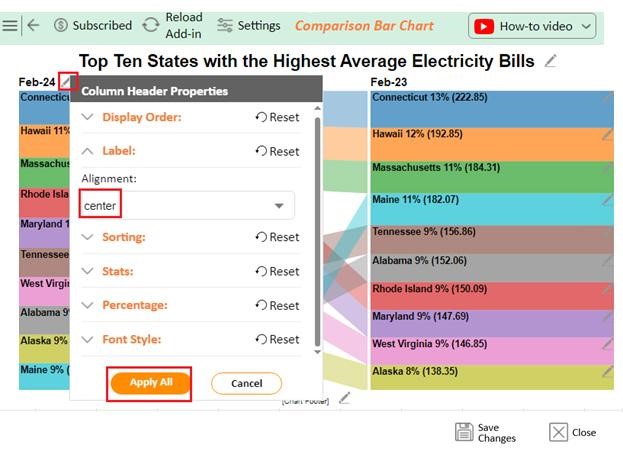
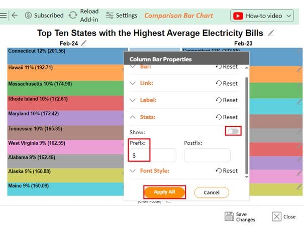
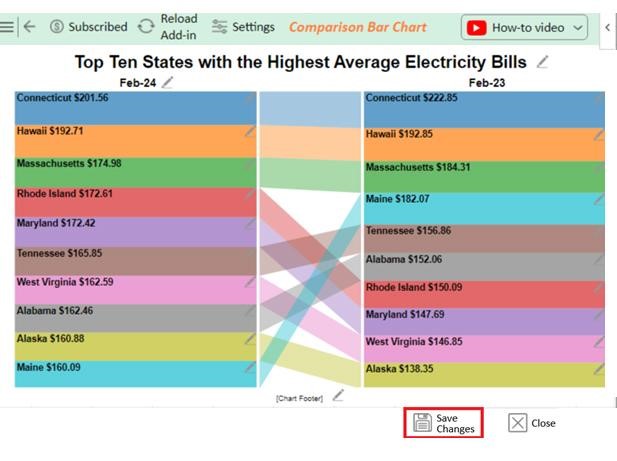
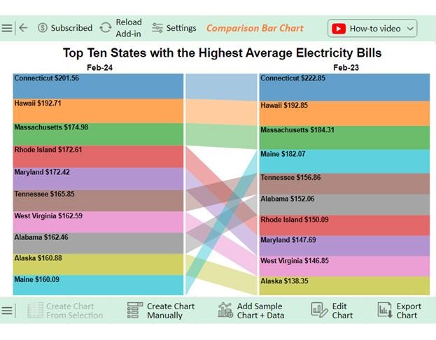
Let’s analyze the electricity cost comparison example data below using ChartExpo.

Month-Year State Avg. Electricity Bill ($)
Feb-24 Connecticut 201.56
Feb-23 Connecticut 222.85
Feb-24 Hawaii 192.71
Feb-23 Hawaii 192.85
Feb-24 Massachusetts 174.98
Feb-23 Massachusetts 184.31
Feb-24 Rhode Island 172.61
Feb-23 Rhode Island 150.09
Feb-24 Maryland 172.42
Feb-23 Maryland 147.69
Feb-24 Tennessee 165.85
Feb-23 Tennessee 156.86
Feb-24 West Virginia 162.59
Feb-23 West Virginia 146.85
Feb-24 Alabama 162.46
Feb-23 Alabama 152.06
Feb-24 Alaska 160.88
Feb-23 Alaska 138.35
Feb-24 Maine 160.09
Feb-23 Maine 182.07


  • To get started with ChartExpo, install ChartExpo in Excel
  • Access My Apps under the INSERT menu.
How to Sort Table in Excel
  • Choose ChartExpo and click the “Insert” button.
How to Sort Table in Excel
  • After ChartExpo loads, choose the “Comparison Bar Chart” from the chart list.
How to Sort Table in Excel
  • Select the data from the sheet, and click the “Create Chart From Selection” button.
How to Sort Table in Excel
  • ChartExpo will create the visualization below for you.
How to Sort Table in Excel
  • If you want to add a chart title, click the “Edit Chart” button.
  • To modify the title, click the pencil icon next to “Chart Header”. Add the appropriate heading in Line 1 under the Text section. Enable the Show option and click the “Apply” button.
How to Sort Table in Excel
  •  You can disable the stats by clicking on the small pencil icon as follows:
How to Sort Table in Excel
  • You can align into the center by clicking on the small pencil icon as follows:
How to Sort Table in Excel
  • You can add the dollar sign with values and disable the stats by clicking on the small pencil icon:
How to Sort Table in Excel
  • Click the “Save Changes” button to ensure the changes are permanent.
How to Sort Table in Excel
  • Your final chart will then resemble the image below.
How to Sort Table in Excel

Insights

  • Connecticut: Electricity bills dropped to $201.56 (from $222.85).
  • Hawaii: Bills remained steady at approximately $192.
  • Massachusetts: Prices decreased to $174.98 (from $184.31).
  • Other states with increases:
    • Rhode Island: $172.61
    • Maryland: $172.42
    • Tennessee: $165.85
    • West Virginia: $162.59
    • Alabama: $162.46
  • Maine: Bills fell to $160.09 (from $182.07).

Pros and Cons of Column Sorting in Excel

Column sorting in Excel is like giving your data a makeover—it’s easier to read, compare, and analyze. But, like any tool, it has its ups and downs. Let’s explore the pros and cons of sorting columns in Excel.

Pros of Column Sorting in Excel

  • Improved organization: Sorting arranges your data alphabetically or numerically, making a messy table clean and structured.
  • Efficient comparison: Do you need to find the top performers or lowest values? Sorting helps you see trends and outliers in seconds.
  • Simplified analysis: Insights jump off the screen when your data is sorted. Learn how to clean data in Excel and master sorting – patterns will become easier to spot and decision-making faster.

Cons of Column Sorting in Excel

  • Loss of original data order: Once sorted, your data’s initial sequence is lost, so save it first for seamless data discovery. Always keep a backup of the orders.
  • Potential errors: Sorting can mess up your data—like separating names from their scores. Always double-check your settings to prevent mix-ups.

FAQs

How do I sort a table in Excel without mixing data?

  • Select the entire table, including headers.
  • Go to the Data tab and click Sort.
  • Check the “My data has headers” option in the Sort dialog box.
  • Choose the column and sort it in order (A to Z or Z to A).

Why won’t Excel let me sort a table?

Excel may not let you sort a table if there are blank rows, merged cells, or inconsistent data types. Ensure your table has no gaps, unmerge cells, and check for uniform data in the column you’re sorting.

How do I sort an entire table in Excel?

  • Highlight the entire table, including headers.
  • Go to the Data tab on the ribbon.
  • Click the Sort
  • Select the column to sort by.
  • Choose the sort order: A to Z or Z to A.
  • Click OK to apply the sort.

Wrap Up

Sorting tables in Excel is a fundamental skill. It simplifies working with data and improves productivity. For personal tasks or professional projects, sorting saves time and reduces errors.

Learning how to sort tables in Excel enhances tools like a price comparison template in Excel. You can arrange data alphabetically, numerically, or by custom rules. These options help you find and analyze information faster.

Sorting ensures better organization. It structures messy datasets and supports clear information design for better communication. From budgets to business reports, it keeps everything clear and logical.

Sorting highlights trends, identifies outliers, and supports better decision-making. It even aids in tracking variance in Excel, helping you compare differences in data more efficiently.

Using Excel for sorting improves presentations and reporting. Organized tables are easier to read and pair well with circular charts, visually representing sorted data. They help you communicate your ideas effectively.

Mastering sorting in Excel is a step toward better data management. It’s simple, powerful, and essential for anyone working with spreadsheets. Explore the differences between tables vs. charts and start practicing today to see the difference. Even better, install ChartExpo for insightful, easy-to-understand charts and boost your data analysis.

How much did you enjoy this article?

ExcelAd2
Start Free Trial!
148504

Related articles

next previous
Microsoft Excel8 min read

Excel Task Tracker Template for Smarter Task Insights

Task tracker template in Excel organizes tasks, tracks deadlines, and boosts efficiency. Learn its benefits, and explore expert tips to simplify task management.

Microsoft Excel10 min read

Invoice Tracker Template in Excel for Better Insights

An invoice tracker Excel template helps track invoices, due dates, and payments. Learn how to use this template for better financial management.

Microsoft Excel12 min read

Key Performance Indicators in Healthcare for Better Insights

Key Performance Indicators in healthcare track patient care and efficiency. Learn about these KPIs, top examples, and how to use them to improve outcomes.

Microsoft Excel10 min read

BMI Calculation Formula in Excel for Better Fitness Insights

The BMI calculation formula in Excel helps track and analyze body mass index. Explore step-by-step instructions and tips to simplify BMI tracking in Excel.

Microsoft Excel29 min read

How to Create a Tornado Chart in Excel? A Complete Guide

Click to learn how to plot a Tornado Chart in Excel using easy-to-follow steps. Also, we’ll address the following question: what is a Tornado Diagram?

ChartExpo logo

Turn Data into Visual
Stories

CHARTEXPO

  • Home
  • Gallery
  • Videos
  • Services
  • Pricing
  • Contact us
  • FAQs
  • Privacy policy
  • Terms of Service
  • Sitemap

TOOLS

  • ChartExpo for Google Sheets
  • ChartExpo for Microsoft Excel
  • Power BI Custom Visuals by ChartExpo
  • Word Cloud

CATEGORIES

  • Bar Charts
  • Circle Graphs
  • Column Charts
  • Combo Charts
  • Comparison Charts
  • Line Graphs
  • PPC Charts
  • Sentiment Analysis Charts
  • Survey Charts

TOP CHARTS

  • Sankey Diagram
  • Likert Scale Chart
  • Comparison Bar Chart
  • Pareto Chart
  • Funnel Chart
  • Gauge Chart
  • Radar Chart
  • Radial Bar Chart
  • Sunburst Chart
  • see more
  • Scatter Plot Chart
  • CSAT Survey Bar Chart
  • CSAT Survey Chart
  • Dot Plot Chart
  • Double Bar Graph
  • Matrix Chart
  • Multi Axis Line Chart
  • Overlapping Bar Chart
  • Control Chart
  • Slope Chart
  • Clustered Bar Chart
  • Clustered Column Chart
  • Box and Whisker Plot
  • Tornado Chart
  • Waterfall Chart
  • Word Cloud
  • see less

RESOURCES

  • Blog
  • Resources
  • YouTube
SIGN UP FOR UPDATES

We wouldn't dream of spamming you or selling your info.

© 2025 ChartExpo, all rights reserved.