• Home
  • Tools dropdown img
    • Spreadsheet Charts

      • ChartExpo for Google Sheets
      • ChartExpo for Microsoft Excel
    • Power BI Charts

      • Power BI Custom Visuals by ChartExpo
    • Word Cloud

  • Charts dropdown img
    • Chart Category

      • Bar Charts
      • Circle Graphs
      • Column Charts
      • Combo Charts
      • Comparison Charts
      • Line Graphs
      • PPC Charts
      • Sentiment Analysis Charts
      • Survey Charts
    • Chart Type

      • Box and Whisker Plot
      • Clustered Bar Chart
      • Clustered Column Chart
      • Comparison Bar Chart
      • Control Chart
      • CSAT Survey Bar Chart
      • CSAT Survey Chart
      • Dot Plot Chart
      • Double Bar Graph
      • Funnel Chart
      • Gauge Chart
      • Likert Scale Chart
      • Matrix Chart
      • Multi Axis Line Chart
      • Overlapping Bar Chart
      • Pareto Chart
      • Radar Chart
      • Radial Bar Chart
      • Sankey Diagram
      • Scatter Plot Chart
      • Slope Chart
      • Sunburst Chart
      • Tornado Chart
      • Waterfall Chart
      • Word Cloud
    • Google Sheets
      Microsoft Excel
  • Services
  • Pricing
  • Contact us
  • Blog
  • Support dropdown img
      • Gallery
      • Videos
      • Contact us
      • FAQs
      • Resources
    • Please feel free to contact us

      atsupport@chartexpo.com

Categories
All Data Visualizations Data Analytics Surveys
Add-ons/
  • Google Sheets
  • Microsoft Excel
  • Power BI
All Data Visualizations Data Analytics Surveys
Add-ons
  • Google Sheets
  • Microsoft Excel
  • Power BI

We use cookies

This website uses cookies to provide better user experience and user's session management.
By continuing visiting this website you consent the use of these cookies.

Ok

ChartExpo Survey


Home > Blog > Microsoft Excel

How to Organize Data in Excel for Clean Reports?

How do you organize data in Excel? Imagine staring at a spreadsheet with hundreds of rows and columns. Names, numbers, and dates blur together, and finding insights feels impossible. This is where Excel becomes powerful—if you know how to use it effectively.

Excel is a tool used by over 750 million people worldwide. It’s essential for businesses, students, and anyone managing information. Yet, many users need help organizing their data efficiently. Messy spreadsheets lead to errors, wasted time, and frustration.

How to Organize Data in Excel

Consider this: a report by Gartner revealed that poor data quality costs companies an average of $15 million annually. Disorganized data contributes significantly to this loss. Whether tracking sales, analyzing trends, or managing inventory, a clear structure is key.

Knowing how to organize data in Excel isn’t about adding more formulas or fancy charts. It starts with basics like proper formatting, using filters, and leveraging built-in tools like tables. Small changes make a big difference.

Picture transforming a chaotic spreadsheet into one that’s clear and actionable. Sorting, grouping, and visualizing data become seamless. Suddenly, decision-making gets faster, and insights emerge effortlessly.

If data is the foundation of decisions, organization is the glue that holds it together. Excel offers the tools; all you need is the know-how.

Ready to take control of your spreadsheets? Let’s dive in.

Table of Contents:

  1. How to Organize Data in Excel?
  2. What are the Best Ways to Organize Data in Excel Files?
  3. How to Visualize Organized Data in Excel?
  4. What are the Benefits of Organizing Excel Data?
  5. Wrap Up

First…

How to Organize Data in Excel?

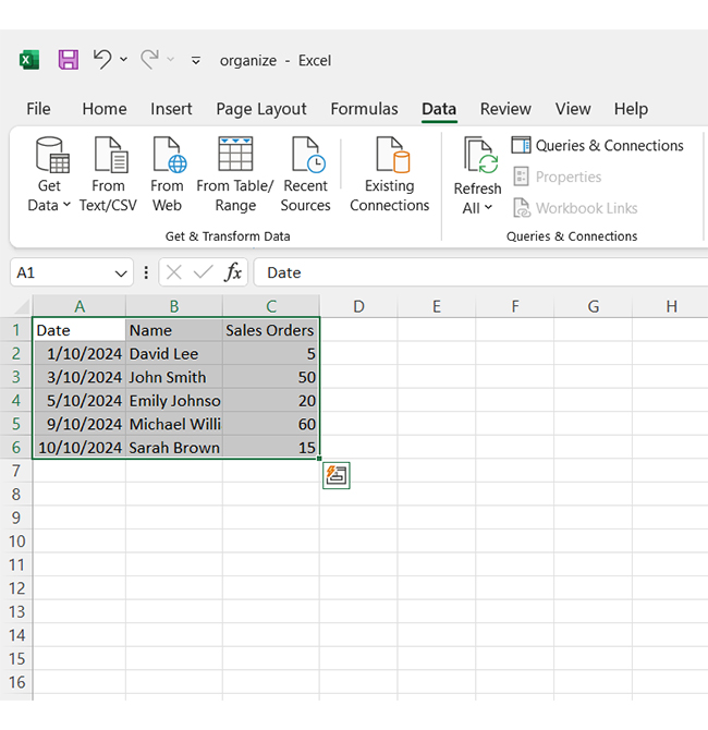
Picture this: you’ve just opened a spreadsheet crammed with sales numbers, client names, and project timelines. Your boss needs a report by the end of the day, but everything looks like a chaotic puzzle.

Where do you start?

  1. Format Cells to Highlight and Segment Data

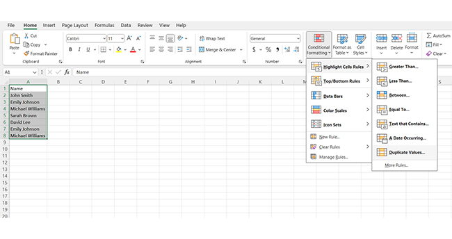
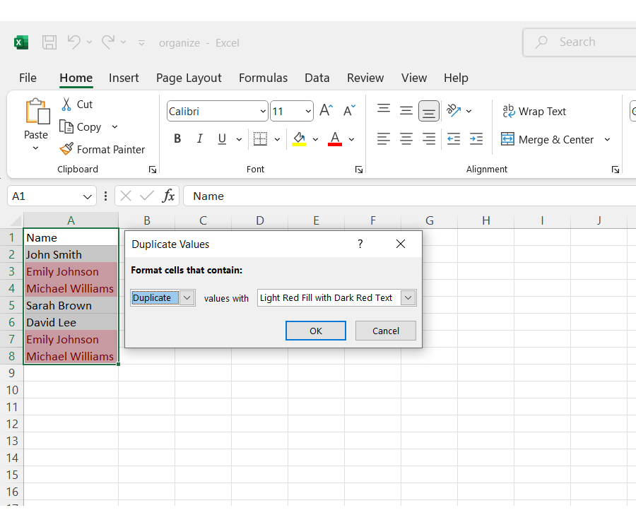
Formatting is like adding visual cues to your data. Use bold headers, color codes, or conditional formatting to spotlight important figures or categorize information. For example:

    • Highlight overdue tasks in red.
    • Use alternating row colors for better readability.

This helps you and your team quickly grasp insights without sifting through endless rows.

  1. Sort and Filter Data to Organize Worksheets

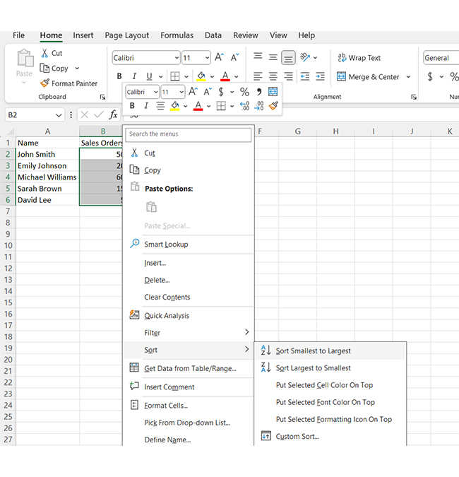
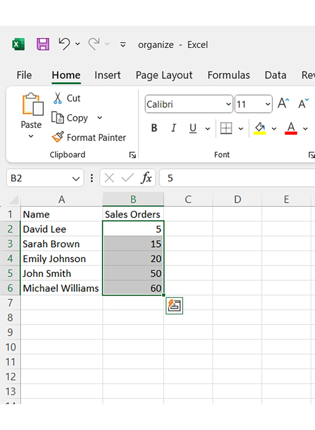
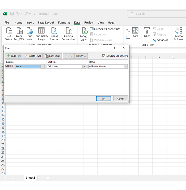
Sorting and filtering are Excel’s secret weapons for managing chaos.

    • Sort data alphabetically, numerically, or by date to create order.
    • Use filters to temporarily hide irrelevant rows, focusing only on what matters.

For example, quickly filter sales data by region to focus on key metrics and KPIs, ensuring a sharper analysis of performance trends.

  1. Apply Formulas to Organize Large Datasets

Let formulas do the heavy lifting! With functions like VLOOKUP, INDEX/MATCH, or IF, you can extract and reorganize data effortlessly.

    • Use SUMIF to calculate the total sales for a specific category.
    • Apply TEXT functions to clean up and format messy strings.
    • Pro tip: Combine formulas to automate complex tasks and reduce manual work.
  1. Create Named Ranges to Assign a Name to Cells

Named ranges make navigation a breeze! Instead of referencing cells like A1:A100, give that range a name like “MonthlySales”.

    • Simplify formulas: =SUM(MonthlySales) is much easier to read than =SUM(A1:A100).
    • Bonus: Named ranges also reduce errors and enhance collaboration.
  1. Use Outlining to Group Specific Rows and Columns

Outlining helps you condense your data visually—group related rows or columns into collapsible sections.

    • For example, group quarterly data under yearly summaries.
    • Quickly expand and collapse groups for a cleaner view of your sheet.

This keeps your worksheet tidy without sacrificing accessibility.

  1. Make Sub Sheets to Distribute and Categorize Data

If your workbook is turning into a labyrinth, create sub-sheets! Split data logically:

    • Use one sheet per department, region, or category.
    • Add hyperlinks between sheets for seamless navigation.

Think of sub sheets as filing cabinets for your data—easy to find and neatly organized.

  1. Use Data Consolidation to Combine Data from Multiple Sheets

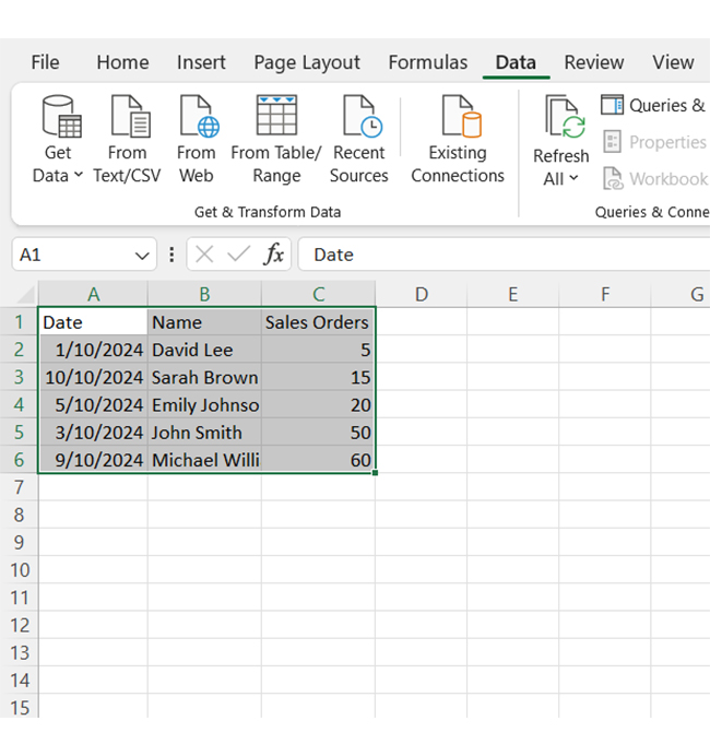
Need to compile data from different sheets? Data Consolidation in Excel is your go-to tool.

    • Combine sales numbers from regional sheets into a master report.
    • Aggregate data with sums, averages, or other functions.

This is perfect for creating a comprehensive overview while maintaining individual sheets for detailed data analysis.

What are the Best Ways to Organize Data in Excel Files?

Is your Excel sheet slowing you down and making your tasks more complicated?

Fear not! You can transform that jumble into a sleek, efficient database with a few strategic moves. Let’s see how to easily organize your data and tidy up your columns.

  1. Start by eliminating duplicate entries in Excel. They’re the hidden culprits behind inflated figures and errors.
Tackle Duplicate Entries for Learning How to Organize Data in Excel
  1. Use Excel’s Conditional Formatting tool to spot duplicates and click “Duplicate Values”.
Use Excel Conditional Formatting for Learning How to Organize Data in Excel
  1. You’ll see repeated data automatically highlighted—typically in red. From there, you can clean them up in seconds.
See Repeated Data Automatically for Learning How to Organize Data in Excel
  1. Next, focus on sorting your data logically. If you’re working with sales orders, for instance, sort them in ascending order.
Focus on Sorting Data Logically for Learning How to Organize Data in Excel
  1. Select the relevant column, go to Data, and choose Sort A to Z. This simple step organizes your entries so they’re easier to review.
Select Relevant Column for Learning How to Organize Data in Excel
  1. To put dates in order, head back to the Data tab.
Put Dataes in Order for Learning How to Organize Data in Excel
  1. Choose your date column, sort by Oldest to Newest, and hit “OK”.
Sort by Oldest to Newest and Hit OK for Learning How to Organize Data in Excel
  1. These methods will take you from chaos to clarity in no time. Look at the data below—it’s faster to analyze, simpler to share, and less stressful to work with.
Simple to Share for Learning How to Organize Data in Excel

How to Visualize Organized Data in Excel?

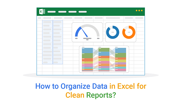
Organized data is essential, but making sense of it requires more than numbers on a screen.

That’s where data visualization comes in. It transforms raw information into clear, actionable insights.

While Excel offers basic charting tools, it often fails to meet more advanced needs. Complex datasets deserve more than standard pie charts.

Enter ChartExpo. This tool turns Excel’s limitations into opportunities, making data visualization effortless and stunning.

Ready to see your data in a whole new way? Install ChartExpo.

Let’s learn how to install ChartExpo in Excel.

  1. Open your Excel application.
  2. Open the worksheet and click the “Insert” menu.
  3. You’ll see the “My Apps” option.
  4. In the Office Add-ins window, click “Store” and search for ChartExpo on my Apps Store.
  5. Click the “Add” button to install ChartExpo in your Excel.

ChartExpo charts are available both in Google Sheets and Microsoft Excel. Please use the following CTAs to install the tool of your choice and create beautiful visualizations with a few clicks in your favorite tool.

Example

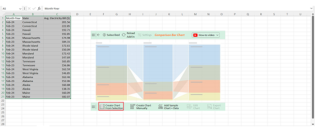
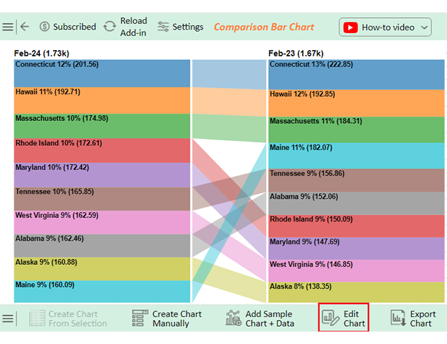
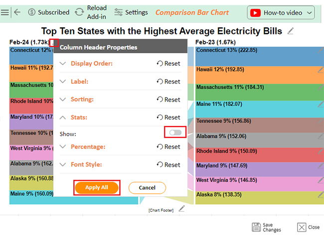
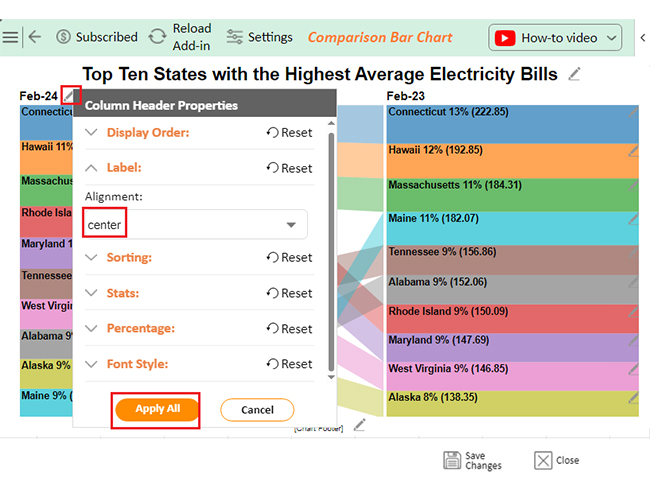
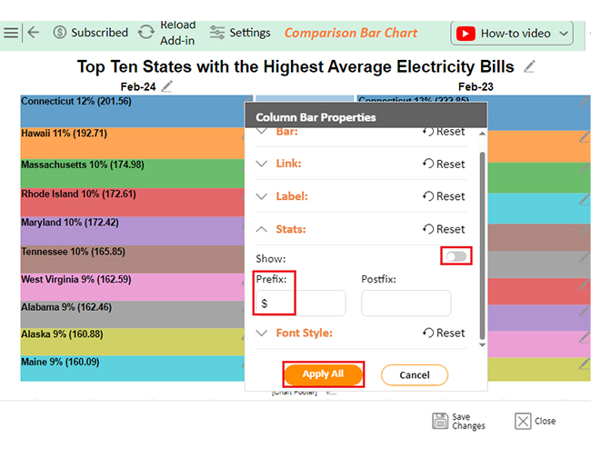
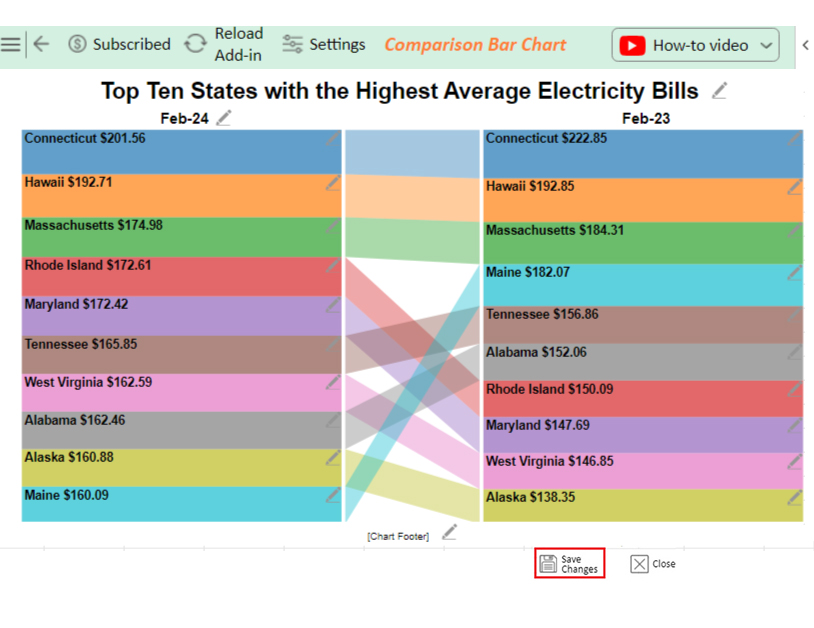
Let’s visualize the sample data below in Excel using ChartExpo and glean valuable insights.

Month-Year State Avg. Electricity Bill ($)
Feb-24 Connecticut 201.56
Feb-23 Connecticut 222.85
Feb-24 Hawaii 192.71
Feb-23 Hawaii 192.85
Feb-24 Massachusetts 174.98
Feb-23 Massachusetts 184.31
Feb-24 Rhode Island 172.61
Feb-23 Rhode Island 150.09
Feb-24 Maryland 172.42
Feb-23 Maryland 147.69
Feb-24 Tennessee 165.85
Feb-23 Tennessee 156.86
Feb-24 West Virginia 162.59
Feb-23 West Virginia 146.85
Feb-24 Alabama 162.46
Feb-23 Alabama 152.06
Feb-24 Alaska 160.88
Feb-23 Alaska 138.35
Feb-24 Maine 160.09
Feb-23 Maine 182.07
  • To get started with ChartExpo, install ChartExpo in Excel.
  • Access My Apps under the INSERT menu.
insert chartexpo in excel
  • Choose ChartExpo and click the “Insert” button.
open chartexpo in excel
  • After ChartExpo loads, choose the “Comparison Bar Chart” from the chart list.
search comparison bar chart in excel
  • Select the data from the sheet, and click the “Create Chart From Selection” button.
Click Create Chart From Selection After Learning How to Organize Data in Excel
  • ChartExpo will create the visualization below for you.
Initial Visual After Learning How to Organize Data in Excel
  • If you want to have the chart’s title, click Edit Chart, as shown in the above image.
  • Click the pencil icon next to the Chart Header to change the title.
  • It will open the properties dialog. Under the Text section, you can add a heading in Line 1 and enable Show.
  • Give the appropriate title of your chart and click the Apply button.
Add Chart Header After Learning How to Organize Data in Excel
  • You can disable the stats by clicking on the small pencil icon as follows:
Disable Stats After Learning How to Organize Data in Excel
  • You can align into the center by clicking on the small pencil icon as follows:
Align into Center After Learning How to Organize Data in Excel
  • You can add the dollar sign with values and disable the stats by clicking on the small pencil icon:
Add Prefix After Learning How to Organize Data in Excel
  • Click the “Save Changes” button to ensure the changes are permanent.
Click Save Changes After Learning How to Organize Data in Excel
  • Your final chart will then resemble the image below.
Final How to Organize Data in Excel

Insights

  • Connecticut: Average electricity bill fell to $201.56 on Feb-24, down from $222.85 on Feb-23.
  • Hawaii: Electricity cost remained steady at approximately $192.
  • Massachusetts: Bill decreased to $174.98, down from $184.31.
  • Rhode Island, Maryland, Tennessee, West Virginia, Alabama, and Alaska: Prices rose to $172.61, $172.42, $165.85, $162.59, $162.46, and $160.88, respectively.
  • Maine: Price dropped significantly to $160.09, down from $182.07.

Enhance Data Insights by Organizing Data in Microsoft Excel for Comparison Bar Charts:

  1. Open your Excel Application.
  2. Install ChartExpo Add-in for Excel from Microsoft AppSource to create interactive visualizations.
  3. Select the Comparison Bar Chart from the list of charts.
  4. Select your data.
  5. Click on the “Create Chart from Selection” button.
  6. Customize your chart properties to add header, axis, legends, and other required information.
  7. Export your chart and share it with your audience.

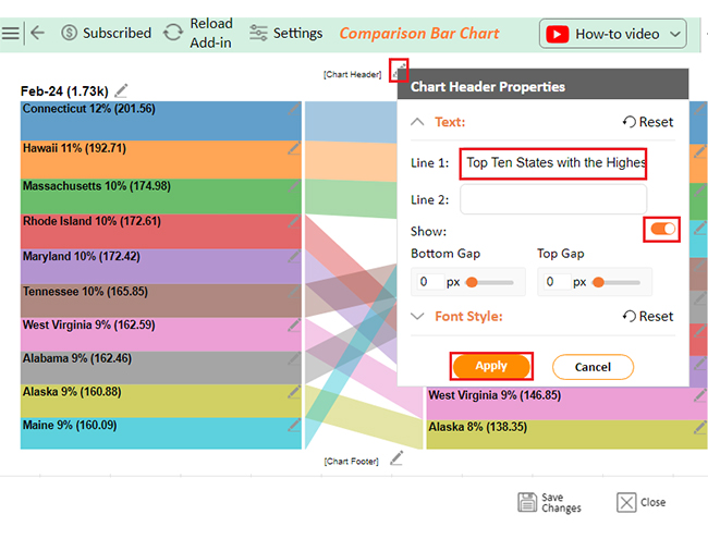
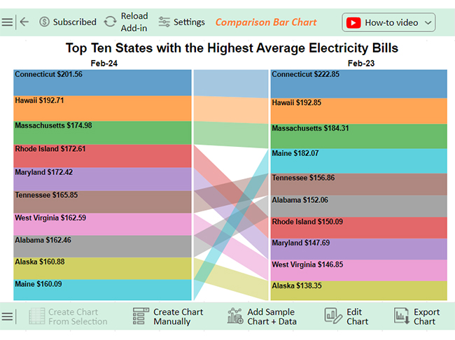
The following video will help you to create a Comparison Bar Chart in Microsoft Excel.

What are the Benefits of Organizing Excel Data?

Have you ever opened a messy spreadsheet and felt instantly overwhelmed? Rows of numbers blur together, making it hard to find what you need. This chaos slows you down and creates room for mistakes.

Organizing your Excel data is a win every time. Why?

  • Improved data clarity and accessibility: Well-structured data is easier to read and access. No more wasting time hunting for the right number or name.
  • Enhanced analysis and reporting: Clear data enhances trend analysis, making patterns and trends stand out, and ensuring your reports are more insightful and impactful.
  • Faster decision-making: Organized data ensures you can focus on data-driven decision-making instead of spending hours piecing together answers. Everything is readily available when you need it.
  • Reduced errors: Cleaner spreadsheets mean fewer chances of miscalculations or missed details.
  • Simplified management: Updates, sorting, and sharing data become effortless when everything is in the right place.

FAQs

How do you organize data as a list in Excel?

To organize data as a list in Excel:

  • Enter information into rows and columns.
  • Use headers for clarity.
  • Highlight the range and format it as a table using “Format as Table”.
  • This improves sorting, filtering, and analysis efficiency.

How do I organize data groups in Excel?

To organize data groups in Excel:

  • Select the rows or columns you want to group.
  • Go to the Data tab and click Group.
  • Use the outline symbols to collapse or expand groups for better data organization and clarity.

Wrap Up

Organizing data in Excel is easy; it only takes following the right steps. With clear strategies, even the messiest spreadsheets can become manageable. Start by cleaning your data. Remove duplicates and unnecessary blanks to create a solid foundation.

Sorting and filtering make data easier to navigate. Structured columns, whether by dates, numbers, or names, save time and reduce confusion.

Always format your cells. Highlight important sections or create tables to keep your work neat and professional.

Named ranges are game-changers for large datasets. They simplify formulas and help you find data quickly. Grouping rows or columns with outlining adds flexibility. You can collapse sections and focus only on what matters most.

When working with multiple sheets, consolidation pulls everything together. Combining data helps you spot trends and keep the bigger picture in view. Each step builds toward clarity and efficiency.

An organized Excel file isn’t just about appearances. It improves decision-making and reduces errors. Clean, structured data boosts confidence in your work.

With these tips, Excel becomes more than a spreadsheet. It’s a tool for insights and productivity. Start small, be consistent, and enjoy the benefits of an organized workflow. Your data deserves it.

How much did you enjoy this article?

ExcelAd2
Start Free Trial!
144641

Related articles

next previous
Microsoft Excel8 min read

Excel Task Tracker Template for Smarter Task Insights

Task tracker template in Excel organizes tasks, tracks deadlines, and boosts efficiency. Learn its benefits, and explore expert tips to simplify task management.

Microsoft Excel10 min read

Invoice Tracker Template in Excel for Better Insights

An invoice tracker Excel template helps track invoices, due dates, and payments. Learn how to use this template for better financial management.

Microsoft Excel12 min read

Key Performance Indicators in Healthcare for Better Insights

Key Performance Indicators in healthcare track patient care and efficiency. Learn about these KPIs, top examples, and how to use them to improve outcomes.

Microsoft Excel10 min read

BMI Calculation Formula in Excel for Better Fitness Insights

The BMI calculation formula in Excel helps track and analyze body mass index. Explore step-by-step instructions and tips to simplify BMI tracking in Excel.

Microsoft Excel29 min read

How to Create a Tornado Chart in Excel? A Complete Guide

Click to learn how to plot a Tornado Chart in Excel using easy-to-follow steps. Also, we’ll address the following question: what is a Tornado Diagram?

ChartExpo logo

Turn Data into Visual
Stories

CHARTEXPO

  • Home
  • Gallery
  • Videos
  • Services
  • Pricing
  • Contact us
  • FAQs
  • Privacy policy
  • Terms of Service
  • Sitemap

TOOLS

  • ChartExpo for Google Sheets
  • ChartExpo for Microsoft Excel
  • Power BI Custom Visuals by ChartExpo
  • Word Cloud

CATEGORIES

  • Bar Charts
  • Circle Graphs
  • Column Charts
  • Combo Charts
  • Comparison Charts
  • Line Graphs
  • PPC Charts
  • Sentiment Analysis Charts
  • Survey Charts

TOP CHARTS

  • Sankey Diagram
  • Likert Scale Chart
  • Comparison Bar Chart
  • Pareto Chart
  • Funnel Chart
  • Gauge Chart
  • Radar Chart
  • Radial Bar Chart
  • Sunburst Chart
  • see more
  • Scatter Plot Chart
  • CSAT Survey Bar Chart
  • CSAT Survey Chart
  • Dot Plot Chart
  • Double Bar Graph
  • Matrix Chart
  • Multi Axis Line Chart
  • Overlapping Bar Chart
  • Control Chart
  • Slope Chart
  • Clustered Bar Chart
  • Clustered Column Chart
  • Box and Whisker Plot
  • Tornado Chart
  • Waterfall Chart
  • Word Cloud
  • see less

RESOURCES

  • Blog
  • Resources
  • YouTube
SIGN UP FOR UPDATES

We wouldn't dream of spamming you or selling your info.

© 2025 ChartExpo, all rights reserved.