Categories
Alternative of Pie Chart becomes an important topic when simple circular visualizations are no longer enough to explain complex data clearly.
In many reporting scenarios, proportional views can make it harder to compare values accurately, especially when multiple categories or close differences are involved.

In real-world data analysis, decision-makers often need clearer comparison methods that go beyond basic proportional visuals.
This is where other chart types become more effective for highlighting trends, differences, and patterns in data.
In this guide, we will explore the most effective Alternative of Pie Chart, when to use them, and how they improve clarity in data visualization and reporting.
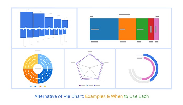
Below are the most effective alternative charts created using ChartExpo in Excel. Each visualization is designed for a specific type of data, helping improve clarity, comparison, and decision-making.
This Spectrum Chart represents region-wise sales distribution across the United States, Canada, the UK, and Australia.
It provides a clear view of how total sales are distributed across regions in a continuous horizontal format, making it easier to compare proportional contributions without the distortion often seen in circular visualizations.
Key Insight
The United States contributes the highest share (44.6%), while Australia has the smallest share (8.9%), making performance gaps visually clearer than a proportional circle-based chart.
This Sequence Chart visualizes hospital service performance across multiple factors such as service quality, customer experience, staff efficiency, and cost perception.
Unlike circular formats, this sequential structure helps in understanding how each service component flows and performs across different evaluation levels.
Key Insight
Customer Experience and Services show higher values, while Cost-related metrics appear lower, helping stakeholders quickly identify operational strengths and gaps.
The Radial Chart displays regional sales performance in a circular but structured format, offering a balanced view of proportion and hierarchy.
It highlights total sales distribution while maintaining better readability compared to traditional pie-style visuals.
Key Insight
Even though the United States dominates sales, the radial structure makes it easier to compare mid-tier contributors like Canada and the UK without visual distortion.
This Multi-Axis Spider Chart visualizes athlete performance across multiple metrics such as speed, strength, endurance, and agility.
It allows you to compare multiple variables at once from a central point, making it ideal for evaluating overall performance across different dimensions.
Unlike proportional visuals, this chart highlights strengths and weaknesses clearly without relying on size-based interpretation.
Key Insight
Athletes with balanced performance across all metrics form a more uniform shape, while variations in the chart immediately reveal specific strengths and areas that need improvement.
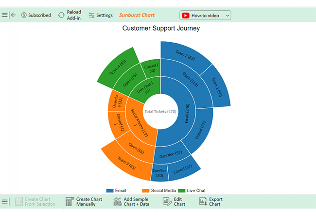
The Sunburst Chart represents the customer support journey across different stages and categories, using layered circular segments to show hierarchy and relationships.
It breaks down complex processes into multiple levels, helping users understand how different stages contribute to the overall flow.
This makes it far more effective for hierarchical data compared to basic proportional visuals.
Key Insight
Users can quickly identify which stages of the support journey handle the highest volume and where drop-offs or bottlenecks may occur within the process.
An Alternative of Pie Chart should be used when your data requires clearer comparison, better structure, or deeper analysis. In many real-world scenarios, other chart types provide more accurate and readable insights.
Use an Alternative of Pie Chart in the following situations:
While Alternatives of Pie Chart offer better precision in many cases, there are situations where a simple circular visualization remains effective.
Organize your dataset in a structured format with hierarchical levels.
For example:
Make sure your data is clean, consistent, and free from empty cells.
This step ensures the chart correctly reflects hierarchical relationships.
Keep the design clean so insights remain easy to interpret.
Once your chart is ready, focus on identifying patterns:
This chart not only shows proportions but also reveals structure within your data. Use it to:

Here are the key benefits:
Bar charts, radial charts, sunburst charts, spectrum charts, sequence charts, and multi-axis spider charts can all be used instead of pie charts for clearer and more detailed data comparisons.
Bar charts are often better than pie charts. They provide clear comparisons and exact values. Stacked bar charts show parts of a whole effectively. Line charts are ideal for trends over time. Donut charts offer a modern alternative to pie charts.
Choosing the right visualization directly impacts how effectively your data is understood. While simple proportional visuals can work for limited scenarios, an Alternative of Pie Chart provides better clarity, comparison, and flexibility for most real-world datasets.
By selecting the appropriate chart based on your data type—whether for comparison, trends, or hierarchical analysis—you can present insights more accurately and make better decisions.
Instead of relying on a single format, focus on using the visualization that best fits your data structure and purpose. Tools like ChartExpo make it easier to create advanced charts in Excel, helping you turn complex data into clear and actionable insights.