Categories
Have you ever had unorganized data in your database? You can agree that it’s usually hard to understand its insights.


The challenge comes from its disorganized nature. That is why organizing data by proper labeling can help you view your data results.
One of the best ways to display data is by visualizing ranking data. With this strategy, you can beat the odds of making your insights persuasive.
One interesting fact about our brains is that they can easily perceive visualized data.
That is why we recommend that you use visualization charts that rank data.
Why?
It is essential to rank your data in a specific order to help your audience follow up. Do you want to know how it’s done?
This blog will help you know how to visualize ranking data.
However, it is essential that we learn more about ranking data.
The ranking is associated with two mathematical values. These values can be greater than, equal to, or less than the second value.
Let us use some of the examples for you to gain a deeper understanding:
The examples above are just a nutshell of the various rankings we are familiar with. The question is, which charts can we use to visualize such data?
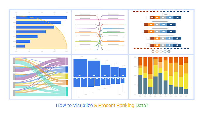
Let us learn about the best charts you can use to visualize ranking data.
Some of these charts include:
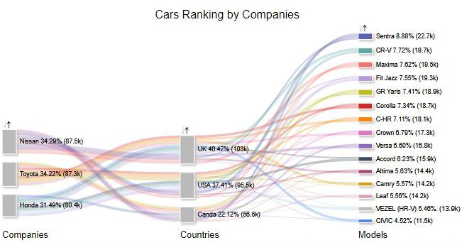
This type of chart visualizes data with the flow of information from one value set to another, like an energy flow chart. It contains nodes and links. The nodes represent the things connected by the flows, while the links represent the flow connections. Among various types of charts, this one is particularly effective for illustrating relationships and movement between different stages or categories.
For instance, Google Analytics can use a Sankey graph to rank websites that cause traffic. It is one of the most insightful charts to create and interpret.
When you have hierarchical data and want to rank it, a Sankey Diagram is an excellent choice.
A Sankey Diagram can help you rank your data in ascending or descending order. You can compare multiple measures with a Sankey chart. By the end, you can organize these various measures and present such data.
With a Sankey Diagram, you can learn how to visualize ranking data.
Below is an example of a Sankey Diagram.
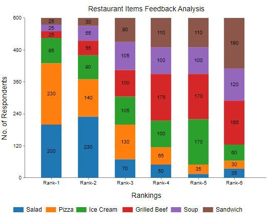
A Stacked Column chart is an extension of a standard column chart. The difference is that each column in this chart has stacked sub-bars on its end-to-end.
You can use a Stacked Column Chart to rank two data sets. You can also see the trend of the data sets over time. With a Stacked column chart, you can know how to show the ranking in a graph.
The objective of using a Stacked Column Chart is to obtain insights into categorical variables. Each of these variables has its different levels.
The length of each column in a Stacked Column Chart indicates the total value. Columns have sub-bars that correspond with a categorical variable.
One advantage of a Stacked Column Chart, similar to a Mekko chart, is that it is easy to read and interpret. You can visualize bulk ranking data without any clutter.
Below is an example of a Stacked Column Chart.
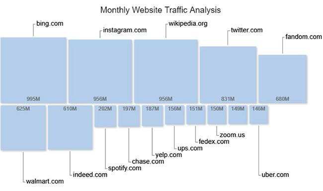
A sequence chart is one of the ranking data visualizations that are easy to read and interpret. Non-professional audiences can gain meaningful insights from such a ranking visualization.
An example of a sequence chart is the ordered squared chart. You can rank various variables in different squares, indicating each variable’s cumulative value. Another effective type of sequence chart is the Waterfall chart, which illustrates how values increase or decrease sequentially. It is the best chart to show ranking and track changes in a clear, step-by-step manner.
It becomes easy to rank variables with this chart because the squares are different sizes. In addition, the squares are arranged in descending order from left to right. This visual representation simplifies the process of understanding data patterns and shows how to draw a graph from a table effectively.
Below is an example of a Sequence Chart.
A Slope Chart is a simple graph that shows rankings, transitions and changes over time.
This chart is similar to a line chart because of its features.
It is one of the most simple ranking charts to read because you do not need much customization to gain vital insights from your data.
With a Slope Chart, you can show the changes over time in your business.
You can use this chart to observe a difference between two comparison points. From these points, you can see an increase and decrease in their values.
A Slope Chart can also rank these comparison points. A slope chart is the best way to analyze ranking data.
Below is an example of a Slope Chart.

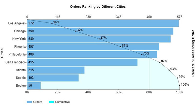
This type of ranking chart has a bar and line graph at the same time. The bar graph is used to represent sets of data in descending order. In contrast, the line graph represents the cumulative total.
One of the essential objectives of a Pareto Chart is that it highlights the most critical variable in a group of other variables.
With this type of ranking visualization, you can focus on areas of improvement. The Pareto chart enables one to recognize weaknesses in an organization or business.
In addition, you can rank your business’s top priority objectives. This strategy helps one take actionable steps on how to improve the business.
A Pareto Chart is one of the best charts to show ranking. You can use it to make business decisions and stay ahead of your competitors in the market.
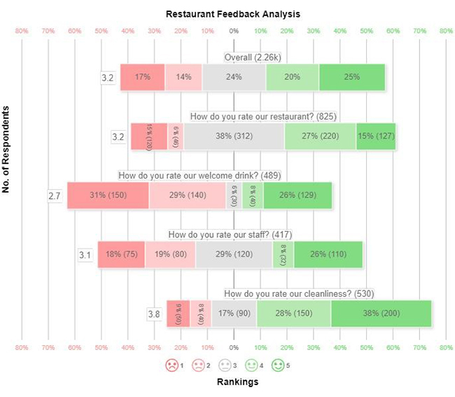
A Likert Scale Chart is a chart that analyzes the opinions and attitudes of the public about a specific topic.
A Likert scale is the key to knowing how to visualize ranking data.
For example, you can analyze your market to know their attitude towards your product. As a businessperson, this chart can help you understand how your target market feels about your services.
This chart can help you uplift your brand. By interacting with your customers, you can know what points in your business you can improve.
The chart works wonders because it assigns values to different sentiments and opinions. Respondents’ feedback is ranked based on the agreement and disagreement levels.
That’s not all.
This chart also assumes that the intensity of the respondents’ answers is linear. This line ranks the agreement and disagreement levels. It is the best Excel chart to show ranking.
Below is an example of a Likert Scale.
Let us use the example of the table above. This is how to display ranking data. We want to compare the set of traffic on various platforms, and tools like a ranking chart maker can help simplify this process by turning raw ranking data into clear and easy-to-understand visuals.
| Platforms | Traffic |
| bing.com | 995 |
| instagram.com | 956 |
| wikipedia.org | 956 |
| twitter.com | 831 |
| fandom.com | 680 |
| walmart.com | 625 |
| indeed.com | 610 |
| spotify.com | 202 |
| chase.com | 197 |
| yelp.com | 187 |
| ups.com | 156 |
| fedex.com | 151 |
| zoom.us | 150 |
| uber.com | 146 |
How do we visualize such data? You guessed right. We will use a Sequence Chart to obtain a meaningful ranking.
This is how to visualize ranking data in Excel.
To get started with ChartExpo in Excel, follow the steps below:


Scroll through, click Sequence Chart on list of visualizations as shown.

Select your data and click on Create Chart from Selection.

Your final chart will appear as shown.
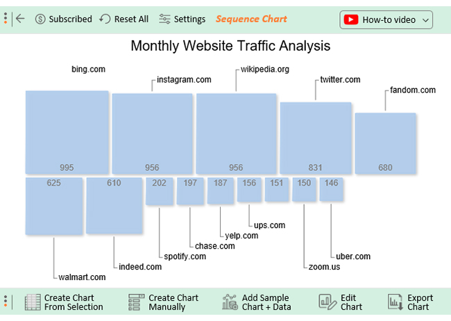
This is how to present ranking data.


When you accurately visualize data, it becomes easy to identify patterns, trends, and other essential insights in your data storytelling.
Many businesses rely on accurate data visualization, such as dot plots, to understand the needs of their target markets. This tool enables businesspeople to effectively adapt to current market requirements, ultimately benefiting both the business and its customers.
By accurately visualizing data, you can gain much information from your customers, such as:
Some of the other benefits you can gain from accurately visualizing data include the following:
Your data story can contain bulk information that is hard to understand. The essence of accurate data visualization is to help your target audience understand your account. One effective way to achieve this is to present a Sunburst Chart, which can break down complex data into an easily digestible format
Using a table is not enough for you and your audience.
Using charts and graphs like a Radar Chart to communicate insights helps your audience understand your conclusions.
We live in a world where technology keeps on changing, and markets are evolving due to shifts in customer behavior and preferences. Accurate data visualization, including tools like Pyramid charts, helps you identify the latest trends. With such insights, you can quickly adapt to a fast-paced world and its changes.
One of the objectives of data visualization, including using tools like a clustered stacked bar chart, is to help you take the necessary action in your business activity. The insights you gain from charts and graphs can help you strategize for your business’s survival.
Data visualization insights, such as Treemap visualization, help you identify issues facing your business, such as communication barriers among interdisciplinary teams.
By using these insights, you can strategize how to motivate team members when you identify such problems. This will help a business grow through enhanced collaboration and communication.
Accurate data visualization can help you study your top competitor’s strategies through competitive analysis. This will help you counter their every move in the market.
With that in mind, data visualization tools can be a valuable source of business intelligence. They are among the most effective ways to stay ahead of competitors.
Using tables to analyze your data can take a long time to accomplish your goal. In contrast, charts and graphs, such as scatter plots, can help you conduct quicker and more effective data analysis.
Your audience would respond better to charts and graphs. Using a table will not help you convince a group of investors.
Accurate data visualization, including tools like YouTube analytics, will help you identify outliers and errors in your findings. In spotting errors, you can take action to remedy such mistakes.
As a businessperson, you can gain insights into your business’s challenges through platforms like YouTube analytics. In doing so, you can strategize to ensure the errors and any other problems don’t resurface in the future.


If you want to visualize your ranking data using ranking charts in Google Sheets, it takes you simple steps.
You can take vital action to supercharge your Google Sheets application with an add-on called ChartExpo. With it, you can create ranking charts and graphs.
The Likert Scale Chart is the best to use among other ranking charts. You can find this chart in ChartExpo’s library.
Depending on your survey, you can choose the Likert Scale Chart. A Likert Scale can visualize your survey data and rank the data points meaningfully.
As we wind up, it is essential to be persuasive in data presentation. One of the ways we have discussed is by visualizing ranking data.
From our examples and discussions, you can now attest that your brain can easily visualize ranking data.
We have covered the various charts you can use to visualize ranking data. Such charts include:
We have used an example of how to visualize ranking data. We have used a Stacked Column Chart to visualize ranking data in Excel.
We have learned that an Excel add-in called ChartExpo is the solution to access ranking charts. With the use of a few clicks, we could visualize our data. We gained insights from our data example.
In essence,
Visualizing ranking data using ranking charts is easy to read and interpret. Reading from our examples is not enough for you.
Now it’s your turn to take action. Start a 7-day free trial with ChartExpo today. Access more incredible ranking charts to improve your business potential.
How much did you enjoy this article?


Calculate accounts receivable turnover ratio to measure credit collection speed, improve cash flow, and strengthen your financial strategy. Read on!

Change Management KPIs are the key to tracking adoption, performance, and ROI during transitions. Find out which metrics matter. Read on!

Data collection methods and techniques determine the quality of every insight you act on. Explore key approaches for gathering reliable data. Read on!


