Categories
Have you ever conducted part-to-whole key category comparisons in your data? You will agree that it is not a walk in the park.


It only gets more complicated if you are dealing with bulky data. Such a situation becomes a never-ending battle as you gather essential insights from your data.
For this reason, you need a visualization that can help you show parts of multiple totals. You need a Stacked Column Chart With two sets of data. Because this chart can help you make comparisons of two data sets in one space.
This particular chart type proves to be an invaluable asset, allowing you to visually dissect and compare two sets of data, presenting a layered view of their contributions to the overall whole.
This graph is essential because it will help you reveal part-to-whole insights in your data story.
In this blog, we will help you understand more about the Stacked Column Chart with two sets of data. By the end, you will know how to create one.
But first, let’s define the chart.
Definition: A Stacked Column Chart is an extension of the standard Column Chart.
Let us explain.
A Stacked Column Chart has columns divided into several sub-bars stacked end-to-end on each other.
Your point of interest is the Stacked Column Chart with two data sets. This is because the chart is suitable for tracking trends of crucial data points over time.
One interesting fact about the Stacked Column Chart, including its variant, the Clustered Stacked Bar Chart, is that it is a better visualization than a Pie Chart. Why? It’s because it performs better in revealing part-to-whole relationships.
Furthermore, the visualization is easy to read and interpret.
We hope you are following us so far.
The question is, how do we create one? Let’s find out in the next section.
When creating a Stacked Column or Stacked Bar Chart in Google Sheets, you can utilize either Google Sheets or other spreadsheet tools. Most individuals prefer these options due to their ease of use and accessibility, as they are free to use.
However, these spreadsheet applications come with basic Segmented bar graphs in their libraries. Customizing your charts will take extra hours to make them more appealing to your audience.
However, we have the best solution for you.
The remedy for this situation is supercharging your spreadsheet tools with a third-party application.
The third-party application will help you access more insightful charts, such as the Stacked Column Chart.
We recommend one of the best third-party applications called ChartExpo. It can significantly help you if you wish to create irresistible graphs and charts.
ChartExpo has a user-friendly interface. This means you don’t need advanced knowledge to use it. It comes with numerous charts, including the Pareto chart, which you can easily customize.
Let’s use a practical example in Google Sheets. You will be amazed by the final results.


Let’s assume you want to compare the two age groups in various locations. The products are clothing and accessories.
With such data, which chart would you go for?
You guessed right. A Stacked Column Chart with two sets of data is best suited for this job.
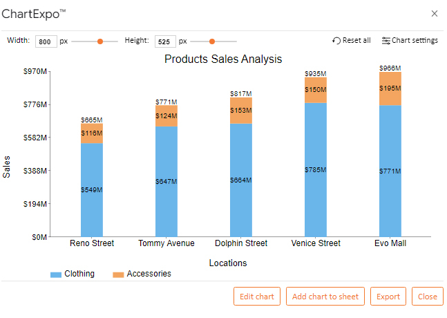
Let us assume you collected the data in the table below.
| Locations | Clothing | Accessories |
| Venice Street | 885 | 150 |
| Evo Mall | 771 | 195 |
| Dolphin Street | 664 | 153 |
| Tommy Avenue | 647 | 124 |
| Reno Street | 549 | 116 |


Then, scroll through the numerous chart templates until you see the Stacked Column Chart.


Your final chart will appear as shown below.


The following are some of the tips you should follow in reading a Stacked Column Chart:
It is essential to review the chart’s trend. This strategy helps you to gain more insights from your visualization. From the example we discussed earlier, all the locations have higher sales of clothing.
All the locations show a similar trend of product distribution.
You should understand key data points and their respective contexts. Therefore, the Chart helps to compare the data points on different categories of data and it makes analysis easier and more understandable.
When you use a Stacked Column Chart or a Stacked Bar Diagram, your objective is to obtain insights from categorical variables in your data. You plot your columns or bars in each categorical variable level, and each column or bar’s length indicates the total value of a particular dimension. In addition, each column or bar has sub-bars that correspond to subcategories.
You can use a Stacked Column Chart with two sets of values if your objective is to visualize each column’s relative decomposition.
You can also use the Stacked Column Chart to compare critical data points. This comparison can help you identify trends and outliers in your data.
Lastly, you can use a Stacked Column Chart with two sets of data to visualize hierarchical data. It is less effective in this role as compared to charts such as the Sunburst Graph. You can also obtain hierarchical insights from a Stacked Column Chart.
A Stacked Column Chart can help you save time. It can visualize bulky data more quickly than other comparison charts.
Manually sorting your survey responses can take much time and can be exhausting. With a Stacked Column Chart, you can visualize many survey responses at once, quickly and efficiently.
If your objective is to reveal outliers in your visualization, a Stacked Column Chart with two sets of data is the best.
Let us explain.
For instance, you own a company that sells different phone brands countrywide. With time, you are trying to establish the best-selling and worst-selling phone brands.
One of the lowest-selling brands performed well in one month. This performance made you respond to the demand by ordering more quantities of the brand.
After responding to your customer’s demands, the brand’s sales drop drastically to the point of no recovery. Assuming this happens in your second year of sales, when you have a significant inventory for the worst-selling phone brand.
This is one of the outliers that a Stacked Column Chart or Stacked Bar Chart can identify to avoid making such errors in the future.
You can use a Stacked Column Chart to reveal part-to-whole relationships in your data story.
You can also use this chart to show parts of the total value. In addition, you can use this chart to visualize ranking data. A Stacked Column can visualize many variables in one space.
You can create a Stacked Column Chart with two sets of data with spreadsheet applications such as Google Sheets.
You only need to supercharge these applications with a third-party app called ChartExpo. It will help you access a Stack Column Chart with two sets of data ready-template.
In a nutshell, obtaining part-to-whole insights from bulky data is not a walk in the park. To succeed in getting such insights, you will require a suitable chart.
From our discussions, we have learned that the Stacked Column Chart of data is best suited for this job.
We recommend this chart if you want to uncover hidden insights and outliers in your data.
We have also learned that Google Sheets have a basic Stacked Column Chart. It could not be of much help in our practical example.
In addition, the practical example was to help you learn how to create a Stacked Column Chart with two sets of data.
We supercharged our spreadsheet applications with a third-party application called ChartExpo. It saved the day since we could obtain a ready Stacked Column Chart template which we could customize with colors and a legend.
Here is the kicker.
You, too, can benefit from the advantages of using ChartExpo. Now it’s your turn to improve your visualization experience.
Start a 7-day free trial today to visualize your data with ChartExpo and access charts that give part-to-whole insights. Do not be left out.
How much did you enjoy this article?


Calculate accounts receivable turnover ratio to measure credit collection speed, improve cash flow, and strengthen your financial strategy. Read on!

Change Management KPIs are the key to tracking adoption, performance, and ROI during transitions. Find out which metrics matter. Read on!

Data collection methods and techniques determine the quality of every insight you act on. Explore key approaches for gathering reliable data. Read on!


