Categories
A ranking chart maker solves this by organizing data into a clear, ordered visual format.
It helps you compare performance, highlight top and bottom results, and present rankings in a way that is easy to understand.
Whether you’re creating a leaderboard, product comparison, or performance report, ranking charts make it easier to turn raw data into meaningful insights that support faster decisions.
A ranking chart maker is a tool that organizes data into ranked visuals such as leaderboards or performance lists.
It helps compare items based on value, performance, or priority to quickly identify top and bottom performers.
Definition: A ranking chart maker is a tool that converts raw data into a ranked visual format, allowing you to compare items based on performance, value, or priority.
It automatically organizes data into ordered charts, making it easy to identify top performers, low performers, and overall trends.
It is commonly used for leaderboards, product comparisons, survey rankings, and performance analysis, where clear ordering and quick comparison are essential.
A ranking chart maker is most useful when you need to compare performance, prioritize results, or clearly show order in data.
Not all charts are designed specifically for ranking, but some can be effectively used to analyze position, compare performance, and track ranking changes when structured correctly.
Below are three commonly used charts that can help visualize data and uncover meaningful insights.
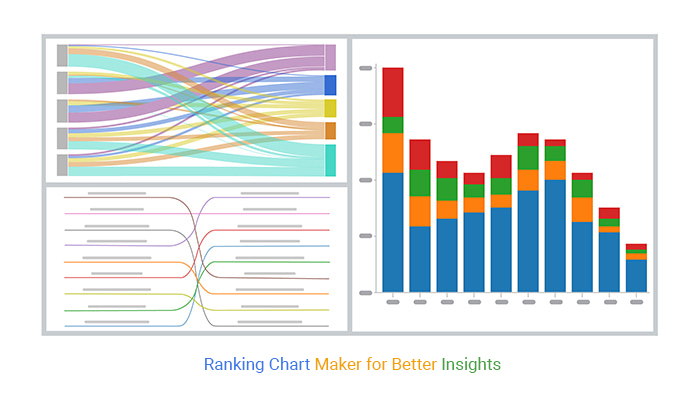
A Stacked Column Chart displays how different categories contribute to a total while also allowing comparison across groups or time periods.
When data is ordered properly, it can help highlight relative ranking within each category.
It is useful when you want to compare how different segments perform while still understanding their contribution to the whole.
Use it when:

A Slope Chart is designed to show how rankings change between two points in time. It connects values with lines, making it easy to track movement in position.
This makes it highly effective for identifying which items improved, declined, or remained stable in rankings.
Use it when:

A Sankey Diagram visualizes the flow of data between different stages or categories. While not a traditional ranking chart, it can be used to understand how items move between positions or categories.
It is especially useful for analyzing transitions, such as how users, products, or segments shift across different stages.
Use it when:

Choosing the right ranking chart maker depends on how you plan to use it—whether for quick visuals, detailed analysis, or automated dashboards.
Below are some of the most effective tools based on different use cases.
Canva is ideal for creating simple and visually appealing ranking charts without technical skills.
Its drag-and-drop interface and ready-made templates make it easy to design leaderboards, top lists, and comparison visuals.
Best for:
Visme is designed for creating engaging and interactive ranking visuals. It supports animations, data imports, and custom styling, making it useful for reports and presentations that require more visual impact.
Best for:
Google Sheets is a practical option for creating basic ranking charts using formulas and built-in visuals. It allows real-time collaboration and easy sharing across teams.
Best for:
Excel provides strong data handling and charting capabilities for ranking analysis. With formulas, sorting, and advanced formatting, it’s suitable for detailed and structured reporting.
Best for:
ChartExpo extends Excel and Google Sheets by offering specialized charts and ready-made templates for ranking analysis.
It simplifies complex visualizations and helps present ranking data in a clearer and more structured way.
Best for:
Creating a ranking chart in Excel involves organizing your data, assigning ranks, and visualizing the results in a clear format.

A ranking chart maker helps simplify data comparison and makes it easier to identify performance differences across categories.
Using a ranking chart maker effectively is not just about creating visuals—it’s about making rankings clear, accurate, and easy to interpret.
Sort your data by value and assign ranks using a function like RANK or RANK.EQ. Then visualize it using a bar or column chart arranged from highest to lowest so the ranking is easy to compare at a glance.
A ranking chart maker is most effective when data needs to be compared, ordered, or prioritized in a clear visual format.
It removes manual sorting and helps turn raw data into structured insights that are easier to interpret.
This makes it easier to identify top and bottom performers, understand patterns, and support faster decision-making in reporting, analysis, and performance tracking.
When combined with tools like ChartExpo, ranking charts become more visual and structured, helping users build clearer insights without complex setup.
How much did you enjoy this article?


Calculate accounts receivable turnover ratio to measure credit collection speed, improve cash flow, and strengthen your financial strategy. Read on!

Change Management KPIs are the key to tracking adoption, performance, and ROI during transitions. Find out which metrics matter. Read on!

Data collection methods and techniques determine the quality of every insight you act on. Explore key approaches for gathering reliable data. Read on!


