• Home
  • Tools dropdown img
    • Spreadsheet Charts

      • ChartExpo for Google Sheets
      • ChartExpo for Microsoft Excel
    • Power BI Charts

      • Power BI Custom Visuals by ChartExpo
    • Word Cloud

  • Charts dropdown img
    • Chart Category

      • Bar Charts
      • Circle Graphs
      • Column Charts
      • Combo Charts
      • Comparison Charts
      • Line Graphs
      • PPC Charts
      • Sentiment Analysis Charts
      • Survey Charts
    • Chart Type

      • Box and Whisker Plot
      • Clustered Bar Chart
      • Clustered Column Chart
      • Comparison Bar Chart
      • Control Chart
      • CSAT Survey Bar Chart
      • CSAT Survey Chart
      • Dot Plot Chart
      • Double Bar Graph
      • Funnel Chart
      • Gauge Chart
      • Likert Scale Chart
      • Matrix Chart
      • Multi Axis Line Chart
      • Overlapping Bar Chart
      • Pareto Chart
      • Radar Chart
      • Radial Bar Chart
      • Sankey Diagram
      • Scatter Plot Chart
      • Slope Chart
      • Sunburst Chart
      • Tornado Chart
      • Waterfall Chart
      • Word Cloud
    • Google Sheets
      Microsoft Excel
  • Services
  • Pricing
  • Contact us
  • Blog
  • Support dropdown img
      • Gallery
      • Videos
      • Contact us
      • FAQs
      • Resources
    • Please feel free to contact us

      atsupport@chartexpo.com

Categories
All Data Visualizations Data Analytics Surveys
Add-ons/
  • Google Sheets
  • Microsoft Excel
  • Power BI
All Data Visualizations Data Analytics Surveys
Add-ons
  • Google Sheets
  • Microsoft Excel
  • Power BI

We use cookies

This website uses cookies to provide better user experience and user's session management.
By continuing visiting this website you consent the use of these cookies.

Ok

ChartExpo Survey


Home > Blog > Microsoft Excel

How to Create a Report in Excel: A Complete Guide

How to create a report in Excel?

Imagine this: You are in a busy workplace. Your boss requires a comprehensive sales report by the end of the day. Panic takes hold, but you suddenly remember Excel, your reliable companion.

How to Create a Report in Excel

Excel is more than a spreadsheet tool; it’s a powerful ally. It turns unprocessed data into valuable understanding. Therefore, mastering how to create a report in Excel can be a game-changer.

Microsoft claims that Excel performs more than one billion calculations each second. This effectiveness enables companies to save numerous hours every year. Excel-generated reports assist businesses in monitoring performance, recognizing patterns, and making data-based decisions.

Creating a report in Excel is simple. You can produce professional reports with a few clicks and some formula knowledge. Start with your data. Input it accurately; this forms the foundation. Use features like PivotTables to summarize and analyze large datasets.

Charts and graphs are your friends. They convert numbers into visuals, making reports easy to understand. Conditional formatting highlights key data points, ensuring nothing important slips through the cracks. These tools not only make your report visually appealing but also incredibly informative.

Practice makes perfect. Proficiency in Excel increases with more usage. Remember – Excel is designed to simplify data management. With practice, you’ll create reports faster and more efficiently.

Without further ado, let’s learn how to create a report in Excel.

Table of Contents:

  1. What is a Report in Excel?
  2. What are Excel Reports Used For?
  3. Marketing and Survey Analysis Report in Excel
  4. How to Create a Report in Excel?
  5. What are the Advantages of Making Reports in Excel?
  6. What are the Limitations of Excel Reporting?
  7. What are the Best Practices for Creating Reports in Excel?
  8. Wrap Up

First…

What is a Report in Excel?

Definition: An Excel report presents data in an organized format. It can include tables, charts, and graphs to make the data easier to understand. You can customize reports to show specific information. Formulas calculate totals, averages, and other metrics. Formatting tools help make the report clear and professional.

Excel reports can be updated easily. Just change the data, and the report adjusts automatically, making it ideal for data reporting examples where you need to track progress over time. You can also use filters to focus on particular data points, and conditional formatting highlights key information.

Reports can be shared with others. You can print them or send them electronically.

Excel reports are versatile, making them suitable for business, finance, education, and many other fields. Use Excel’s built-in templates and tools like the Multi-Axis Chart in Excel to create reports quickly. These features save time and ensure consistency.

What are Excel Reports Used For?

Excel reports are essential tools in many fields, offering a versatile way to handle data. Whether you’re crunching numbers or tracking project milestones, Excel has you covered. Here are the various uses of Excel reports:

  • Data analysis: Excel reports help you analyze large datasets to uncover trends and insights. Use pivot tables and charts to break down complex data into understandable chunks.
  • Financial reporting: Create detailed financial statements, including balance sheets, income statements, and cash flow reports. Excel helps you keep track of all your financial data accurately.
  • Performance tracking: Monitor employee performance or track the progress of business goals with tools like a Progress Bar in Excel. Excel makes it easy to set up dashboards that update in real-time.
  • Project management: Keep projects on track using Excel reports to monitor timelines, budgets, and resources. Gantt charts and project plans are just a few clicks away.
  • Data visualization: Turn raw data into visually appealing charts and graphs. Excel’s data visualization tools help you present information clearly and effectively.
  • Inventory management: Manage stock levels and track inventory movements. Excel reports can help you avoid stockouts and overstocking.
  • Sales reporting: Track sales performance and analyze customer trends. Excel reports can show you which products are selling well and which need more attention.
  • Human resources: Manage employee data, track leave, and monitor hiring processes. Excel makes it easy to handle HR tasks efficiently.
  • Operational reporting: Monitor daily operations and ensure smooth operation. Excel reports help you monitor KPIs and operational metrics.
  • Custom reports: Create reports tailored to your specific needs. Excel’s flexibility allows you to design and format reports that meet your unique requirements.

Marketing and Survey Analysis Report in Excel

The Excel report below displays four charts. We will examine each chart used in the report.
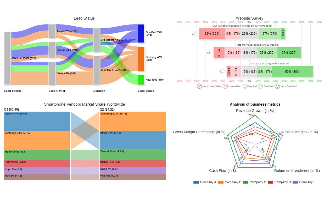
Report Sample For Learning How to Create a Report in Excel

Lead Status: The Sankey Diagram illustrates how leads are distributed from their origins to their current state. Here are a few important observations:

Analysis of the flow:

  • Most of Amelia’s leads are evenly divided between being qualified, nurtured, and new.
  • Most of George’s leads are in the nurturing phase, with a smaller number being qualified and new.
  • Oliver’s leads are primarily in the nurturing phase.

Website Survey: The Likert Scale Chart displays survey results for a website, indicating feedback on three aspects of the site. Below are the observations derived from the chart:

Overall Insights:

  • Improvement needed: The homepage’s value proposition clarity is the most crucial aspect that needs improvement. A significant number of users are highly dissatisfied.
  • Visual appeal: The visual appeal is relatively well-received, eliciting diverse opinions. While there is room for enhancements, the urgency level is lower than the need for clarity in the value proposition.
  • Navigation: The website’s navigation is highly rated, indicating that users find it easy to use.

Market Share: The bar chart compares the market shares of smartphone vendors globally in the first and second quarters. Below are the main takeaways:

In general, the chart showcases the intense competition in the smartphone industry:

  • Samsung and Apple are in the lead.
  • Xiaomi is making progress.
  • There are small changes in the market shares of other companies.

Evaluation of business indicators: The Multi-Axis Spider Chart displays various types/scales within a single chart, providing a comprehensive financial performance analysis by visualizing different financial performance indicators. Below are the key observations:

Overall, the data indicates that even though Company C excels, every company has distinct strengths and areas for enhancement.

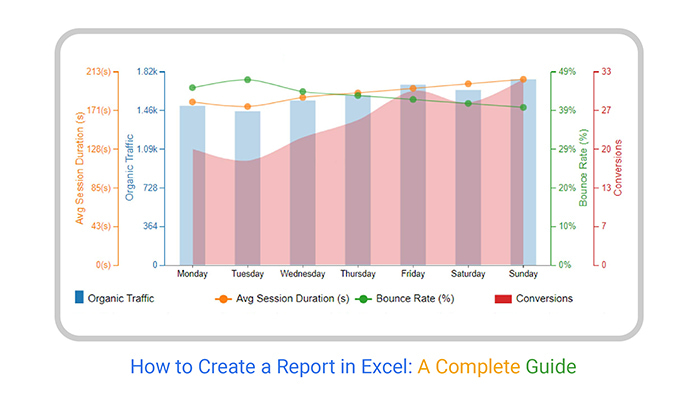
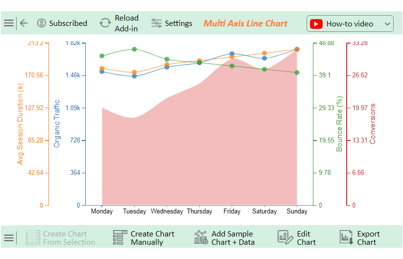
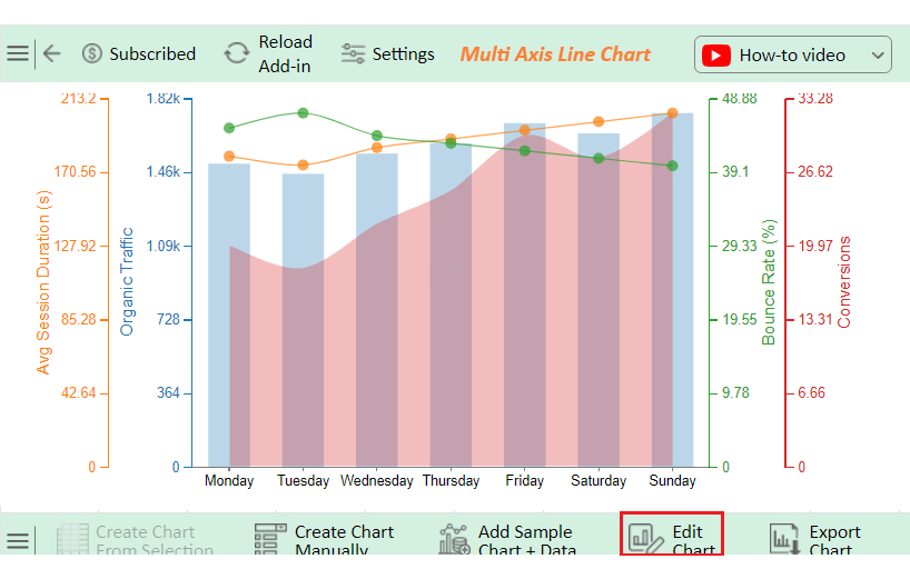
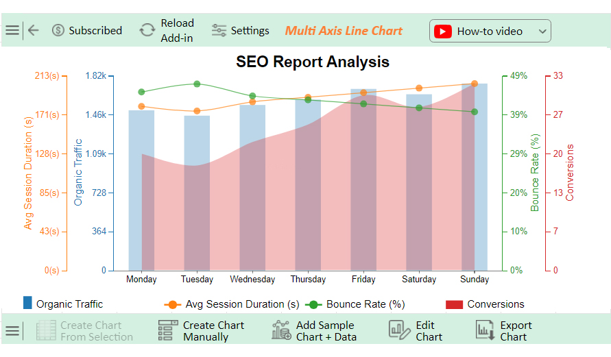
In the next part, we will explore a different type of chart (Multi-Axis Line Chart) that may be suitable for this report in Excel.

How to Create a Report in Excel?

Have you ever tried to create a report in Excel only to end up with a complex data jungle? Excel is a powerhouse for data analysis. However, data visualization in Excel can feel like trying to paint the Mona Lisa with a toothbrush.

Enter ChartExpo, the superhero of data visualization. While Excel crunches numbers like a pro, ChartExpo turns those numbers into stunning visuals. This makes your data readable and downright captivating.

Ready to transform your reports from drab to fab? Let’s dive in!

Let’s learn how to install ChartExpo in Excel.

  1. Open your Excel application.
  2. Open the worksheet and click the “Insert” menu.
  3. You’ll see the “My Apps” option.
  4. In the Office Add-ins window, click “Store” and search for ChartExpo on my Apps Store.
  5. Click the “Add” button to install ChartExpo in your Excel.

ChartExpo charts are available both in Google Sheets and Microsoft Excel. Please use the following CTAs to install the tool of your choice and create beautiful visualizations with a few clicks in your favorite tool.

Excel Reports Examples

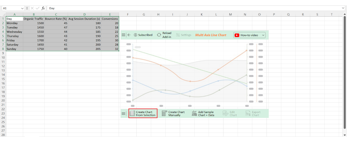
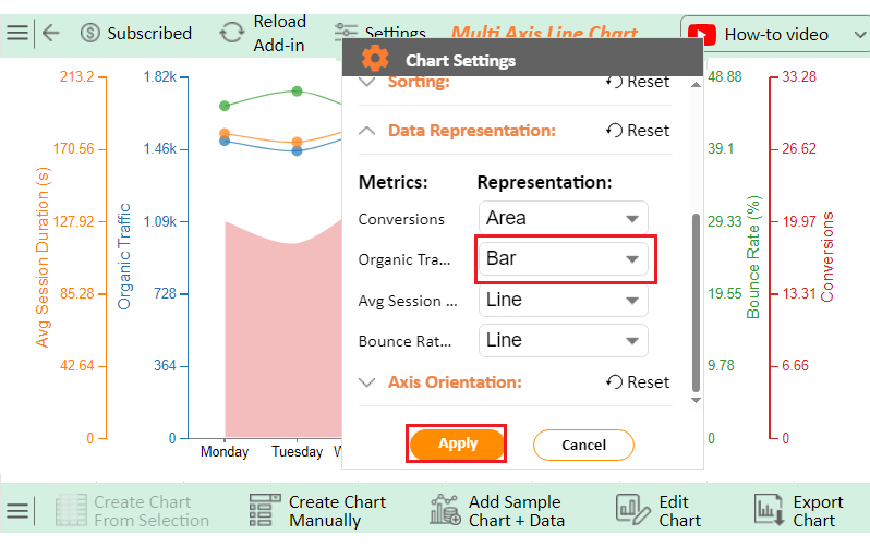
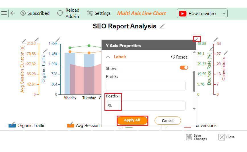
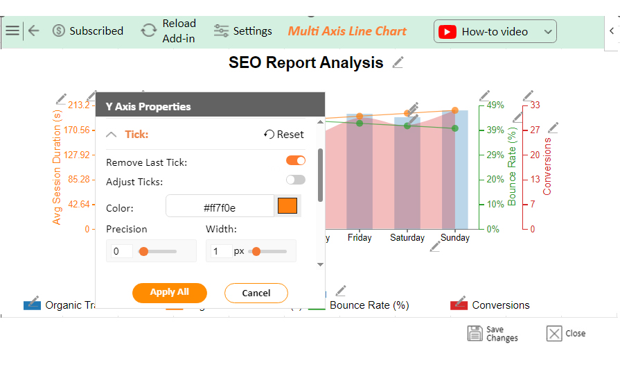
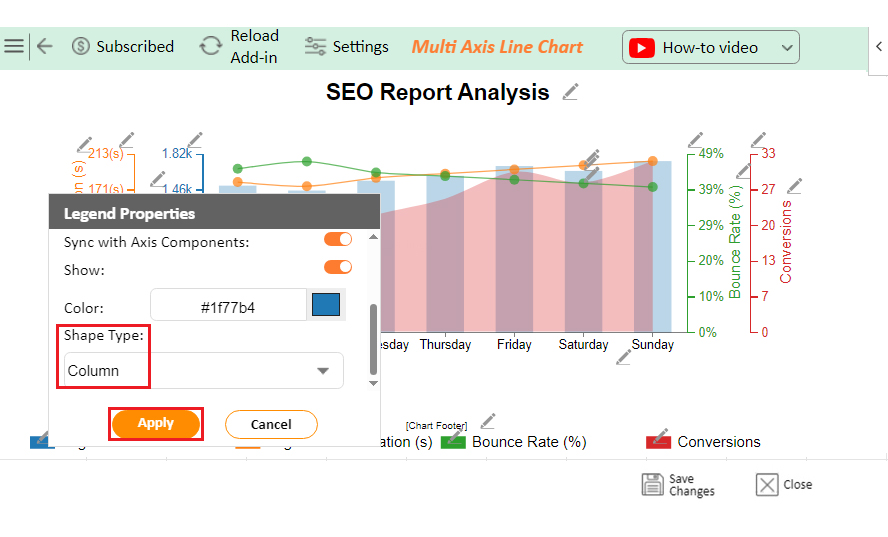
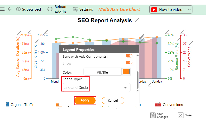
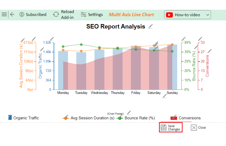
Let’s analyze the Excel report example data below using ChartExpo.

Day Organic Traffic Bounce Rate (%) Avg Session Duration (s) Conversions
Monday 1500 45 180 20
Tuesday 1450 47 175 18
Wednesday 1550 44 185 22
Thursday 1600 43 190 25
Friday 1700 42 195 30
Saturday 1650 41 200 28
Sunday 1750 40 205 32
  • To get started with ChartExpo, install ChartExpo in Excel.
  • Now Click on My Apps from the INSERT menu.
insert chartexpo in excel
  • Choose ChartExpo from My Apps, then click Insert.
open chartexpo in excel
  • Once it loads, scroll through the charts list to locate and choose the “Multi-Axis Line Chart”.
search multi axis line chart in excel
  • Click the “Create Chart From Selection” button after selecting the data from the sheet, as shown.
Click Create Chart From Selection After Learning How to Create a Report in Excel
  • ChartExpo will generate the visualization below for you.
Initial Visual After Learning How to Create a Report in Excel
  • Click on Settings and change the “Data Representation” as follows.
Change Data Representation After Learning How to Create a Report in Excel
  • If you want to add anything to the chart, click the Edit Chart button:
Click Edit Chart After Learning How to Create a Report in Excel
  • Click the pencil icon next to the Chart Header to change the title.
  • It will open the properties dialog. Under the Text section, you can add a heading in Line 1 and enable Show.
  • Give the appropriate title of your chart and click the Apply button.
Add Chart Header After Learning How to Create a Report in Excel
  • Change the precision value to zero as follows:
Change Precision Value to Zero After Learning How to Create a Report in Excel
  • Change the precision value to zero and add the dollar sign as follows:
Add Prefix to Chart After Learning How to Create a Report in Excel
  • Change the precision value of the session Duration to zero and add the dollar sign:
Change Value of Avg Session Duration After Learning How to Create a Report in Excel
  • Change the Legend shape of Organic Traffic to Column and click the Apply button.
Change Legend Shape of Organic Traffic After Learning How to Create a Report in Excel
  • Change the Legend shapes of Bounce Rate and Avg. Session Duration into a Line and Circle and click the Apply button.
Change Legend Shape of Bounce Rate After Learning How to Create a Report in Excel
  • Click the “Save Changes” button to persist the changes made to the chart.
Click Save Changes After Learning How to Create a Report in Excel
  • Your final Multi Axis Line Chart will look like the one below.
Final How to Create a Report in Excel

Insights

  • The data shows increasing organic traffic, lower bounce rates, and longer session durations from Monday to Sunday.
  • Conversions are peaking on Sunday, with the highest traffic, lowest bounce rate, longest sessions, and most conversions.

How to Create a Report in Microsoft Excel?

This video will guide you on how to create a report in Excel, a crucial skill for organizing and presenting data effectively. Incorporate this technique into your Excel workflow to elevate your reporting capabilities!

What are the Advantages of Making Reports in Excel?

Creating reports in Excel offers numerous advantages. This makes it a favorite tool for professionals across various industries. Give it a try, and experience these advantages firsthand:

  • Flexibility: Excel allows you to customize reports to suit your needs. You can add, remove, and rearrange data easily. This flexibility ensures your reports are always relevant and up-to-date.
  • Ease of use: Excel’s intuitive interface makes it user-friendly. You don’t need to be a tech expert to create and modify reports. Simple drag-and-drop features make data handling a breeze.
  • Data analysis: Excel is packed with powerful data analysis tools, including pivot reporting. Use formulas, pivot tables, and statistical functions to draw meaningful insights from your data.
  • Integration: Excel integrates seamlessly with other software, such as Microsoft Office Suite, databases, and cloud services. This connectivity makes data import and export smooth and efficient.
  • Automation: Save time with Excel’s automation features. Macros and VBA scripts can automate repetitive tasks, ensuring consistency and reducing the risk of errors.
  • Collaboration: Share your Excel reports easily with colleagues. Multiple users can work on a single document simultaneously, facilitating teamwork and collaboration.
  • Scalability: Excel can handle it all, whether you’re working with small or large data volumes. Its robust infrastructure ensures performance remains optimal even as your data grows.
  • Visualization: Excel offers a variety of charts and graphs to visualize data. These visual tools make complex information easier to understand and present.
  • Cost-effectiveness: Excel is a cost-effective solution compared to specialized reporting software. Its wide range of features offers great value for its price.
  • Versatility: Excel is versatile and can be used for various reporting needs. From financial summaries to project timelines, it effortlessly adapts to different tasks.

What are the Limitations of Excel Reporting?

While Excel is a powerful tool for creating reports, it does have some limitations. Understanding these drawbacks will help you decide when to use Excel and when to consider alternative solutions.

  • Scalability: Excel struggles with extensive datasets. As the amount of data increases, performance can slow down, making it less efficient for handling extensive data analysis.
  • Data integrity: Manually entering data in Excel increases the risk of errors. Typos, misformatted cells, and incorrect formulas can compromise the accuracy of your reports.
  • Limited collaboration: Although Excel supports sharing and collaboration, it’s not ideal for multiple users working simultaneously on large, complex files. Changes can overwrite each other, leading to confusion and data loss.
  • Complexity: Advanced features in Excel, like VBA scripting or complex formulas, have a steep learning curve. Not everyone has the skills to use these features effectively.
  • Data security: Excel lacks robust security features. Sensitive information can be vulnerable if the file falls into the wrong hands. Password protection is available but can be easily bypassed by determined users.
  • Reporting automation: While Excel offers some automation capabilities, it’s limited compared to specialized reporting tools. Setting up automated reports can be time-consuming and requires advanced knowledge.
  • Version control: Keeping track of different versions of the same Excel file can be challenging. Without proper version control, you might end up working on outdated or incorrect data.

What are the Best Practices for Creating Reports in Excel?

Creating reports in Excel can be a game-changer for presenting data clearly and effectively. To ensure your reports are top-notch, follow these best practices:

  1. Define purpose and audience: Understand the purpose of your report and who will be reading it. Then, tailor the content and complexity to meet their needs, ensuring relevance and clarity.
  2. Organize data effectively: Keep your data well-organized. Use separate sheets for raw data and calculations, and ensure your data is clean and consistent.
  3. Use descriptive headings: Clear, descriptive headings make it easy for readers to navigate your report. Label each section and column accurately to avoid confusion.
  4. Apply consistent formatting: Consistent formatting enhances readability. Use the same font, color schemes, and styles throughout your report. This uniformity makes the report look professional and easy to follow.
  5. Include summary and highlights: Summarize key findings at the beginning of your report. Highlight important data points and trends to help readers grasp the main insights quickly.
  6. Use Tables and PivotTables: Tables and PivotTables are powerful tools for organizing and summarizing data. They allow you to sort, filter, and present data dynamically.
  7. Utilize formulas and functions: Excel’s formulas and functions can automate calculations and data analysis. Use them to streamline your work and ensure accuracy.
  8. Visualize data with charts: Charts and graphs transform raw data into visual stories. Choose the right types of charts and graphs for your data to make your findings more understandable and impactful.

FAQs

How to create an Excel summary report?

  1. Open Excel.
  2. Import your data.
  3. Create a new worksheet for the summary.
  4. Use formulas to calculate totals, averages, and key metrics.
  5. Add charts for visualization.
  6. Label sections.
  7. Format cells for readability.
  8. Save and share the report.

How do I create a report layout in Excel?

  1. Open Excel.
  2. Insert a new worksheet.
  3. Create headings for each section.
  4. Add tables for data.
  5. Use formulas for calculations.
  6. Insert charts for visuals.
  7. Apply cell formatting for clarity.
  8. Arrange sections logically.
  9. Save the layout template for future use.

What is the format of reporting in Excel?

Reporting in Excel involves the following:

  1. Organize data into rows and columns.
  2. Use clear headings.
  3. Apply formatting like bold and colors.
  4. Insert charts and graphs.
  5. Use formulas for calculations.
  6. Ensure data is accurate and easy to read.

Wrap Up

Creating a report in Excel involves several key steps. Start by defining the purpose of your report. Know what you want to achieve and who your audience is. This helps in tailoring the report to meet specific needs.

Organize your data effectively. Ensure all your data is clean and well-structured. Use separate sheets for raw data, calculations, and the final report. This keeps everything organized and easy to manage.

Apply consistent formatting throughout your report. Use the same font, color schemes, and styles. This makes your report look professional and improves readability. Descriptive headings are crucial. They guide the reader through your report and make it easy to follow.

Incorporate tables and PivotTables to organize and summarize data. They allow for dynamic sorting and filtering, which helps present data clearly and concisely. Utilizing Excel’s formulas and functions can automate calculations and enhance accuracy, saving time and reducing errors.

Data visualization is key to making your report impactful. Use charts and graphs to present data visually. Choose the right type of chart for your data. This makes complex information easier to understand.

Include a summary and highlights in your report. Summarize key findings at the beginning. Highlight important data points and trends. This helps readers quickly grasp the main insights.

Creating a report in Excel doesn’t have to be daunting. With these best practices, you can produce clear, concise, and informative reports.

So next time you’re asked how to create a report in Excel, smile. You’ve got this. With Excel’s tools and a bit of practice, you’ll turn data into compelling stories.

How much did you enjoy this article?

ExcelAd1
Start Free Trial!
137886

Related articles

next previous
Microsoft Excel10 min read

Invoice Tracker Template in Excel for Better Insights

An invoice tracker Excel template helps track invoices, due dates, and payments. Learn how to use this template for better financial management.

Microsoft Excel12 min read

Key Performance Indicators in Healthcare for Better Insights

Key Performance Indicators in healthcare track patient care and efficiency. Learn about these KPIs, top examples, and how to use them to improve outcomes.

Microsoft Excel10 min read

BMI Calculation Formula in Excel for Better Fitness Insights

The BMI calculation formula in Excel helps track and analyze body mass index. Explore step-by-step instructions and tips to simplify BMI tracking in Excel.

Microsoft Excel29 min read

How to Create a Tornado Chart in Excel? A Complete Guide

Click to learn how to plot a Tornado Chart in Excel using easy-to-follow steps. Also, we’ll address the following question: what is a Tornado Diagram?

Microsoft Excel14 min read

How to Create a Scatter Plot in Excel with 3 Variables?

Click to discover how to create a Scatter Plot in Excel with 3 variables. We’ll also address the following question: why do we use Scatter Plot Graph?

ChartExpo logo

Turn Data into Visual
Stories

CHARTEXPO

  • Home
  • Gallery
  • Videos
  • Services
  • Pricing
  • Contact us
  • FAQs
  • Privacy policy
  • Terms of Service
  • Sitemap

TOOLS

  • ChartExpo for Google Sheets
  • ChartExpo for Microsoft Excel
  • Power BI Custom Visuals by ChartExpo
  • Word Cloud

CATEGORIES

  • Bar Charts
  • Circle Graphs
  • Column Charts
  • Combo Charts
  • Comparison Charts
  • Line Graphs
  • PPC Charts
  • Sentiment Analysis Charts
  • Survey Charts

TOP CHARTS

  • Sankey Diagram
  • Likert Scale Chart
  • Comparison Bar Chart
  • Pareto Chart
  • Funnel Chart
  • Gauge Chart
  • Radar Chart
  • Radial Bar Chart
  • Sunburst Chart
  • see more
  • Scatter Plot Chart
  • CSAT Survey Bar Chart
  • CSAT Survey Chart
  • Dot Plot Chart
  • Double Bar Graph
  • Matrix Chart
  • Multi Axis Line Chart
  • Overlapping Bar Chart
  • Control Chart
  • Slope Chart
  • Clustered Bar Chart
  • Clustered Column Chart
  • Box and Whisker Plot
  • Tornado Chart
  • Waterfall Chart
  • Word Cloud
  • see less

RESOURCES

  • Blog
  • Resources
  • YouTube
SIGN UP FOR UPDATES

We wouldn't dream of spamming you or selling your info.

© 2025 ChartExpo, all rights reserved.