Categories
By ChartExpo Content Team
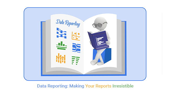
The only report that matters is the one someone uses.
Data reporting is often the difference between confusion and clarity. Without it, decision-makers are left grappling with raw numbers, unsure of what actions to take. When data isn’t presented clearly, it’s easy to miss key trends, and that’s where many businesses falter.
The challenge is real. Too often, data piles up in overwhelming spreadsheets, leaving decision-makers unsure of where to start. How do you make sense of mountains of numbers? How do you find the critical insights hidden in all that complexity? Without effective data reporting, you’re left fumbling in the dark, missing opportunities, and reacting to problems instead of proactively solving them.
Data reporting is not just about gathering data—it’s about presenting it in a way that makes it actionable. Clear, focused reporting turns raw data into insights that guide decisions with precision. With the right approach, you can turn confusion into confidence and make smarter, faster choices.
Let’s dive into how data reporting can transform your decision-making process and drive business success.
| Report Formats and Their Ideal Uses | ||
| Format | Best For | Output Type |
| Dashboard | Real-time tracking of KPIs and performance metrics | Visual display with charts and indicators |
| Executive Summary | High-level overviews for senior decision-makers | One-pager or short report with key takeaways |
| Operational Report | Detailed day-to-day updates for frontline teams | Spreadsheet or detailed document |
| Scorecard | Comparing performance against targets or goals | Table-based report with color-coded metrics |
| Benchmark Report | Assessing business performance against industry standards | Comparison table or bar chart-heavy document |
| Exploratory Report | Investigating new trends or outliers in the data | Statistical summaries and visualizations |
| Compliance Report | Meeting regulatory or legal reporting requirements | Structured document with mandatory disclosures |
| Presentation Deck | Communicating results in meetings or stakeholder briefings | Slides with visuals and narrative points |
| Interactive Report | Allowing users to filter and explore data themselves | Interactive dashboards or drill-down tools |
| Snapshot Report | Quick summary of current status for rapid review | PDF or static view with minimal interactivity |
Decision-makers often face a storm of choices. They need clarity. This is where data reporting shines. It’s like having a reliable GPS in a foreign city. It guides leaders to make informed choices by presenting data in digestible formats. By analyzing trends and patterns, it offers a clear view of what’s happening in the business landscape.
Without it, decision-makers might feel like they’re in a maze without a map. Effective reporting distills data into actionable insights. These insights empower leaders to make decisions with confidence. This confidence stems from understanding the story behind the numbers. Thus, they can steer their organizations toward growth and success.
Strategic outcomes hinge on accurate information. Reporting acts as a catalyst for achieving these outcomes. It highlights key metrics that align with business goals. By spotlighting these metrics, it helps organizations track their progress. It’s akin to having a scoreboard that shows whether you’re winning or losing.
Moreover, it uncovers opportunities for improvement. When analyzed properly, it can pinpoint areas that need attention. This insight allows companies to adjust their strategies promptly. In essence, it equips businesses with the knowledge to stay competitive. Staying competitive is crucial in today’s fast-paced business environment.
| Metrics That Matter by Department | ||
| Department | Priority Metric | Use in Decision-Making |
| Marketing | Customer Acquisition Cost (CAC) | Assess campaign efficiency and optimize spend |
| Marketing | Conversion Rate | Evaluate landing page and funnel effectiveness |
| Sales | Sales Growth Rate | Track performance against targets |
| Sales | Lead-to-Customer Ratio | Understand sales funnel efficiency |
| Operations | Order Fulfillment Time | Improve logistics and inventory management |
| Operations | Downtime | Identify and reduce operational inefficiencies |
| Finance | Gross Margin | Measure profitability of products or services |
| Finance | Cash Flow | Ensure liquidity and operational sustainability |
| HR | Employee Turnover Rate | Improve retention and culture strategies |
| HR | Time to Hire | Optimize recruitment processes |
| Customer Support | First Response Time | Improve service responsiveness |
| Customer Support | Customer Satisfaction Score (CSAT) | Gauge support quality and customer loyalty |
| IT | System Uptime | Maintain operational continuity |
| IT | Support Ticket Volume | Measure IT demand and resource planning |
Mistakes in data reporting can lead to misguided decisions. One common pitfall is data overload. Too much information can overwhelm rather than enlighten. It’s like trying to find a needle in a haystack. The solution is to focus on relevant data that aligns with your goals. This keeps reports clear and targeted.
Another trap is poor visualization. Bad graphs can confuse rather than clarify. Good visualization tells a story at a glance. It turns complex data into something the audience can grasp quickly. To avoid this, use simple, clear visuals that match the information you want to convey. This approach not only prevents confusion but also enhances understanding.
| Common Missteps and How to Fix Them | ||
| Pitfall | Why It Happens | How to Avoid It |
| Overloading reports with irrelevant data | Lack of prioritization and unclear objectives | Define clear goals and filter for actionable insights |
| Using unclear or complex visuals | Poor design choices or overuse of effects | Stick to simple charts that directly support the narrative |
| Inconsistent metrics across departments | No centralized data governance | Standardize definitions and use a shared data dictionary |
| Data pulled from outdated sources | No real-time integration or sync | Automate connections with live data sources |
| Lack of stakeholder alignment | Reports built without audience input | Engage stakeholders early to gather requirements |
| Manual reporting processes | Reliance on outdated tools and habits | Implement automation tools for repeat tasks |
| Ignoring mobile or dashboard usability | Reports designed only for desktop formats | Design responsive reports that adapt to devices |
| No follow-up or action on reports | Disconnect between reporting and operations | Integrate reporting cycles with review meetings and KPIs |
| Misinterpreting correlation as causation | Lack of statistical understanding | Add context and annotations to guide interpretation |
| Focusing only on lagging indicators | Easier to report on past data than predictive insights | Include leading indicators to guide future actions |
Data accuracy is vital. It’s like the foundation of a house. If the base isn’t solid, everything on top crumbles. When data contains errors, reports become misleading. Imagine trying to navigate a city with a faulty map. You’d end up lost or worse.
Inaccurate data spreads confusion. It’s like a game of telephone, where the original message gets distorted as it moves along. Decisions based on flawed data can steer businesses in the wrong direction. This means wasted resources and missed opportunities. Companies need to be cautious. They must prioritize accuracy to prevent costly mistakes.
Data validation is like a quality check. It’s about ensuring every piece of information is correct before it enters reports. This process involves careful examination. It’s not about fancy tools but about discipline and attention to detail.
Start by establishing rules for your data. Think of these as guidelines that ensure consistency. Regular audits are crucial too. They help catch errors early. This proactive approach saves time and reduces the risk of inaccuracies slipping through. Implementing these techniques builds trust in the data and the decisions it informs.
Data integrity is the backbone of decision-making. It’s what transforms raw numbers into meaningful insights. Without it, reports are just pretty charts with no real value. Accurate data leads to reliable insights. This means better decisions and more confidence in those choices.
Consider data as the compass for your business. If it points in the wrong direction, you’ll never reach your destination. Reliable data ensures that strategies are based on facts, not guesses. This reliability fosters trust within the team and with stakeholders. In the end, maintaining data integrity empowers businesses to move forward with clarity and purpose.
Imagine trying to find a needle in a haystack, but the haystack is made of numbers and graphs. That’s how many feel about data reports. These reports often come packed with endless columns and baffling statistics. The sheer volume can make anyone’s head spin. Picture a manager trying to make sense of a 50-page report before a meeting. It’s like drinking from a fire hose—too much, too fast.
In this sea of information, important insights get buried. Decision-makers need clarity. They need a clear view of what’s important without wading through a swamp of numbers. It’s about making sense of the chaos and extracting valuable insights. When data is too complicated, it doesn’t help anyone. It must be presented in a way that makes sense, even for someone who isn’t a data expert.
Let’s talk about trimming the fat. The first step is to gather only the data that matters. It’s about cutting out the noise and focusing on what’s truly valuable. Think of it as cleaning out a cluttered closet, keeping only the items you actually use. This makes the entire reporting process more efficient and less overwhelming.
Next, present this data in a user-friendly way. Use visuals that highlight key points and make trends stand out. Imagine converting a long list of numbers into a simple, easy-to-read chart. It’s like turning a jigsaw puzzle into a clear picture. This approach saves time and helps decision-makers spot patterns quickly. They can then make informed choices without getting bogged down in unnecessary details.
Data isn’t just numbers; it’s a tool for making decisions. But when it’s too complex, it becomes useless. Decision-makers need clear, actionable information. Think of it as giving them the ingredients to bake a cake, not just a recipe book. They should see what actions to take without second-guessing.
By simplifying data, businesses can move faster. Clear data means quicker decisions and better strategies. It’s like having a GPS that guides you directly to your destination, without confusing detours. This clarity is essential in today’s fast-paced environment, where every decision counts and time is of the essence.
| Reporting Frequency by Decision Type | ||
| Decision Type | Ideal Frequency | Example Report |
| Strategic Planning | Quarterly or Annually | Executive Performance Review |
| Budgeting and Forecasting | Monthly or Quarterly | Financial Forecast Report |
| Marketing Campaign Optimization | Weekly | Campaign Performance Dashboard |
| Sales Target Monitoring | Weekly or Bi-weekly | Sales Pipeline Report |
| Operational Performance | Daily or Weekly | Production Output Summary |
| Customer Service Quality | Weekly | Support Ticket Resolution Report |
| IT System Health Monitoring | Real-time or Daily | System Uptime Dashboard |
| Compliance and Risk Reporting | Monthly or Quarterly | Regulatory Compliance Checklist |
| Inventory and Supply Chain | Daily or Weekly | Inventory Reorder Report |
| Employee Engagement and HR Metrics | Monthly | Turnover and Hiring Trends |
| Board and Investor Reporting | Quarterly | Earnings Summary and Projections |
Amazon is a master at making data work. Picture their warehouses, bustling with activity. They track inventory in real-time, ensuring shelves are stocked just right. It’s a balancing act, like a tightrope walker keeping steady. They use data to predict what products need restocking and when. This prevents overstocking and shortages, saving money and time.
Their system analyzes sales trends, customer demand, and shipping times. It’s like having a crystal ball that shows what’s coming next. This predictive power helps Amazon remain a leader in logistics. They keep customers happy and their operations smooth. It’s a brilliant example of turning complex data into a well-oiled machine.
Dot plots are a nifty tool for visualizing data. They turn dense data into simple visuals. Picture a series of dots showing sales over time. Each dot tells a story, revealing trends that might be hidden in spreadsheets. It’s like turning a dense novel into a quick comic strip.
These plots help spot trends and outliers at a glance. They’re perfect for comparing different data sets. By incorporating sales follow-up statistics, you can visualize sales performance across regions as dots on a line. It’s easy to identify which regions are thriving and which need attention. Dot plots make complex data streams accessible and clear to everyone, not just the data whizzes.
The following video will help you create the Charts in Microsoft Excel.
The following video will help you to create the Charts in Google Sheets.
Imagine spending hours sorting through endless spreadsheets. Manually entering numbers, double-checking formulas, and updating charts. This isn’t just time-consuming; it’s a nightmare. This kind of work saps energy and leaves little room for real thinking.
Errors slip through cracks. Humans aren’t perfect, and fatigue makes mistakes easy. A misplaced number here, a forgotten update there, and suddenly, reports tell a false story. The burden grows, and the cycle continues. It’s a maze with no exit.
Think of a factory where robots handle repetitive tasks. They work tirelessly, freeing humans for more critical thinking. This is where automated workflows come in. They collect, process, and present data without breaking a sweat.
Set up the right tools, and reports generate themselves. No more manual entry, no more errors. The system works seamlessly, giving you accurate results in a fraction of the time. Now, humans can focus on interpreting data, not just compiling it.
Time is money. When you free up time, you free up resources for strategic thinking. With less time spent on data grunt work, more time is available for analysis. Decisions improve, and businesses grow.
Automation transforms your role. Instead of a data miner, you become a strategist. You spot trends, predict outcomes, and drive success. The value of your work increases, and so does your satisfaction.
John Deere faced a challenge. Farmers needed precise data to optimize yields. But manual data collection was slow and error-prone. The solution? Implement a system that automates data gathering from farm equipment.
Now, data flows from fields to reports without human touch. Farmers receive timely insights, allowing them to make informed decisions. Yields improve, profits rise, and manual labor decreases. This approach revolutionized the way John Deere supports farming.
| Comparing Manual and Automated Approaches | ||
| Task | Manual Approach | Automated Approach |
| Data Collection | Manually exporting from multiple sources | APIs and connectors pull data automatically |
| Data Cleaning | Manual review and correction in spreadsheets | Automated validation and transformation rules |
| Report Creation | Copying/pasting into templates | Pre-built templates auto-filled with live data |
| Visualization | Building charts by hand in Excel | Dynamic charts generated from real-time data |
| Scheduling | Reports created on-demand or manually scheduled | Scheduled delivery via automation tools |
| Collaboration | Emailing files to team members | Shared dashboards with real-time updates |
| Version Control | Multiple file versions causing confusion | Centralized, real-time updates prevent versioning issues |
| Error Checking | Manual proofreading and formula checks | Automated alerts for anomalies and inconsistencies |
| Customization | Manually tailoring reports per stakeholder | Role-based access to customized views |
| Time Required | High time investment for repetitive tasks | Low effort after initial setup |
Picture a river, branching into streams. A Sankey Diagram does this with data. It shows how information flows through systems, highlighting efficiency. Each branch represents a step in the data process.
As data streams from collection to reporting, the diagram reveals bottlenecks and opportunities. It provides a clear view of how automation impacts reporting. Understanding this flow helps refine processes, ensuring smooth and efficient operations.
| Choosing the Right Visualization Method | ||
| Visualization Type | Best For | Example Use Case |
| Sankey Diagram | Visualizing flow and relationships | Tracking user behavior through a website |
| Dot Plot | Comparing frequency or value distributions | Sales distribution across multiple stores |
| Clustered Column Chart | Comparing grouped categories over time | Quarterly sales by region |
| Radar Chart | Visualizing multivariate performance across dimensions | Comparing team competencies |
| Waterfall Chart | Showing cumulative effects of sequential changes | Analyzing profit from revenue to net income |
| Heat Map | Highlighting intensity or concentration | Website click activity by page area |
| Bar Chart | Comparing proportions across categories | Market share by product line |
| Line Chart | Tracking trends over time | Monthly revenue over one year |
| Stacked Area Chart | Showing part-to-whole changes over time | Departmental budget contribution |
| Scatter Plot | Identifying correlations between two numeric variables | Customer segments by profit and revenue |
Have you ever poured your heart into a report only to watch it collect dust? Many reports lack the visual punch to grab attention. Stakeholders are busy. They need information that jumps off the page. Bland layouts and confusing charts often lead to disengaged readers. The challenge is not just to present data but to tell a story. One that sticks, supported by clear insights such as those from a correlation matrix in Excel when analyzing relationships between key variables.
Think of a report as a book. If the cover doesn’t catch your eye, will you open it? Reports need a visual hook. Stakeholders want clear, striking visuals that convey meaning at a glance. Your job is to turn raw numbers into a narrative. One that pulls readers in and keeps them engaged.
Visuals can turn a dry report into a page-turner. Advanced techniques are your secret weapon. Think beyond bar charts. Use heat maps to show trends over time. A Scatter plot reveals relationships between variables. Each type of visualization has a unique strength. Choose one that fits your data’s story.
Infographics can transform complex data into something memorable. They simplify the story, making it easy to grasp. Icons, colors, and shapes guide the reader’s eye. They highlight key points and make the report human-friendly. The right visual technique can make your report the star of the meeting.
Engaged stakeholders make better decisions. Clear, compelling visuals help them understand data quickly. They don’t have time to wade through pages of text. Visuals offer a shortcut. They summarize insights, highlight trends, and provoke thought.
An engaging report empowers decision-makers. It provides clarity, leading to swift actions. When stakeholders grasp data instantly, they respond faster. The right visual can be the difference between a decision today or a delay until tomorrow.
Netflix is a master at using data to drive decisions. They analyze content performance across regions. This helps them tailor their offerings. Their reports are visual masterpieces. They use charts and graphs to show what’s working and what’s not.
A clustered column chart might compare viewer numbers across countries. It helps Netflix decide where to invest in new content. When stakeholders see clear visuals, they understand the impact. This leads to informed decisions that keep Netflix ahead of competitors.
Clustered column charts are a visual powerhouse. They compare multiple data sets side by side. This makes them ideal for high-stakes reporting. Imagine comparing sales data across different regions. Each column stands for a different region, making differences obvious.
The beauty of clustered column charts lies in their simplicity. They are easy to read and interpret. This clarity aids in making quick decisions. When stakeholders see metrics laid out clearly, they focus on what matters. They can act with confidence, knowing they have a complete picture.
Data reports often feel like a puzzle with too many pieces. Decision-makers look at them and think, “What am I supposed to do with this?” The issue arises when data reports are packed with numbers but lack context. It’s like baking a cake without knowing the recipe—it doesn’t end well. The challenge is to bridge this gap so decision-makers can see the full picture.
The disconnect also stems from reports not speaking the language of the decision-makers. They need insights, not just numbers. Imagine trying to read a book in a language you don’t know. Frustrating, right? When data reports align with the needs of the team, they transform from a jumble of numbers into a story that everyone understands.
| Tailoring Reports to Stakeholder Literacy | ||
| Role | Data Fluency | Report Style Tips |
| C-suite Executives | Low to Medium | Focus on high-level KPIs, use simple visuals, keep summaries short |
| Finance Leaders | High | Include detailed metrics, trend lines, and variance analyses |
| Marketing Managers | Medium | Use charts that highlight campaign ROI, audience behavior, and conversion paths |
| Sales Directors | Medium | Focus on dashboards with quotas, pipelines, and forecasts |
| Operations Managers | Medium | Provide visual process metrics, timelines, and fulfillment trends |
| Data Analysts | Very High | Include raw data access, statistical outputs, and technical annotations |
| IT Managers | High | Use system logs, uptime charts, and security metrics with technical notes |
| HR Professionals | Low to Medium | Include employee trends, engagement scores, and turnover metrics |
| Customer Support Leads | Medium | Use visual trends for ticket volumes, CSAT, and resolution times |
| Investors or Board Members | Low | Stick to visual overviews, trend highlights, and strategic outcomes |
Think of data reports as custom suits. They need to fit the person perfectly. When reports are crafted with the audience in mind, they become a tool for action. Decision-makers need clarity, and reports should provide just that. Use visual aids that simplify complex data, like charts that highlight trends.
Involving stakeholders in the process of creating reports is key. Ask them what they need. What questions are they trying to answer? This approach ensures reports are relevant and useful. When reports answer these questions clearly, they become a trusted resource for making decisions.
Data reports are more than just documents. They are a map to guide teams toward their goals. When reports are understandable, teams can make informed decisions. This empowers them to act confidently, knowing they have the right information.
Consider a scenario where a team uses insights from reports to adjust its strategy mid-project. The success that follows boosts morale and shows the power of well-delivered data. Teams that use these insights can navigate challenges effectively, leading to better outcomes.
Pfizer, the pharmaceutical giant, shows how effective data reporting can be. During clinical trials, they rely on laboratory testing reports to make critical decisions. These reports are not just about numbers; they provide insights into the effectiveness and safety of new drugs.
By tailoring reports to meet the needs of their scientists and decision-makers, Pfizer ensures clarity. This approach allows quick adjustments in trials, improving outcomes. The process highlights how well-crafted reports can save time and resources in high-stakes situations.
Imagine trying to choose a new phone with a list of features in front of you. Overwhelming, right? A radar chart can simplify this by showing multiple data points in a single view. It offers a visual snapshot, making it easier to spot strengths and weaknesses.
Radar charts allow teams to compare various metrics side by side. This clarity helps in making decisions quickly and efficiently. When used correctly, these charts can guide teams toward making choices that align with their goals, ensuring no data point is left unnoticed.
When reports go to the wrong folks, it’s like sending a love letter to your dentist. They don’t know what to do with it! Misaligned data distribution can create chaos. Teams wait for the information they need, and decisions get stuck in traffic. It’s a mess that can cause serious delays in decision-making.
Imagine a chef trying to cook without the right ingredients. That’s what it’s like for stakeholders without proper data. They need the right info, at the right time, to make decisions. Without it, their work suffers, timelines stretch, and opportunities slip away. It’s a recipe for inefficiency.
Picture a tailor-made suit. That’s how data distribution should be—customized for those who need it. Setting up targeted systems considers what each stakeholder needs, and when. This ensures everyone gets the right data, like a well-timed delivery of ingredients to our chef.
Think of it as creating a playlist for each team. You wouldn’t send a rock playlist to a jazz lover, right? Similarly, each stakeholder group should receive reports that matter to them. This approach keeps everyone in the loop and drives timely decisions.
Timely data is the secret sauce for quick decisions. When information flows smoothly, teams can act fast and stay ahead. Accurate data helps avoid mistakes and keeps everyone on the same page. It’s the lifeline for effective decision-making.
Imagine trying to navigate a maze blindfolded. That’s what decision-making feels like without proper data. Having the right info at the right moment is like having a map to guide you. It reduces risks, boosts confidence, and helps teams reach their goals without stumbling.
Uber, a giant in the ride-sharing arena, knows the value of data. They use targeted reporting to manage their fleet. Each driver gets info based on their route, performance, and efficiency. This system helps Uber keep its operations smooth and effective.
Think of Uber’s fleet as a well-oiled machine. Each part plays a role, and data helps keep it running smoothly. By giving drivers and managers tailored reports, Uber boosts its fleet’s performance, reduces downtime, and enhances customer satisfaction.
A progress bar chart for reports is like a countdown clock. It shows how close reports are to being ready and who can access them. This visual aid helps teams stay informed and prepared.
Imagine waiting for a pizza delivery without knowing when it’ll arrive. Frustrating, right? A progress bar eliminates this uncertainty. It keeps everyone in the loop, ensuring they know when to expect the data they need to move forward with their tasks.
Traditional data reporting methods can feel like an old, creaky bridge. They often struggle under the weight of modern demands. Reports can become stale and miss out on the fresh insights that businesses crave. Companies relying solely on these methods might find themselves stuck in a rut, unable to adapt to fast-changing environments.
The main issue is the lack of dynamism. Static reports can’t keep up with the fast flow of information. This stagnation can lead to missed opportunities. Imagine trying to catch a train with outdated schedules. The train speeds away, leaving you behind. Businesses need faster, smarter ways to keep pace.
AI and predictive analytics act like a GPS for data reporting. They guide businesses through complex data landscapes with precision. These tools sift through mountains of information, extracting meaningful insights that traditional methods might overlook. They help businesses predict trends and make informed decisions.
With AI, reporting becomes a proactive process. Instead of merely reacting to past data, companies can anticipate future patterns. It’s like having a crystal ball that helps you prepare for what’s to come. This shift from reactive to proactive reporting boosts accuracy and sharpens insights.
| Enhancing Reports with Predictive Tools | ||
| AI Feature | What It Enables | Example Result |
| Trend Detection | Automatically highlights rising or falling patterns | Early identification of declining sales in a region |
| Anomaly Detection | Flags unusual spikes or dips in data | Instant alert for suspicious financial activity |
| Forecasting Models | Predicts future performance based on historical data | Sales forecast for next quarter |
| Natural Language Generation | Turns data into written summaries | Auto-generated performance reports |
| Real-time Data Streaming | Keeps reports continuously updated | Live dashboard of supply chain status |
| Segmentation Algorithms | Groups customers or data points intelligently | Dynamic targeting in marketing campaigns |
| Prescriptive Recommendations | Suggests actions based on data patterns | Suggested inventory reorder for low-stock items |
| Sentiment Analysis | Analyzes customer feedback for tone and mood | Monthly summary of customer satisfaction trends |
| Scenario Simulation | Models multiple outcomes for decision-making | Best-case vs worst-case financial planning |
| Automated Correlation Analysis | Discovers relationships across datasets | Identifies link between employee churn and training gaps |
Staying current with the latest tools is vital for any business. Those who do gain a competitive edge. AI-driven reporting transforms raw data into valuable information. It empowers businesses to make decisions that drive growth and innovation.
Falling behind in reporting tools can be costly. Businesses might miss out on spotting trends or recognizing early warning signs. Using AI ensures that companies are not just keeping pace but leading the charge. It’s like being in a race where the best tools help you cross the finish line first.
Tesla stands out as a leader in using AI for sustainability. The company uses AI-driven reports to track its environmental impact. These reports provide insights into energy consumption and greenhouse gas emissions. With this information, Tesla can make informed decisions about improving its sustainability efforts.
The AI tools offer a clear picture of Tesla’s environmental footprint. They highlight areas for improvement and help set realistic goals. This proactive approach helps Tesla maintain its commitment to reducing its impact on the planet. It’s a real-world example of how AI reporting drives meaningful change.
A waterfall chart is like a visual storyteller. It shows how an initial value is affected by a series of intermediate values leading to a final result. In data reporting, this chart helps illustrate trends and predictive modeling. It breaks down complex data into understandable segments.
By using a waterfall chart, businesses can see the impact of different factors on overall results. It’s a handy tool for visualizing how predictions play out over time. This clarity helps decision-makers understand the flow of data and make informed choices.
Building a system that grows with your needs can feel like constructing a skyscraper on shaky ground. As the need for data reporting expands, keeping accuracy and speed intact becomes a juggling act. Imagine trying to keep plates spinning while adding more and more to the mix. Often, the challenge lies in maintaining a strong foundation while expanding upward. This expansion requires flexibility and a robust setup that prevents any potential collapse under pressure.
Accuracy and speed are vital, like the lifeboats on a ship. If the reporting system falters, you risk taking on water—data inaccuracies, delayed insights, and missed opportunities. To avoid this, transparency in processes and a clear understanding of data flow are essential. A solid framework ensures that as your needs grow, your reports remain reliable and timely.
Creating a scalable framework is like planting a tree that grows with the organization. It provides consistent data reporting, ensuring every branch—every department—flourishes. A centralized system acts as the tree trunk, supporting diverse branches of data, each with its unique needs. This way, every team can access the same high-quality data without losing sight of the forest for the trees.
A flexible framework also acts like a chameleon, adjusting to the changing environment. It accommodates new data sources and reporting tools, ensuring adaptability without sacrificing integrity. This setup allows for growth without the risk of outgrowing the system itself. It’s about creating a system that’s as dynamic as the data it handles, staying relevant and useful for years to come.
| Key Workflow Stages from Raw Data to Delivery | ||
| Stage | Goal | Typical Tool or Output |
| Data Collection | Gather raw data from various sources | APIs, data connectors, CSV exports |
| Data Cleaning | Ensure data accuracy and consistency | ETL tools, data quality rules |
| Data Integration | Combine data from multiple systems | Data warehouses, integration platforms |
| Data Transformation | Convert data into analysis-ready formats | SQL queries, transformation scripts |
| Data Validation | Verify correctness and completeness | Validation rules, QA dashboards |
| Analysis | Extract patterns and insights | Statistical software, BI tools |
| Visualization | Make insights accessible and understandable | Charting libraries, reporting tools |
| Report Generation | Create formatted deliverables | Automated reporting systems |
| Review and Approval | Check for alignment and clarity | Stakeholder feedback loops |
| Distribution | Deliver reports to the right audience | Email scheduling, dashboard platforms |
| Archiving and Retention | Store reports for compliance or audits | Cloud storage, document management systems |
Efficiency in data reporting is like the oil in an engine, keeping everything running smoothly. As data grows, so do the complexities of handling it. Without a scalable system, you might find yourself stuck in the mud, unable to move forward. Efficient data handling ensures that you can quickly respond to insights, making informed decisions in real-time.
An efficient system also acts as a lighthouse, guiding teams through the sea of data. It provides clarity and focus, allowing for swift and accurate navigation through the numbers. This efficiency leads to better decision-making, enabling organizations to stay competitive and proactive, rather than reactive, in their strategies.
Wells Fargo faced the challenge of scaling its compliance reporting to meet regulatory demands. Imagine trying to catch a fast-moving train; that’s what it felt like for them. They needed a system that could keep up with their rapid growth while ensuring compliance with ever-changing regulations. Their solution? A scalable and centralized framework that could adapt to new regulations without missing a beat.
This framework served as the backbone of their reporting system, maintaining consistency and accuracy across all departments. It allowed them to respond quickly to regulatory changes, ensuring compliance and avoiding costly penalties. By investing in a robust framework, Wells Fargo not only met regulatory demands but also improved overall efficiency and data quality.
| How Industries Differ in Reporting Needs | ||
| Industry | Common Metrics | Compliance or Focus Area |
| Healthcare | Patient wait times, readmission rates, staff-to-patient ratios | HIPAA compliance, patient privacy |
| Retail | Sales per square foot, inventory turnover, foot traffic | Stock optimization, customer behavior analysis |
| Finance | Net interest margin, capital adequacy ratio, ROI | SOX compliance, financial transparency |
| Manufacturing | Cycle time, defect rate, overall equipment effectiveness | Lean production, quality control |
| Education | Graduation rate, student-teacher ratio, attendance | Accreditation standards, student performance |
| Logistics | Delivery time, order accuracy, fleet utilization | Route optimization, service-level agreements |
| Telecommunications | Call drop rate, average revenue per user, churn rate | Regulatory uptime, customer satisfaction |
| Energy | Energy output, equipment downtime, emissions | Environmental compliance, sustainability goals |
| Government | Budget utilization, service delivery time, complaint resolution rate | Transparency, regulatory reporting |
| Technology | User retention, feature adoption, system uptime | Agile tracking, innovation velocity |
Think of a stacked area chart as a growth timeline, showing how scalable reporting evolves. It’s a visual representation of progress, highlighting the journey from a single report to a comprehensive system. Each layer represents a stage in the growth process, illustrating how different elements come together to form a cohesive whole.
This chart serves as a roadmap, guiding organizations through the process of scaling their reporting systems. It helps identify areas of improvement and success, providing a clear picture of how far they’ve come and where they’re headed. By visualizing growth, organizations can better plan for future expansion, ensuring their reporting systems remain effective and resilient.
Data reporting is how smart teams avoid guesswork. It takes raw numbers and turns them into reports people can act on. When done right, it shortens meetings, sharpens focus, and moves projects forward.
Skip the noise. Collect what matters. Present it so anyone can understand it. Use visuals that tell a clear story, not ones that confuse your team. And always check your data. One small error can lead to a bad call that costs more than time.
Don’t let volume slow you down. Build reports that help people see patterns fast. Use smart tools to cut out repeat work. Then focus on decisions, not updates.
Different teams need different views. So ask questions. What do they want to see? When do they need it? Reports that match these needs save time and lead to better choices.
And as your reporting grows, build systems that grow with you. That’s how big teams stay fast and stay sharp.
In the end, good data reporting doesn’t look good. It works. And the people who use it? They move faster, think clearer, and win more often.
The best reports don’t impress — they get used.
How much did you enjoy this article?


Calculate accounts receivable turnover ratio to measure credit collection speed, improve cash flow, and strengthen your financial strategy. Read on!

Change Management KPIs are the key to tracking adoption, performance, and ROI during transitions. Find out which metrics matter. Read on!

Data collection methods and techniques determine the quality of every insight you act on. Explore key approaches for gathering reliable data. Read on!


