Categories
Depreciation measures how that value decreases. On the other hand, amortization is breaking down the initial cost of an asset. Depreciation and amortization data are visualized through your Income Statement, enhancing insights through visual analytics. A cash flow analysis is one of the most significant ways a business can use to analyze inflows and outflows.
Why?
Well, this analysis shows what your business does with income. Besides, it can help you streamline internal operations and make data-backed decisions.


Analyzing cash flow does not have to be time-consuming and complex. Yes, you read that right.
Google Sheets lacks ready-made charts for analyzing cash flow. You don’t have to ditch your Google Sheets in favor of other costly tools in the market.
You can improve your Google Sheets by installing third-party apps (add-ons) to access ready-made and visually appealing charts for analyzing cash flow. This will enable you to access ready-made and easy-to-use charts for survey data visualization.
In this blog, you’ll learn:
Before jumping into the blog’s core, we’ll address the following question: what is cash flow analysis?
A cash flow statement summarizes the amount of cash and cash equivalents entering and leaving your business.
Besides, it measures how well your business is managing its cash position. Or how efficiently your business meets its debt obligations and funds its operating expenses.

Analyzing cash flow complements the balance sheet and income statement and is a mandatory part of a company’s financial reports.
Remember, a cash flow statement is just a table with figures. Imagine analyzing cash flow statements dating back, let’s say, two previous financial years. The table would likely be long and intimidating due to the volume of data.
This means for you to extract actionable insights from your cash flow statement, you have to use charts and graphs.
This is where a visualization related to cash flow comes in.
Like we said earlier, if your visualization tool lacks an inbuilt visualization for Cash Flow Analysis, worry not.
In a moment, we’ll be discussing an easy-to-use method you can use to visualize your 3-statement financial model.
Like the Balance Sheet, the Cash Flow/Funds flow Diagram provides information on the financial health of your business.
More so, it’s the go-to piece of information for investors with intentions to increase their equity in your business.
So, what’s Cash Flow?
Cash flow is the net amount of cash and cash equivalents going in and out of your business.
It’s made up of two key components: cash received and spent.
Cash received represents inflows, while money spent represents outflows. Your business’s ability to create value for investors is fundamentally determined by its ability to generate positive free cash flows.
Free Cash Flow is the cash your business generates from its operations after deducting capital expenditures.
In the following video, you will learn how to analyze Cash Flow in Google Sheets with the help of a video tutorial.
In the coming section, we’ll address the following question: why is cash flow analysis important?
As we said, analyzing cash flow is an essential element of your financial analysis.
This implies you need a proper and easy-to-interpret Cash Flow forecast in Google Sheets or through Power BI income statement to go beyond the surface of your data and uncover hidden insights. Visualizing your cash flow data requires specialized charts specifically designed for this job.
However, popular spreadsheet tools, such as Google Sheets, lack this chart.
This is where a Cash Flow generator comes in.
In the ensuing section, we’ll address the basics of analyzing the cash flow.
Analyzing cash flow requires you to generate the following statements namely operating, investing, and financing cash flow.
Cash from operating activities represents money received from customers, less the amount spent on operating expenses, including those recorded in a small business expense report. Investing activities reflect funds spent on fixed assets and financial instruments.
To gain deeper insights into these financial flows, you can analyze a Chord diagram, which visually represents the relationships and flows between different financial activities and accounts.
Also, they’re long-term and include properties and assets in a plant or the purchase of stock or securities of another company.
There are three types of cash flows, namely:
Operating cash flow is generated from your operations. And it includes cash sales and the cost of goods sold (utilities, salaries, etc).
Conversely, cash flow from investments is the money spent on buying stocks or bonds. Cash inflow is generated by interest and dividends paid on these securities.
Lastly, financing cash flow is the expense of acquiring capital.
So, what are the cash flow statement features?
A Cash Flow Statement is very dynamic because it records the investment of cash from the start to the end of a particular financial year. This statement does not recognize matching principles. Additionally, you can use it to calculate cash flows from operations and calculate return on investment capital, providing valuable insights into the overall financial health of a business.
Besides, it displays the changes in your financial positions associated with operational, investing, and financial activities. For a more comprehensive view, you might also consider using an income statement template to track and analyze your financial performance.
Calculating a cash flow is not complicated.
And this is because it’s a reflection of your business’s cash in and outflows. The simplicity ends there for most small business owners. We recommend every business owner to take time and understand cash flow calculations.
Below are the 3 key cash flow formulas you can use.
One of the key cash flow formulas is Free Cash Flow (FCF).
While a traditional cash flow statement gives you a picture of your cash flow at a given time, it doesn’t help with planning and budgeting. This is because it does not reflect available cash. For effective financial planning, learning how to create a monthly budget in Excel can be a valuable tool.
Calculating Free Cash Flow is easier than you think. To start, generate your income statement.
First, let’s define some terms to make everything easier for you.
The net income is the total income left after deducting your costs from gross revenue. You’ll find the aforementioned details in the Income Statement.
A huge chunk of your business assets loses value over time.
Depreciation measures how that value decreases. On the other hand, amortization is breaking down the initial cost of an asset. Depreciation and amortization data are visualized through your Income Statement, enhancing insights through visual analytics.
The working capital is the difference between assets and liabilities. Also, it represents the capital you use in your business operations.
Calculate your working capital using the total assets and liabilities on your Balance Sheet.
Capital expenditure is the cash you spend on fixed assets, like land, real estate, etc. Capital expenditure data is in the Statement of Cash Flows.
Check out the final Free Cash Flow (FCF) formula.
Free Cash Flow = Net income + Depreciation/Amortization – Change in Working Capital – Capital Expenditure’
Look at the example below.
You’re a copywriter and intend to calculate your Free Cash Flow to evaluate whether it’s pragmatic to hire a virtual assistant.
Assume the figures below depict your finances.
So, your Free Cash Flow (FCF) is represented by:
$150,000 + $0 – $20,000 – $3,500 = $126,500
$126,500 is the Free Cash Flow (FCF) available to reinvest back into your business.
While FCF shows the cash available to reinvest in the business, it doesn’t always paint a reliable picture of your normal cash flow.
This is because the Free Cash Flow (FCF) formula doesn’t account for:
If you sell a high-value large asset, the FCF will go way up, which does reliably reflect your average cash flow.
To calculate an Operating Cash Flow, pull out your balance sheet and income statement.
First, let’s define some terms to make everything easier for you.
The Operating Income is also the Earnings before Interest and Taxes (EBIT).
To calculate this metric, subtract operating expenses ( wages paid and cost of goods sold) from total revenue.
The Operating Cash formula (OCF) is:
Operating Cash Flow = Operating Income + Depreciation – Taxes + Change in Working Capital
Look at the example below.
Operating Cash Flow formula is represented by:
$75,000 + $0 – $11,000 + (-$19,000) = $45,000
While Free and Operating Cash Flow gives you a good idea of income flow, they won’t help you with planning for the future. This is where forecasting your cash flow comes in.
Cash Flow Forecast is one of the easiest metrics to calculate.
Check out the CFF formula below.
Cash Flow Forecast (CFF) = Beginning Cash + Projected Inflows – Projected Outflows = Ending Cash
First, let’s define some terms to make everything easier for you.
Beginning income is the cash your business has on hand today. You can get this data in your Statement of Cash Flows.
The project inflows are the income you expect to receive in a particular period. It includes current invoices that will come due. And future invoices you expect to receive cash for.
The project outflows are the aggregate costs you incur in a given financial year.
Look at the example below.
Check out the Cash Flow Forecast (CFF) formula below
$60,000 + $20,000 – $10,000 = $70,000
The CFF is $70,000
Keep reading because, in the coming section, we’ll address how to perform cash flow analysis.
Google Sheets is a trusted data visualization tool because it’s familiar and has been there for decades.
But the spreadsheet application lacks ready-made charts for analyzing cash flow also known as a funds flow diagram.
We understand switching tools is not an easy task.
This is why we’re not advocating you ditch Google Sheets in favor of other expensive data visualization tools.
There’s an easy-to-use and amazingly affordable visualization tool that comes as an add-in you can easily install in your Google Sheets, especially useful for performance-based budgeting, with ready-made graphs for cash flow analysis. The tool is called ChartExpo.
So, what is ChartExpo?
ChartExpo is an incredibly intuitive add-on you can easily install in your Google Sheets without watching hours of YouTube tutorials.
With many ready-to-go visualizations, ChartExpo turns your complex, raw data into insightful charts for analyzing cash flow that tell the data stories in real-time.
In the coming section, we’ll take you through how to make a Sankey diagram in Google Sheets.
You don’t want to miss this!
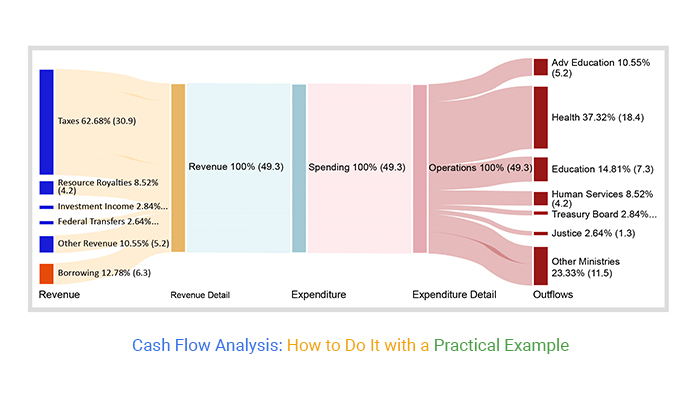
This section will use a Sankey diagram to visualize the tabular data below.
| Revenue | Revenue Detail | Expenditure | Expenditure Detail | Outflows | Count |
| Taxes | Revenue Detail | Expenditure | Expenditure Detail | Health | 18.4 |
| Taxes | Revenue Detail | Expenditure | Expenditure Detail | Education | 7.3 |
| Taxes | Revenue Detail | Expenditure | Expenditure Detail | Adv Education | 5.2 |
| Resource Royalties | Revenue Detail | Expenditure | Expenditure Detail | Human Services | 4.2 |
| Investment Income | Revenue Detail | Expenditure | Expenditure Detail | Treasury Board | 1.4 |
| Federal Transfers | Revenue Detail | Expenditure | Expenditure Detail | Justice | 1.3 |
| Other Revenue | Revenue Detail | Expenditure | Expenditure Detail | Other Ministries | 5.2 |
To install ChartExpo, an add-in for Google Sheets, click this link.


This section will use a Sankey Diagram (cash flow analysis-friendly chart) to visualize the data below.
| Total Budget | Departments | Spending | Amounts |
| Total Budget | Salaries | Team | 26 |
| Total Budget | Salaries | Drivers | 13 |
| Total Budget | Salaries | Directors | 3 |
| Total Budget | Research & Development | Wind Tunnel Testing | 16 |
| Total Budget | Research & Development | Other R&D | 15 |
| Total Budget | Research & Development | Track Testing | 10 |
| Total Budget | Production | Customer Engine Supply | 20 |
| Total Budget | Production | Manufacturing | 13 |
| Total Budget | Production | Engine | 3 |
| Total Budget | Production | Monocoque | 1 |
| Total Budget | Production | Gearbox | 1 |
| Total Budget | Production | Other | 1 |
| Total Budget | Operations | Logistics | 13 |
| Total Budget | Operations | Entertainment | 10 |
| Total Budget | Operations | Freight | 5 |
| Total Budget | Operations | IT | 4 |
| Total Budget | Operations | Factory and Utilities | 2 |
| Total Budget | Operations | Professional Services | 2 |
| Total Budget | Operations | Fuel | 1 |


Some insights from the above Diagram include the following:
The following video will help you to create a Sankey Chart in Google Sheets.
Note: You can also use ChartExpo to Cash Flow Diagram in Excel for analyzing cash flow.
The cash flow analysis presents sources and uses of money in your business. Besides, it measures how well your business is managing its cash position.
There are three unique formulas you can use to determine the cash flow position of your business. They include:
A cash flow analysis is one of the most significant ways a business can use to analyze inflows and outflows.
Why?
Well, this analysis shows what your business does with income. Besides, it can help you streamline internal operations and make data-backed decisions.
Analyzing cash flow does not have to be time-consuming and complex. Yes, you read that right.
Google Sheets lacks ready-made charts for analyzing cash flow.
You don’t have to ditch your Google Sheets in favor of other costly tools in the market.
So, what’s the solution?
We recommend you install third-party apps, such as ChartExpo, to access ready-to-use charts for analyzing cash flow.
ChartExpo is an add-on for Google Sheets that’s loaded with insightful and ready-to-go graphs for analyzing cash flow. You don’t need programming or coding skills to use ChartExpo.
More benefits
Sign up for a 7-day free trial today to access ready-made visualization for cash flow analysis that is easy to interpret and visually appealing to your target audience.
How much did you enjoy this article?


Calculate accounts receivable turnover ratio to measure credit collection speed, improve cash flow, and strengthen your financial strategy. Read on!

Change Management KPIs are the key to tracking adoption, performance, and ROI during transitions. Find out which metrics matter. Read on!

Data collection methods and techniques determine the quality of every insight you act on. Explore key approaches for gathering reliable data. Read on!


