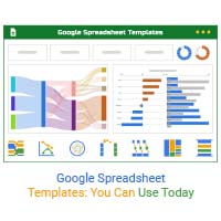
A Sankey Diagram says more than a thousand Pie Charts. The Sankey Diagram in Google Sheets is best suited for visualizing data with flow-like characteristics, like energy and cost breakdowns.
Why?
The flow data type is complex and bulky. Besides, it can easily overwhelm you, particularly if you lack a suitable chart for the job. Also, you’ll be scratching the surface if you use ill-suited visualization designs to show insights into the flow data type.
We recommend you try a Sankey Diagram because it will save you time immensely. Additionally, the visualization design is amazingly simple to read and interpret.
Google Sheets has a difficult process of creating Sankey Diagrams. But we do not recommend you to get rid of the Google Sheets. You can get to an instant and ready-made Sankey Diagram in Google Sheets by installing a specific add-on in your Google Sheets.
In this blog you will learn:
Before jumping right into the how-to guide, we’ll address the following question: What is a Sankey Diagram?
Definition: A Sankey Diagram in Google Sheets is a visualization chart you can use to display insights into data flow through stages or phases.
While initially, the charts were used only to visualize energy flows in an engineering system, they’re now used in other disciplines and sectors of the global economy.
The chart gets its name from Matthew Sankey, a captain in the Irish Royal Engineers. During the 1890s, he used visual illustration to display the efficiency and purpose of various steam engine components.
He understood that 100% efficiency in a steam engine was almost impossible. This diagram helped the army captain to highlight the areas with significant losses.
Today, we use Sankey Diagrams in Google Sheets in the following fields, namely:
Whenever you have materials or resources entering a process, leverage this chart to display insights into the efficiency of usage.
Keep reading because we’ll take you through how to make a Sankey Diagram in Google Sheets in the coming sections.
Nodes are the vertical bars, which reflect the value of the metric under study.
Links are the horizontal flow lines that connect with nodes. Remember, each color of the link matches the node. The wider the link, the higher the value of the data point under study.
Let’s get to the main part of the blog: How to make a Sankey Diagram?
Visualization is a form of analysis you can use to extract answers from your data. One of the common tools for visualizing data using different types of charts and graphs is Google Sheets.
However, the spreadsheet application lacks ready-made Sankey Diagrams.
We’re not advising you to do away with Google Sheets in favor of other expensive tools.
And this is because there’s an amazingly affordable data visualization tool that comes as an add-on you can easily install in Google Sheets to access insightful, ready-made, and easy-to-customize Sankey Diagrams in Google Sheets. The tool is called ChartExpo.
So, what is ChartExpo?
ChartExpo is an add-on you can easily install in your Google Sheets without needing tutorials. By using ChartExpo you can easily create many complex and advanced charts like Sankey Chart in Google Sheets without any coding in a few clicks.
With many ready-to-go and insightful charts, graphs, and maps, ChartExpo turns your complex, raw data into easy-to-interpret and visually appealing Google Sheets charts that tell data stories in real-time.
More benefits
In the coming section, we’ll show you how to create a Sankey Diagram in Google Sheets.
This section will use a Sankey Chart in Google Sheets to visualize the data below.
Store | Category | Items | Brand | Units Sold |
Online Store | Electronics | Mobile | Samsung | 39 |
Online Store | Electronics | Tablet | Samsung | 73 |
Online Store | Electronics | Laptop | Dell | 156 |
Online Store | Garments | Jeans | Levi’s | 46 |
Online Store | Garments | T-Shirt | H&M | 104 |
Online Store | Garments | Jackets | Puma | 41 |
Online Store | Furniture | Sofa | IKEA | 73 |
Online Store | Furniture | Chair | Kartell | 46 |
Online Store | Furniture | Desk | Stickley | 43 |
To install ChartExpo into your Google Sheets, click this link.
The Sankey Diagram above shows the order analysis of an online store.
The image below is another Sankey Diagram that is generated in Google Sheets using the ChartExpo add-on.
In the next section, you will learn how to create a Sankey diagram in Google Sheets with the help of a video tutorial.
In the following video, you will learn how to make a Sankey diagram in Google Sheets.
The chart makes it easy to spot the most significant changes in key metrics that matter to you. The Sankey Diagram is versatile and flexible. And this means you can leverage it to track costs, materials, marketing analytics, etc.
Remember, the movement of your data matters significantly. The key goal of Sankey analysis is to display insights into how and why particular metrics are changing.
A Sankey Diagram can help you uncover the most substantial fluctuations in your data across various categories or stages that matter to you.
The size of each link and node in the Sankey Diagram shows you the critical elements in your data sets.
Aside from data flow, the other key advantage of using Sankey is its bird’s-eye-view of key data points.
This high-level perspective is unbeatable, especially when you’re trying to analyze the efficiency of one of your processes, such as budget spending.
You can use a Sankey Diagram in Google Sheets to visualize data from a wide range of industries, including:
A Sankey Diagram is one of the best charts for analyzing data with flow attributes, such as materials, funds, energy, etc. Each node is connected to the other via a link. The bigger the flow lines, the higher the metric value under study. The value of each metric under study is differentiated using contrasting colors.
Let’s say your goal is to establish how you spend your household budget.
The bird’s eye view insights would be your entire household budget. You can easily use separate nodes to differentiate significant versus non-essential costs.
In this scenario, the size of each node depicts how substantial each cost is to the household. If you notice that one of the most enormous flows depicts eating at restaurants, you’ll have an opportunity to decide whether to scale down.
Google Sheets lacks ready-made Sankey Diagrams.
We’re not advising you to do away with Google Sheets in favor of other expensive tools.
This is because there’s an add-on you can easily install in Google Sheets to access insightful, ready-made, and easy-to-customize Sankey Diagrams.
The tool is called ChartExpo.
Follow the steps below to create a Sankey Diagram in Google Sheets.
Avoid using Sankey Diagrams if you have a smaller data sample. And this is because you won’t get accurate and reliable insights. Secondly, your data should have more than three attributes for a Sankey Chart to display insights easily and conveniently without clutter or distortion.
A Sankey Diagram in Google Sheets says more than a thousand Pie Charts. You can use the chart to visualize data with flow-like attributes.
The chart is best suited for visualizing data with flow-like characteristics, like energy and cost breakdowns.
Why?
This data type is complex and bulky. Besides, it can easily overwhelm you, particularly if you lack a suitable chart for the job.
You’ll be scratching the surface if you use ill-suited visualization designs to show insights into the flow data type.
We recommend you try a Sankey Diagram because it will save you time immensely. Additionally, the visualization design is amazingly simple to read and interpret.