Categories
Global warming, climate change, and renewable energies dominate discourses in forums, such as the World Economic Forum in Davos and the UN.


One of the reasons countries are marshaling their financial and political resources is climate change and associated problems. There have been catastrophes associated with global warming and climate change in the last two decades.
Investments in renewable energy are seen as the solution to combat global warming.
Given that renewable energy sources are about to become a reality in the next few years, there’s a need to track their effectiveness.
In other words, we need to track key metrics, such as:
Some of the tested and proven visualization designs for the task include:
These charts are incredibly easy to decode, even for non-technical audiences.
Google Sheets is one of the go-to popular data visualization tools among professionals and business owners worldwide. But the visualization tool has basic Sankey Chart, Clustered Bar Chart, and Donut Charts.
And this implies you’ve got to invest extra effort and time to edit the charts to align with your needs.
You can download and install a specific add-in in your Google Sheets to access ready-to-use charts (highlighted below).
In this blog you’ll learn the following:
Before diving into the how-to guide, let’s address the following question: what is renewable energy?
Definition: Renewable energy is clean energy that comes mostly from natural sources or processes.
For example, sunlight or wind keeps shining and blowing, even if their availability depends on time and weather.
This form of energy is often viewed as the solution to devastating climate change and global warming. Renewables are becoming a more important power source, accounting for over one-eighth of U.S. generation.
As renewable use continues to grow, a key goal will be to modernize America’s electricity grid, making it smarter, more secure, and better integrated across regions.
To account for energy consumption, production, and losses, you need renewable energy charts, such as the Sankey Chart.
A renewable energy chart visually represents data on the production, consumption, and growth of various renewable energy sources, such as solar, wind, hydro, and geothermal.
Illustrating these metrics, helps stakeholders understand trends, make comparisons, and track the progress of renewable energy adoption, aiding in informed decision-making for sustainability and energy policies.
In the following video, we will show you how to create a Renewable Energy Chart using Sankey Diagram in Google Sheets.
You can use Solar panels to collect solar energy and turn it into electricity. You may already have a garden lantern that is powered by a solar panel. When used as a major power source, solar panels are often quite large and are mostly mounted on the roof of a home, office, or industrial complex. Solar energy can help you cut costs associated with heating and electricity.
Using motors, you can harness electricity from water bodies, such as lakes, dams, and rivers.
You can use a windmill to generate cleaner, cheaper electricity for domestic and industrial use. During the 18th and 19th centuries, wind energy performed repetitive mechanical tasks, such as pumping water from wells or grinding grain. Today, windmills are widely used to generate power for domestic and industrial use.
Ocean energy includes tidal, wave, and thermal energy. It utilizes the natural movements of the ocean, such as tides and waves, to generate electricity, making it a promising renewable energy source.
Hydrogen can be produced from various renewable sources and used as a clean fuel for power generation or transportation. When combined with oxygen, it generates electricity, producing only water as a byproduct.
In the coming section, we’ll address the following question: what is the best renewable energy chart?
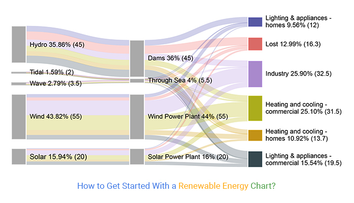
The Sankey Chart is one of the best renewable energy charts because it displays insights using flows from node to node.

The visualization design tracks the renewable energy flow from primary energy sources up to the final stage (consumption) using a Sankey diagram Excel as well as in Google Sheets.
In other words, a Sankey diagram for energy where the width of the streams is proportional to the quantity of flow, and where the flows can combine, split, and be traced through a series of events or stages.
The Sankey Chart and Chord Diagram both visually and quantitatively illustrate the flow of renewable energy and its transformation. This includes primary sources (wind, solar, water, geothermal, etc.) fed into the grid and distributed for consumption by industrial and domestic consumers.
So, if used effectively, it’s arguably the best data visualization to use in a data story, especially when formulating renewable energy policies for a country or state.
A Clustered Bar Chart displays more than one data series in grouped vertical columns.

Each data series shares the same axis labels, so vertical bars are grouped by category. Clustered Bar charts allow the direct comparison of multiple series, but they become visually complex quickly. They work best in situations where data points are limited.

Donut charts show the proportions in categorical data, with the size of each piece representing the proportion of each category.
Google Sheets has built-in charts you can use to extract answers from your data.
However, you’ll never find ready-to-use renewable energy charts, such as the Sankey Chart, for your analysis. The most viable option available for you is installing a particular third-party add-on (we’ll talk about later) to access ready-made renewable energy charts.
You don’t need to do away with Google Sheets in favor of other expensive tools.
We recommend you try the ChartExpo add-on for Google Sheets because of the reasons listed below.
ChartExpo does not require coding or programming skills, unlike other data visualization-based add-ons. More so, it has an ultra-friendly user interface (UI) for everyone to use.
This tool comes pre-loaded with a large number of ready-made charts, such as Sankey Chart, Radar Chart, and Control Chart, etc. to offset the missing ones in Google Sheets. Use ChartExpo to produce charts that are incredibly easy to read and understand.
So, what is ChartExpo?
ChartExpo comes as an add-on for Google Sheets.
Essentially, it turns your Google Sheets into a usable data visualization tool capable of delivering hidden insights into your data, irrespective of the size or complexity.
The premium renewable energy chart maker comes with a 7-day free trial period.
The key benefit of ChartExpo is the fact that it produces charts that are easy to read and interpret. More so, it allows you to save charts in the world’s most recognized formats, namely PNG, SVG, PDF, and JPG.
In this section, we’ll use a Sankey Chart to visualize the data below.
| Main Source | Source type | Usage | Mega Watt |
| Hydro | Dams | Lost | 9.8 |
| Hydro | Dams | Industry | 7.5 |
| Hydro | Dams | Heating and cooling – commercial | 6.7 |
| Hydro | Dams | Heating and cooling – homes | 5.3 |
| Hydro | Dams | Lighting & appliances – commercial | 8.9 |
| Hydro | Dams | Lighting & appliances – homes | 6.8 |
| Tidal | Through Sea | Lost | 0.3 |
| Tidal | Through Sea | Industry | 0.5 |
| Tidal | Through Sea | Heating and cooling – commercial | 0.4 |
| Tidal | Through Sea | Heating and cooling – homes | 0.1 |
| Tidal | Through Sea | Lighting & appliances – commercial | 0.5 |
| Tidal | Through Sea | Lighting & appliances – homes | 0.2 |
| Wave | Through Sea | Lost | 0.8 |
| Wave | Through Sea | Industry | 0.7 |
| Wave | Through Sea | Heating and cooling – commercial | 0.9 |
| Wave | Through Sea | Heating and cooling – homes | 0.3 |
| Wave | Through Sea | Lighting & appliances – commercial | 0.5 |
| Wave | Through Sea | Lighting & appliances – homes | 0.3 |
| Wind | Wind Power Plant | Lost | 3.7 |
| Wind | Wind Power Plant | Industry | 17.9 |
| Wind | Wind Power Plant | Heating and cooling – commercial | 18.1 |
| Wind | Wind Power Plant | Heating and cooling – homes | 5.8 |
| Wind | Wind Power Plant | Lighting & appliances – commercial | 5.5 |
| Wind | Wind Power Plant | Lighting & appliances – homes | 4 |
| Solar | Solar Power Plant | Lost | 1.7 |
| Solar | Solar Power Plant | Industry | 5.9 |
| Solar | Solar Power Plant | Heating and cooling – commercial | 5.4 |
| Solar | Solar Power Plant | Heating and cooling – homes | 2.2 |
| Solar | Solar Power Plant | Lighting & appliances – commercial | 4.1 |
| Solar | Solar Power Plant | Lighting & appliances – homes | 0.7 |
To Get Started with Sankey Chart, install the ChartExpo add-on for Google Sheets from the link, and then follow the simple and easy steps below.


In the coming section, we will show you how to create an energy flow diagram in Google Sheets.
A renewable energy graph helps simplify complex data, making it easier to understand the contribution of different renewable sources over time.
It allows for clear tracking of renewable energy growth, helping stakeholders assess the success of sustainability efforts and policy impacts.
Graphs can compare different types of renewable energy, providing insights into which sources are gaining more prominence or efficiency.
By visually representing data, renewable energy graphs help decision-makers identify trends and allocate resources to the most promising energy sources.
These graphs effectively communicate the benefits and expansion of renewable energy, raising public awareness and support for sustainable energy transitions.
Select a chart that best represents your data, such as a bar chart for comparisons or a line chart for trends over time.
Focus on key metrics, like energy output or percentage growth, to avoid overwhelming the viewer with too much information.
Clearly label axes, data points, and legends to make the chart easy to read and understand.
Use consistent and meaningful color coding to differentiate between various renewable energy sources like solar, wind, and hydro.
Highlight year-over-year trends or compare energy types to emphasize progress and areas of improvement.
Renewable energy is often viewed as the solution to devastating climate change and global warming. Renewables are becoming a more important power source.
As renewable energy use continues to grow, the key goal will be to modernize the world’s electricity grid, making it better integrated.
Yes, renewable sources of energy are cleaner, cheaper, and more reliable.
For example, sunlight or wind keeps shining and blowing, even if their availability depends on time and weather. Renewable energy is the solution to devastating climate change and global warming. You can use it for domestic and industrial purposes.
Renewable energy is one of the themes that dominate discourses in global forums, such as the UN.
One of the reasons why countries are marshaling their financial and political resources is climate change and associated problems. There have been catastrophes associated with global warming and climate change in the last two decades.
Investments in renewable energy are seen as the solution to combat global warming.
Given that renewable sources of energy are about to become a reality in the next few years, there’s a need to track their effectiveness.
Some of the tested and proven visualization designs for the task include:
Google Sheets is one of the go-to popular data visualization tools among professionals and business owners worldwide. However, the visualization tool has basic Sankey Charts, Clustered Bar Charts, and Donut Charts.
And this implies you’ve got to invest extra effort and time to edit the charts to align with your needs.
We recommend installing third-party apps, such as ChartExpo, into your Google Sheets to access ready-made and visually appealing renewable energy charts.
ChartExpo is an add-on with insightful and easy-to-interpret renewable energy charts, plus many complex and interactive visualization designs. You don’t require programming skills to visualize your data using the application.
Sign up for a 7-day free trial today to access ready-made and visually appealing renewable energy charts for your data story.
How much did you enjoy this article?


Calculate accounts receivable turnover ratio to measure credit collection speed, improve cash flow, and strengthen your financial strategy. Read on!

Change Management KPIs are the key to tracking adoption, performance, and ROI during transitions. Find out which metrics matter. Read on!

Data collection methods and techniques determine the quality of every insight you act on. Explore key approaches for gathering reliable data. Read on!


