Categories
In the high-stakes world of finance, numbers don’t just tell stories; they spin entire sagas. The enchanting art of financial performance analysis, highlighted through real-world Financial Performance Analysis Examples, lies at the heart of deciphering these numeric narratives. Here, spreadsheets transform into thrilling tales, revealing the secrets beneath.


Is your business flourishing or floundering?
Together, we’ll embark on an exhilarating journey into the heart of the financial landscape. We’ll scrutinize revenue trends, explore cost structures, and unearth the treasure trove of profitability.
But this isn’t your average run-of-the-mill analysis. We’re not just going to throw some numbers onto a graph and call it a day. No, we’ll create a financial masterpiece and reveal the story behind those digits. Consequently, you can see the following;
That’s not all; we’ll even provide you with a real-life financial performance analysis example. Ultimately, you’ll become a financial detective, piecing together the puzzle of company success or failure.
Financial performance analysis entails scrutinizing a company’s financial well-being and effectiveness. It encompasses evaluating documents such as balance sheets and income statement templates to assess key metrics, trends, and ratios.
This examination yields valuable insights into a company’s effectiveness, stability, and potential for growth. Financial Performance Analysis Examples, including 3-statement financial modeling, become critical tools for decision-making, helping businesses, investors, and creditors make informed financial choices.
Financial performance analysis encompasses various types of analysis that provide different perspectives on a company’s financial health. Let’s take a look at each of these types and explore Financial Performance Analysis Examples:
Profitability analysis focuses on a company’s capacity to generate profits. Key metrics include the gross profit margin, net profit margin, and return on equity (ROE).
Liquidity analysis assesses a company’s ability to meet its short-term financial obligations. This is critical for a company’s day-to-day operations and overall financial stability. Key liquidity metrics include the current ratio, quick ratio (acid-test ratio), and the operating cash flow ratio.
Stakeholders want to understand if a company can meet its long-term debt obligations. A company’s long-term financial stability is the main concern of solvency analysis. Key solvency metrics include the debt-to-equity ratio, interest coverage ratio, and debt-to-assets ratio.
Efficiency analysis examines how effectively a company utilizes its resources to generate sales and profits. Efficiency metrics include the inventory turnover ratio, accounts receivable turnover, asset turnover ratio, and debt to total assets ratio analysis.
A company’s cash inflows and outflows concern cash flow analysis. This analysis helps assess a company’s ability to maintain operations and manage financial resources effectively. Key cash flow metrics include operating cash flow, investing and financing, and free cash flow.
Here are a few financial performance analysis examples, metrics, and indicators:
These examples represent a range of metrics used in financial performance analysis to assess different aspects of a company’s fiscal health and operational efficiency.
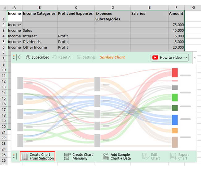
Let’s say you have the data below on income and expenses.
| Income | Income Categories | Profit and Expenses | Expenses Subcategories | Salaries, Wages, & Marketing Details | Amount |
| Income | 75,000 | ||||
| Income | Sales | 45,000 | |||
| Income | Interest | Profit | 5,000 | ||
| Income | Dividends | Profit | 5,000 | ||
| Income | Other Income | Profit | 20,000 | ||
| Sales | Profit | 5,000 | |||
| Sales | Operating Expenses | 40,000 | |||
| Operating Expenses | Salaries and Wages | 20,000 | |||
| Salaries and Wages | Management | 10,000 | |||
| Salaries and Wages | Sales Team | 5,000 | |||
| Salaries and Wages | Support Team | 3,000 | |||
| Salaries and Wages | Administrative | 2,000 | |||
| Operating Expenses | Rent | 10,000 | |||
| Operating Expenses | Utilities | 2,000 | |||
| Operating Expenses | Marketing | 5,000 | |||
| Marketing | Online Ads | 3,000 | |||
| Marketing | Print Ads | 1,500 | |||
| Marketing | Social Media | 500 | |||
| Operating Expenses | Supplies | 3,000 |
You want to create a financial performance analysis report that everyone can understand.
While Excel is excellent for data organization and analysis, it falls short when it comes to visualization. Trying to create visually appealing charts and graphs in Excel can be a tedious and time-consuming process. The limited customization options and lack of advanced visualization tools often result in dull and uninspiring visuals.
However, all hope is not lost – ChartExpo comes to the rescue. ChartExpo transforms your data into visually stunning representations that captivate and engage your audience. Say goodbye to boring Excel charts and embrace the dynamic world of ChartExpo visualizations.
Let’s learn how to Install ChartExpo in Excel.
ChartExpo charts are available in Google Sheets and Microsoft Excel. Please use the following CTAs to install your favorite tool and create beautiful visualizations, such as a funds flow diagram, with just a few clicks.
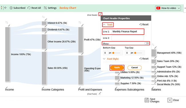
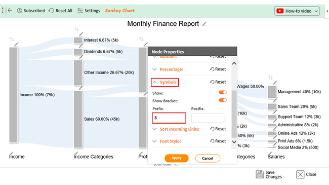
Follow the steps below to create your financial performance analysis report in Excel with ChartExpo.


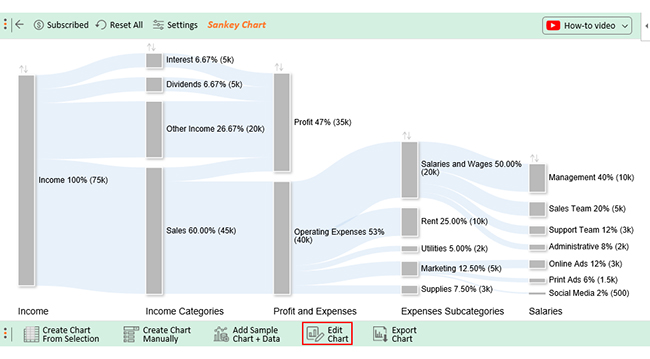
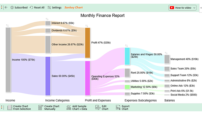
The total monthly income is $75,000. Sales account for the majority, contributing $45,000, while interest and dividends each contribute $5,000. Additionally, $20,000 is generated from other income sources.
The overall expenses for the small business expense reporting sum up to $40,000, with a significant portion dedicated to operating expenses. Among the operating expenses, salaries and wages make up the most significant chunk at $20,000, underscoring the importance of labor costs. Rent, utilities, marketing, and supplies account for the remaining operating expenses.
The data reveals a more detailed breakdown of salaries and wages. The “Management” category incurs the highest salary expense of $10,000, followed by the “Sales Team” at $5,000, the “Support Team” at $3,000, and finally, the “Administrative” team at $2,000.
The $5,000 allocated for marketing expenses is divided into three subcategories: $3,000 for online ads, $1,500 for print ads, and $500 for social media.
A profit of $35,000 ($75,000 income – $40,000 expenses) is evident in the Sankey diagram. Sales play a significant role in generating this profit, contributing $5,000 to the overall amount.
Financial Performance Analysis is crucial for several reasons:
Imagine investing in a company without looking at its financial health’ It’s like buying a mystery box blindfolded. Financial Performance Analysis Examples help you avoid this, equipping you with the power to make informed decisions. Whether you’re an investor, a creditor, or a business manager, this tool guides you toward informed financial choices.
Think of financial analysis as the financial time-traveler’s DeLorean. It lets you go back and forth in a company’s financial history, uncovering trends and patterns. Thus, you can determine whether a company’s performance is improving or deteriorating. Then, you can make timely adjustments or take advantage of opportunities.
Ever played a game of financial Jenga? That’s what lending and investing without financial performance analysis feels like. This tool helps you gauge a company’s ability to repay debts and manage risks. You wouldn’t want to invest your hard-earned cash in a ship that’s more Titanic than seaworthy.
If business is a battlefield, financial performance analysis is your battle strategy. It provides the blueprints for your financial conquests. It reveals which divisions are thriving and which are struggling. Consequently, this helps you draw up plans for expansion or consolidation.
Every player wants to know where they stand in the grand business game. Financial performance analysis does exactly that. It paints a vivid picture of your company’s presence in the business circus. If your Return on Equity (ROE) outshines the bigwigs, you’re the financial equivalent of the high-wire performer.
One common example of a financial performance measure is the Earnings Before Interest and Taxes (EBIT). EBIT reveals a company’s operating profitability by excluding interest and taxes. Consequently, this makes it easier to compare the core profitability of different businesses.
The two major techniques for financial analysis are ratio analysis and vertical analysis. Ratio analysis evaluates the relationship between different financial metrics. On the other hand, vertical analysis examines the proportions of individual financial items within financial statements.
The benefits of financial performance analysis include informed decision-making, risk assessment, strategic planning, and performance measurement. It aids investors, creditors, and business owners in making sound financial choices and improving overall financial health.
Financial performance analysis, exemplified through real-world Financial Performance Analysis Examples, is not just an exercise in spreadsheet wizardry; it’s the lifeblood of smart financial decision-making.
Imagine being an investor about to plunge into the stock market. Would you leap blindfolded into the abyss? Of course not! You’d use financial analysis to spot the gems and avoid the landmines. Or picture yourself as a business manager planning the next big expansion. Would you wing it? No way! You’d turn to financial analysis to map out a successful strategy.
The ability to identify trends is priceless. Like fortune-tellers, financial analysts uncover patterns that help prepare for the future. With ChartExpo, patterns come alive, turning rows of numbers into dynamic visuals.
Financial Performance Analysis Examples play a crucial role in risk assessment, serving as the early warning system that alerts investors and lenders to potential financial turbulence on the horizon.
When it comes to strategic planning, it’s the strategist’s handbook. It highlights operational efficiencies and inefficiencies, offering a roadmap to enhance performance and profitability.
How much did you enjoy this article?


Calculate accounts receivable turnover ratio to measure credit collection speed, improve cash flow, and strengthen your financial strategy. Read on!

Change Management KPIs are the key to tracking adoption, performance, and ROI during transitions. Find out which metrics matter. Read on!

Data collection methods and techniques determine the quality of every insight you act on. Explore key approaches for gathering reliable data. Read on!


