Categories
An energy flow diagram is a powerful visual tool used to represent how energy moves through a system. They help simplify complex energy data, making it easier to analyze energy distribution, losses, and efficiency across processes.
These diagrams are widely used in fields like energy management, engineering, and environmental analysis to track energy inputs, outputs, and transformations. A common example is the Sankey diagram, which clearly shows energy flow quantities and relationships.
Definition: An energy flow diagram is a visual representation that shows how energy moves, transforms, and is distributed within a system. It illustrates energy inputs, outputs, and losses to help analyze efficiency and performance.
These diagrams typically use arrows or flow lines, where the width represents the amount of energy being transferred. A common example is a flow diagram which clearly displays energy flow quantities and relationships.

This is essential for understanding how energy moves through a system. They simplify complex processes, making it easier to analyze performance, efficiency, and energy distribution.
Energy systems often involve multiple inputs, outputs, and transformations. An energy flow diagram makes these processes easy to understand by presenting them in a clear visual format.
Governments and organizations use an energy flow diagram to analyze energy usage and develop effective policies for sustainability and resource management.
Businesses use these diagrams to identify energy losses and optimize processes, helping reduce costs and improve overall efficiency.
Make complex information easier to explain, making it useful for education, reporting, and stakeholder presentations.
The energy flow chart includes several key features that make it effective for analyzing and visualizing an energy dashboard.
Energy flow charts show how energy moves from sources like solar, coal, or natural gas to end-use sectors such as residential, industrial, and transportation. This provides a complete view of the energy lifecycle.
To represent energy values using measurable units (e.g., BTUs or joules). The width of each flow line indicates the quantity of energy being transferred or consumed.
It can highlight energy losses (often called rejected energy) during conversion processes. This helps identify inefficiencies and areas for improvement.
Arrows or flow lines indicate the direction of energy movement, making it easy to follow how energy is transformed and distributed across a system.
By displaying multiple flows in a single view, these diagrams allow users to compare how energy is allocated across different sectors or processes.
It’s widely used for analyzing energy consumption patterns, supporting decision-making, and visualizing data in reports and dashboards.
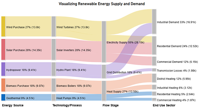
Explore examples used to visualize, analyze, and optimize energy systems across different settings.
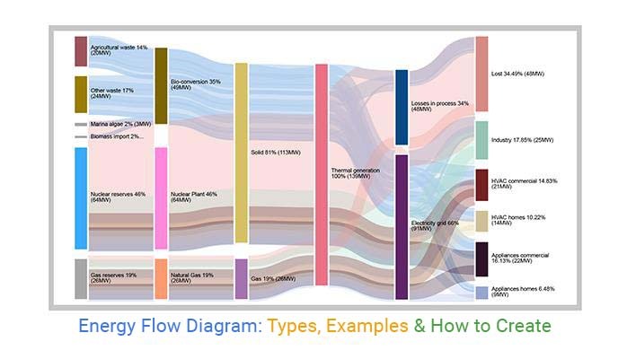
Through this, we can track multiple sources, including agricultural waste, other waste, marina algae, biomass imports, nuclear reserves, and natural gas, showing megawatt outputs and end-user consumption across industries, HVAC systems, and residential appliances.
Key insight: The diagram highlights bio-conversion and thermal generation processes, revealing the complex journey of energy from source to application.

This residential energy flow diagram example emphasizes line thickness to represent energy magnitude. Energy is tracked from main sources to rooms and devices, showing how electricity is distributed.
Key insight: The air conditioner, oven, and stove are the top energy consumers, while the kitchen is the room with the highest usage. This helps homeowners identify areas to save energy efficiently.

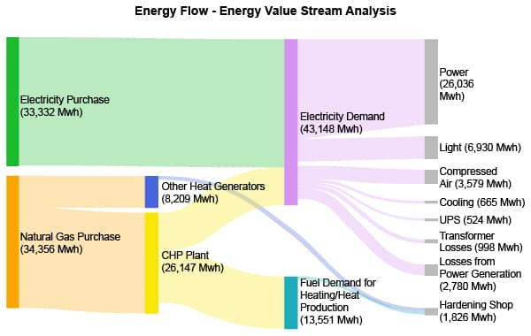
In an industrial setting, this energy flow diagram example tracks electricity, gas, and steam through production processes. It shows how energy is transformed, consumed, and lost at various stages.
Key insight: The diagram helps pinpoint high-consumption areas, conversion losses, and efficiency gaps, allowing industries to optimize energy usage, reduce waste, and save costs.
Visualizes energy usage in a building, covering lighting, HVAC, and appliances. Flow line thickness represents energy consumption magnitude.
Key insight: Major energy consumers include air conditioning units, heating systems, and kitchen appliances, guiding facility managers and homeowners to implement energy-saving measures.
Identify the system, process, or facility you want to visualize. Determine all energy inputs, outputs, and losses to ensure your diagram accurately reflects reality.
Collect all relevant data, such as energy consumption, production, conversion efficiency, and waste. Use reliable sources like utility records, system logs, or industry reports.
Open a blank workbook in Excel and structure your data clearly:
Flow diagrams are ideal for representing energy flows because they visually highlight the magnitude and direction of energy transfers.
Use the ChartExpo add-in for Excel to create your chart. Carefully map all energy sources, flows, and quantities to ensure accuracy.

Include a descriptive title and annotate key flows or energy losses to make the diagram easy to interpret for readers or stakeholders.
Double-check that all flows correspond to your data. Verify totals and ensure no inputs or outputs are missing.
Export the diagram as a PNG, JPEG, or PDF. Embed it in reports, presentations, or dashboards for clear communication.
Energy flows may change over time. Update your data and refresh the diagram periodically to keep it accurate and relevant.

It can provide a simple, visual way to track energy movement through a system. They help identify where energy is coming from, how it’s used, and where it’s lost.
By mapping energy inputs and outputs, these diagrams make it easier to spot inefficiencies or wastage, helping organizations optimize energy use and reduce costs.
With a clear understanding of energy flows, engineers, managers, and stakeholders can make informed decisions about improvements, investments, and sustainability measures.
Easy to simplify complex energy systems, making it easier to share insights with teams, clients, or non-technical audiences.
By regularly updating diagrams, organizations can monitor improvements, track energy-saving initiatives, and measure the impact of operational changes.
Before starting, decide which processes, equipment, or facilities you want to include. Clearly defining boundaries ensures that your diagram is accurate and focused, avoiding unnecessary complexity.
Gather reliable data on energy inputs, outputs, conversions, and losses. Ensure units are consistent (e.g., kWh, MJ) and double-check for accuracy. Accurate data is essential for meaningful insights.
For most, flow charts are ideal because flow widths visually represent energy quantities. Select a method that clearly shows the magnitude and direction of energy flows.
Label all sources, destinations, and energy flows. Use distinct colors for different energy types to improve readability and help viewers quickly understand the diagram.
Avoid cluttering the diagram with excessive details. Focus on major energy flows and losses, and provide additional details in annotations or accompanying notes. Simplicity improves comprehension and usability.
One of the biggest mistakes is failing to define what is included in your energy flow analysis clearly. Without boundaries, diagrams become confusing and may omit critical flows or include irrelevant data.
Incorrect data or inconsistent units can misrepresent energy flows, leading to wrong conclusions. Always verify data sources and ensure all measurements use the same unit system.
Adding too many minor flows or excessive details can make the diagram hard to read. Focus on the major energy sources, conversions, and losses, keeping it clear and actionable.
Failing to label sources, destinations, and flows properly, or using colors that are too similar, can confuse viewers. Use clear labels and distinct colors for each energy type to enhance readability.
Skipping the review process can leave errors unnoticed. Always cross-check totals, flows, and connections to ensure your diagram accurately reflects the energy system.
Energy flow diagrams can be created using tools like Microsoft Excel, Power BI, Google Sheets, and specialized visualization software such as ChartExpo and Tableau. These tools help visualize energy inputs, outputs, and losses clearly and accurately.
A process flow diagram illustrates the steps and stages of a particular process, while an energy flow diagram specifically shows how energy is sourced, transformed, distributed, and used within that process.
Reading an energy flow diagram is straightforward. Remember that the width of the arrows represents energy quantity. Start from the source and follow the arrows through transformations, distribution, consumption, and losses to understand the complete energy journey.
An energy flow diagram is a powerful tools that provide clear insights into complex energy systems. Whether you are a policymaker, an engineer optimizing processes, or a student studying energy, these diagrams serve as invaluable aids.
By understanding how energy moves through a system, we can make informed decisions, reduce waste, and work toward a more sustainable future.
The next time you encounter a maze of energy pathways.
Unlock the potential of the energy flow chart and explore the hidden patterns in your energy data. These insights can help drive efficiency, innovation, and smarter energy management for a brighter tomorrow.
How much did you enjoy this article?


Calculate accounts receivable turnover ratio to measure credit collection speed, improve cash flow, and strengthen your financial strategy. Read on!

Change Management KPIs are the key to tracking adoption, performance, and ROI during transitions. Find out which metrics matter. Read on!

Data collection methods and techniques determine the quality of every insight you act on. Explore key approaches for gathering reliable data. Read on!


