• Home
  • Tools dropdown img
    • Spreadsheet Charts

      • ChartExpo for Google Sheets
      • ChartExpo for Microsoft Excel
    • Power BI Charts

      • Power BI Custom Visuals by ChartExpo
    • Word Cloud

  • Charts dropdown img
    • Chart Category

      • Bar Charts
      • Circle Graphs
      • Column Charts
      • Combo Charts
      • Comparison Charts
      • Line Graphs
      • PPC Charts
      • Sentiment Analysis Charts
      • Survey Charts
    • Chart Type

      • Box and Whisker Plot
      • Clustered Bar Chart
      • Clustered Column Chart
      • Comparison Bar Chart
      • Control Chart
      • CSAT Survey Bar Chart
      • CSAT Survey Chart
      • Dot Plot Chart
      • Double Bar Graph
      • Funnel Chart
      • Gauge Chart
      • Likert Scale Chart
      • Matrix Chart
      • Multi Axis Line Chart
      • Overlapping Bar Chart
      • Pareto Chart
      • Radar Chart
      • Radial Bar Chart
      • Sankey Diagram
      • Scatter Plot Chart
      • Slope Chart
      • Sunburst Chart
      • Tornado Chart
      • Waterfall Chart
      • Word Cloud
    • Google Sheets
      Microsoft Excel
  • Services
  • Pricing
  • Contact us
  • Blog
  • Support dropdown img
      • Gallery
      • Videos
      • Contact us
      • FAQs
      • Resources
    • Please feel free to contact us

      atsupport@chartexpo.com

Categories
All Data Visualizations Data Analytics Surveys
Add-ons/
  • Google Sheets
  • Microsoft Excel
  • Power BI
All Data Visualizations Data Analytics Surveys
Add-ons
  • Google Sheets
  • Microsoft Excel
  • Power BI

We use cookies

This website uses cookies to provide better user experience and user's session management.
By continuing visiting this website you consent the use of these cookies.

Ok

ChartExpo Survey


Home > Blog > Microsoft Excel

Data Consolidation in Excel: A Step-by-Step Guide

What is data consolidation in Excel?

Imagine you’re managing data from multiple sources—sales from one region, expenses from another, and customer feedback from a third. Keeping track of everything can become overwhelming. This is where data consolidation in Excel steps in to simplify the process. Instead of hopping between countless spreadsheets, Excel allows you to merge all that information into one clean, organized report.

Data Consolidation in Excel

In 2024, businesses are dealing with more data than ever before. According to Statista, the total volume of data created globally is projected to reach over 180 zettabytes by 2025. For professionals, this means tools like Excel’s data consolidation are not optional—they’re essential. By consolidating data, you can create clear reports and make decisions faster.

Whether you’re handling financial statements or tracking inventory, using data consolidation in Excel saves time and reduces errors. It’s one tool that ensures your insights are based on complete and accurate information.

With the right approach, even the most complex data sets can become easy to manage. So, let’s help you focus on analysis rather than manual data entry.

Table of Contents:

  1. What is Data Consolidation in Excel?
  2. Why Consolidate Data in Excel?
  3. Methods of Data Consolidation in Excel
  4. How to Consolidate Data in Excel?
  5. What are the Challenges of Using the Data Consolidate Feature?
  6. How to Analyze Consolidate Data in Excel?
  7. Wrap Up

First…

What is Data Consolidation in Excel?

Definition: Data consolidation in Excel combines information from different worksheets or workbooks into one summary. It helps you organize scattered data into a single, clear report for efficient data reporting.

Whether you’re dealing with financial figures, sales records, or other data, this feature merges everything into one place.

Data consolidation is useful when working with multiple data sources. Why? It reduces manual effort and minimizes errors. It saves time and ensures your reports are accurate and complete, making data-driven decision-making easier.

Why Consolidate Data in Excel?

Picture this: you’re juggling several spreadsheets, each filled with valuable information. It’s easy to miss key details, and things can get messy fast. Data consolidation in Excel brings everything together in one place, making life easier.

Here are four reasons why it’s a game-changer:

  • Saves time: Merging data manually is time-consuming. Consolidating speeds up the process, so you spend less time on repetitive tasks.
  • Reduces errors: Combining data automatically minimizes the risk of mistakes caused by manual input.
  • Simplifies analysis: Having all your data in one sheet makes comparing, analyzing, and interpreting data easier.
  • Improves decision-making: With organized data, you can quickly draw insights and make better, faster decisions.

Methods of Data Consolidation in Excel

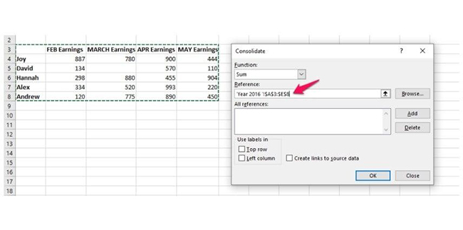
When consolidating data in Excel, you have two powerful methods: by position and by category. Each serves a specific purpose, depending on how your data is structured.

  • By Position

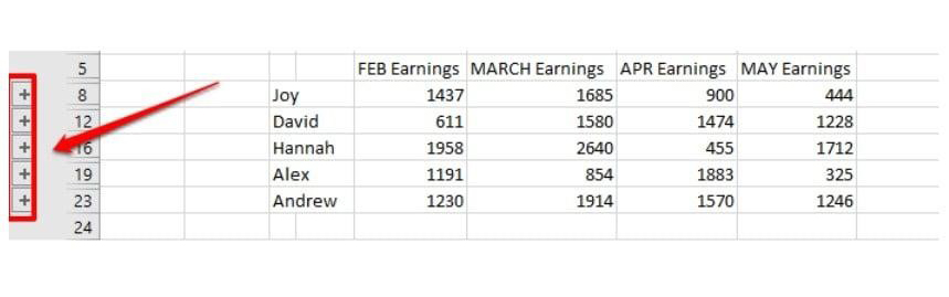
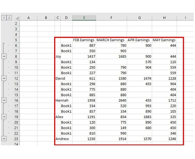
Consolidating by position works best when your data is laid out in the same arrangement across different sheets. Excel merges data based on cell location, ensuring all information from identical positions is added together. This is useful when all your worksheets follow the same format, such as monthly reports with consistent rows and columns.

  • By Category

Consolidating by category is better if data labels (like row or column headings) vary across worksheets. Excel groups and combines data based on matching labels rather than location. This method is handy when working with more dynamic or unstructured data sets. For instance, when merging sales figures from different regions where the labels may differ but the categories are similar.

How to Consolidate Data in Excel?

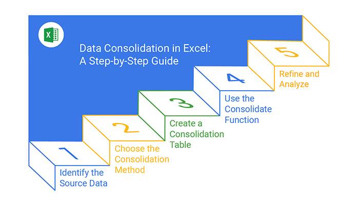
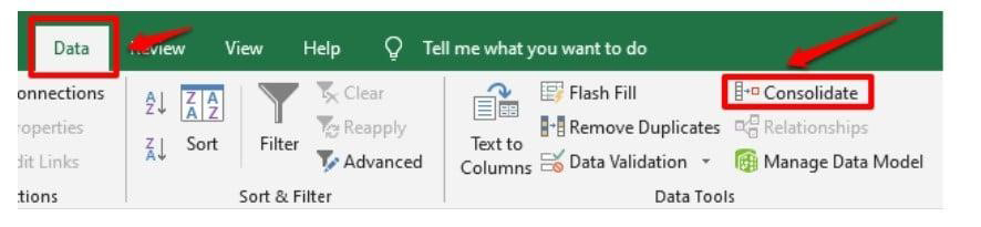
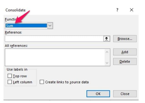
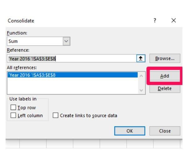
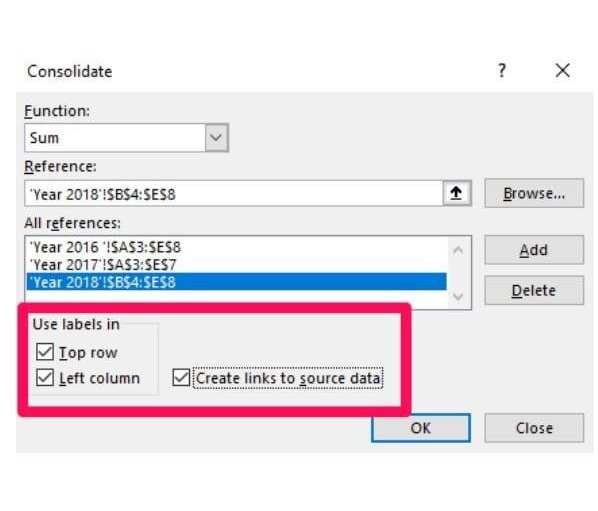
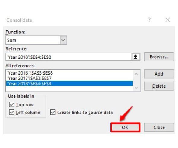
Let’s walk through how to consolidate data in Excel step by step:

  1. Create a summary sheet: Add a new worksheet or rename an existing one. We’ll call ours “Summary.”
Add New Worksheet for Doing Data Consolidation in Excel
  1. Select the start point: Make sure the sheet is empty. Click the top-left cell where your summary will begin.
  2. Access consolidation tool: Go to Data > Consolidate on the Excel ribbon.
Go to Data Then Consolidate for Doing Data Consolidation in Excel
  1. Choose a function: From the drop-down list, pick how you want to combine data (e.g., Sum, Average). We’ll use “Sum” for this example.
Combine Data for Doing Data Consolidation in Excel
  1. Select your data source: Click the “Collapse Dialog” button and select the data range in your first worksheet (e.g., A3 to E8 from “Year 2016”).
Click Collapse Dialog Button for Doing Data Consolidation in Excel
    • In the reference section, you’ll see your worksheet’s name with an exclamation mark, followed by the selected row and column range (e.g., “Year 2016 !$A$3:$E$5”).
  1. Add reference: Click Add to include this range in your list of references.
Click Add to Include for Doing Data Consolidation in Excel
  1. Repeat for other sheets: Do the same for your remaining worksheets. Ensure all ranges are added.
  2. Use labels: Check the boxes for “Top Row” and “Left Column” to include labels from your data.
Include Labels from Data for Doing Data Consolidation in Excel
  1. Finalize: Click OK to consolidate the data.
Click Ok for Doing Data Consolidation in Excel
  1. Use the “+” buttons to view original details from each source.
Use + Buttons to View Original Detail for Doing Data Consolidation in Excel
  1. And that’s it! You’ve now created a consolidated data sheet in Excel.
Now You Created Data Consolidation in Excel

What are the Challenges of Using the Data Consolidate Feature?

While the data consolidation feature in Excel can be a lifesaver, it does come with challenges. Let’s explore some common hurdles you might face when consolidating data.

  • Inconsistent data formats: Consolidation can get tricky if your source data uses different formats. Mismatched date formats or numerical entries can throw off your results.
  • Lack of data validation: Excel doesn’t automatically check data accuracy before consolidation. Errors in your source files may carry over to your final report.
  • Limited functionality: The consolidate feature is powerful but limited. It only works with basic data operations – complex calculations require additional steps.
  • Static results: Once data is consolidated, the results don’t update automatically when the source data changes. You’ll need to refresh it manually.
  • Complex data structures: Data with irregular structures or varying layouts across sheets can confuse Excel, leading to incomplete or incorrect summaries.
  • Data range selection: Selecting data ranges manually can be tedious, especially when dealing with large or multiple worksheets.
  • Performance issues: Consolidating large datasets can slow Excel down, impacting productivity.

How to Analyze Consolidate Data in Excel?

Data analysis can feel like wrestling with a messy pile of numbers. Without clear visuals, it’s easy to miss patterns or make wrong conclusions.

That’s where data visualization steps in. It turns data into something you can see and understand.

While Excel is great for crunching numbers, its charting tools often fall short. They’re basic, clunky, and not always intuitive.

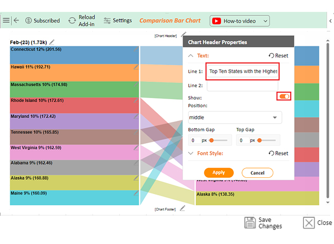
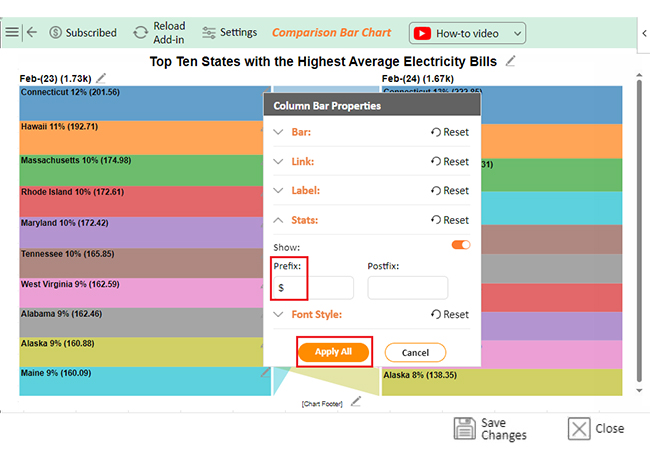
We have a solution – ChartExpo. This add-in transforms Excel’s limited visuals into dynamic, insightful charts and graphs. It makes complex data simple, helping you uncover insights quickly.

Ready to take your Excel game to the next level? Install ChartExpo.

Let’s learn how to install ChartExpo in Excel.

  1. Open your Excel application.
  2. Open the worksheet and click the “Insert” menu.
  3. You’ll see the “My Apps” option.
  4. In the Office Add-ins window, click “Store” and search for ChartExpo on my Apps Store.
  5. Click the “Add” button to install ChartExpo in your Excel.

ChartExpo charts are available both in Google Sheets and Microsoft Excel. Please use the following CTAs to install the tool of your choice and create beautiful visualizations with a few clicks in your favorite tool.

Examples of Data Consolidation in Excel

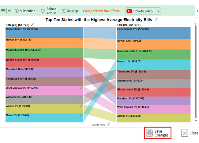
Let’s consolidate the data below in Excel and visualize it using ChartExpo.

Month-Year State Avg. Electricity Bill ($)
Feb-(23) Connecticut 201.56
Feb-(24) Connecticut 222.85
Feb-(23) Hawaii 192.71
Feb-(24) Hawaii 192.85
Feb-(23) Massachusetts 174.98
Feb-(24) Massachusetts 184.31
Feb-(23) Rhode Island 172.61
Feb-(24) Rhode Island 150.09
Feb-(23) Maryland 172.42
Feb-(24) Maryland 147.69
Feb-(23) Tennessee 165.85
Feb-(24) Tennessee 156.86
Feb-(23) West Virginia 162.59
Feb-(24) West Virginia 146.85
Feb-(23) Alabama 162.46
Feb-(24) Alabama 152.06
Feb-(23) Alaska 160.88
Feb-(24) Alaska 138.35
Feb-(23) Maine 160.09
Feb-(24) Maine 182.07
  • To get started with ChartExpo, install ChartExpo in Excel.
  • Access My Apps under the INSERT menu.
insert chartexpo in excel
  • Choose ChartExpo and click the “Insert” button.
open chartexpo in excel
  • After ChartExpo loads, choose the “Comparison Bar Chart” from the chart list.
search comparison bar chart in excel
  • You will see the blank chart below on the screen.
See Blank Chart After Creating Data Consolidation in Excel
  • Select the data from the sheet, and click the “Create Chart From Selection” button.
Click Create Chart From Selection Button After Creating Data Consolidation in Excel
  • ChartExpo will create the visualization below for you.
Initial Visual After Creating Data Consolidation in Excel
  • If you want to add a chart title, click the “Edit Chart” button.
  • To modify the title, click the pencil icon next to “Chart Header”. Add the appropriate heading in Line 1 under the Text section. Enable the Show option and click the “Apply” button.
Add Chart Header After Creating Data Consolidation in Excel
  • You can add the dollar sign with values as follows:
Add Prefix with Values After Creating Data Consolidation in Excel
  • Once you are satisfied with the changes, save them by clicking the “Apply All” button.
  • Click the “Save Changes” button to ensure the changes are permanent.
Click Save Changes After Creating Data Consolidation in Excel
  • Your final chart will then resemble the image below.
Final Data Consolidation in Excel

Insights

  • Electricity bills increased from Feb-23 to Feb-24 overall.
  • Connecticut saw a rise of +$21.29.
  • Massachusetts experienced an increase of +$9.33.
  • Rhode Island had a decrease of -$22.52.
  • Maryland’s bills dropped by -$24.73.
  • Alaska saw a decline of -$22.53.

Create Precise Comparison Bar Charts with Effective Data Consolidation in Microsoft Excel:

  1. Open your Excel Application.
  2. Install ChartExpo Add-in for Excel from Microsoft AppSource to create interactive visualizations.
  3. Select the Comparison Bar Chart from the list of charts.
  4. Select your data.
  5. Click on the “Create Chart from Selection” button.
  6. Customize your chart properties to add header, axis, legends, and other required information.
  7. Export your chart and share it with your audience.

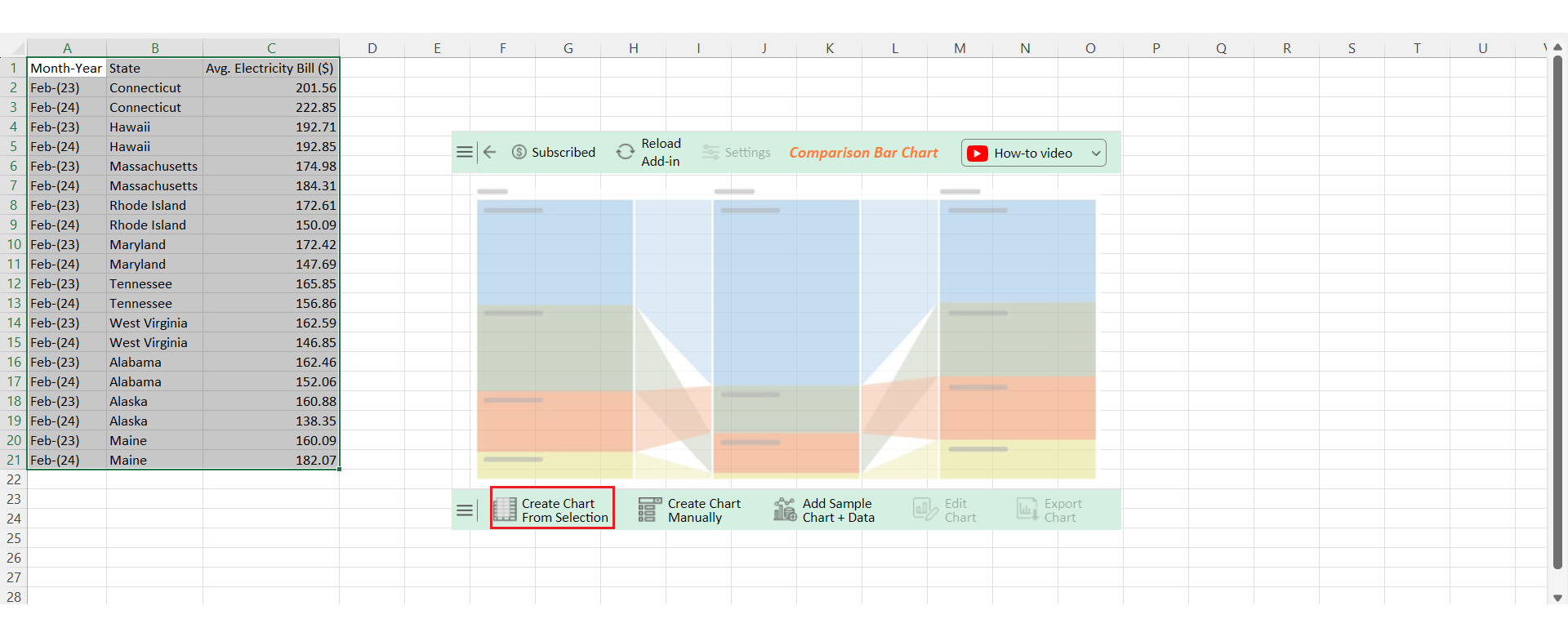
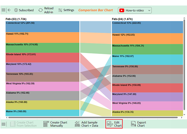
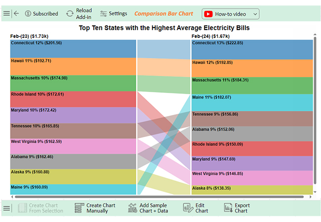
The following video will help you to create a Comparison Bar Chart in Microsoft Excel.

FAQs

How do you consolidate data count in Excel?

To consolidate data count in Excel:

  1. Go to Data > Consolidate.
  2. Select “Count” from the function drop-down.
  3. Choose your data ranges from different sheets or files.
  4. Click Add after each selection, then hit OK to merge and count the data.

How do you consolidate lines in Excel?

To consolidate lines in Excel:

  1. Select Data > Consolidate.
  2. Choose a function like “Sum” or “Average”.
  3. Select your ranges from different sheets.
  4. Click Add for each range, and press OK.
  5. Excel will combine the lines into one summary.

How do I automatically consolidate data in Excel?

To automatically consolidate data in Excel:

  1. Go to Data > Consolidate.
  2. Select your function and choose the data ranges.
  3. Check the box for Create links to source data.
  4. Click OK. The summary will update automatically when the source data changes.

Wrap Up

Data consolidation in Excel is a powerful tool. It helps you merge information from different sheets into one summary. This saves time and simplifies analysis.

By consolidating data, you can organize scattered information. Whether dealing with financial figures or sales data, everything comes together neatly. This reduces the need for manual input.

There are two main methods: by position and by category. Each method suits different data layouts, ensuring accuracy in your summaries. Choosing the right method depends on how your data is structured.

While useful, data consolidation has its challenges. Inconsistent formats or complex data structures can complicate the process. But with careful setup, you can manage these issues.

Excel’s consolidate feature speeds up data analysis. It minimizes errors and helps you focus on making decisions. Though basic, it’s a valuable function for most users.

For more advanced needs, pairing Excel with ChartExpo enhances data visualization. Together, they turn data into clear, actionable insights.

Do not hesitate.

Install ChartExpo today to make data analysis a breeze.

How much did you enjoy this article?

ExcelAd2
Start Free Trial!
143625

Related articles

next previous
Microsoft Excel8 min read

Excel Task Tracker Template for Smarter Task Insights

Task tracker template in Excel organizes tasks, tracks deadlines, and boosts efficiency. Learn its benefits, and explore expert tips to simplify task management.

Microsoft Excel10 min read

Invoice Tracker Template in Excel for Better Insights

An invoice tracker Excel template helps track invoices, due dates, and payments. Learn how to use this template for better financial management.

Microsoft Excel12 min read

Key Performance Indicators in Healthcare for Better Insights

Key Performance Indicators in healthcare track patient care and efficiency. Learn about these KPIs, top examples, and how to use them to improve outcomes.

Microsoft Excel10 min read

BMI Calculation Formula in Excel for Better Fitness Insights

The BMI calculation formula in Excel helps track and analyze body mass index. Explore step-by-step instructions and tips to simplify BMI tracking in Excel.

Microsoft Excel29 min read

How to Create a Tornado Chart in Excel? A Complete Guide

Click to learn how to plot a Tornado Chart in Excel using easy-to-follow steps. Also, we’ll address the following question: what is a Tornado Diagram?

ChartExpo logo

Turn Data into Visual
Stories

CHARTEXPO

  • Home
  • Gallery
  • Videos
  • Services
  • Pricing
  • Contact us
  • FAQs
  • Privacy policy
  • Terms of Service
  • Sitemap

TOOLS

  • ChartExpo for Google Sheets
  • ChartExpo for Microsoft Excel
  • Power BI Custom Visuals by ChartExpo
  • Word Cloud

CATEGORIES

  • Bar Charts
  • Circle Graphs
  • Column Charts
  • Combo Charts
  • Comparison Charts
  • Line Graphs
  • PPC Charts
  • Sentiment Analysis Charts
  • Survey Charts

TOP CHARTS

  • Sankey Diagram
  • Likert Scale Chart
  • Comparison Bar Chart
  • Pareto Chart
  • Funnel Chart
  • Gauge Chart
  • Radar Chart
  • Radial Bar Chart
  • Sunburst Chart
  • see more
  • Scatter Plot Chart
  • CSAT Survey Bar Chart
  • CSAT Survey Chart
  • Dot Plot Chart
  • Double Bar Graph
  • Matrix Chart
  • Multi Axis Line Chart
  • Overlapping Bar Chart
  • Control Chart
  • Slope Chart
  • Clustered Bar Chart
  • Clustered Column Chart
  • Box and Whisker Plot
  • Tornado Chart
  • Waterfall Chart
  • Word Cloud
  • see less

RESOURCES

  • Blog
  • Resources
  • YouTube
SIGN UP FOR UPDATES

We wouldn't dream of spamming you or selling your info.

© 2025 ChartExpo, all rights reserved.