Categories
In a world saturated with marketing noise, captivating your audience is akin to catching a unicorn on a unicycle. But fret not. I have a secret weapon to supercharge your engagement and cultivate a loyal following: interactive storytelling.


Storytelling isn’t just for bedtime tales or huddled around a campfire. It’s a powerful tool that captivates your audience and makes them head over heels for your brand. Using it effectively can transform disinterested bystanders into fervent fans.
Forget about dull statistics and mind-numbing facts. You’ll grab your customers’ attention from the get-go with interactive storytelling. Then, take them on an emotional rollercoaster, where they laugh, cry, and feel connected to your brand.
Today, we’ll decode the art of interactive storytelling a weapon of mass engagement that works wonders across industries. From e-commerce escapades to educational odysseys, I’ll show you how to reach the heart of your audience.
Get ready to engage like never before.
Definition: Interactive storytelling is a powerful tool that engages the audience and creates a deeper connection. It uses interactive content like videos, quizzes, games, and more to transport customers to another dimension. Interactive storytelling grabs attention, keeps customers hooked, and cultivates a loyal following. It’s a thrilling journey that revolutionizes marketing strategies and elevates customer engagement.
Here’s an outline of five popular interactive storytelling techniques:
Visual narrative is the other name for visual storytelling. It is the art of conveying a story or message via visual components, like images and illustrations. Visual storytelling enthralls and captures the audience by eliciting emotions and delivering a memorable experience.
One fundamental benefit of visual narratives is their capacity to overcome language and cultural boundaries. Visuals speak a universal language, bridging backgrounds and serving as a potent tool for communication, self-expression, and self-service analytics.
Another facet of visual narrative is its capacity to present intricate data concisely and comprehensibly. This is especially beneficial in educational settings, where visuals enhance students’ comprehension of complex concepts.
Visual narrative can be found in various mediums and forms, including films, animations, advertisements, and user interfaces. Each medium offers unique opportunities and challenges for data storytelling. However, the underlying principles remain the same – to engage, inform, and entertain the audience through visuals.
Interactive storytelling holds immense significance in a variety of domains. This is tied to its ability to engage audiences, convey messages, and provide unique experiences.
Involving the audience as active participants creates a more immersive and captivating experience than passive storytelling methods. This engagement can lead to increased attention, interest, and retention of information.
Interactive storytelling allows you to tailor content to individual preferences and choices. This fosters a stronger connection between the audience and the content, making it more relevant and meaningful to them.
Interactive storytelling facilitates effective learning. Engaging with the story and active participation increases the likelihood of retaining information and understanding complex concepts.
Interactive storytelling isn’t just a storyteller’s delight; it’s a marketer’s dream. It enables brands to connect with their audience on an emotional level and create memorable experiences. It’s like a magnetic force that attracts and retains customers, making them die-hard brand fans.
Interactive storytelling often presents choices and challenges, encouraging critical thinking and decision-making. This is handy for training and simulation, helping individuals develop problem-solving skills and make informed decisions.
Interactive storytelling provides an entertaining and enjoyable experience for the audience. Incorporating gamification elements turns storytelling into a playful adventure, keeping the audience engaged and entertained.
Here are some of the benefits of using interactive storytelling:
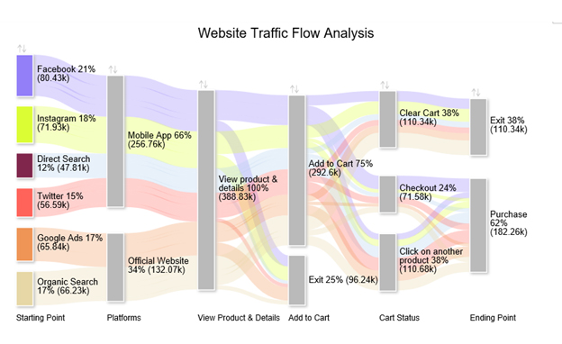
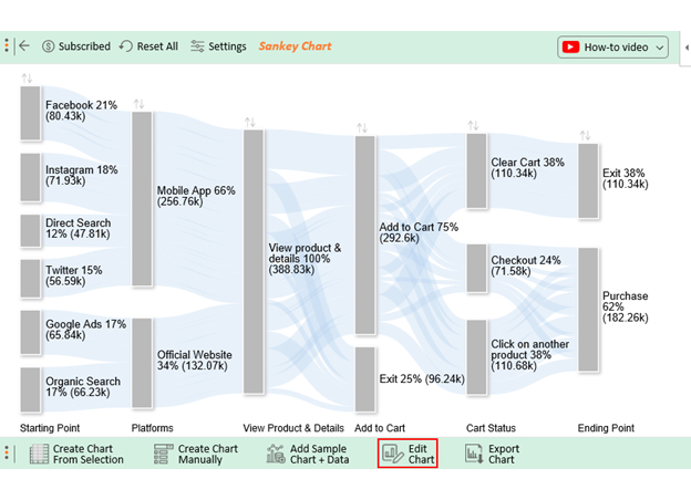
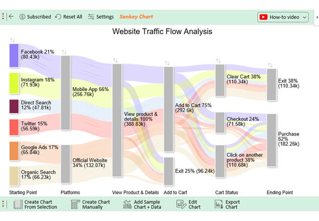
The Sankey chart is one of the creative data visualization charts that has been tested and proven in visualizing:
The creative data visualization graph draws your audience’s attention to the significant flows. Besides, it uses color to emphasize the key insights.
Sankey Diagram leverages links that are proportional to the metric under study.
Check out the table below. Can you provide a reliable data story to your audience?
| Starting Point | Platforms | View Product & Details | Add to Cart | Cart Status | Ending Point | Traffic |
| Mobile App | View product & details | Add to Cart | Clear Cart | Exit | 20177 | |
| Mobile App | View product & details | Add to Cart | Checkout | Purchase | 26674 | |
| Mobile App | View product & details | Add to Cart | Click on another product | Purchase | 11616 | |
| Mobile App | View product & details | Exit | 21965 | |||
| Mobile App | View product & details | Add to Cart | Clear Cart | Exit | 24979 | |
| Mobile App | View product & details | Add to Cart | Checkout | Purchase | 6684 | |
| Mobile App | View product & details | Add to Cart | Click on another product | Purchase | 12829 | |
| Mobile App | View product & details | Exit | 27434 | |||
| Direct Search | Mobile App | View product & details | Add to Cart | Clear Cart | Exit | 11281 |
| Direct Search | Mobile App | View product & details | Add to Cart | Checkout | Purchase | 8102 |
| Direct Search | Mobile App | View product & details | Add to Cart | Click on another product | Purchase | 22124 |
| Direct Search | Mobile App | View product & details | Exit | 6305 | ||
| Mobile App | View product & details | Add to Cart | Clear Cart | Exit | 11376 | |
| Mobile App | View product & details | Add to Cart | Checkout | Purchase | 12751 | |
| Mobile App | View product & details | Add to Cart | Click on another product | Purchase | 25429 | |
| Mobile App | View product & details | Exit | 7034 | |||
| Google Ads | Official Website | View product & details | Add to Cart | Clear Cart | Exit | 13854 |
| Google Ads | Official Website | View product & details | Add to Cart | Checkout | Purchase | 6357 |
| Google Ads | Official Website | View product & details | Add to Cart | Click on another product | Purchase | 20156 |
| Google Ads | Official Website | View product & details | Exit | 25474 | ||
| Organic Search | Official Website | View product & details | Add to Cart | Clear Cart | Exit | 28670 |
| Organic Search | Official Website | View product & details | Add to Cart | Checkout | Purchase | 11015 |
| Organic Search | Official Website | View product & details | Add to Cart | Click on another product | Purchase | 18522 |
| Organic Search | Official Website | View product & details | Exit | 8023 |
Note the difference after visualizing the table above. For instance, all the traffic landed on the product page, with 292.6k users adding the product to their cart. 96.24k users exited after viewing the product.
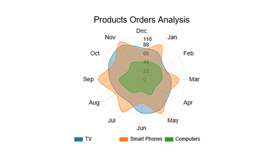
A Radar Chart is a two-dimensional graph you can use to visualize data.
You can use the visualization design to display insights into two or more key insights. Besides, it’s best suited for displaying relationships between key variables in data.
Other common monikers of the chart include:
Check out the table below. Can you tell me what’s going on?
| Product | Month | Orders |
| TV | Jan | 80 |
| TV | Feb | 65 |
| TV | Mar | 75 |
| TV | Apr | 80 |
| TV | May | 90 |
| TV | Jun | 85 |
| TV | Jul | 65 |
| TV | Aug | 70 |
| TV | Sep | 80 |
| TV | Oct | 93 |
| TV | Nov | 99 |
| TV | Dec | 80 |
| Smart Phones | Jan | 100 |
| Smart Phones | Feb | 60 |
| Smart Phones | Mar | 95 |
| Smart Phones | Apr | 75 |
| Smart Phones | May | 100 |
| Smart Phones | Jun | 60 |
| Smart Phones | Jul | 95 |
| Smart Phones | Aug | 75 |
| Smart Phones | Sep | 109 |
| Smart Phones | Oct | 80 |
| Smart Phones | Nov | 109 |
| Smart Phones | Dec | 75 |
| Computers | Jan | 50 |
| Computers | Feb | 55 |
| Computers | Mar | 51 |
| Computers | Apr | 40 |
| Computers | May | 45 |
| Computers | Jun | 30 |
| Computers | Jul | 39 |
| Computers | Aug | 45 |
| Computers | Sep | 56 |
| Computers | Oct | 39 |
| Computers | Nov | 48 |
| Computers | Dec | 44 |
Note the difference after visualizing the data above. The chart below shows the individual performances of television (TVs), smartphones, and computers.
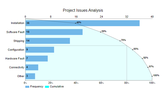
A Pareto chart is a visualization design that comprises bars and a line to display insights following the 80/20 rule.
The 80/20 rule is based on the rationale that 80% of the problems are caused by 20% of variables.
Data points are displayed in descending order using bars. And the cumulative frequency total is depicted using a line. On the other hand, the left vertical axis shows the frequency of occurrence or any other key metric under study.
The key goal of the Pareto Diagram is to highlight the significant variables driving massive change. You can use the graph to identify the defects that require significant and urgent intervention.
Check out the table below. Can you tell me what’s going on?
| Issues | Count |
| Installation | 36 |
| Software Fault | 18 |
| Shipping | 14 |
| Configuration | 9 |
| Hardware Fault | 7 |
| Connectivity | 4 |
| Other | 3 |
Note the difference after visualizing the data above. Shipping, software faults, and installation account for 80% of the issues facing the project under study.
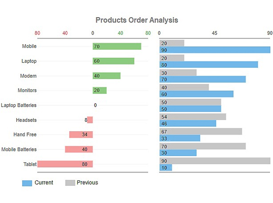
A Progress Bar Chart is one of the creative data graphs you can use to show the progress made in a project.
Use the visualization design to track your project objectives for actionable insights. The Progress Bar Visualization uses green bars to show the growth of the key data points. Also, it has red bars, which stand for the decline.
Check out the table below. Can you provide a reliable data story to your audience?
| Items | Current | Previous |
| Mobile | 90 | 20 |
| Laptop | 80 | 20 |
| Modem | 70 | 30 |
| Monitors | 60 | 40 |
| Laptop Batteries | 50 | 50 |
| Headsets | 46 | 54 |
| Hand Free | 33 | 67 |
| Mobile Batteries | 30 | 70 |
| Tablet | 10 | 90 |
Note the difference after visualizing the data.
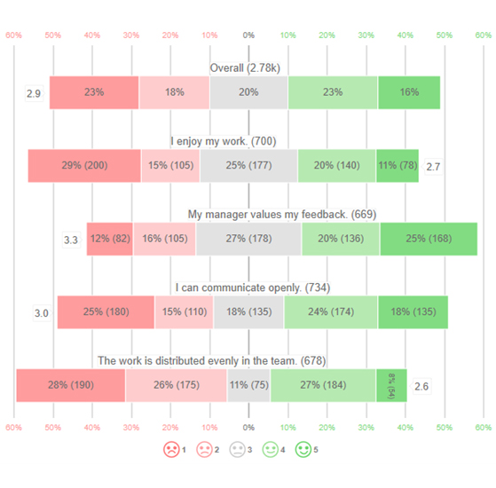
A Likert Scale Graph is one of the creative data visualization charts that has a psychometric scale for displaying insights into questionnaire data.
You can leverage the chart to display insights into the responses gathered during a survey exercise. The chart is named after Rensis Likert, a psychologist.
Look at the survey data from a questionnaire. What are the key takeaways?
| Questions | Rating | Responses |
| I enjoy my work. | 1 | 200 |
| I enjoy my work. | 2 | 105 |
| I enjoy my work. | 3 | 177 |
| I enjoy my work. | 4 | 140 |
| I enjoy my work. | 5 | 78 |
| My manager values my feedback. | 1 | 82 |
| My manager values my feedback. | 2 | 105 |
| My manager values my feedback. | 3 | 178 |
| My manager values my feedback. | 4 | 136 |
| My manager values my feedback. | 5 | 168 |
| I can communicate openly. | 1 | 180 |
| I can communicate openly. | 2 | 110 |
| I can communicate openly. | 3 | 135 |
| I can communicate openly. | 4 | 174 |
| I can communicate openly. | 5 | 135 |
| The work is distributed evenly in the team. | 1 | 190 |
| The work is distributed evenly in the team. | 2 | 175 |
| The work is distributed evenly in the team. | 3 | 75 |
| The work is distributed evenly in the team. | 4 | 184 |
| The work is distributed evenly in the team. | 5 | 54 |
Check out the final chart below.
You can easily provide key insights into the data above. For instance, the overall satisfaction level is 2.9/5, which is abysmal.
Ready to unleash the magic hidden within the symphony of customer feedback?
Excel and ChartExpo are your ultimate duet partners.
Say goodbye to the cacophony of raw numbers and hello to the enchanting visualizations that dazzle your stakeholders. This dynamic duo will transform your data into an awe-inspiring melody of customer insights.
Analyzing survey data has never been this captivating.
Benefits of Using ChartExpo
How to Install ChartExpo in Excel?
ChartExpo charts are available both in Google Sheets and Microsoft Excel. Please use the following CTA’s to install the tool of your choice and create beautiful visualizations in a few clicks in your favorite tool.
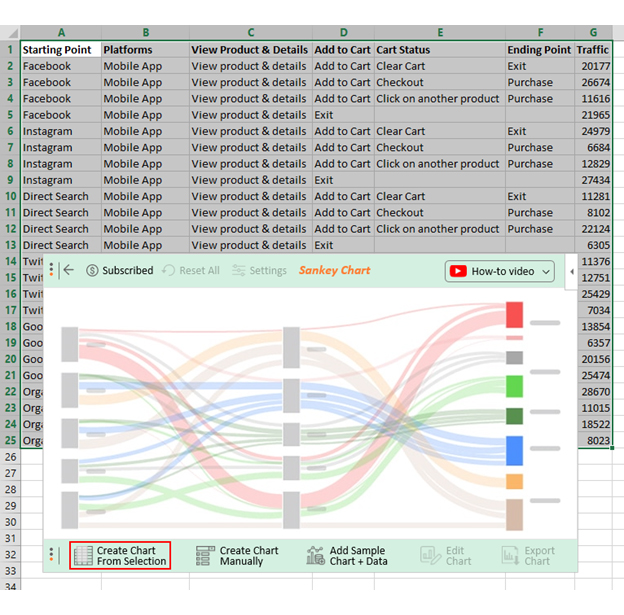
Assume you have website traffic data, as shown in the table below.
| Starting Point | Platforms | View Product & Details | Add to Cart | Cart Status | Ending Point | Traffic |
| Mobile App | View product & details | Add to Cart | Clear Cart | Exit | 20177 | |
| Mobile App | View product & details | Add to Cart | Checkout | Purchase | 26674 | |
| Mobile App | View product & details | Add to Cart | Click on another product | Purchase | 11616 | |
| Mobile App | View product & details | Exit | 21965 | |||
| Mobile App | View product & details | Add to Cart | Clear Cart | Exit | 24979 | |
| Mobile App | View product & details | Add to Cart | Checkout | Purchase | 6684 | |
| Mobile App | View product & details | Add to Cart | Click on another product | Purchase | 12829 | |
| Mobile App | View product & details | Exit | 27434 | |||
| Direct Search | Mobile App | View product & details | Add to Cart | Clear Cart | Exit | 11281 |
| Direct Search | Mobile App | View product & details | Add to Cart | Checkout | Purchase | 8102 |
| Direct Search | Mobile App | View product & details | Add to Cart | Click on another product | Purchase | 22124 |
| Direct Search | Mobile App | View product & details | Exit | 6305 | ||
| Mobile App | View product & details | Add to Cart | Clear Cart | Exit | 11376 | |
| Mobile App | View product & details | Add to Cart | Checkout | Purchase | 12751 | |
| Mobile App | View product & details | Add to Cart | Click on another product | Purchase | 25429 | |
| Mobile App | View product & details | Exit | 7034 | |||
| Google Ads | Official Website | View product & details | Add to Cart | Clear Cart | Exit | 13854 |
| Google Ads | Official Website | View product & details | Add to Cart | Checkout | Purchase | 6357 |
| Google Ads | Official Website | View product & details | Add to Cart | Click on another product | Purchase | 20156 |
| Google Ads | Official Website | View product & details | Exit | 25474 | ||
| Organic Search | Official Website | View product & details | Add to Cart | Clear Cart | Exit | 28670 |
| Organic Search | Official Website | View product & details | Add to Cart | Checkout | Purchase | 11015 |
| Organic Search | Official Website | View product & details | Add to Cart | Click on another product | Purchase | 18522 |
| Organic Search | Official Website | View product & details | Exit | 8023 |
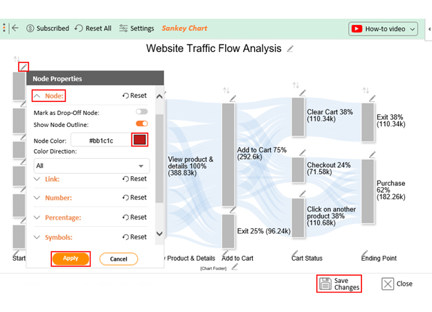
Let me show you how to design a visualization of your data to glean valuable insights.


We’ve uncovered a potent strategy to revolutionize customer engagement through interactive storytelling. This approach makes audiences active participants in your brand’s narrative, taking center stage in their journey.
Interactive storytelling transcends traditional marketing by offering an immersive and personalized experience. It adapts to individual preferences, evokes emotions, and cultivates lasting memories. It also merges education with entertainment, providing a holistic experience that captivates the modern audience.
Interactive storytelling tools, such as interactive quizzes and gamified contests, help foster stronger connections with your customers. It’s no longer about passive consumption but co-authoring the story with your audience.
ChartExpo offers a robust platform for visual data representation, making it an ideal choice for conveying complex information. The ability to chart data, show trends, and present findings visually makes it invaluable in interactive storytelling.
Embrace the power of choice, personalization, and gamification with ChartExpo’s interactive storytelling and experience the magic. Invite your customers to participate actively and watch your brand’s story unfold with vigor.
Happy interactive storytelling!
How much did you enjoy this article?


Calculate accounts receivable turnover ratio to measure credit collection speed, improve cash flow, and strengthen your financial strategy. Read on!

Change Management KPIs are the key to tracking adoption, performance, and ROI during transitions. Find out which metrics matter. Read on!

Data collection methods and techniques determine the quality of every insight you act on. Explore key approaches for gathering reliable data. Read on!


