• Home
  • Tools dropdown img
    • Spreadsheet Charts

      • ChartExpo for Google Sheets
      • ChartExpo for Microsoft Excel
    • Power BI Charts

      • Power BI Custom Visuals by ChartExpo
    • Word Cloud

  • Charts dropdown img
    • Chart Category

      • Bar Charts
      • Circle Graphs
      • Column Charts
      • Combo Charts
      • Comparison Charts
      • Line Graphs
      • PPC Charts
      • Sentiment Analysis Charts
      • Survey Charts
    • Chart Type

      • Box and Whisker Plot
      • Clustered Bar Chart
      • Clustered Column Chart
      • Comparison Bar Chart
      • Control Chart
      • CSAT Survey Bar Chart
      • CSAT Survey Chart
      • Dot Plot Chart
      • Double Bar Graph
      • Funnel Chart
      • Gauge Chart
      • Likert Scale Chart
      • Matrix Chart
      • Multi Axis Line Chart
      • Overlapping Bar Chart
      • Pareto Chart
      • Radar Chart
      • Radial Bar Chart
      • Sankey Diagram
      • Scatter Plot Chart
      • Slope Chart
      • Sunburst Chart
      • Tornado Chart
      • Waterfall Chart
      • Word Cloud
    • Google Sheets
      Microsoft Excel
  • Services
  • Pricing
  • Contact us
  • Blog
  • Support dropdown img
      • Gallery
      • Videos
      • Contact us
      • FAQs
      • Resources
    • Please feel free to contact us

      atsupport@chartexpo.com

Categories
All Data Visualizations Data Analytics Surveys
Add-ons/
  • Google Sheets
  • Microsoft Excel
  • Power BI
All Data Visualizations Data Analytics Surveys
Add-ons
  • Google Sheets
  • Microsoft Excel
  • Power BI

We use cookies

This website uses cookies to provide better user experience and user's session management.
By continuing visiting this website you consent the use of these cookies.

Ok

ChartExpo Survey


Home > Blog > Data Analytics

What is Aggregated Data & How It Enhances Data Insights

As a data (or business) analyst, you’ll likely work with aggregated data. But what is aggregated data? In a nutshell, aggregated data is the information collected by a business from multiple sources.

What is Aggregated Data

This guide explores what aggregated data is, why it is important, types of aggregated data, and examples of data aggregation.

Table of Contents:

  1. What is Aggregated Data?
  2. What Does Aggregate Data Mean?
  3. Why is Data Aggregation Important?
  4. How Many Types of Aggregate Data?
  5. How to Aggregate Data in Power BI?
  6. How Do You Visualize Data Using Power BI?
  7. What are the Benefits of Power BI Aggregate?
  8. Wrap Up

First…

What is Aggregated Data?

Aggregate data is the information a business collects from multiple sources and compiles into summary reports. The collected information can be numerical or non-numerical, and it leads to valuable insights.

The data has to be comprehensive, relevant, and reliable because misunderstood data points or errors in information can affect the accuracy of the analysis. You also need to gather enough data and sources to support your claims.

What Does Aggregate Data Mean?

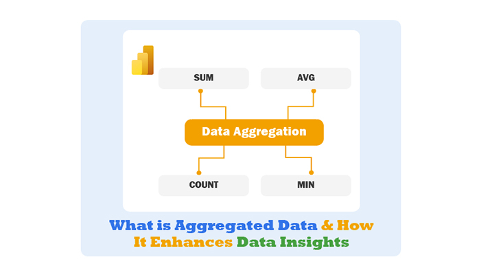
Data aggregation summarizes data from multiple sources. It provides capabilities for multiple aggregate measurements like sum, average, and counting. Here are common examples of aggregate data:

  • Voter turnout by state or country. It shows the total votes of candidates for a specific region.
  • The average age of customers by product. It shows the average age of the customer for each product.
  • Number of customers by country. It shows the count of customers in each country.

Aggregate data doesn’t have to be numeric. You can count the number of non-numeric data elements. Before aggregating data, the atomic data has to be analyzed for accuracy, and there has to be enough data for aggregation. For instance, counting votes when 5% of the results are available won’t produce a relevant aggregation for prediction.

Why is Data Aggregation Important?

Aggregate data helps analysts examine trends and find patterns that can provide valuable insights like influencing financial decisions or informing business strategy. Analysts, leaders, policymakers, administrators, and researchers use aggregate data to gain insight into their work. Aggregate data are also used to notice patterns, make arguments, and inform policy decisions.

How Many Types of Aggregate Data?

  • Sum: The total values within the group. For instance, the total sales revenue in a month.
  • Average (Mean): The sum of values divided by the number of values. For instance, the average score of students on a test.
  • Count: The number of items (or occurrences) in a group. For instance, the number of transactions in a given period.
  • Minimum: The smallest value within the group. For instance, the lowest temperature recorded in a week.
  • Maximum: The largest value within a group. For instance, the highest price of a stock over a month.

How to Aggregate Data in Power BI?

Step 1: Load Data

  • Open Power BI Desktop.
  • Click on “Get Data” and select the data source (like SQL Server, or Excel).
  • Load the dataset into Power BI.

Step 2: Transform Data

  • Navigate to the “Transform Data” option to open Power Query Editor.
  • Select the table you want to aggregate.

Step 3: Group Data

  • In Power BI Query Editor, select the columns by which you want to group. These columns will define the aggregation categories.
  • Click on the “Group By” button in the “Home” tab.
  • In the “Group By” dialog, specify the grouping criteria:
    • Group By: Choose the columns to group by.
    • New Column Name: Enter a name for the aggregated column.
    • Operation: Choose the type of aggregation (it could be Sum, Average, or Count).
    • Column: Choose the column to aggregate.
  • Click “OK” to apply the grouping and aggregation.

Step 4: Apply Changes

  • Click “Close & Apply” in Power Query Editor to load the aggregated data into Power BI.

Step 5: Create Visualizations

  • Navigate to the “Report” view in Power BI Desktop.
  • Drag and drop the aggregated data fields into visualizations like pie charts, bar charts, or tables to display and analyze the aggregated results.

Step 6: Customize and Analyze

  • Customize your data visualizations to highlight key insights.
  • Use filters and slicers to refine and interact with the aggregated data.

For instance, take a look at the data below:

Country-Region Amount
USA 100
UK 150
Canada 100
Germany 125
Japan 125
Australia 150

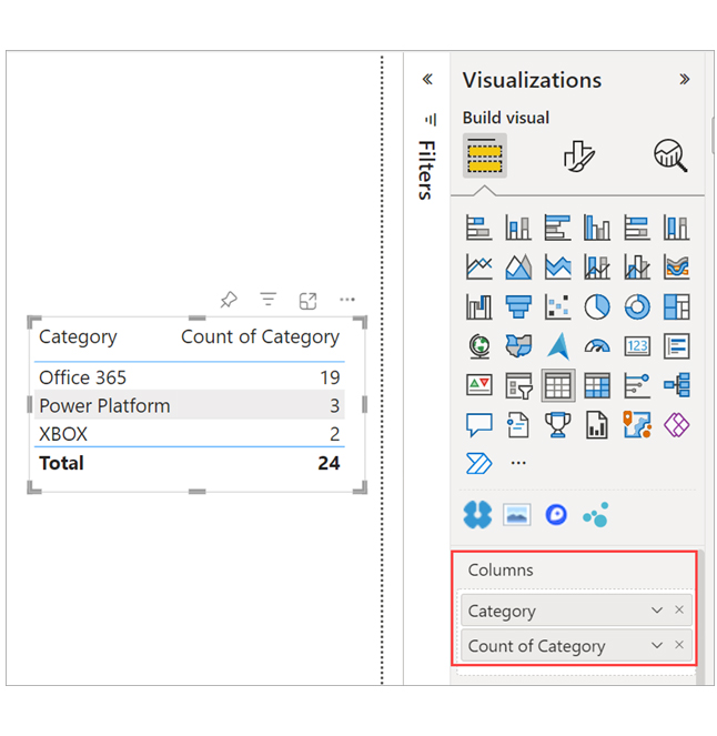
You’ll get results similar to:

  • Do Not Summarize: Each value is shown separately
  • Sum: 750
  • Average: 125
  • Maximum: 150
  • Minimum: 100
  • Count (Not Blanks): 6
  • Count (Distinct): 4
  • Standard deviation: 20.4124145…
  • Variance: 416.666…
  • Median: 125.

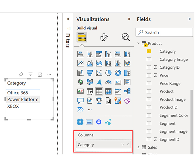
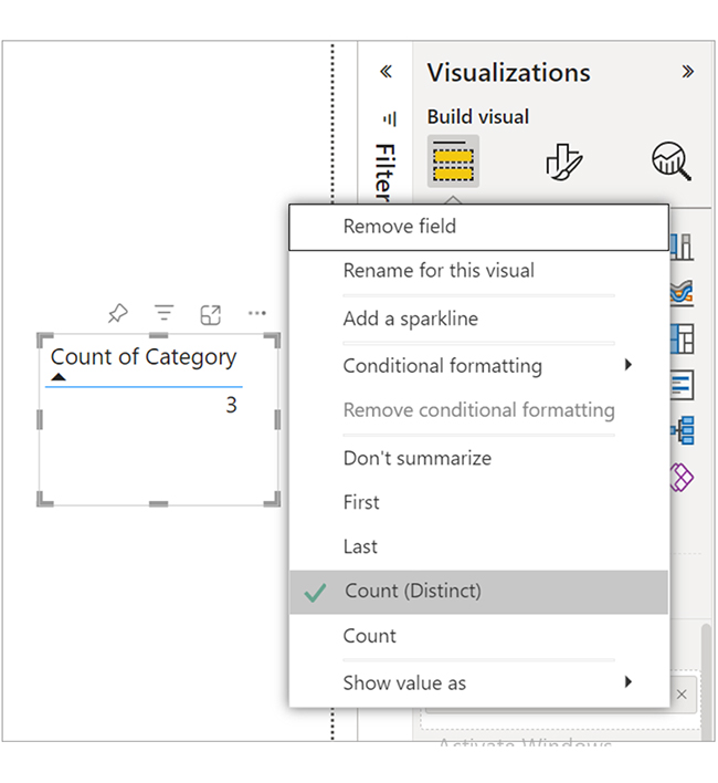
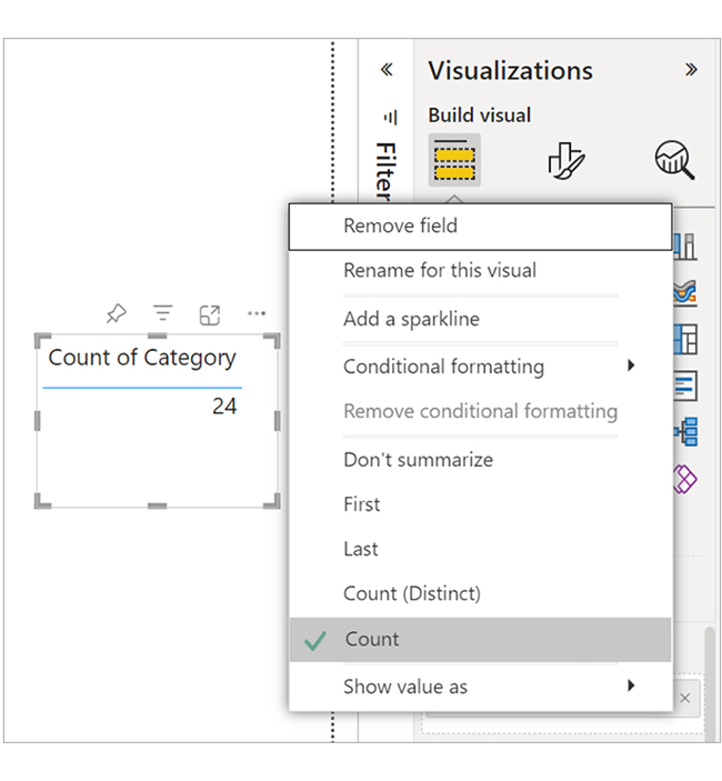
There’s also the option to aggregate a non-numeric field. For instance, if there’s a Category name field, add it as a value and set it to Count, Distinct count, First, or Last.
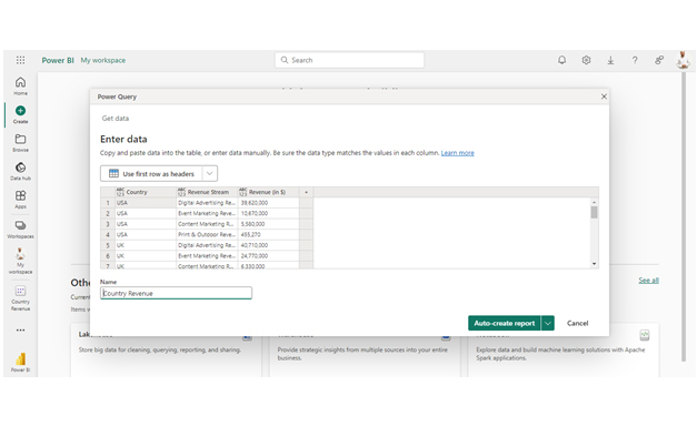
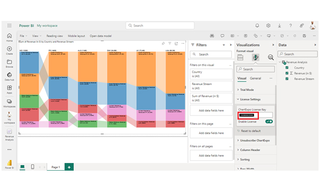
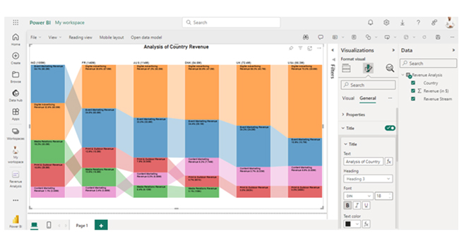
  • Drag the Category field onto the report canvas. The Values are usually used for numeric fields. Power BI recognizes that the field is a text field. Therefore, it will create a table with a single column.
Create Table With Single Column After Learning What is Aggregated Data
  • Select the arrow next to Category, and change the aggregation from the default “Don’t summarize” to “Count (Distinct).” Power BI counts the number of different categories. In this illustration, there are three:
Counts Number of Different Categories After Learning What is Aggregated Data
  • If you change the aggregation to “Count,” Power BI counts the total number. Here, there are 24 entries for Category.
Change Aggresgation to Count After Learning What is Aggregated Data
  • You have to drag the same field (Category for this illustration) into the Columns well again. Keep the default aggregation “Don’t summarize.” Power BI breaks down the count by Category.
Keep Default Aggregation After Learning What is Aggregated Data

How Do You Visualize Data Using Power BI?

Stage 1: Log into Power BI, enter your email, and click “Submit.”

  • Log in to Power BI.
  • Enter your email address and click the “Submit” button.
Enter email to login to Power BI
  • You are redirected to your Microsoft account.
  • Enter your password and click “Sign in“.
Enter Password to login to Power BI
  • You can choose whether to stay signed in.
Click on stay signed in
  • Once done, the Power BI home screen will open.

Stage 2: Create a Data Set and Select the Data Set to Use in the Sankey Chart

  • Go to the left-side menu and click the “Create” button.
  • Select “Paste or manually enter data“.
select Paste or manually enter data in Power BI ce487
  • We’ll use the sample data below for this example.
Country Revenue Stream Revenue (in $)
USA Digital Advertising Revenue 39,620,000
USA Event Marketing Revenue 10,670,000
USA Content Marketing Revenue 5,580,000
USA Print & Outdoor Revenue 455,270
UK Digital Advertising Revenue 40,710,000
UK Event Marketing Revenue 24,770,000
UK Content Marketing Revenue 6,330,000
UK Print & Outdoor Revenue 552,190
DNK Digital Advertising Revenue 47,040,000
DNK Event Marketing Revenue 29,070,000
DNK Content Marketing Revenue 7,740,000
DNK Print & Outdoor Revenue 600,690
DNK Media Relations Revenue 106,430
AUS Digital Advertising Revenue 53,790,000
AUS Event Marketing Revenue 38,530,000
AUS Content Marketing Revenue 6,590,000
AUS Print & Outdoor Revenue 9,040,000
AUS Media Relations Revenue 6,130,000
FR Digital Advertising Revenue 57,860,000
FR Event Marketing Revenue 50,450,000
FR Content Marketing Revenue 3,560,000
FR Print & Outdoor Revenue 18,790,000
FR Media Relations Revenue 15,460,000
IND Digital Advertising Revenue 60,470,000
IND Event Marketing Revenue 63,200,000
IND Content Marketing Revenue 2,080,000
IND Print & Outdoor Revenue 29,500,000
IND Media Relations Revenue 30,020,000
  • Paste the data table above into the “Power Query” window. Next, select the “Create a dataset only” option.
Select Create a Dataset Only After Learning What is Aggregated Data
  • Navigate to the left-side menu, and click on the “Data Hub” option. Power BI will populate the data set list. If no data set has been created, you’ll get an error message. Next, click on “Create report.”
Click on Create Report After Learning What is Aggregated Data
  • To see the chart metrics, click on “Expand All.” At this point, you can check the dimensions and metrics.
Click on Expand All After Learning What is Aggregated Data
  • Click on “Get more visuals.” After that, search ChartExpo and select the Comparison Bar Chart.
Click Get More Visuals After Learning What is Aggregated Data
  • Click on “Add.”
Click on Add Button After Learning What is Aggregated Data
  • After that, you’ll see the Comparison Bar Chart in the visuals list.
See Comparison Bar Chart in Visual List After Learning What is Aggregated Data
  • In Visual, click on License Settings and add the key. You’ll see the comparison bar chart after adding the key.
Click License Settings and Add Key After Learning What is Aggregated Data
  • Here’s the final look at the Comparison Bar Chart in Power BI.
Final What is Aggregated Data

Insights

  • India has the highest total revenue, and they’re closely followed by France, Australia, and Denmark.
  • In most countries, “Digital Advertising” tends to be a significant revenue contributor. That’s not the case in India where “Event Marketing” is leading.
  • The “Media Relations” revenue stream is absent in countries like the US and the UK.

What are the Benefits of Power BI Aggregate?

  • Simplified Analysis: Aggregation reduces complex data into summarized forms, making it easy for analyzing and interpreting data to capture key metrics and trends effectively.
  • Improved Clarity: Aggregated data offers a clearer overview of large datasets, including Power BI datasets, and also highlights important patterns and relationships without overwhelming details.
  • Enhanced Performance: Aggregating data helps improve performance and efficiency by reducing the volume of data processed in real-time reports and data visualizations.
  • Effective Reporting: Aggregated data supports the creation of meaningful and concise reports like totals, averages, and percentages. All these come in handy during data-driven decision-making, ensuring informed choices are made.
  • Trend Analysis: Aggregation facilitates the data analysis of trends over time (or across categories). This will help the user identify changes and forecast future patterns.

FAQs

Can you aggregate data in Power BI?

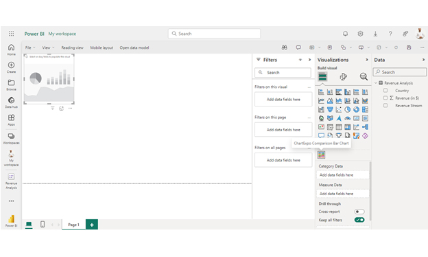
Yes, the “Group By” feature in Power Query can help you aggregate data in Power BI. Alternatively, you can apply the aggregation functions directly in data models and visualizations.

What is the default aggregation in Power BI?

The default aggregation in Power BI is usually “Sum” for numerical data fields. For categorical data, Power BI shows data without aggregation unless it is specified in the visualizations.

What is the aggregate function in Power BI?

Aggregate functions in Power BI perform calculations on data. These calculations include SUM, AVERAGE, COUNT, MIN, and MAX. They summarize and analyze data to produce insights in visualizations and reports.

Wrap Up

Aggregated data combines multiple data points into summary metrics like averages or sums. It simplifies large datasets, highlights trends, and aids in analysis. All these help in effective data interpretation and decision-making.

With Power BI Aggregate, you can easily summarize data, and compare different periods, groups, or segments. This will, in turn, enable more effective performance evaluation and strategic planning.

Aggregated data improves the ability to create various visualizations like pie charts, line graphs, and bar charts. This makes complex data more accessible and actionable.

By following the steps outlined in this guide, you’ll be able to use Power BI to visualize aggregated data.

How much did you enjoy this article?

ExcelAd1
Start Free Trial!
143721

Related articles

next previous
Data Analytics7 min read

Financial Forecasting for Startups: A Complete Guide

This guide dives deep into financial forecasting for startups. You'll also discover elements of a financial projection for a startup, and tips for creating one.

Data Analytics32 min read

Data Reporting: Making Your Reports Irresistible

Data reporting turns numbers into insights that guide decisions. Learn how to simplify complex data and make confident choices. Read on for key strategies!

Data Analytics10 min read

Employee Performance KPIs: Insights That Drive Action

Employee performance KPIs track productivity and success. Learn the key metrics, measurement methods, and analysis techniques to boost performance.

Data Analytics27 min read

Prescriptive Analytics: From Forecasts to Fixes

Prescriptive analytics helps you turn data into action. Learn how it improves decision-making, drives results, and supports smarter strategies. Get started!

Data Analytics32 min read

Predictive Analytics: See What's Coming Before It Happens

Predictive analytics helps businesses cut costs, reduce risks, and act fast when it matters most. Want results that stick? Predictive analytics works—read on!

ChartExpo logo

Turn Data into Visual
Stories

CHARTEXPO

  • Home
  • Gallery
  • Videos
  • Services
  • Pricing
  • Contact us
  • FAQs
  • Privacy policy
  • Terms of Service
  • Sitemap

TOOLS

  • ChartExpo for Google Sheets
  • ChartExpo for Microsoft Excel
  • Power BI Custom Visuals by ChartExpo
  • Word Cloud

CATEGORIES

  • Bar Charts
  • Circle Graphs
  • Column Charts
  • Combo Charts
  • Comparison Charts
  • Line Graphs
  • PPC Charts
  • Sentiment Analysis Charts
  • Survey Charts

TOP CHARTS

  • Sankey Diagram
  • Likert Scale Chart
  • Comparison Bar Chart
  • Pareto Chart
  • Funnel Chart
  • Gauge Chart
  • Radar Chart
  • Radial Bar Chart
  • Sunburst Chart
  • see more
  • Scatter Plot Chart
  • CSAT Survey Bar Chart
  • CSAT Survey Chart
  • Dot Plot Chart
  • Double Bar Graph
  • Matrix Chart
  • Multi Axis Line Chart
  • Overlapping Bar Chart
  • Control Chart
  • Slope Chart
  • Clustered Bar Chart
  • Clustered Column Chart
  • Box and Whisker Plot
  • Tornado Chart
  • Waterfall Chart
  • Word Cloud
  • see less

RESOURCES

  • Blog
  • Resources
  • YouTube
SIGN UP FOR UPDATES

We wouldn't dream of spamming you or selling your info.

© 2025 ChartExpo, all rights reserved.