• Home
  • Tools dropdown img
    • Spreadsheet Charts

      • ChartExpo for Google Sheets
      • ChartExpo for Microsoft Excel
    • Power BI Charts

      • Power BI Custom Visuals by ChartExpo
    • Word Cloud

  • Charts dropdown img
    • Chart Category

      • Bar Charts
      • Circle Graphs
      • Column Charts
      • Combo Charts
      • Comparison Charts
      • Line Graphs
      • PPC Charts
      • Sentiment Analysis Charts
      • Survey Charts
    • Chart Type

      • Box and Whisker Plot
      • Clustered Bar Chart
      • Clustered Column Chart
      • Comparison Bar Chart
      • Control Chart
      • CSAT Survey Bar Chart
      • CSAT Survey Chart
      • Dot Plot Chart
      • Double Bar Graph
      • Funnel Chart
      • Gauge Chart
      • Likert Scale Chart
      • Matrix Chart
      • Multi Axis Line Chart
      • Overlapping Bar Chart
      • Pareto Chart
      • Radar Chart
      • Radial Bar Chart
      • Sankey Diagram
      • Scatter Plot Chart
      • Slope Chart
      • Sunburst Chart
      • Tornado Chart
      • Waterfall Chart
      • Word Cloud
    • Google Sheets
      Microsoft Excel
  • Services
  • Pricing
  • Contact us
  • Blog
  • Support dropdown img
      • Gallery
      • Videos
      • Contact us
      • FAQs
      • Resources
    • Please feel free to contact us

      atsupport@chartexpo.com

Categories
All Data Visualizations Data Analytics Surveys
Add-ons/
  • Google Sheets
  • Microsoft Excel
  • Power BI
All Data Visualizations Data Analytics Surveys
Add-ons
  • Google Sheets
  • Microsoft Excel
  • Power BI

We use cookies

This website uses cookies to provide better user experience and user's session management.
By continuing visiting this website you consent the use of these cookies.

Ok

ChartExpo Survey


Home > Blog > Power BI

Power BI vs. Power Query: Understanding Key Differences

Power BI is a business analytics tool from Microsoft that helps users visualize and share insights from their data. It integrates with multiple data sources and provides interactive dashboards and reports. In this guide, you’ll see the comparison between Power BI vs Power Query.

Power BI vs Power Query

You’ll also dive deep into Power Query, how and when to use it, its Pros and cons, and the difference between Power BI and Power Query.

Table of Contents:

  1. How and When Can You Use It?
  2. What is a Power Query?
  3. How and When Can You Use It?
  4. What is the Difference between Power BI and Power Query?
  5. How to Use Power BI and Power Query?
  6. How to Migrate Power Query to Power BI?
  7. How to Visualize Data in Power BI?
  8. What are the Pros and Cons of It?
  9. Wrap Up

First…

How and When Can You Use It?

You can use the Power BI in cases like:

When to Use Power BI?

  • Data Analysis and Reporting: It’s used for analyzing large datasets, and creating interactive reports and dashboards.
  • Decision-Making: It’s used to support decision-making with real-time data and visual insights.
  • Data Integration: For combining data from multiple sources for a comprehensive view.
  • Data Visualization: To present data in an easily understandable format through graphs, charts, and maps.

How to Use Power BI?

  • Connect to Data Sources: Import data from multiple sources like Excel files, web sources, cloud services, or databases.
  • Transform Data: Use Power Query to shape, clean, and transform data.
  • Create Visualizations: Build interactive dashboards and reports using a variety of data visualizations like pie charts, maps, and bar charts.
  • Build Reports: Design detailed reports with multiple pages, and also incorporate various visual elements.
  • Share and Collaborate: Publish reports to the Power BI service to share with others. You can also collaborate and create dashboards that update automatically.

What is a Power Query?

Definition: Power Query is a data connection technology used in Power BI, Excel, and other Microsoft tools. It allows users to connect to multiple data sources, transform and clean data, and load it into a worksheet or model.

How and When Can You Use It?

  • Open Power Query:
    • In Power BI: To open Power Query Editor, navigate to the Home tab and click on “Transform Data.”
    • In Excel: Navigate to the Data Tab, click on “Get Data,” and select “From Other Sources.”
  • Connect to Data:
    • Use “Get Data” to connect to multiple data sources like web pages, databases, cloud services, or files (Excel, CSV).
  • Transform Data:
    • Use the Query Editor to perform transformations like sorting, filtering, pivoting/unpivoting columns, merging tables, and changing data types.
    • To apply the transformation, select options from the menu or use the “Advanced Editor” for more complex modifications.
  • Load Data:
    • Once transformations are complete, click “Close & Load” (for Excel users), or “Close & Apply” (for Power BI users) to load the cleaned data into the worksheet or model.
  • Refresh Data:
    • Set up data refresh schedules to ensure your reports and dashboard stay updated with the latest information.

When to Use Power Query?

  • Data Preparation: Used for cleaning and shaping raw data before analysis or visualization.
  • Automation: For automating repetitive data transformation tasks like regular updates or scheduled data refreshes.
  • Data Modeling: Used for preparing data to fit specific analytical or reporting needs. This ascertains that the data structure aligns with your requirements.

What is the Difference between Power BI and Power Query?

Power BI and Power Query serve different but complementary roles in data analysis:

  • Power BI is a business analytics tool that helps users visualize data and create interactive reports and dashboards.
  • Power Query is a data connection and transformation tool used within Power BI, Excel, and other Microsoft products.

Which one is best?

Your choice will be largely dependent on your needs.
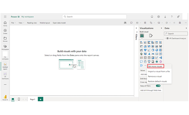
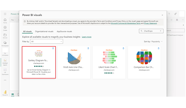
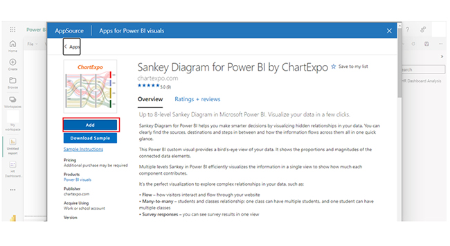
  • Power BI is used for creating reports and dashboards. It offers extensive data visualization and interactive features. It’s best for analyzing data and sharing insights across teams.
  • Power Query is used for data preparation and transformation. It’s a tool within Power BI and Excel used for connecting, cleaning, and shaping data before data analysis.

How to Use Power BI and Power Query?

Using Power BI

  • Connect to Data: Use the “Get Data” option to import data from multiple sources.
  • Transform Data: Clean and shape data in Power Query Editor if needed.
  • Create Visualizations: Use Power BI’s drag-and-drop interface to create charts, maps, and graphs.
  • Publish and Share: Publish reports to Power BI Service for sharing and collaboration.

Using Power Query

  • Open Power Query: You can access Power Query in Power BI or Excel from the “Transform Data” or “Get Data” options.
  • Connect to Data: Select and connect to data sources.
  • Transform Data: Use the Query Editor to clean, shape, and transform data.
  • Apply Changes: Save and apply the change to load the transformed data into your worksheet or model.

How to Migrate Power Query to Power BI?

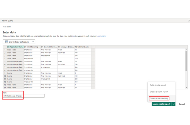
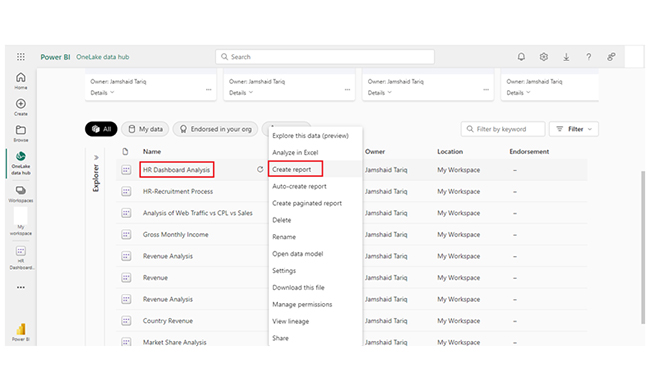
Here are steps to help you migrate Power Query from Excel to Power BI:
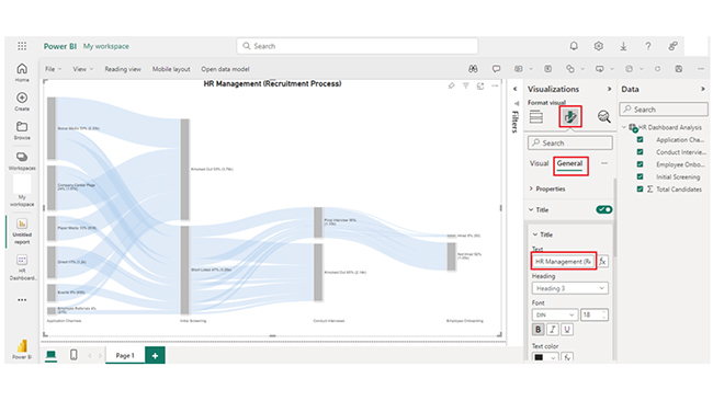
  • Launch the Power BI and start a new report.
  • Navigate to the “Home” tab and click “Get Data.” Next, select “Excel” to import the workbook containing your Power Query queries.
  • During the import, choose the sheets or tables that include your Power Query queries.
  • To open the Power Query Editor, click “Transform Data.” Your queries will be displayed here.
  • Review and adjust queries as needed. After all, there might be differences in data connections or formats.
  • Apply changes and load the data into Power BI for further visualization and analysis.

How to Visualize Data in Power BI?

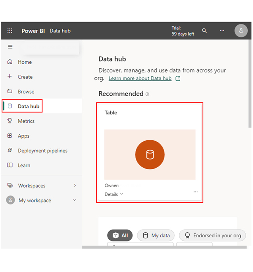
Stage 1: Logging in to Power BI

  • Log in to Power BI.
  • Enter your email address and click the “Submit” button.
Enter email to login to Power BI
  • You are redirected to your Microsoft account.
  • Enter your password and click “Sign in“.
Enter Password to login to Power BI
  • You can choose whether to stay signed in.
Click on stay signed in
  • Once done, the Power BI home screen will open.

Stage 2: Creating a Data Set and Selecting the Data Set to Use in Your Chart

  • Go to the left-side menu and click the “Create” button.
  • Select “Paste or manually enter data“.
select Paste or manually enter data in Power BI ce487
  • We’ll use the sample data below for this example.
Country Revenue Stream Revenue (in $)
USA Digital Advertising Revenue 39,620,000
USA Event Marketing Revenue 10,670,000
USA Content Marketing Revenue 5,580,000
USA Print & Outdoor Revenue 455,270
UK Digital Advertising Revenue 40,710,000
UK Event Marketing Revenue 24,770,000
UK Content Marketing Revenue 6,330,000
UK Print & Outdoor Revenue 552,190
DNK Digital Advertising Revenue 47,040,000
DNK Event Marketing Revenue 29,070,000
DNK Content Marketing Revenue 7,740,000
DNK Print & Outdoor Revenue 600,690
DNK Media Relations Revenue 106,430
AUS Digital Advertising Revenue 53,790,000
AUS Event Marketing Revenue 38,530,000
AUS Content Marketing Revenue 6,590,000
AUS Print & Outdoor Revenue 9,040,000
AUS Media Relations Revenue 6,130,000
FR Digital Advertising Revenue 57,860,000
FR Event Marketing Revenue 50,450,000
FR Content Marketing Revenue 3,560,000
FR Print & Outdoor Revenue 18,790,000
FR Media Relations Revenue 15,460,000
IND Digital Advertising Revenue 60,470,000
IND Event Marketing Revenue 63,200,000
IND Content Marketing Revenue 2,080,000
IND Print & Outdoor Revenue 29,500,000
IND Media Relations Revenue 30,020,000
  • Paste the data table above into the “Power Query” window. Next, select the “Create a dataset only” option.
Click Create a Dataset Only After Learning Power BI vs Power Query
  • Navigate to the left-side menu, and click on the “Data Hub” option. Power BI will populate the data set list. If no data set has been created, you’ll get an error message.
Click Data Hub After Learning Power BI vs Power Query
  • Click on the “Create Report” dropdown.
Click Create Report After Learning Power BI vs Power Query
  • To add the Power BI Sankey Diagram Extension by ChartExpo, you’ll have to create the Sankey Diagram. That requires the use of an add-in or Power BI visual from Appsource. Navigate to the right side of the Power BI dashboard, and open the Power BI Visualizations panel. Click the ellipsis symbol (…) to import the Power BI Sankey Diagram extension by ChartExpo. On the menu that opens, select the “Get more visuals’ option.
Click Get More Visuals After Learning Power BI vs Power Query
  • Enter “ChartExpo” in the highlighted search box. You’ll see the “Sankey Diagram for Power BI by ChartExpo” as shown below.
Enter Sankey Diagram for Power BI After Learning Power BI vs Power Query
  • Click on the Sankey Diagram. After that, click the highlighted “Add” button.
Click Add Button After Learning Power BI vs Power Query
  • Power BI will add the “Sankey Diagram for Power BI by ChartExpo” icon in the visualization panel.
Add Sankey Diagram Icon in Visualization Panel After Learning Power BI vs Power Query
  • To draw a Sankey Diagram with ChartExpo’s Power BI extension, select the “Sankey Diagram for Power BI by ChartExpo” icon in the visualization panel. You’ll see a window that opens in the report section of the dashboard.
A Report Window will Open in Power BI After Learning Power BI vs Power Query
  • You’ll have to select the fields to use in the Sankey chart.
Select Fields After Learning Power BI vs Power Query
  • Follow the sequence below when selecting the fields:
    • Application Channels
    • Initial Screening
    • Conduct Interviews
    • Employee Onboarding
    • Total Candidates
  • You’ll have to provide your email address or the ChartExpo License key. To see the Sankey Chart display of your data, you’ll have to add the key under the visual section.
Enter License Key After Learning Power BI vs Power Query
  • You can add the top header text in the chart under the General section as shown below:
Add Top Header in Chart After Learning Power BI vs Power Query
  • Click on Visual to set the number and also enable the options as shown below:
Click on Visual, Set Number and also Enable Options After Learning Power BI vs Power Query
  • You can change the “Node Font Style” as shown below:
Change Node Font Style After Learning Power BI vs Power Query
  • You can change the “Level Font Style.”
Change Level Font Style After Learning Power BI vs Power Query
  • You’ll see the Level Labels as shown below:
See Level Labels After Learning Power BI vs Power Query
  • You can change the Node color by following the steps below:
Change Nodes Colors After Learning Power BI vs Power Query
  • You’ve seen “How to change Level 1 color.” You can follow the same step to change the node color of other levels.
Change Nodes Colors of Level 1 After Learning Power BI vs Power Query
  • Here’s the final look of the HR Dashboard in Power BI using ChartExpo after changing all nodes’ colors.
Final Power BI vs Power Query

Insights

  • Social Media is the primary application channel with the highest number of candidates (1100).
  • Company Career Page follows with 900 candidates.
  • Events and Paper Media have comparatively lower candidate counts of 350 and 700, respectively.
  • Direct applications have 600 candidates.

Maximize Data Clarity with Power BI vs. Power Query in Visuals:

Dive deep into the differences and capabilities of Power BI vs Power Query in this informative tutorial. By exploring how these two tools work together, you can enhance your data analysis with dynamic charts and graphs. Power BI enables you to visualize data, create reports, and share insights, while Power Query allows you to efficiently clean, transform, and load data from various sources. Understanding the strengths of each tool helps you make informed decisions on when to use Power Query for data preparation and Power BI for data visualization. With their combined power, you can streamline workflows, improve data accuracy, and deliver comprehensive insights through compelling visuals that drive better business outcomes.

What are the Pros and Cons of It?

Pros of Power BI

  • User-Friendly: It features an intuitive interface, and makes it accessible for users at different technical levels.
  • Integration: It integrates seamlessly with other Microsoft products like Azure and Excel. This enhances workflow efficiency.
  • Real-Time Updates: It provides real-time data monitoring and interactive dashboards. This will, in turn, aid timely data-driven decision-making.

Cons of Power BI

  • Complex Advanced Features: Advanced functionalities and customizations can be complex and require technical expertise.
  • Learning Curve: Mastering all features involves a significant learning curve.

FAQs

Can you connect Power Query to Power BI?

Yes, Power Query in Power BI is used to connect to, transform, and prepare data. You can access Power Query directly within Power BI by clicking “Transform Data” on the Home tab.

Is Power Query related to Power BI?

Yes, Power Query is integrated into Power BI. It’s used within Power BI to connect to, transform, and clean data before creating visualizations and reports.

Is Power BI better than Power Query?

Power BI and Power Query serve different purposes. Power BI excels in visualization and reporting, while Power Query is focused on data preparation and transformation. They complement each other.

Wrap Up

Comparing Power BI vs. Power Query is of the essence. It will help you understand that Power BI focuses on data visualization and reporting, while Power Query specializes in data connection, preparation, and transformation.

Power BI can integrate seamlessly with other Microsoft products like Azure and Excel. The free version offers substantial functionality but imposes restrictions on data capacity and refresh rates.

When it comes to analyzing large datasets and creating interactive reports and dashboards, Power BI is your best bet. It offers visual insights and helps users make decisions with real-time data. Furthermore, it helps in presenting data in an understandable format through maps, graphs, and charts.

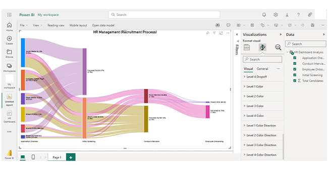
For effective data evaluation, you should create dashboards in Power BI and also represent evolving data using visualizations like the Sankey chart.

How much did you enjoy this article?

PBIAd2
Start Free Trial!
141734

Related articles

next previous
Power BI12 min read

Power BI Group By Guide for Effective Data Insights

Learn how Power BI Group By helps you aggregate data, clarify trends, and create reports by grouping values to make large datasets manageable & insightful.

Power BI12 min read

How to Create Sankey Diagram in Microsoft Power BI?

Learn How to Create Sankey Diagram in Microsoft Power BI using Desktop & Web Service. What they are and how to use them effectively.

Power BI8 min read

Power BI Artificial Intelligence: Insights Using Visuals

Discover all there is to know about the Power BI artificial intelligence. You'll also discover how AI is used in Power BI, and how to use it for analysis and more.

Power BI9 min read

Budgeting in Healthcare: Use Visuals to Spot Budget Gaps

This guide helps you discover what budgeting in healthcare is. You'll also discover the factors that affect hospital budgets and types of budgeting in healthcare.

Power BI9 min read

Predictive Analytics in Power BI for Making Insightful Visuals

This guide shows you everything you need to know about Predictive Analytics in Power BI. It also shows you how it works, and how to interpret the results.

ChartExpo logo

Turn Data into Visual
Stories

CHARTEXPO

  • Home
  • Gallery
  • Videos
  • Services
  • Pricing
  • Contact us
  • FAQs
  • Privacy policy
  • Terms of Service
  • Sitemap

TOOLS

  • ChartExpo for Google Sheets
  • ChartExpo for Microsoft Excel
  • Power BI Custom Visuals by ChartExpo
  • Word Cloud

CATEGORIES

  • Bar Charts
  • Circle Graphs
  • Column Charts
  • Combo Charts
  • Comparison Charts
  • Line Graphs
  • PPC Charts
  • Sentiment Analysis Charts
  • Survey Charts

TOP CHARTS

  • Sankey Diagram
  • Likert Scale Chart
  • Comparison Bar Chart
  • Pareto Chart
  • Funnel Chart
  • Gauge Chart
  • Radar Chart
  • Radial Bar Chart
  • Sunburst Chart
  • see more
  • Scatter Plot Chart
  • CSAT Survey Bar Chart
  • CSAT Survey Chart
  • Dot Plot Chart
  • Double Bar Graph
  • Matrix Chart
  • Multi Axis Line Chart
  • Overlapping Bar Chart
  • Control Chart
  • Slope Chart
  • Clustered Bar Chart
  • Clustered Column Chart
  • Box and Whisker Plot
  • Tornado Chart
  • Waterfall Chart
  • Word Cloud
  • see less

RESOURCES

  • Blog
  • Resources
  • YouTube
SIGN UP FOR UPDATES

We wouldn't dream of spamming you or selling your info.

© 2025 ChartExpo, all rights reserved.