Categories
By ChartExpo Content Team
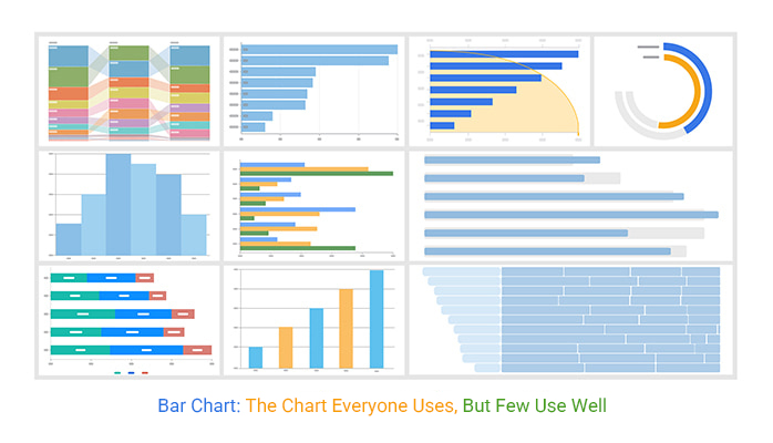
A bar chart decides before anyone says a word.
It doesn’t explain. It points. It says, “Look here. This matters.” The shape, the color, the order, they all push the eye toward one thing: action. The bar chart is the quiet prompt that makes teams pause, question, and move.
But the wrong bar chart can blur the message. It can draw attention to the noise. It can delay the call that was needed to happen five minutes ago. A bar chart with no focus turns data into background chatter.
A good bar chart sets the agenda. It shows the moment that needs attention. It helps cut costs, approve budgets, and flag risks. A good one doesn’t wait for a voiceover. It speaks first. And what it says sticks.
If your bar chart doesn’t help someone act, it’s a missed shot. Ready to make it count? Read on.
| Bar Chart Types and Their Business Use Cases | ||
| Bar Chart Type | Best Used For | Example Business Scenario |
| Vertical Bar Chart | Comparing discrete categories | Sales by region, product performance |
| Horizontal Bar Chart | Comparing long category names or many items | Survey results, employee satisfaction across departments |
| Stacked Bar Chart | Showing part-to-whole relationships over a category | Revenue by product line and channel |
| Grouped Bar Chart | Comparing sub-categories within each main category | Monthly sales by product category and team |
| 100% Stacked Bar Chart | Showing proportion without emphasizing total volume | Market share by brand across regions |
| Lollipop Chart (variation) | Highlighting values while minimizing ink | Ranking customer satisfaction scores |
| Bar Chart with Highlight | Focusing attention on key data points | Flagging top-performing branches |
| Bar Chart with Trend Line | Combining categorical comparison with directional signal | Budget vs actual with trend insight |
A chart isn’t just numbers on a page. It asks you to decide. Which bar is taller? Which trend needs attention? It pushes you to weigh options. It’s about making choices. You see the facts and need to react. Do we increase production? Do we cut costs? It’s not just about data. It’s about action.
These visual tools make decisions easier. They highlight what’s most important. They strip away the noise. You’re left with what demands attention. They show progress or lack of it. They make it clear when a strategy isn’t working. Or when it’s time to push forward with a plan.
Why do we turn to this tool time and again? Trust. It’s reliable. It’s simple. It’s effective. When faced with mountains of data, this tool cuts through the clutter. It presents information clearly. You don’t need to be a data expert to understand it. It makes complex ideas easy to grasp.
In the boardroom, time is money. Decisions must be quick but informed. This visual method is perfect for that. It shows what’s important at a glance. It helps set priorities. It gives a clear picture of what’s happening. That’s why it’s a staple in decision-making processes.
| Bar Chart vs Other Common Visuals: What to Use When | ||
| Chart Type | Best For | When to Use Instead of a Bar Chart |
| Bar Chart | Comparing quantities across categories | Use when clarity and direct comparison are top priorities |
| Pie Chart | Showing parts of a whole | Use when you have few categories and need to emphasize proportion |
| Line Chart | Showing trends over time | Use when data points are continuous and time-based |
| Area Chart | Showing cumulative data over time | Use when emphasizing volume or total change over time |
| Stacked Bar Chart | Comparing sub-parts across categories | Use when you want to visualize both individual and total values |
| Grouped Bar Chart | Comparing multiple series within categories | Use when side-by-side comparisons are needed |
| Dot Plot | Highlighting exact values without using bars | Use when precise value distinction is key and data is dense |
| Heatmap | Comparing values across two variables | Use when you need to show patterns across a matrix or grid |
Each chart has a purpose. It might highlight success. Or it could point out a problem. It’s about focus. One agenda per chart. This keeps the message clear. There’s no confusion. You see exactly what’s needed. The simplicity allows for a direct message.
Ever notice how a single image can tell a story? That’s the power of this tool. A single glance can reveal a lot. You see trends and make connections. You get insights without wading through pages of reports. It’s efficient. It’s effective. It gets the job done.
Numbers alone can be overwhelming. They can confuse more than clarify. But these charts? They bring numbers to life. They show what matters. They highlight what needs action. Whether it’s a spike in sales or a dip in performance, it’s clear what needs attention.
The trick is in turning data into decisions. This tool makes it possible. It shows trends. It highlights issues. It points to opportunities. It’s not just about data. It’s about what you do with it. Making sense of numbers is one thing. Acting on them is another. This visual aid bridges that gap.
| Anatomy of an Effective Bar Chart | ||
| Chart Element | Function | Best Practice |
| Title | Introduces a chart and highlights the key message | State the outcome or insight, not just the topic |
| Bars | Visual representation of data values | Use consistent width and clear spacing |
| X-Axis | Defines categories or groups | Label clearly and avoid crowding |
| Y-Axis | Defines the scale or value range | Start at zero to avoid misleading visuals |
| Labels | Identify categories and values | Use direct labels on bars when possible |
| Legend | Explains the colors or patterns used | Include only if multiple series are shown |
| Annotations | Highlight specific data points or trends | Use sparingly to call out important insights |
| Gridlines | Assist in estimating values | Use light lines to avoid visual clutter |
| Color | Distinguishes data or emphasizes focus | Use high contrast for highlights and muted tones for background |
| Spacing | Separates visual elements for clarity | Ensure bars and labels are not crowded |
Ever tried to grab a kid’s attention? It’s a sprint, not a marathon. Your data needs the same approach. The first few seconds are all you get to make an impression. If your chart doesn’t capture interest immediately, it’s game over. This isn’t about flashy tricks; it’s about clarity.
Think of it like a headline in a newspaper. It’s got to be snappy and direct. Your chart should guide the viewer’s eye to the most critical data right away. Achieve this by placing important bars in prominent positions and using contrasting colors. The goal? Make sure your audience knows where to look without hesitation.
A cluttered chart is like a crowded room. It’s hard to focus on any one thing. When presenting data, each bar should convey a clear message. Overloading with too many points dilutes the impact. The viewer’s eye should glide smoothly from one bar to the next, understanding each point effortlessly.
Imagine each bar as a sentence in a story. Each one should add value without overwhelming the reader. Use spacing to your advantage. Keep bars well-separated to emphasize individual data points. This design choice isn’t about making the chart prettier; it’s about making it useful and easy to grasp.
Color isn’t just for show. It’s a powerful tool to guide the viewer’s attention. When used wisely, it highlights differences and draws focus to key areas. Think of it like a traffic light – you know exactly what to do when you see it. Similarly, color choices should be deliberate, not random.
Spacing is also vital. It helps avoid the visual chaos that can occur when bars are too close. Proper spacing allows each bar to stand out, making the chart cleaner. Order matters too. Arrange data logically, whether by size, time, or category. This organization helps viewers follow the information naturally.
Ever seen a movie with a confusing plot? That’s what a chart with a poor hierarchy feels like. Even if the data is spot-on, a messy presentation can ruin it. It’s like having a great story but telling it in the wrong sequence. The viewer ends up lost and frustrated.
The key is to build a clear path for the eyes to follow. Highlight important areas to provide a narrative. If your chart’s hierarchy is off, the message gets lost. The data might be accurate, but without a clear presentation, the audience won’t get it.
| Common Bar Chart Mistakes and How to Fix Them | ||
| Mistake | Why It Hurts | How to Fix It |
| Starting the y-axis above zero | Distorts the visual proportion of differences | Always start the y-axis at zero for accurate comparison |
| Using too many bars | Overwhelms the viewer and hides insights | Limit to Top-N items or group into ‘Other’ category |
| Rotated or small labels | Hard to read and increases cognitive load | Use horizontal direct labels and ensure readability |
| Inconsistent bar width or spacing | Creates visual imbalance and confusion | Keep bar width and spacing uniform |
| Overuse of bright colors | Creates a distraction and weakens focus | Use neutral tones and highlight only key bars |
| Unsorted bars | Makes it harder to interpret rankings or patterns | Sort logically by value, time, or strategic priority |
| Too many series in grouped bars | Clutters the chart and reduces clarity | Split into small multiples or simplify to key comparisons |
| Legend reliance for a single series | Forces unnecessary back-and-forth scanning | Label bars directly when showing one data series |
| Vague or generic title | Fails to communicate insight or purpose | Write titles that express the main outcome or insight |
| Missing source or data context | Reduces credibility and trust | Include a source note and the relevant timeframe |
Picture a concert where the spotlight shines on an empty stage. Awkward, right? That’s what happens when the wrong bar stands out in your chart. It’s crucial to spotlight the data that matters most.
If the focus is on irrelevant information, the whole message gets skewed. This is where a ranking chart maker helps ensure the highest or most important values are automatically emphasized in a clear, structured order.
The spotlight should always shine on the hero of your story – the key data point. Use size, color, or positioning to ensure the right bar grabs attention.
This isn’t about ignoring other data; it’s about ensuring the most important information leads the narrative. Focus on what truly matters to convey a clear message.
The following video will help you create a Bar Chart in Microsoft Excel.
The following video will help you create a Bar Chart in Google Sheets.
The following video will help you create a Bar Chart in Microsoft Power BI.
| Bar Chart Design Choices That Improve Viewer Memory | ||
| Design Choice | Why It Improves Memory | How to Apply It |
| Shape Contrast | Unusual or distinctive shapes are easier to recall | Use thicker or uniquely styled bars for emphasis |
| Color Highlighting | Bold colors draw attention to key points | Use a standout color for the most important bar |
| Consistent Layout | Predictability helps encode and retrieve information | Keep layout, axes, and label positions consistent |
| Clear Sorting | Logical order supports mental organization | Sort bars by value, date, or importance |
| Direct Labeling | Reduces cognitive load by eliminating legends | Label bars directly with key values |
| Minimalist Design | Less clutter improves focus and retention | Remove nonessential elements and use whitespace strategically |
| Focused Title | Titles that state insights help memory encoding | Use outcome-based titles, not just topics |
| Use of Icons or Shapes | Icons create a stronger visual association | Use subtle icons where appropriate to reinforce meaning |
| Whitespace and Spacing | Separates elements for visual clarity | Ensure spacing between bars and chart elements is balanced |
| Repetition of Key Data | Repetition aids retention without rereading | Restate the key number or label in multiple chart areas |
Ever wondered why some visuals linger in memory while others fade away? It’s all in the design. The chart that wins the memory race is the one that captures attention through simplicity and clarity. Think of it as a visual handshake, strong, confident, and memorable.
Winning charts don’t need to be complex. They need to be clear and precise. A simple, yet effective design ensures that the message is understood at a glance. When viewers recall the chart, they recall the message. This is the secret sauce of a successful visual. It’s about saying more with less and making sure what you say sticks.
Sorting data traditionally might seem logical, but it can sometimes hide the story. Imagine sorting your clothes by color when you’re better off sorting by season. Sorting charts by value or significance can reveal patterns that alphabetical sorting might hide. This approach helps viewers grasp the story more quickly.
Retention improves when charts prioritize the message over tradition. By arranging data to highlight the key points, the chart becomes a storyteller. It guides the viewer, pointing out what matters most. This leads to better understanding and retention. When data is sorted with a purpose, the message is clear, and it lingers longer in memory.
| Bar Chart Sorting Techniques and Viewer Impact | ||
| Sorting Technique | Viewer Behavior Outcome | Use Case Example |
| Descending by value | Focuses the viewer on the top-performing or most critical items | Ranking top products by revenue |
| Ascending by value | Builds narrative toward high performers | Showing improvements or step changes |
| Custom strategic order | Aligns interpretation with business priorities | Displaying phases of a workflow or funnel |
| Chronological | Reinforces trend analysis or time-based comparison | Visualizing monthly performance over a year |
| Grouped by category | Encourages intra-category comparisons | Comparing sales across regions and product types |
| Sorted by variance | Directs attention to the largest differences | Highlighting budget vs actual gaps |
| Sorted by frequency | Prioritizes recurring or common issues | Support ticket reasons sorted by count |
| Clustered by audience need | Matches the mental model of specific viewers | Custom ordering by stakeholder relevance |
| Alphabetical | Improves scanability for lookup | Finding departments by name in an org-wide metric chart |
Consistency isn’t just about aesthetics. It’s about trust. When viewers see a familiar layout, they feel at ease. It’s like a comfy chair they can sink into. They know what to expect and where to find information. This builds confidence in the data presented.
A consistent layout doesn’t mean boring. It means reliable. When each chart follows the same structure, viewers can focus on the data, not the design. This reliability in presentation ensures that viewers trust the message. They’re not distracted by flashy designs. They’re engaged by the content, confident in its accuracy.
Imagine a spotlight on stage. It draws the audience’s eye to the main act. In charts, highlighting works the same way. Use color, size, or placement to draw attention to key data points. This ensures viewers remember what truly matters.
Highlighting isn’t about making everything stand out. It’s about focus. By emphasizing specific data, you guide the viewer’s attention. This focus helps them remember the highlighted points long after they’ve seen the chart. It’s a powerful tool for retention, ensuring the message is clear and memorable.
| How to Use Highlights to Focus Bar Chart Attention | ||
| Highlight Technique | Purpose | When to Use It |
| Bright color on one bar | Draws immediate focus | Emphasize the top performer or key issue |
| Desaturated background bars | Pushes non-key data into the background | Make a primary bar stand out without deleting context |
| Bold outline or stroke | Separates a bar visually without changing fill | Differentiate a benchmark or goal bar |
| Increased bar width | Visually enlarges the importance | Show a critical result in dense data |
| Annotations on bar | Adds context or insight directly | Explain outliers or unexpected values |
| Positioning at the start or end | Utilizes natural eye flow | Ensure high-importance data is seen first |
| Pattern fill or texture | Differentiate visually when color is limited | For accessibility or grayscale-friendly design |
| Label contrast (bold or color) | Increases the readability of selected values | Highlight exact data values to prevent scanning |
| Drop shadow effect | Adds depth and visual layering | Used sparingly to create subtle emphasis |
| Arrow or callout | Directs attention to a key bar | Guide the viewer to insights in large or complex charts |
Think of the times you’ve had to walk away from your work. You want your chart to speak just as effectively in your absence. This requires a focus on self-explanatory elements. Titles, labels, and colors should all contribute to the story.
A well-crafted chart is like a good book cover. It invites the reader in and gives them a hint of what’s inside. By ensuring your visuals are informative at first sight, you ensure your message is received even when you’re not there to explain it.
Titles are like headlines. They should grab attention and convey the main point. Instead of a generic title, use one that reflects the conclusion or insight. This method immediately informs the viewer of what’s important.
Consider titles as the first impression. They set the stage for what’s to follow. By focusing on the outcome, you guide your audience to the intended message right from the start. This approach saves time and eliminates guessing.
Nobody likes to play detective with a chart. Direct labels on bars are a simple yet effective way to improve clarity. They eliminate the need for a legend, making it easier for the audience to understand what they’re looking at.
Think of each label as a road sign. It directs viewers effortlessly to the information they need. This not only speeds up comprehension but also enhances the overall experience. Clarity and speed make for a winning combination.
Annotations should work like mini-headlines. They highlight key points, drawing the viewer’s eye to the most important data. Instead of adding them as an afterthought, integrate them into the design from the beginning.
Imagine annotations as a spotlight. They illuminate crucial insights, making sure they don’t go unnoticed. By strategically placing these highlights, you ensure your audience walks away with the right takeaways.
Order is never just there. It’s like the director of a play, setting the scene for the audience. The way you organize information can emphasize certain parts while downplaying others. Have you ever noticed how the first thing you see in a list catches your attention? That’s the power of order.
When you choose how to sort, you’re choosing what’s important. This choice can shape what people remember. It’s not just about what you show, but how you show it. This makes the order a silent storyteller, guiding the audience through the data in a way that makes sense.
A descending sort is like a scoreboard. It shows who’s on top and who’s not. This method shines a spotlight on performance. It’s a straightforward way to highlight the best and the rest. People naturally look to the top, so putting your stars there makes them the focus.
On the flip side, a custom sort is more like a playbook. It’s about strategy, showing a specific path or sequence. This kind of sorting can reveal patterns or trends that aren’t obvious. It’s all about telling a story that might not be clear at first glance. Custom sort can make complex ideas digestible.
Sorting alphabetically is like putting books in a library by title. It’s neat, but it doesn’t tell you much. It misses the chance to highlight trends, patterns, or outliers. In many cases, it leaves the viewer with more questions than answers. It’s safe, but not always useful.
Choosing alphabetical order means passing up a moment to make an impact. It’s a bit like taking the scenic route when you have a clear destination. Sure, it’s pleasant, but it doesn’t get you where you need to go quickly. Using other sorting methods can make the data more engaging and informative.
Think about the path someone takes when making a decision. Sorting can mirror that journey. If you’re presenting data to guide a choice, align the order with the steps someone would take. This makes the information intuitive and easy to digest. It’s like laying out stepping stones.
When the order matches the decision path, it’s easier for viewers to follow. It’s like having a map that leads you through the data. This way, the audience can connect the dots without getting lost. It’s not just about showing data, but about guiding understanding.
Once, a company faced backlash over a supposed trend in their data. The issue? The bars were in the wrong order. This simple mistake led to misinterpretation. It’s a cautionary tale about how important sorting is. A misleading order can lead to wrong conclusions.
The wrong order can create confusion and spread misinformation. It’s not just about visuals; it’s about clarity. Sorting correctly is key to accurate storytelling. This shows the critical role of thoughtful sorting. It’s not just an option; it’s a necessity.
Let’s face it, data can be tricky. One person sees a success story, while another might see a problem. To avoid this, focus on building a chart that tells the same story to everyone. Use clear labels and straightforward numbers. This helps ensure everyone reads the data the same way.
You don’t want your chart to become the modern art of the office, where everyone with their own take. Instead, aim for a shared understanding. Keep things simple. Avoid jargon and use colors and symbols that are universally understood. This helps prevent those “Wait, what?” moments that can derail a productive meeting.
| Preventing Misinterpretation in Bar Charts Across Teams | ||
| Tactic | Why It Helps | How to Apply It |
| Use shared terminology | Ensures all teams interpret categories in the same way | Standardize category labels and definitions across departments |
| Add outcome-based titles | Clarifies what the chart is meant to show | Use titles that reflect the key takeaway or business insight |
| Use annotations for context | Explains anomalies or spikes | Add short notes directly above or near relevant bars |
| Include the data timeframe | Aligns interpretations around the period of analysis | Add a subtitle or axis label with specific dates or quarters |
| Direct label on bars | Reduces the need to cross-reference legends | Place values directly on or near each bar |
| Highlight role-relevant data | Keeps attention on what matters per team | Use color or callouts for marketing, finance, or ops priorities |
| Avoid internal jargon | Prevents confusion across functions | Use plain language for metrics and dimensions |
| Clarify data source | Improves trust and credibility | Add a footnote or microcopy indicating data origin |
| Test for misreads | Surface points of confusion before sharing | Preview charts with multiple teams to identify ambiguity |
| Provide a short chart summary | Unifies understanding across roles | Add 1–2 sentence insights below the chart in presentations |
Ever felt lost staring at a chart, wondering what on earth it means? Microcopy to the rescue! A few well-placed words can guide the viewer and clarify the message. Think of it as a friendly nudge in the right direction, helping everyone grasp the data quickly.
Microcopy isn’t just filler; it’s a critical part of your chart’s communication. A little text here and there can make a world of difference. It answers questions before they’re even asked, ensuring your audience knows exactly what they’re seeing and why it matters.
Different roles need different information. But that doesn’t mean your chart should look like a circus. Keep it simple and add role-specific signals subtly. This way, everyone sees what they need without getting overwhelmed by excess detail.
When designing charts, the goal is clarity, not chaos. Use role-specific signals wisely. You can achieve this with minimal design tweaks, like varying line styles or using specific color codes. This ensures the chart remains clean while delivering the right insights to the right people.
Titles and labels are your chart’s first impression. Make them count. Be explicit about what the chart covers. Avoid vague titles that leave viewers guessing. A clear title and well-defined labels guide the audience and set the stage for meaningful insights.
An explicit title acts like a headline, summarizing the chart’s purpose. Labels should do the heavy lifting, explaining each section clearly. This reduces misunderstandings and ensures everyone can follow the data trail without taking a wrong turn.
It’s fascinating how the same data can tell different stories. Marketing might see an opportunity to win back customers, while finance spots a cost increase. To bridge this gap, present the data with context. Explain why each point matters to different teams.
A single chart can spark various interpretations. That’s both a challenge and an opportunity. By giving context, you can guide each department to see relevant insights. This approach encourages collaboration and aligns strategies, turning potential confusion into clarity.
In such cases, different visual formats can even act as an alternative of Pie chart, especially when you need to present the same data from multiple perspectives more clearly.
| Bar Chart Design Priorities by Business Role | ||
| Business Role | Primary Focus in a Bar Chart | Design Recommendation |
| Marketing | Campaign performance, audience segmentation | Highlight key metrics and use colors to show campaign outcomes |
| Sales | Territory and rep comparisons, quota tracking | Use grouped or stacked bars to compare reps or regions |
| Finance | Cost breakdown, budget vs actuals | Use sorted bars and annotations to show variances |
| Operations | Process bottlenecks, resource allocation | Emphasize time-based groupings and trend comparisons |
| HR | Employee metrics by department or tenure | Use horizontal bars for long labels and grouped views by category |
| Product | Feature usage, defect counts | Highlight trends and group data by release or version |
| Executive | Top-line metrics and strategic priorities | Use simplified bar charts with clear titles and minimal distractions |
| Customer Support | Ticket volume, resolution times | Use direct labels and color-coded bars to show SLA adherence |
| IT | System uptimes, incident frequency | Use time-aligned bar charts with annotations for outliers |
| Analytics | KPI variance, hypothesis testing | Add baseline markers and small multiples for comparisons |
| When a Bar Chart Has Too Much: Symptoms and Solutions | ||
| Symptom | Why It Hurts | Solution |
| More than 15 bars | Overwhelms the viewer and reduces clarity | Use Top-N approach or group into ‘Other’ |
| Rotated axis labels | Hard to read and slows down the interpretation | Use a horizontal layout or shorten category names |
| Equal emphasis on all bars | Dilutes focus and hides important data | Highlight key bars using color or annotation |
| Tiny bar differences | Visually insignificant and easily missed | Use data labels or consider an alternate chart type |
| Cluttered legends | Forces the viewer to decode rather than understand | Label directly or simplify the series |
| Overlapping elements | Breaks readability and causes confusion | Increase spacing or resize the chart area |
| No grouping or sorting | Makes it hard to detect patterns | Sort bars logically and group related categories |
| Excessive series in one chart | Confuses comparisons and lowers the impact | Split into small multiples or filter by series |
| Dense color palette | Creates visual noise and viewer fatigue | Limit to a few strategic colors for clarity |
| Too much text in one view | Leads to cognitive overload | Use tooltips, interactivity, or collapsible sections |
Ever found yourself squinting at a chart, trying to figure out what it says? If viewers have to zoom in or guess, the message is lost. Charts should communicate effectively at a glance. When details are too small or unclear, frustration sets in. People want answers, not a challenge.
Think about the time spent decoding a confusing chart. It’s wasted. A clear presentation respects the viewer’s time and intelligence. Ensure labels and bars are readable without effort. A chart that’s easy to read is more likely to engage and inform.
A chart with too many bars looks like a crowded concert. It’s hard to focus on the music when everyone’s shouting. More than 15 bars can be overwhelming. It’s like trying to listen to 15 songs at once. Keep it simple for clarity and focus.
Rotated labels are another red flag. If someone has to tilt their head to read, they might skip it altogether. Labels should be easy to understand. Equal emphasis on all bars dilutes the message. Highlight what matters most to guide the viewer’s attention.
Narrowing down the focus can transform chaos into clarity. Using the Top-N approach shines a light on the most important data points. The “Other” category can handle the rest. This method keeps the chart tidy and relevant. Filters allow viewers to dig deeper into what interests them.
Small multiples offer another solution. Instead of one overloaded chart, break it into smaller, related ones. Each tells a part of the story without overwhelming. These techniques make the information digestible and engaging.
Not every data point contributes to the decision-making process. Extra information can cloud judgment. Cut what doesn’t aid the decision. It’s like trimming a hedge. You shape it so the garden looks its best.
Focus on what helps the audience make choices. Remove any data that distracts or confuses. A clear, concise chart empowers decision-makers. They see what matters and can act with confidence.
| Bar Chart Content Filters That Sharpen Decision Impact | ||
| Filter Type | Why It Improves Decision Impact | How to Apply It |
| Top-N filter | Focuses attention on the most important items | Limit display to top 5 or top 10 values |
| Threshold filter | Removes data below the relevance level | Hide bars under a performance threshold (e.g., <5%) |
| Category grouping | Reduces clutter from long tails | Combine low-impact items into the ‘Other’ category |
| Dynamic filters | Enables interactive exploration | Allow users to toggle dimensions or timeframes |
| Role-based filters | Tailor’s view of stakeholder needs | Display relevant KPIs per team or role |
| Metric-specific filters | Surfaces only critical dimensions | Filter by metrics like churn rate or margin |
| Date filters | Focuses the analysis on the relevant period | Enable the recent quarter, month, or year toggle |
| Conditional color rules | Highlights values of interest | Use color logic to flag under or over targets |
| Variance filters | Flags change beyond normal range | Filter bars where the variance exceeds the set delta |
| Missing data exclusion | Improves clarity and integrity | Remove bars with incomplete or zero-value entries |
When used wisely, redundancy can speed up comprehension. Think of it like having both a GPS and a road sign. Each serves a purpose and confirms the path. In visual data, reinforcing key information helps those who might miss the point otherwise. It acts as a safety net, ensuring the message sticks.
But there’s a fine line. Too much repetition can distract rather than aid. Like hearing the same joke repeatedly, it loses its effect. Aim for a sweet spot where redundancy supports, not overpowers. The key is to enhance understanding without making the viewer feel lost in a sea of information.
Imagine reading a book where the chapter titles perfectly summarize the content. Labels and values in visuals should work the same way. They should enhance the message without merely echoing it. For instance, a label can provide context that a number alone might not convey. It adds depth, guiding the viewer to a fuller understanding.
Yet, repetition for the sake of it can be a pitfall. If labels and values mirror each other without adding extra insight, they risk being redundant noise. The goal is to blend these elements seamlessly, allowing them to support and illuminate the story your data tells.
Too much of anything can be overwhelming. It’s like having too many cooks in the kitchen. Redundant elements can add cognitive load, making it difficult for viewers to focus. The brain gets bogged down trying to sift through unnecessary details. This leads to confusion rather than clarity.
Think of a clear night sky. A few bright stars stand out, guiding your gaze. If the sky were full of shooting stars, you’d struggle to focus on any one point. Similarly, in visuals, select what truly adds value. Trim the excess to let the important details shine.
Context is everything. What works in one setting might not in another. In a presentation slide, redundancy can be helpful. It reinforces the key message in a setting where time is limited. A quick glance should convey the core idea, even if the viewer is distracted.
On a dashboard, however, users have more time to explore. Here, redundancy can be more subtle, supporting detailed analysis rather than headline points. The trick is to tailor the amount of repetition to fit the context, ensuring it aids rather than hinders the viewer’s experience.
Ever walk into a meeting and see a chart that seems to be there to fill space? It’s like that extra fork at a dinner setting; no one knows what to do with it. A chart should support decisions like a sturdy bridge, not act as a decorative piece. If it doesn’t guide a choice, it’s just noise.
When you create a chart, ask yourself, “Does this help make a decision?” If the answer is no, you might as well be showing off your vacation photos during a board meeting. A chart should illuminate the path forward, not leave everyone scratching their heads.
Picture a relay race. The baton is your data, and it needs to pass smoothly from chart to insight to action. If the baton drops, the race is lost. In the realm of data, the same rules apply. A chart should lead to insight, which in turn sparks action. It’s a chain reaction of understanding.
The magic happens when you connect the dots. Your chart lays the groundwork, insights build the framework, and action is the grand finale. Like a good book, each chapter leads logically into the next, turning data into decisions.
| Bar Chart Triggers: What Viewers Do After They See the Chart | ||
| Visual Signal | Viewer Response | Business Action Triggered |
| Sharp dip in performance bar | Investigate the root cause | Escalate the issue or conduct a review |
| Bar exceeds forecast range | Assess opportunity or risk | Reallocate budget or adjust targets |
| Bar highlighted in red | Recognize underperformance | Trigger corrective action or intervention |
| Top-N bar shows unexpected leader | Re-evaluate strategy | Adjust priorities or resource allocation |
| Bar growth over time | Confirm the success of the initiative | Scale effort or expand investment |
| Flat trend across bars | Detect stagnation | Initiate exploratory analysis |
| The outlier bar is far above the others | Flag anomaly | Validate data or investigate a spike |
| Sudden drop in customer bar | Identify the retention issue | Launch a win-back campaign |
| Minimal change post-launch | Gauge ineffectiveness | Refine messaging or adjust deployment |
| Bar overlap between segments | Identify overlap or cannibalization | Redesign segmentation or product targeting |
Before you even lift a finger to create a chart, ask, “What decision needs support?” It’s like knowing the destination before starting a road trip. Without this clarity, you might end up in the middle of nowhere with a bewildered audience.
Every chart is a tool, and every tool has a purpose. If you don’t know the purpose, you might as well be hammering nails with a rubber chicken. Aim your chart to answer the decision-makers’ burning questions, and you’re halfway to success.
| Sorting Methods in Bar Charts and Their Strategic Impact | ||
| Sorting Method | Strategic Benefit | Best Used When |
| Descending | Highlights top performers or priorities | When you want to emphasize the best or worst outcomes |
| Ascending | Builds suspense or shows gradual improvement | When telling a story from low to high value |
| Custom | Aligns with the strategic narrative or phases | When the order reflects internal priorities or business stages |
| Chronological | Reveals changes over time | When tracking performance or metrics sequentially |
| Grouped | Enables comparison within and across categories | When showing segments like region or product line |
| Random | May indicate a lack of purpose | Rarely appropriate unless intentionally neutralized |
| Alphabetical | Simplifies lookup by name | When a user needs to find a specific category quickly |
| Frequency | Highlights the volume of occurrences | When sorting by how often something happens |
| Deviation from baseline | Focuses on gaps from the norm | When comparing actuals to a standard or goal |
Ever notice how a spotlight draws your eye on stage? Use this trick in your charts. Color, text, and position are your spotlight operators. They guide the viewer’s eye to what matters most. A splash of color or a bold font can transform a sea of bars into a clear message.
Position your key points where eyes naturally land. Think of it as setting the table for a feast. You want the main dish front and center, not hidden behind the breadbasket. This way, your audience knows what’s important at a glance.
A bar chart isn’t about bars. It’s about decisions.
Every color, every label, every sort tells someone where to look and what to think. If the wrong bar stands out, the message gets lost. If the labels confuse, the point gets buried. The chart either moves action forward or stops it cold.
You don’t need more bars. You need better focus. Fewer points. Sharper order. Clear titles that speak without you. A bar chart should guide without asking for help. It should show what matters first and hold attention long enough to make it count.
Don’t waste time building charts no one remembers. Make each one count.
A chart that speaks for itself never goes unheard.
How much did you enjoy this article?


Calculate accounts receivable turnover ratio to measure credit collection speed, improve cash flow, and strengthen your financial strategy. Read on!

Change Management KPIs are the key to tracking adoption, performance, and ROI during transitions. Find out which metrics matter. Read on!

Data collection methods and techniques determine the quality of every insight you act on. Explore key approaches for gathering reliable data. Read on!


