• Home
  • Tools dropdown img
    • Spreadsheet Charts

      • ChartExpo for Google Sheets
      • ChartExpo for Microsoft Excel
    • Power BI Charts

      • Power BI Custom Visuals by ChartExpo
    • Word Cloud

  • Charts dropdown img
    • Chart Category

      • Bar Charts
      • Circle Graphs
      • Column Charts
      • Combo Charts
      • Comparison Charts
      • Line Graphs
      • PPC Charts
      • Sentiment Analysis Charts
      • Survey Charts
    • Chart Type

      • Box and Whisker Plot
      • Clustered Bar Chart
      • Clustered Column Chart
      • Comparison Bar Chart
      • Control Chart
      • CSAT Survey Bar Chart
      • CSAT Survey Chart
      • Dot Plot Chart
      • Double Bar Graph
      • Funnel Chart
      • Gauge Chart
      • Likert Scale Chart
      • Matrix Chart
      • Multi Axis Line Chart
      • Overlapping Bar Chart
      • Pareto Chart
      • Radar Chart
      • Radial Bar Chart
      • Sankey Diagram
      • Scatter Plot Chart
      • Slope Chart
      • Sunburst Chart
      • Tornado Chart
      • Waterfall Chart
      • Word Cloud
    • Google Sheets
      Microsoft Excel
  • Services
  • Pricing
  • Contact us
  • Blog
  • Support dropdown img
      • Gallery
      • Videos
      • Contact us
      • FAQs
      • Resources
    • Please feel free to contact us

      atsupport@chartexpo.com

Categories
All Data Visualizations Data Analytics Surveys
Add-ons/
  • Google Sheets
  • Microsoft Excel
  • Power BI
All Data Visualizations Data Analytics Surveys
Add-ons
  • Google Sheets
  • Microsoft Excel
  • Power BI

We use cookies

This website uses cookies to provide better user experience and user's session management.
By continuing visiting this website you consent the use of these cookies.

Ok

ChartExpo Survey


Home > Blog > Power BI

Power BI Dataset: Download & Analyze for Enhanced Insights

Data is power, and Power BI is the king of data visualization. It has robust data visualization tools and advanced analytics capabilities. This makes it the go-to solution for businesses looking to turn data into actionable insights.

One of the key components of Power BI is the dataset. It is the foundation upon which all reports, and dashboards are built.

power bi dataset

Before you can create insightful visuals, you need to have the right dataset.

So, how do you create a Power BI dataset?

You’ve come to the right place.

We’ll explore the types of Power BI datasets you can create and how to do it. Whether you’re uploading files, generating push or streaming datasets, or using external-hosted models, we’ve got you covered.

And we won’t stop there.

We’ll also discuss best practices for deploying and managing your datasets, including model design and configuration.

Table of Content:

  1. What is a Power BI Dataset?
  2. Why Dataset for Power BI is Important?
  3. Components of a Dataset in Power BI
  4. How to Create a Dataset in Power BI?
  5. List of Some Best Datasets For Power BI
  6. How to Access the Power BI Dataset?
  7. How to Use Dataset in Power BI?
  8. Power BI Dataset Best Practices
  9. Advantages of a Dataset in Power BI 
  10. Wrap Up

What is a Power BI Dataset?

Definition: A dataset is a collection of related data organized and stored for analysis and visualization. It is a foundational component within the Power BI ecosystem. It acts as a data source for creating reports, dashboards, and visualizations.

A dataset in Power BI typically consists of one or more tables that contain structured data. Each table contains rows and columns, where rows signify individual records or observations, and columns denote the attributes or fields of those records, all managed seamlessly through the Power BI deployment pipeline.

Why Dataset for Power BI is Important?

A dataset for Power BI is crucial because it serves as the foundation for creating insightful and interactive reports and dashboards. With a well-structured dataset, users can easily analyze data, identify trends, and make informed decisions.

It ensures data accuracy, consistency, and accessibility, enabling users to visualize complex data in a clear and meaningful way. Additionally, a good dataset enhances collaboration, as team members can share and work on the same data, leading to more cohesive and data-driven strategies.

Components of a Dataset in Power BI

A Power BI dataset consists of the following components:

  1. Tables: A dataset consists of one or more tables, the primary containers for organizing and storing data. Each table contains rows and columns where rows correspond to individual records, capturing specific information. Additionally, columns represent the attributes or fields associated with those records.
  2. Columns: Columns within tables hold specific data values. They define the data type they store, such as text, numbers, dates, or Boolean values.
  3. Relationships: Datasets can establish relationships between tables based on common fields. Relationships define how tables are related to each other. Furthermore, they enable combining data from multiple tables in visualizations and calculations.
  4. Measures: Measures are calculations defined on numeric columns. They perform aggregations or calculations across the data, such as sums, averages, or counts. Measures enable the creation of key performance indicators (KPIs) dashboard and other aggregated metrics.

How to Create a Dataset in Power BI?

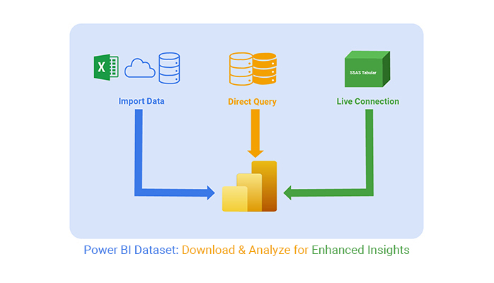
Various methods exist to generate datasets in Power BI, depending on your data source and workflow preferences. Here are the common methods:

  1. Import data: You can import data from various sources into Power BI Desktop. Click “Get Data” and choose the appropriate data source, such as Excel files, CSV files, or cloud-based services.
  2. DirectQuery: DirectQuery lets you create a dataset directly connecting to a data source. You don’t have to import the data into Power BI. It enables real-time or near-real-time access to data by querying the data source directly. This is useful when dealing with large datasets or when the data needs to remain up-to-date.
  3. Live connection: With a live connection, Power BI connectors directly to the data source. For instance the SQL Server database or Analysis Services cube. This method is useful when creating reports and visualizations that reflect real-time data.

List of Some Best Datasets For Power BI

NYC Taxi Data

The NYC Taxi Data is a detailed and extensive dataset that provides information on taxi trips in New York City. It includes data such as trip durations, fare amounts, and the locations where passengers are picked up and dropped off. Spanning millions of trips over several years, this dataset is a valuable resource for understanding urban mobility and transportation trends in NYC.

Analyzing this data can reveal insights into the taxi industry. For instance, you can track how trips vary over time and across different areas, and pinpoint areas with high taxi activity.

Key variables in the dataset include:

  • Trip Duration: Time of the trip in seconds.
  • Trip Distance: Distance traveled in miles.
  • Number of Passengers: Count of passengers per trip.
  • Fare Amount: Fare charged to the passenger in dollars.
  • Payment Method: How passengers pay (e.g., credit card, cash).
  • Pickup and Drop-off Locations: GPS coordinates for pickup and drop-off points.
  • Trip Type: Whether the trip was dispatched (green taxi or for-hire) or a street hail (yellow taxi).
  • Pickup and Drop-off Time: Date and time of the pickup and drop-off.

To download this dataset, click here.

Global Superstore

The Global Superstore dataset simulates retail sales operations across various countries. It includes detailed information about customers, orders, and products, making it valuable for analyzing retail sales data. This dataset is particularly useful for studying customer behavior, product performance, and sales patterns due to its comprehensive and diverse data.

Key variables in the dataset include:

  • Order ID: Unique identifier for each order.
  • Order Date: Date and time when the order was placed.
  • Ship Date: Date and time when the order was shipped.
  • Ship Mode: Method of shipping (e.g., standard, express).
  • Customer ID: Unique identifier for each customer.
  • Customer Name: Full name of the customer.
  • Segment: Customer segment (e.g., Home Office, Corporate).
  • Country: Customer’s country.
  • City: Customer’s city.
  • State: Customer’s state.
  • Postal Code: Customer’s postal code.
  • Region: Geographic region of the customer.
  • Product ID: Unique identifier for each product.
  • Category: Broad category of the product (e.g., Furniture, Office Supplies, Technology).
  • Sub-Category: Specific sub-category of the product (e.g., Chairs, Paper, Phones).
  • Product Name: Name of the product.
  • Sales: Total sales revenue for the product.
  • Quantity: Number of units sold.
  • Discount: Discount applied to the product.
  • Profit: Total profit earned from the product.

To download this dataset, click here.

World Bank Development Indicators

The Global Superstore dataset simulates retail sales operations across various countries. It includes detailed information about customers, orders, and products, making it valuable for analyzing retail sales data. This dataset is particularly useful for studying customer behavior, product performance, and sales patterns due to its comprehensive and diverse data.

Key variables in the dataset include:

  • Order ID: Unique identifier for each order.
  • Order Date: Date and time when the order was placed.
  • Ship Date: Date and time when the order was shipped.
  • Ship Mode: Method of shipping (e.g., standard, express).
  • Customer ID: Unique identifier for each customer.
  • Customer Name: Full name of the customer.
  • Segment: Customer segment (e.g., Home Office, Corporate).
  • Country: Customer’s country.
  • City: Customer’s city.
  • State: Customer’s state.
  • Postal Code: Customer’s postal code.
  • Region: Geographic region of the customer.
  • Product ID: Unique identifier for each product.
  • Category: Broad category of the product (e.g., Furniture, Office Supplies, Technology).
  • Sub-Category: Specific sub-category of the product (e.g., Chairs, Paper, Phones).
  • Product Name: Name of the product.
  • Sales: Total sales revenue for the product.
  • Quantity: Number of units sold.
  • Discount: Discount applied to the product.
  • Profit: Total profit earned from the product.

To download this dataset, click here.

Airbnb Listings

This dataset offers a detailed view of Airbnb listings in New York City, providing insights into various aspects such as pricing, property types, amenities, bedroom counts, and geographical locations. It’s an excellent resource for conducting exploratory data analysis and creating visualizations to understand how listings and prices vary across different neighborhoods.

Key Features of the Dataset:

  • Id: A unique identifier assigned to each Airbnb listing.
  • Host Id: A unique identifier for the host of the listing.
  • Host Name: The name of the host responsible for the listing.
  • Neighbourhood Group: The broader neighborhood areas such as Manhattan, Brooklyn, etc.
  • Host Identity Verification: Indicates whether the host’s identity has been verified or remains unverified.

You can easily download this just by clicking here.

How to Access the Power BI Dataset?

  • Open Power BI Desktop: Launch Power BI Desktop on your computer.
  • Select Get Data: Click on the “Get Data” button on the Home tab.
  • Choose Power BI Datasets: From the list of data sources, select “Power BI Dataset.”
  • Sign In: If prompted, sign in with your Power BI account credentials.
  • Select a Dataset: Browse through the available datasets and select the one you need.
  • Load the Dataset: Click “Load” to import the dataset into your Power BI Desktop environment for analysis and report creation.

How to Use Dataset in Power BI?

We’ll divide the process into 5 distinct stages:

Stage 1: Logging in to Power BI

  • Log in to Power BI.
  • Enter your email. Click the “Submit” button.
Enter email to login to Power BI
  • You are redirected to your Microsoft account.
  • Enter your password and click “Sign in”.
Enter Password to login to Power BI
  • Choose whether to stay signed in.
Click on stay signed in
  • Once done, the Power BI home screen will open.

Stage 2: Creating a Data Set and Selecting the Data Set to Use in Your Sankey Chart

  • Click on the “Create” option on the left-side menu.
  • Select ”Paste or manually enter data“.
select Paste or manually enter data in Power BI
  • We’ll use the following cash flow data for this example
Store Category Items Brand Units Sold
Online Store Electronics Mobile Samsung 39
Online Store Electronics Tablet Samsung 73
Online Store Electronics Laptop Dell 156
Online Store Garments Jeans Levi’s 46
Online Store Garments T-Shirt H&M 104
Online Store Garments Jackets Puma 41
Online Store Furniture Sofa IKEA 73
Online Store furniture Chair Kartell 46
Online Store furniture Desk Stickley 43
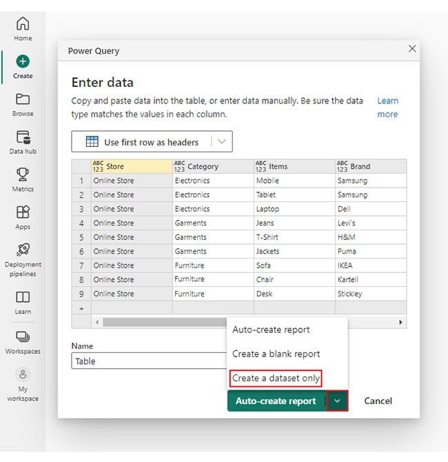
  • Paste the above data table into the “Power Query” window.
  • Select the “Create a dataset only” option.
Create Dataset in Power BI ce309
  • Click on the “Data Hub” option on the left-side menu.
  • Power BI populates the data set list. (If you have not created a data set, refer to the Error! Reference source not found section.)
Click on Data Hub
  • Choose the data set you want to use to create your Sankey diagram.
  • Power BI populates the screen as shown below:
Workspace in Power BI
  • The data set and its fields are shown on the right side. The middle area shows report and data set options.
  • Click on the “Create a report” dropdown.
  • Select “Start from scratch“.
  • You should see the Report Canvas screen as shown below:
Create Report and start from scratch

Stage 3: Adding the Power BI Sankey Diagram Extension by ChartExpo

  • Creating the Sankey Diagram requires us to use an add-in or Power BI visual from AppSource.
  • Navigate to the right side of the Power BI dashboard.
  • Open the Power BI Visualizations panel.
  • Click the ellipsis symbol (…) as highlighted in the diagram below. This will import the Power BI Sankey Diagram extension by ChartExpo.
Report Canvas screen in Power BI
  • The following menu opens:
  • Select the “Get more visuals” option.
  • The following window opens:
click on to get more visuals
  • Enter “Sankey Diagram for Power BI by ChartExpo” in the highlighted search box.
  • You should see the “Sankey Diagram for Power BI by ChartExpo” as shown in the image below.
Sankey Diagram for Power BI by ChartExpo
  • Click the highlighted “Add” button.
Click the Add button
  • Power BI will add the “Sankey Diagram for Power BI by ChartExpo” icon in the visualization panel.
Click on Sankey Diagram Icon

Stage 4: Drawing a Sankey Diagram with ChartExpo’s Power BI extension

  • Select the “Sankey Diagram for Power BI by ChartExpo” icon in the visualization panel.
  • The following window opens in the report section of your dashboard:
Report Section in Dashboard
  • You can resize the visual as needed.
  • Navigate to the right side of your Power BI dashboard.
  • You should see “Fields” next to “Visualizations.”
Fields next to visualizations
  • You’ll select the fields to use in your Sankey chart here.
  • The ChartExpo visual needs to be selected, though. Select the fields in the following sequence:
    • Total Spend
    • Department
    • Category
    • Spend Amount ($)
Select fields for Sankey diagram
  • You’ll be asked for a ChartExpo license key or email address.
enter email for ChartExpo license

Stage 5: Activate your ChartExpo Trial or Apply a Subscription Key

  • Select the ChartExpo visual. You should see three icons below “Build Visual” in the Visualizations panel.
Build visual panel in Power BI
  • Select the middle icon, “Format visual.”
  • The visual properties will be populated as shown below.
visual properties in Power BI
  • If you are a new user,
    • Type in your email under the section titled “Trial Mode”.
    • This should be the email address that you used to subscribe to the ChartExpo add-in. It is where your ChartExpo license key will be sent.
    • Ensure that your email address is valid.
    • Click “Enable Trial.” You’ll get a 7-day trial.
enter email id
  • You should receive a welcome email from ChartExpo.
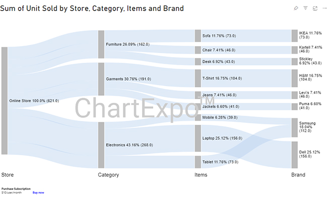
  • The Sankey Diagram you create under the 7-day trial contains the ChartExpo watermark (see below).
power bi dataset ce339 1
  • If you have obtained a license key:
    • Enter your license key in the “ChartExpo License Key” textbox in the “License Settings” section (see below).
    • Slide the toggle switch next to “Enable License” to “On.”
enter license key
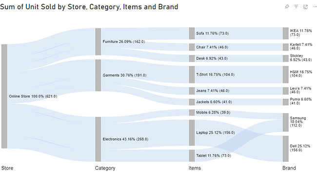
  • Your Sankey diagram should now be ready (see below). Note that it does not have a watermark.
power bi dataset ce339 2
  • Let’s add colors to each node. Expand the “Level Colors” properties and select the colors.
coloring Sankey diagram
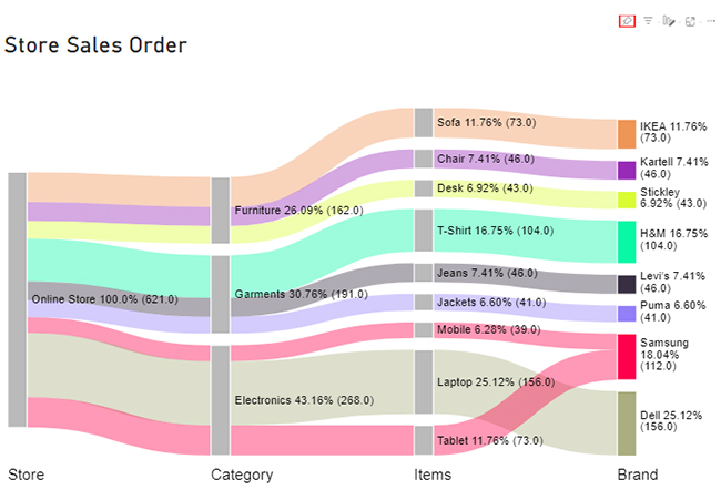
  • Click on the “Pin” icon at the top of the Sankey Chart.
power bi dataset ce339 3
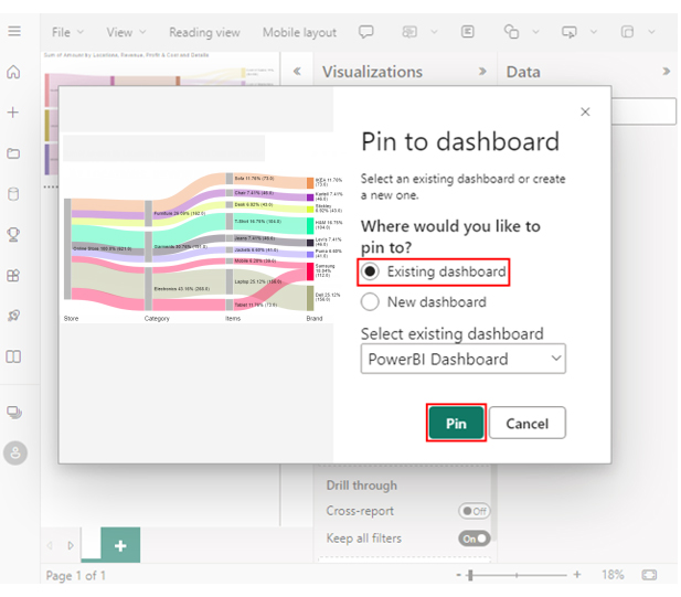
  • Select the dashboard on which you want to pin the chart.
  • Click on the “Pin” button.
power bi dataset pin to dashboard ce339 3
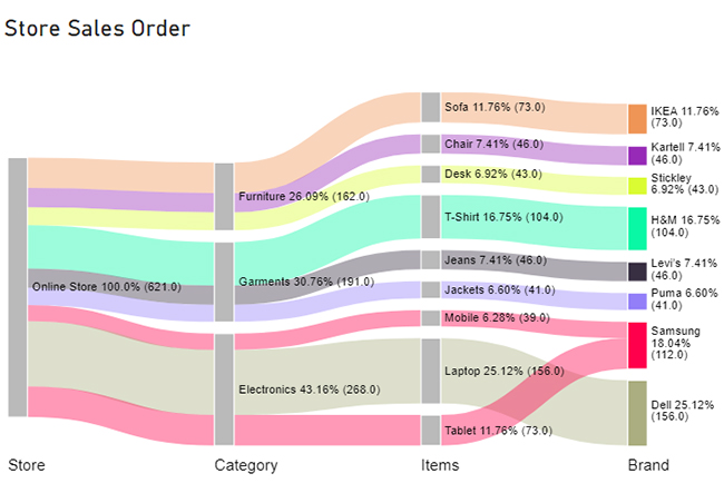
  • Your final chart will appear below.
final power bi dataset

Insights

  • Level 1 (online store) has a total of 621 orders.
  • Looking at Level 2 (Category), Electronics contributes the most with 43% (268 orders). Furniture has the least contribution at 26% (162 orders).
  • At Level 3 (Items), Laptops and T-shirts are the top contributors, with 25% (156 orders) and 17% (104 orders), respectively.
  • At Level 4 (Brand), Dell and Samsung stand out with the highest sales compared to other brands. They have 25% (156 orders) and 18% (112 orders), respectively.

Power BI Dataset Best Practices

  • Use a Star Schema: Organize your data into fact and dimension tables for efficient querying and analysis.
  • Clear Naming Conventions: Use intuitive and consistent names for tables, columns, and measures to make the dataset easy to understand and maintain.
  • Optimize Data Types: Select appropriate data types to improve performance and reduce storage requirements.
  • Implement Incremental Refresh: Update only the new or changed data to save time and resources during data refresh operations.
  • Row-Level Security: Protect sensitive data by defining security roles that control user access at the row level.

Advantages of a Dataset in Power BI

  • Centralized Data Source: A single dataset can be used across multiple reports and dashboards, ensuring consistency and reducing redundancy.
  • Enhanced Performance: Optimized datasets improve query performance, making data retrieval faster and more efficient.
  • Data Security: Implement row-level security to control data access, ensuring users only see data relevant to them.
  • Collaboration: Share datasets with team members, enabling collaborative analysis and reporting.
  • Automated Updates: Set up scheduled refreshes to keep your data current without manual intervention.

FAQs

What are the Best Datasets for Power BI Practice?

  • AdventureWorks: A comprehensive dataset for practicing various business scenarios.
  • World Bank Data: Offers extensive global economic and development statistics.
  • Google Analytics Sample: Great for analyzing website traffic and user behavior.
  • Kaggle Datasets: Wide range of datasets across different industries and topics.
  • Sample Financial Dataset: Perfect for practicing financial and sales data analysis.

What is Included in the Dataset?

A Power BI dataset typically includes tables with the actual data. It also includes metadata, such as column names, data types, and table relationships. It can also include calculated columns, measures, and other data modeling elements for analysis and visualization.

What are the different types of Power BI datasets?

There are three main types of Power BI datasets:

  • Import datasets store data imported from external sources.
  • DirectQuery datasets establish a live connection to a data source.
  • Composite datasets combine data from multiple sources, including import and DirectQuery datasets.

Wrap Up

Power BI offers various methods to create different types of datasets. This provides flexibility and versatility in data analysis and visualization.

Import Power BI datasets allow you to import data from external sources and store it within Power BI. It provides fast query performance and offline data analysis capabilities. This is ideal for scenarios where data doesn’t require real-time updates.

DirectQuery datasets establish a live connection to the data source. This dataset type is beneficial when working with constantly changing or large datasets requiring up-to-date information.

Additionally, Power BI allows you to create composite datasets by combining data from multiple sources. This provides a unified data view, enabling comprehensive analysis and visualization across different sources.

By leveraging these diverse dataset creation options, you can harness the full potential of Power BI. Also, by combining Power BI with the power of ChartExpo, data analysis, and visualization becomes a breeze.

How much did you enjoy this article?

PBIAd2
Start Free Trial!
127232

Related articles

next previous
Power BI12 min read

How to Create Sankey Diagram in Microsoft Power BI?

Learn How to Create Sankey Diagram in Microsoft Power BI using Desktop & Web Service. What they are and how to use them effectively.

Power BI8 min read

Power BI Artificial Intelligence: Insights Using Visuals

Discover all there is to know about the Power BI artificial intelligence. You'll also discover how AI is used in Power BI, and how to use it for analysis and more.

Power BI9 min read

Budgeting in Healthcare: Use Visuals to Spot Budget Gaps

This guide helps you discover what budgeting in healthcare is. You'll also discover the factors that affect hospital budgets and types of budgeting in healthcare.

Power BI9 min read

Predictive Analytics in Power BI for Making Insightful Visuals

This guide shows you everything you need to know about Predictive Analytics in Power BI. It also shows you how it works, and how to interpret the results.
Power BI8 min read

Quarterly Business Review Template for Optimum Reports

Discover what the quarterly business review template is. This guide also shows you the best practices to consider when using the QBR template.
ChartExpo logo

Turn Data into Visual
Stories

CHARTEXPO

  • Home
  • Gallery
  • Videos
  • Services
  • Pricing
  • Contact us
  • FAQs
  • Privacy policy
  • Terms of Service
  • Sitemap

TOOLS

  • ChartExpo for Google Sheets
  • ChartExpo for Microsoft Excel
  • Power BI Custom Visuals by ChartExpo
  • Word Cloud

CATEGORIES

  • Bar Charts
  • Circle Graphs
  • Column Charts
  • Combo Charts
  • Comparison Charts
  • Line Graphs
  • PPC Charts
  • Sentiment Analysis Charts
  • Survey Charts

TOP CHARTS

  • Sankey Diagram
  • Likert Scale Chart
  • Comparison Bar Chart
  • Pareto Chart
  • Funnel Chart
  • Gauge Chart
  • Radar Chart
  • Radial Bar Chart
  • Sunburst Chart
  • see more
  • Scatter Plot Chart
  • CSAT Survey Bar Chart
  • CSAT Survey Chart
  • Dot Plot Chart
  • Double Bar Graph
  • Matrix Chart
  • Multi Axis Line Chart
  • Overlapping Bar Chart
  • Control Chart
  • Slope Chart
  • Clustered Bar Chart
  • Clustered Column Chart
  • Box and Whisker Plot
  • Tornado Chart
  • Waterfall Chart
  • Word Cloud
  • see less

RESOURCES

  • Blog
  • Resources
  • YouTube
SIGN UP FOR UPDATES

We wouldn't dream of spamming you or selling your info.

© 2025 ChartExpo, all rights reserved.