• Home
  • Tools dropdown img
    • Spreadsheet Charts

      • ChartExpo for Google Sheets
      • ChartExpo for Microsoft Excel
    • Power BI Charts

      • Power BI Custom Visuals by ChartExpo
    • Word Cloud

  • Charts dropdown img
    • Chart Category

      • Bar Charts
      • Circle Graphs
      • Column Charts
      • Combo Charts
      • Comparison Charts
      • Line Graphs
      • PPC Charts
      • Sentiment Analysis Charts
      • Survey Charts
    • Chart Type

      • Box and Whisker Plot
      • Clustered Bar Chart
      • Clustered Column Chart
      • Comparison Bar Chart
      • Control Chart
      • CSAT Survey Bar Chart
      • CSAT Survey Chart
      • Dot Plot Chart
      • Double Bar Graph
      • Funnel Chart
      • Gauge Chart
      • Likert Scale Chart
      • Matrix Chart
      • Multi Axis Line Chart
      • Overlapping Bar Chart
      • Pareto Chart
      • Radar Chart
      • Radial Bar Chart
      • Sankey Diagram
      • Scatter Plot Chart
      • Slope Chart
      • Sunburst Chart
      • Tornado Chart
      • Waterfall Chart
      • Word Cloud
    • Google Sheets
      Microsoft Excel
  • Services
  • Pricing
  • Contact us
  • Blog
  • Support dropdown img
      • Gallery
      • Videos
      • Contact us
      • FAQs
      • Resources
    • Please feel free to contact us

      atsupport@chartexpo.com

Categories
All Data Visualizations Data Analytics Surveys
Add-ons/
  • Google Sheets
  • Microsoft Excel
  • Power BI
All Data Visualizations Data Analytics Surveys
Add-ons
  • Google Sheets
  • Microsoft Excel
  • Power BI

We use cookies

This website uses cookies to provide better user experience and user's session management.
By continuing visiting this website you consent the use of these cookies.

Ok

ChartExpo Survey


Home > Blog > Power BI

How to Create a Power BI KPI Dashboard?

Creating a Power BI KPI dashboard is not an easy task. Defining your key performance indicators (KPIs) is only half the task.

Power BI KPI dashboard

You need to present the data to your stakeholders in a persuasive way.

You might have the data collected by a software application, for example, and stored in a spreadsheet.

The data could even be updated manually.

All these factors pose a challenge when it comes to creating an insights appealing yet effective dashboard.

The good news is that Power BI (PBI) provides KPI dashboard templates to get you started.

In this article, we delve into Power BI KPI dashboards. We begin by defining them. We then discuss the best chart that you can use for your PBI KPI dashboards.

We’ll learn how to create a KPI dashboard in PBI and explore some use cases.

Table of Content:

  1. What is a KPI Dashboard in Power BI?
  2. Why Power BI Metrics Dashboard Matters?
  3. When to Use KPI Power BI Dashboard?
  4. Key Features of a Power BI Metrics Dashboard
  5. Power BI KPI Dashboard Examples
  6. How to Build an Effective KPI Dashboard in Power BI
    • Step 1: Log In to Power BI
    • Step 2: Select Data Sources
    • Step 3: Design the Dashboard Using Chart Add-In
    • Step 4: Share Your Dashboard
  7. How to Customize Your KPI Dashboard in Power BI?
  8. How to Use a Power BI KPI Dashboard Template?
  9. Advantages and Disadvantages of a KPI Reporting Dashboard in Power BI
  10. Best Practices For PBI KPI Dashboard
  11. Power BI KPI Dashboard – FAQs
  12. Wrap Up

What is a KPI Dashboard in Power BI?

Definition: A KPI dashboard in Power BI is a visual representation of your organization’s KPIs. It provides a centralized view of your data. This helps you see how your business is performing against your goals.

KPI dashboards are made up of KPI widgets. These widgets display a KPI’s current value, target value, and status.

You can create KPI widgets for any metric that is important to your business, such as:

  • Sales
  • Revenue
  • Customer satisfaction
  • Employee Productivity

KPI dashboards are a powerful tool that can help you identify areas for improvement.

And in Power BI for Mac KPI dashboard, you can quickly make informed decisions to help you achieve your goals.

Why Power BI Metrics Dashboard Matters?

Power BI Metrics Dashboards transform complex data into clear, actionable insights, helping businesses make smarter decisions fast. Here’s why they matter:

  • Real-Time Data Monitoring: Dashboards provide up-to-date metrics so you can track performance and respond to issues immediately.
  • Improved Decision Making: Visual summaries help leaders quickly understand trends and focus on what matters most.
  • Enhanced Collaboration: Shareable dashboards keep teams aligned by presenting the same data story to everyone.
  • Increased Efficiency: Automated data refreshes reduce manual reporting, saving time and minimizing errors.
  • Customizable Insights: Tailor dashboards to specific roles or business goals for relevant and meaningful metrics.

When to Use KPI Power BI Dashboard?

Knowing when to use a KPI dashboard in Power BI ensures you maximize its benefits and stay on top of your goals. Here are the key moments to deploy one:

  • Tracking Business Objectives: Use KPI dashboards to monitor progress towards strategic goals and key targets.
  • Performance Management: When you need to evaluate team or individual performance visually and measurably.
  • Project Monitoring: To keep an eye on project timelines, budgets, and milestones in real time.
  • Identifying Trends & Issues: Quickly spot emerging patterns or red flags before they escalate.
  • Regular Reporting: For monthly or weekly reviews that require concise, actionable insights rather than raw data dumps.

Key Features of a Power BI Metrics Dashboard

  • Real-Time Data Refresh: Always up-to-date with live data connections.
  • Widgets KPI Indicators: Use gauges, colors, and icons to show performance.
  • Interactive Filters: Drill down by time, region, or category easily.
  • Customizable Layouts: Design dashboards to fit your brand or goals.
  • Secure Sharing: Control access with role-based permissions.

Power BI KPI Dashboard Examples

In this section, we explore the Power BI kpi dashboard samples.

  • Sales Dashboard

A sales dashboard is a visual representation that can be used to track sales KPIs like:

  • Sales revenue: This is the total amount of money that your sales team has generated.
  • Sales quota attainment: This is the percentage of your sales quota that your team has met.
  • Lead conversion rate: This is the percentage of leads that your sales team has converted into customers.
  • Customer holding rate: This is the percentage of customers that your sales team has retained over a period of time.

A sales KPI dashboard provides sales managers with a single view of key sales KPIs and metrics. This makes it easier to track performance and identify areas for improvement.

Here are some of the key performance indicators (KPIs) that you can track on a sales KPI dashboard in Power BI:

You can also track other KPIs that are specific to your business, such as:

    • The number of new customers acquired,
    • The number of sales calls made,
    • and the number of deals closed.

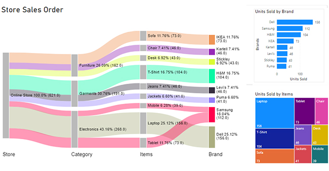
The following is a PBI dataset of sales delivery data:

Store Category Items Brand Units Sold
Online Store Electronics Mobile Samsung 39
Online Store Electronics Tablet Samsung 73
Online Store Electronics Laptop Dell 156
Online Store Garments Jeans Levi’s 46
Online Store Garments T-Shirt H&M 104
Online Store Garments Jackets Puma 41
Online Store Furniture Sofa IKEA 73
Online Store furniture Chair Kartell 46
Online Store furniture Desk Stickley 43

A PBI KPI dashboard will present the above data in a very effective way.

sales KPI dashboard
  • Financial Dashboard

A financial dashboard in Power BI is a visual representation of important KPIs for a business’s financial health.

Here are some examples of financial KPIs that you can track on a Power BI data visualization dashboard:

  • Sales: The total amount of sales that your business has generated.
  • Revenue: The total amount of money that your business has earned.
  • Expenses: The total amount of money that your business has spent.
  • Profit: The amount of money that your business has made after deducting expenses from revenue.
  • Customer satisfaction: The level of satisfaction that your customers have with your products or services.

By tracking these KPIs, you can get a better understanding of the financial health of your business.

This information can help you make data-informed decisions to help you achieve your goals.

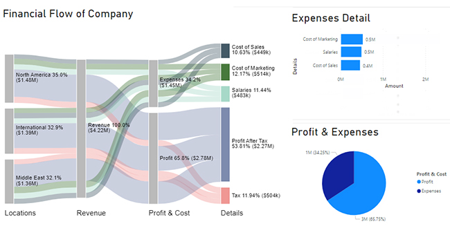
Let’s use the following data to create a PBI KPI financial dashboard:

Locations Revenue Profit & Cost Details Amount
North America Revenue Expenses Cost of Sales 132000
North America Revenue Expenses Salaries 159000
North America Revenue Expenses Cost of Marketing 170000
North America Revenue Profit Tax 182000
North America Revenue Profit Profit After Tax 834000
International Revenue Expenses Cost of Sales 162000
International Revenue Expenses Salaries 158000
International Revenue Expenses Cost of Marketing 145000
International Revenue Profit Tax 171000
International Revenue Profit Profit After Tax 753000
Middle East Revenue Expenses Cost of Sales 155000
Middle East Revenue Expenses Salaries 166000
Middle East Revenue Expenses Cost of Marketing 199000
Middle East Revenue Profit Tax 151000
Middle East Revenue Profit Profit After Tax 685000

A PBI KPI dashboard presents the above data in a visually appealing way, as shown below:

PBI KPI dashboard
  • Marketing Dashboard

A marketing dashboard in Power BI is a charting tool that displays key marketing KPIs to help evaluate campaign performance and brand impact.

Here are some examples of marketing KPIs you can track on a Power BI dashboard:

  • Website Traffic: The total count of users visiting your website during a specific period.
  • Lead Conversion Rate: The proportion of potential customers who successfully become paying clients.
  • Cost Per Acquisition (CPA): How much it costs to acquire each new customer.
  • Return on Marketing Investment (ROMI): The revenue generated from marketing activities compared to the cost.
  • Engagement Rate: How users interact with your content (likes, shares, comments, etc.).

By monitoring these KPIs, you can better understand how your marketing efforts are performing.

This data-driven insight allows for more strategic decision-making and improved campaign results.

PBI Marketing Dashboard
  • Operational Dashboard

An operational dashboard in Power BI provides real-time insights into the day-to-day performance of your business operations.

Here are some examples of operational KPIs you can track on a Power BI KPI dashboard:

  • Inventory Levels: The current stock of products available.
  • Order Fulfillment Time: The time it takes to process and ship customer orders.
  • Employee Productivity: Output or performance metrics by team or individual.
  • Downtime: Any operational delays or system outages.
  • On-Time Delivery Rate: The share of orders that reach customers within the scheduled delivery window.

Tracking these KPIs helps businesses optimize workflows, reduce inefficiencies, and maintain smooth daily operations.

It empowers you to make timely decisions that keep your business running efficiently.

How to Build an Effective KPI Dashboard in Power BI (Step-by-Step)

In this section, we learn how to create a KPI dashboard in Power BI.

Step 1: Log In to Power BI

  • Log in to Power BI.
  • Enter your email. Click the “Submit” button.
log-in-to-power-bi-320
  • Enter your password and click “Sign in.”
submit button
  • Choose whether to stay signed in.
enter password to Power BI

Step 2: Select Data Sources

  • Click on the “Create” option on the left-side menu.
  • Select ”Paste or manually enter data.”
Manually enter data
  • We’ll use the following data for this example.
Locations Revenue Profit & Cost Details Amount
North America Revenue Expenses Cost of Sales 132000
North America Revenue Expenses Salaries 159000
North America Revenue Expenses Cost of Marketing 170000
North America Revenue Profit Tax 182000
North America Revenue Profit Profit After Tax 834000
International Revenue Expenses Cost of Sales 162000
International Revenue Expenses Salaries 158000
International Revenue Expenses Cost of Marketing 145000
International Revenue Profit Tax 171000
International Revenue Profit Profit After Tax 753000
Middle East Revenue Expenses Cost of Sales 155000
Middle East Revenue Expenses Salaries 166000
Middle East Revenue Expenses Cost of Marketing 199000
Middle East Revenue Profit Tax 151000
Middle East Revenue Profit Profit After Tax 685000
  • Paste the above data table into the “Power Query” window.
  • Select the “Create a dataset only” option.
Create a dataset only
  • Click on the “Data Hub” option on the left-side menu.
  • Power BI populates the data set list. (If you have not created a data set, refer to the Error! Reference source not found section.)
Data Hub
  • Choose the data set you want to use to create your Sankey diagram.
  • Power BI populates the screen as shown below:
create report in power bi
  • The data set and its fields are shown on the right side. The middle area shows report and data set options.
  • Click on the “Create a report” dropdown.
  • Select “Start from scratch.”
Start from scratch
  • You should see the Report Canvas screen as shown below:
Report Canvas screen

Step 3: Design the Dashboard Using Chart Add-In

  • To finish creating our Sankey Diagram, we’ll use an add-in or Power BI widgets from AppSource.
  • Navigate to the Power BI Insights panel.
  • Click the ellipsis (…) highlighted above to import the Power BI Sankey Diagram extension by ChartExpo.
Power BI visual from
  • The following menu opens:
  • Select the “Get more Insights” option.
  • The following window opens:
Get more visuals
    • Enter “Sankey Diagram for Power BI by ChartExpo” in the highlighted search box.
  • You should see “Sankey Diagram for Power BI by ChartExpo” as shown in the image below.
Sankey Diagram for Power BI by ChartExpo
  • Click the highlighted “Add” button.
create Sankey Diagram for Power BI by ChartExpo
  • Power BI will add the “Sankey Diagram for Power BI by ChartExpo” icon in the visualization panel.
icon in the visualization panel
  • Select the “Sankey Diagram for Power BI by ChartExpo” icon in the visualization panel.
  • The following window opens in the report section of your dashboard:
select-sankey-chart-in-power-bi
  • You can resize the visual as needed.
  • Navigate to the right side of your Power BI dashboard. You should see “Fields” next to “Visualizations.”
select fields
  • You’ll select the fields to use in your Sankey Chart here.
  • The ChartExpo visual needs to be selected, though.
  • Select the fields in the following sequence:
    • Locations
    • Revenue
    • Profit and Cost
    • Details
    • Amount
select fields power bi
  • You’ll be asked for a ChartExpo license key or email address.
ChartExpo license key
  • Select the ChartExpo visual. You should see three icons below “Build Visual” in the Visualizations panel.
Build visual
  • Select the middle icon, “Format visual.”
  • The visual properties will be populated as shown below.
format visual
  • If you are a new user,
    • Type in your email under the section titled “Trial Mode”.
    • This should be the email address that you used to subscribe to the ChartExpo add-in. It is where your ChartExpo license key will be sent.
    • Ensure that your email address is valid.
    • Click “Enable Trial.” You’ll get a 7-day trial.
Enable Trial
  • You should receive a welcome email from ChartExpo.
  • The Sankey Diagram you create under the 7-day trial contains the ChartExpo watermark (see below).
ChartExpo watermark
  • If you have obtained a license key:
    • Enter your license key in the “ChartExpo License Key” textbox in the “License Settings” section (see below).
    • Slide the toggle switch next to “Enable License” to “On.”
License Settings

Step 4: Share Your Dashboard

sankey chart in power bi

How to Customize Your KPI Dashboard in Power BI?

  • To add colors, expand the “Level Colors” properties and select a color.
  • Do this to change the color of each node.
  • All changes are automatically saved.
expand stats
  • Click on the “Pin” icon at the top of the Sankey Chart.
sankey visual in power bi
  • Select the dashboard on which you want to pin the chart.
  • Click on the “Pin” button.
sankey graph in power bi
  • Your final Sankey Chart looks like the one below:
sankey graph in power bi
  • You can add more charts and graphs to this dashboard according to your use case.

Insights

  • Level 1 (locations) shows that North America is a major contributor to revenue. North America’s revenue was $1.48m, which is around 35%. The Middle East contributed the least in revenue ($1.38m), which was 32%.
  • At level 2, (revenue), the company’s total revenue was $4.22m.
  • At level 3, (profit and expenses), $1.45m was spent on expenses. This left the company with a $2.87m profit.
  • At level 4. (details), The $2.87m profit was split between $2.27m profits and $504K taxes.
  • Expenses were divided into three nodes: sales costs, salaries, and marketing costs. This translates to $449K, $483K, and $514K, respectively.

How to Use a Power BI KPI Dashboard Template?

Here are some of the uses of a Power BI KPI dashboard template:

  • Tracking key metrics

KPI dashboards provide a central location for users to track important metrics for their business. By utilizing a Power BI data connector, users can seamlessly integrate and visualize their data, helping them stay up-to-date on performance and identify areas where improvement is needed.

  • Identifying trends

KPI dashboards can be used to identify trends in performance over time. This can help users make better decisions about how to allocate resources and improve their business.

When choosing a tool for creating KPI dashboards, it’s worth comparing options like Looker vs. Power BI to determine which best meets your needs for data analysis and visualization.

  • Help in making data-informed decisions

KPI dashboards can help users make data-informed decisions. This is because they provide a clear picture of how the business is performing.

  • Improving communication and collaboration

Sharing KPI data with employees, managers, and other stakeholders can get everyone on the same page. This helps in working towards common goals.

  • Increased efficiency

KPI dashboards can help you save time by automating the process of collecting and analyzing data.

Advantages and Disadvantages of a KPI Reporting Dashboard in Power BI

Advantages of KPI Reporting Dashboard in Power BI

  • Real-Time Performance Tracking

Power BI connects directly to data sources, enabling live updates. This allows teams to view performance as it happens and react promptly to changing conditions.

  • Data-Driven Decision Making

By transforming raw data into easy-to-understand widgets, KPI dashboards help stakeholders make faster and more accurate business decisions.

  •  Interactive Visualizations

Users can interact with dashboards to drill down into details, filter by categories, and explore underlying data without creating new reports.

  • Automated Reporting

Dashboards can be scheduled to refresh automatically, reducing the need for manual data entry or repetitive report generation.

  • Customizable for Stakeholders

Different roles need different insights. Power BI lets you create role-specific dashboards, ensuring each viewer sees the most relevant KPIs.

Disadvantages of KPI Reporting Dashboard in Power BI

  • Initial Setup Complexity

Designing an effective KPI dashboard can be technically challenging. It often requires knowledge of DAX formulas, data modeling, and Power Query.

  • Data Overload Risk

Including too many KPIs on a single dashboard can overwhelm users and dilute the focus, making it harder to interpret what truly matters.

  • Dependency on Data Quality

Poor data quality can result in misleading KPIs. Dashboards are only as accurate as the data feeding them, which makes validation essential.

  • Licensing Costs

To share dashboards or use advanced features, users often need Power BI Pro or Premium, which adds ongoing costs for organizations.

  • Learning Curve

While Power BI is user-friendly, new users may still face a learning curve when interpreting complex visuals or customizing reports without guidance.

Best Practices For PBI KPI Dashboard

  • Focus on Business Goals

Start by identifying what matters most to your audience. Select KPIs that align directly with business objectives like revenue growth, customer satisfaction, or efficiency.

  • Keep it Simple and Clean

Avoid clutter. Display only the most critical KPIs and use a clean layout with consistent colors and fonts. Less is more when it comes to executive-level dashboards.

  • Use Visual Hierarchy

Organize your dashboard so the most important KPIs are seen first (usually top-left). Use size, color, and placement to guide the viewer’s eye.

  • Enable Interactivity

Use slicers, filters, and drill-down features to allow users to explore data by region, time, or category without leaving the dashboard.

  • Ensure Data Accuracy & Refresh

Always connect to reliable data sources and schedule regular refreshes. Inaccurate or outdated KPIs can lead to poor business decisions.

Power BI KPI Dashboard – FAQs

In this section, we answer some questions you might still have regarding Power BI KPI dashboards.

Which tool is commonly used for KPI dashboards?

Power BI is a widely used tool for creating KPI dashboards. It allows businesses to track key metrics in real-time using interactive and customizable visuals. With features like data integration, automatic updates, and drill-down capabilities, Power BI helps teams monitor performance, identify trends, and make informed decisions quickly.

Which chart is usually used in Power BI to represent KPI?

Power BI commonly uses Card and Gauge charts to represent KPIs for quick performance snapshots. The Sankey Chart is used to visualize flows and relationships between KPIs, such as customer journeys or budget distribution. It helps identify how values move across stages, revealing bottlenecks and opportunities.

What is the difference between a KPI report and a KPI dashboard?

A KPI report and a KPI dashboard are both tools used to track and measure KPIs.

However, there are some key differences between the two.

A KPI report is a static document that is typically distributed to stakeholders regularly. It usually includes a summary of performance data as well as analysis and insights into the data.

A KPI dashboard, on the other hand, is a dynamic widget representation of KPI data. It usually monitors performance in real time.

Wrap Up

We have explored Power BI KPI dashboards. We began by defining them and looking at the best widgets you can use in KPI dashboards.

We then learned how to create KPI dashboards in Power BI. Eventually, we looked at the Power BI KPI dashboard uses.

We also answered some questions you might have had about KPI dashboards in Power BI.

We hope that you’re now ready to create effective and appealing KPI dashboards on Power BI.`

Related Articles:

  • Business Intelligence Dashboard
  • Executive Dashboard Examples
  • Healthcare Dashboard Examples
  • Store Performance Dashboards
  • Airline Customer Dashboard

How much did you enjoy this article?

PBIAd2
Start Free Trial!
126823

Related articles

next previous
Power BI13 min read

Date Hierarchy in Power BI: Ultimate Guide for Users

Enhance your analysis with Date Hierarchy in Power BI. Discover the steps to create, customize, & utilize hierarchies effectively for more insight and reporting.

Power BI12 min read

How to Create a Dashboard in Power BI?

Uncover the secrets through the steps for how to create a dashboard in Power BI. Harness the power of Microsoft's business intelligence platform.

Power BI12 min read

Power BI Sales Dashboard for Actionable Insights

Boost your sales analysis with Power BI. Discover the benefits of a Power BI sales dashboard and learn how to create one with this step-by-step guide.

Power BI12 min read

Healthcare Dashboard Examples for Better Patient Insights

Immerse yourself in Healthcare Dashboard Examples, illustrating innovative ways to transform complex data into actionable insights for healthcare professionals.

Power BI12 min read

Power BI Group By Guide for Effective Data Insights

Learn how Power BI Group By helps you aggregate data, clarify trends, and create reports by grouping values to make large datasets manageable & insightful.

ChartExpo logo

Turn Data into Visual
Stories

CHARTEXPO

  • Home
  • Gallery
  • Videos
  • Services
  • Pricing
  • Contact us
  • FAQs
  • Privacy policy
  • Terms of Service
  • Sitemap

TOOLS

  • ChartExpo for Google Sheets
  • ChartExpo for Microsoft Excel
  • Power BI Custom Visuals by ChartExpo
  • Word Cloud

CATEGORIES

  • Bar Charts
  • Circle Graphs
  • Column Charts
  • Combo Charts
  • Comparison Charts
  • Line Graphs
  • PPC Charts
  • Sentiment Analysis Charts
  • Survey Charts

TOP CHARTS

  • Sankey Diagram
  • Likert Scale Chart
  • Comparison Bar Chart
  • Pareto Chart
  • Funnel Chart
  • Gauge Chart
  • Radar Chart
  • Radial Bar Chart
  • Sunburst Chart
  • see more
  • Scatter Plot Chart
  • CSAT Survey Bar Chart
  • CSAT Survey Chart
  • Dot Plot Chart
  • Double Bar Graph
  • Matrix Chart
  • Multi Axis Line Chart
  • Overlapping Bar Chart
  • Control Chart
  • Slope Chart
  • Clustered Bar Chart
  • Clustered Column Chart
  • Box and Whisker Plot
  • Tornado Chart
  • Waterfall Chart
  • Word Cloud
  • see less

RESOURCES

  • Blog
  • Resources
  • YouTube
SIGN UP FOR UPDATES

We wouldn't dream of spamming you or selling your info.

© 2025 ChartExpo, all rights reserved.