• Home
  • Tools dropdown img
    • Spreadsheet Charts

      • ChartExpo for Google Sheets
      • ChartExpo for Microsoft Excel
    • Power BI Charts

      • Power BI Custom Visuals by ChartExpo
    • Word Cloud

  • Charts dropdown img
    • Chart Category

      • Bar Charts
      • Circle Graphs
      • Column Charts
      • Combo Charts
      • Comparison Charts
      • Line Graphs
      • PPC Charts
      • Sentiment Analysis Charts
      • Survey Charts
    • Chart Type

      • Box and Whisker Plot
      • Clustered Bar Chart
      • Clustered Column Chart
      • Comparison Bar Chart
      • Control Chart
      • CSAT Survey Bar Chart
      • CSAT Survey Chart
      • Dot Plot Chart
      • Double Bar Graph
      • Funnel Chart
      • Gauge Chart
      • Likert Scale Chart
      • Matrix Chart
      • Multi Axis Line Chart
      • Overlapping Bar Chart
      • Pareto Chart
      • Radar Chart
      • Radial Bar Chart
      • Sankey Diagram
      • Scatter Plot Chart
      • Slope Chart
      • Sunburst Chart
      • Tornado Chart
      • Waterfall Chart
      • Word Cloud
    • Google Sheets
      Microsoft Excel
  • Services
  • Pricing
  • Contact us
  • Blog
  • Support dropdown img
      • Gallery
      • Videos
      • Contact us
      • FAQs
      • Resources
    • Please feel free to contact us

      atsupport@chartexpo.com

Categories
All Data Visualizations Data Analytics Surveys
Add-ons/
  • Google Sheets
  • Microsoft Excel
  • Power BI
All Data Visualizations Data Analytics Surveys
Add-ons
  • Google Sheets
  • Microsoft Excel
  • Power BI

We use cookies

This website uses cookies to provide better user experience and user's session management.
By continuing visiting this website you consent the use of these cookies.

Ok

ChartExpo Survey


Home > Blog > Data Analytics

Store Performance Dashboards: Optimizing Retail Success

Imagine you walk into a store, ready to browse and buy. But instead of finding beautifully displayed products and helpful staff, you’re greeted with cluttered shelves and confusing signs.

Store Performance Dashboards

Frustrating, right?

That’s exactly how it feels when your store performance dashboards are a mess.

But fear not. I will help you turn those lackluster dashboards into powerful tools.

First things first, simplify! Get rid of all the unnecessary fluff and focus on the key metrics that truly matter. And don’t be afraid to get creative with your visualizations.

Next, make sure your dashboards are user-friendly. Nobody wants to spend hours deciphering complicated charts and tables. Keep it simple and clean, and watch those insights flow effortlessly.

Lastly, keep your dashboards updated and relevant. Store performance is a dynamic beast, and your dashboards should reflect that. Regularly analyze and tweak your metrics to stay ahead of the game.

Grab your favorite drink and buckle up; we’re about to embark on a wild ride of dashboard optimization. I will help you take your store performance dashboards from drab to fab in no time.

Table of Content:

  1. What is a Store Performance Dashboard?
  2. Why Physical Retailers Need a Store Dashboard?
  3. Key Metrics for a Store Management Dashboard
  4. Retail Business Dashboard Template Examples
  5. How to Optimize Store Performance Dashboards?
  6. How to Create a Store Performance Dashboard in Power BI?
  7. Benefits of a Retail Analytics Dashboard
  8. Limitations of a Retail Dashboard
  9. Tips For Retail Store Performance Dashboard
  10. Store Performance Dashboard – FAQs
  11. Wrap Up

But first!

What is a Store Performance Dashboard?

Definition: A store performance dashboard is a business intelligence tool that consolidates key retail metrics such as sales, inventory, customer behavior, and employee productivity into a single, easy-to-read view.

It provides real-time insights through charts and graphs, helping store managers and business leaders track performance, identify trends, and make data-driven decisions.

By centralizing retail analytics, the dashboard improves efficiency, highlights underperforming areas, and supports strategies for boosting overall store performance.

Why Physical Retailers Need a Store Dashboard?

Physical retailers deal with constant changes in sales, inventory, and customer behavior. A store dashboard helps them track these factors in real time, making it easier to respond quickly and improve performance.

  • Better Sales Tracking: Retailers can monitor revenue, margins, and top-selling products at a glance.
  • Efficient Inventory Management: Dashboards highlight stock levels, turnover, and stockouts to avoid shortages or overstocking.
  • Improved Customer Insights: Metrics like foot traffic, conversion rates, and satisfaction scores help retailers understand shopper behavior.
  • Employee Productivity Monitoring: Track sales per employee and labor costs to optimize staffing.
  • Data-Driven Decisions: Centralized insights make it easier to identify trends, compare store performance, and plan strategies effectively.

Key Metrics for a Store Management Dashboard

Sales and Revenue

  • Total Sales: Gross revenue generated by the store.
  • Gross Margin: Profitability after deducting the cost of goods sold.
  • Average Transaction Value (ATV): Average spend per customer transaction.
  • Sales per Square Foot: Sales productivity based on retail space usage.
  • Sales by Category: Performance of different product lines.

Inventory

  • Inventory Turnover: Efficiency of stock management.
  • Sell-Through Rate: Percentage of received stock that is sold.
  • Stockouts: Frequency of out-of-stock items.

Customer Behavior

  • Conversion Rate: Percentage of store visitors who make a purchase.
  • Foot Traffic: Number of visitors entering the store.
  • Customer Satisfaction (CSAT): Customer feedback on experience.
  • Customer Retention Rate: Share of repeat customers.

Employee Productivity

  • Sales per Employee: Revenue contribution per staff member.
  • Units per Transaction: Average items purchased per transaction.
  • Labor Cost as % of Sales: Efficiency in managing staffing costs.

Retail Business Dashboard Template Examples

  • Sales Performance Dashboard

Tracks total sales, gross margin, sales per square foot, and category-wise performance to understand what drives revenue.

Sales Performance Dashboard
  • Inventory Management Dashboard

Monitors stock levels, inventory turnover, sell-through rate, and stockouts to ensure efficient supply and prevent shortages.

Inventory Management Dashboard
  • Customer Insights Dashboard

Focuses on metrics like foot traffic, conversion rates, CSAT scores, and retention rates to analyze customer behavior and satisfaction.

Customer Insights Dashboard
  • Employee Engagement Surveys Dashboard

Many retail dashboards integrate employee engagement surveys, helping managers track morale, satisfaction, and performance feedback. This supports stronger employee retention and a healthier workplace culture.

Customer Insights Dashboard
  • Multi-Store Comparison Dashboard

Enables regional or corporate managers to compare performance across different locations, identify underperforming stores, and replicate best practices.

Multi-Store Comparison Dashboard

How to Optimize Store Performance Dashboards?

Are you ready to unleash the power of optimization and revolutionize the way you run your store? These secrets will help you take your store from average to extraordinary.

  • Define key performance indicators (KPIs): Identify and define the KPIs that align with your business goals. Examples include sales revenue, inventory turnover, customer satisfaction, and employee productivity.
  • Select an effective dashboard tool: Choose a user-friendly tool that suits your business needs. It should allow for easy customization of visualizations to ensure accessibility and ease of use.
  • Integrate data sources: To achieve a comprehensive understanding of store performance, it is essential to seamlessly integrate diverse data sources, incorporating information from sales systems, inventory management tools, and customer databases. This holistic approach is significantly enhanced with the incorporation of a Store Performance Dashboard. By leveraging the capabilities of a store performance dashboard, you not only integrate data seamlessly but also gain a centralized and real-time visual representation of key metrics.
  • Create comprehensive dashboards: Develop dashboards that present a comprehensive overview of key metrics. Use charts, graphs, and tables to make data interpretation quick and intuitive.
  • Real-time data updates: Opt for dashboards that offer real-time data updates, enabling timely decision-making and dynamic response to changing market conditions.
  • Monitor sales and inventory trends: Keep a close eye on sales and inventory trends. This will help you identify popular products, manage stock levels, and adjust pricing or promotions as needed.
  • Customer behavior analysis: Analyze customer behavior data to understand preferences, buying patterns, and areas for improvement in the overall customer experience.
  • Employee performance monitoring: Implement metrics to monitor employee performance, providing insights into productivity, customer interactions, and areas for training or improvement.
  • Responsive marketing strategies: Adapt marketing strategies based on insights from the dashboard. Also, tailor promotions and advertising efforts to align with customer preferences and market trends analysis.
  • Optimize store layout and merchandising: Use customer movement and product performance data to optimize store layouts. This will help improve the shopping experience and promote higher sales.
  • Identify and address operational bottlenecks: Spot operational bottlenecks or inefficiencies using dashboard insights. Then, address them promptly to enhance overall operational efficiency.
  • Utilize geographic and demographic insights: Leverage geographic and demographic data to understand regional variations in customer behavior. This will enable targeted marketing and inform store placement decisions.
  • Implement targeted promotions and loyalty programs: Design promotions and loyalty programs based on customer insights, encouraging repeat business and fostering customer loyalty.
  • Set thresholds and alerts: Establish threshold values for critical metrics and set up alerts to notify stakeholders when these thresholds are crossed. This will facilitate proactive problem-solving.
  • Regularly review and update dashboards: Schedule regular dashboard reviews to ensure relevance and effectiveness. Also, update it as business goals or market conditions evolve.
  • Employee training and engagement: Utilize performance metrics to identify training needs, engage employees in their roles, and foster a positive work environment. This will contribute to improved customer interactions and satisfaction.

How to Create a Store Performance Dashboard in Power BI?

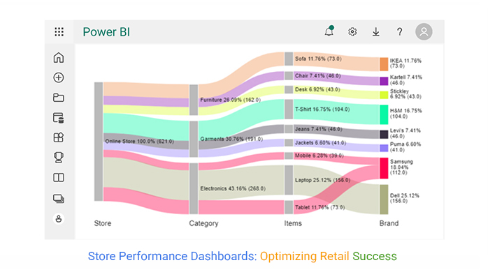
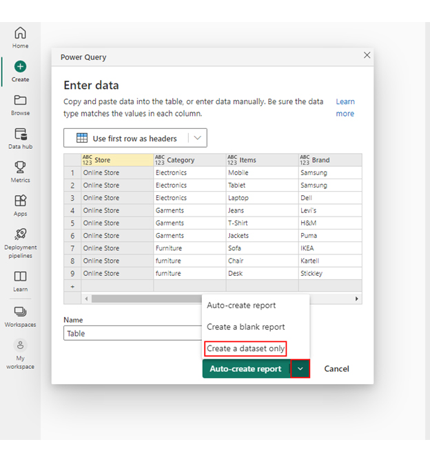
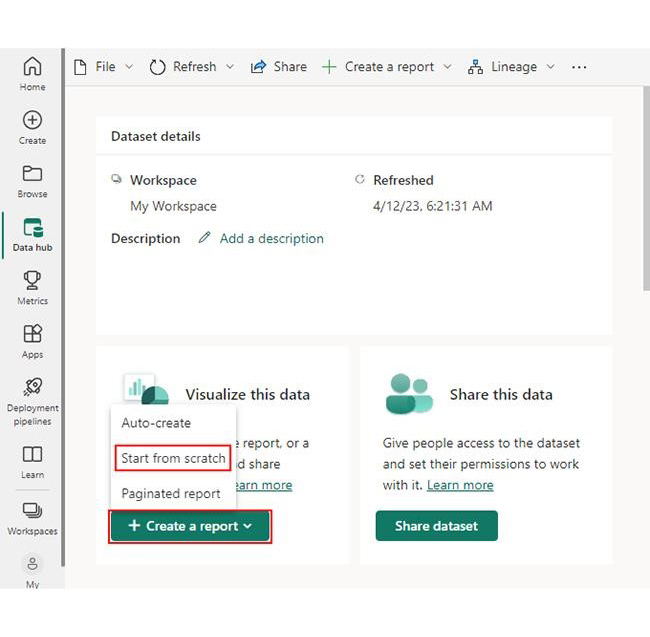
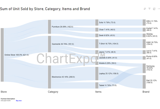
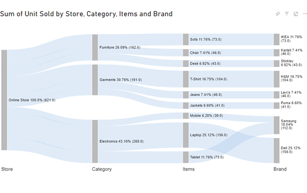
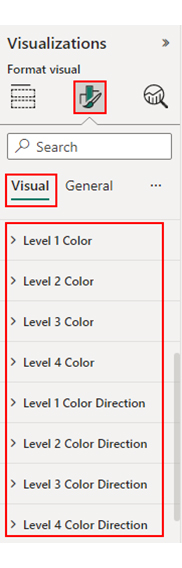
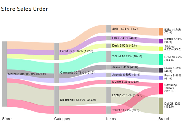
Follow the steps below to unleash the power of BI for retail and turn your store’s performance into a spectacle. Power BI will transform those mundane numbers into a visual symphony of insights.

Stage 1: Logging in to Power BI

  • Log in to Power BI.
  • Enter your email. Click the “Submit” button.
Enter email to login to Power BI
  • You are redirected to your Microsoft account.
  • Enter your password and click “Sign in“.
Enter Password to login to Power BI
  • You can choose whether to stay signed in.
Click on stay signed in
  • Once done, the Power BI home screen will open.

Stage 2: Creating a Data Set and Selecting the Data Set to Use in Your Sankey Chart

  • Go to the left-side menu and click the “Create” button.
  • Select “Paste or manually enter data“.
select Paste or manually enter data in Power BI ce458
  • We’ll use the store sales order data below for this example.
Store Category Items Brand Unit Sold
Online Store Electronics Mobile Samsung 39
Online Store Electronics Tablet Samsung 73
Online Store Electronics Laptop Dell 156
Online Store Garments Jeans Levi’s 46
Online Store Garments T-Shirt H&M 104
Online Store Garments Jackets Puma 41
Online Store Furniture Sofa IKEA 73
Online Store Furniture Chair Kartell 46
Online Store Furniture Desk Stickley 43
  • Paste the above data table in the Power Query Window.
  • Select the “Create a dataset only” option.
Create Dataset in Power BI ce491
  • On the left-side menu, click “Data Hub“.
  • Power BI populates the data set list. (If you have not created a data set, refer to the Error! Reference source not found section).
Click on Data Hub ce491
  • Choose a data set for the Sankey chart.
  • PBI populates the screen as shown below:
Workspace in Power BI ce465
  • Click on the “Create a report” dropdown.
  • Select “Start from scratch“.
click on to get more visuals ce477
  • A Report Canvas screen appears as below:
Report Canvas screen in Power BI ce465

Stage 3: Adding the Power BI Sankey Diagram Extension by ChartExpo

  • Creating the Sankey Diagram requires us to use an add-in or Power BI visual from AppSource.
  • Navigate to the right side of the Power BI dashboard.
  • Open the Power BI Visualizations panel.
  • Click the ellipsis symbol (…) as highlighted in the diagram below. This will import the Power BI Sankey Diagram extension by ChartExpo.
click on to get more visuals ce465
  • The following menu opens:
  • Select the “Get more visuals” option.
get more visuals in Power BI ce465
  • The following window opens.
  • Enter “Sankey Diagram for Power BI by ChartExpo” in the highlighted search box.
  • You should see the “Sankey Diagram for Power BI by ChartExpo”, as shown in the image below…
Sankey Diagram for Power BI by ChartExpo
  • Click the highlighted “Add” button.
Click the Add button
  • Power BI will add the “Sankey Diagram for Power BI by ChartExpo” in the visualization panel.
Click on Sankey Diagram Icon

Stage 4: Drawing a Sankey Diagram with ChartExpo’s Power BI extension

  • Select the “Sankey Diagram for Power BI by ChartExpo” icon in the visualization panel.
  • The following window opens in the report section of your dashboard:
Report Section in Dashboard ce465
  • You can resize the visual as needed.
  • Navigate to the right side of your Power BI dashboard.
  • You should see “Fields” next to “Visualizations“.
Fields next to visualizations ce491
  • You’ll select the fields to use in your Sankey chart here.
  • The ChartExpo visual needs to be selected, though. Select the field in the following sequence:
    • Store
    • Category
    • Items
    • Brand
    • Unit Sold
Select fields for Sankey diagram ce491
  • You’ll be asked for a ChartExpo license key or email address.
enter email for ChartExpo license ce430

Stage 5: Activate your ChartExpo Trial or Apply a Subscription Key

  • Select the ChartExpo visual.
  • You should see three icons below “Build Visual” in the Visualizations panel.
Build visual panel in Power BI
  • Select the middle icon, “Format visual“.
  • The visual properties will be populated as shown below.
visual properties in Power BI
  • If you are a new user,
    • Type in your email under the section titled “Trial Mode”.
    • This should be the email address that you used to subscribe to the ChartExpo add-in. It is where your ChartExpo license key will be sent.
    • Ensure that your email address is valid.
    • Click “Enable Trial.” You’ll get a 7-day trial.
enter email id
  • You should receive a welcome email from ChartExpo.
  • If you do not find the email in your inbox, kindly check your spam folder.
  • The Sankey Diagram you create under the 7-day trial contains the ChartExpo watermark.
Store Performance Dashboards 1
  • If you have obtained a license key:
    • Enter your license key in the “ChartExpo License Key” textbox in the “License Settings” section (see below).
    • Slide the toggle switch next to “Enable License” to “On“.
enter license key
  • Your Sankey Diagram will then appear without a watermark.
Store Performance Dashboards 2
  • Let’s add colors to each node. Expand the “Level Colors” properties and select the colors.
coloring sankey diagram ce491
  • Automatically, all changes will be saved.
Final Store Performance Dashboards

Insights

  • The online store (Level 1) has recorded a total of 621 orders.
  • Moving to Level 2 (Category), Electronics emerges as the predominant category, contributing 43% of the orders (268). Furniture exhibits the least contribution at 26% (162 orders).
  • At Level 3 (Items), Laptops stand out as a significant contributor, comprising 25% of the orders (156), followed by T-shirts at 17% (104 orders).
  • At Level 4 (Brand), Dell and Samsung outshine other brands, with Dell accounting for 25% of the orders (156) and Samsung making up 18% (112).

Benefits of a Retail Analytics Dashboard

  • Real-Time Sales Insights

A retail analytics dashboard gives instant visibility into sales performance, revenue trends, and profit margins. Retailers can quickly identify best-selling products, track seasonal spikes, and adjust strategies on the go.

  • Smarter Inventory Management

With live tracking of stock levels, turnover, and sell-through rates, retailers can avoid overstocking or stockouts. This ensures better inventory planning, improved cash flow, and higher customer satisfaction.

  • Better Customer Understanding

Dashboards reveal key metrics like foot traffic, conversion rates, and satisfaction scores. These insights help retailers understand shopper behavior, improve store layouts, and create personalized customer experiences.

  • Improved Staff Efficiency

By measuring sales per employee, units per transaction, and labor costs, retailers can optimize workforce management. This leads to better scheduling, higher productivity, and reduced operational costs.

  • Data-Driven Decision Making

Bringing all key metrics into one centralized view makes it easier to identify patterns and track overall performance. Retailers can use these insights to create actionable strategies that boost growth and competitiveness.

Limitations of a Retail Dashboard

  • Data Accuracy Issues

A dashboard is only as reliable as the data feeding it. Inaccurate or incomplete data can lead to misleading insights and poor business decisions.

  • High Setup and Maintenance Effort

Integrating multiple data sources (POS, inventory, marketing tools) requires technical expertise. Regular updates and maintenance can also be time-consuming.

  • Overload of Metrics

Too many KPIs in one dashboard may overwhelm users, making it harder to focus on the most critical insights for decision-making.

  • Limited Customization

Some dashboards have restrictions on design or functionality, which can prevent businesses from tailoring them fully to their unique goals.

  • User Training Required

Not all employees are comfortable interpreting data visualizations. Without proper training, the dashboard’s effectiveness may be limited.

Tips For Retail Store Performance Dashboard

  • Track Key KPIs Only: Focus on sales, inventory, customers, and staff productivity.
  • Keep It Simple: Use clear visuals without clutter.
  • Use Real-Time Data: Base insights on the latest updates.
  • Customize by Role: Tailor dashboards for managers or executives.
  • Review and Improve: Refine metrics as business needs change.

Store Performance Dashboard – FAQs

What is the Power BI dashboard for retail stores?

The Power BI dashboard for retail stores is a visual interface that consolidates and presents key retail metrics. It provides insights into sales performance, inventory levels, customer behavior, and other critical data. This enables retailers to gain insights, track performance, and make informed decisions, enhancing overall operational efficiency.

How can a shop use dashboards to monitor business?

Shops can use dashboards to monitor business by integrating data from sales, inventory, and customer interactions. This visual representation allows real-time tracking of key metrics, enabling informed decision-making and optimizing overall business performance.

What is a store dashboard?

A store dashboard visually represents key performance indicators, displaying metrics like sales, inventory, and customer data. It provides a real-time overview of a store’s operational aspects, aiding decision-making and strategic planning.

Wrap Up

Optimizing store performance dashboards hinges on aligning visualizations with critical business metrics. Regular updates to data ensure the accuracy of insights, enabling well-informed decision-making. Moreover, implementing targeted marketing strategies enhances customer engagement and stimulates sales growth.

Analyzing employee performance fosters a positive work environment and contributes to overall productivity improvements. Furthermore, geographic and demographic insights facilitate tailored offerings to specific customer segments, enhancing customer satisfaction.

Setting thresholds and alerts in the dashboard ensures proactive issue resolution, maintaining operational efficiency and preventing potential disruptions. Moreover, integrating various data sources provides a holistic view, supporting comprehensive decision-making across different aspects of the business.

Striking a balance between customization and user-friendly interfaces guarantees accessibility and effectiveness. This ensures the dashboard is a valuable tool for all stakeholders.

Real-time monitoring of sales and inventory trends facilitates strategic adjustments, maximizing profitability and maintaining a competitive edge.

Ultimately, optimizing store performance dashboards is an ongoing and adaptive process. Ensure that it aligns with evolving business goals and makes it responsive to dynamic market conditions.

How much did you enjoy this article?

PBIAd1
Start Free Trial!
132208

Related articles

next previous
Data Analytics14 min read

How to Conduct Customer Behavior Analytics in Excel?

Unlock the power of customer behavior analytics to track habits, predict trends, and improve customer satisfaction across every touchpoint.

Data Analytics10 min read

Leading vs Lagging Indicators: A Walkthrough with Visual

Explore leading vs. lagging indicators with clear examples and definitions. This blog will help you improve planning, tracking, and decision-making.

Data Analytics9 min read

Event Budget Template for Clear Insights

An event budget template tracks and controls event costs with ease. Learn how to build, use, and improve it in Google Sheets for better planning.

Data Analytics13 min read

How to Create Monthly Sales Reports Templates in Excel?

Discover the 4 best monthly sales report templates in Excel. Track sales, compare targets, and spot trends easily with ready-to-use reporting tools

Data Analytics8 min read

Business Dashboard Examples for Improved Decision Making

What is a business dashboard, and how can you create one? These answers are provided in this guide. You'll also see some business dashboard examples.

ChartExpo logo

Turn Data into Visual
Stories

CHARTEXPO

  • Home
  • Gallery
  • Videos
  • Services
  • Pricing
  • Contact us
  • FAQs
  • Privacy policy
  • Terms of Service
  • Sitemap

TOOLS

  • ChartExpo for Google Sheets
  • ChartExpo for Microsoft Excel
  • Power BI Custom Visuals by ChartExpo
  • Word Cloud

CATEGORIES

  • Bar Charts
  • Circle Graphs
  • Column Charts
  • Combo Charts
  • Comparison Charts
  • Line Graphs
  • PPC Charts
  • Sentiment Analysis Charts
  • Survey Charts

TOP CHARTS

  • Sankey Diagram
  • Likert Scale Chart
  • Comparison Bar Chart
  • Pareto Chart
  • Funnel Chart
  • Gauge Chart
  • Radar Chart
  • Radial Bar Chart
  • Sunburst Chart
  • see more
  • Scatter Plot Chart
  • CSAT Survey Bar Chart
  • CSAT Survey Chart
  • Dot Plot Chart
  • Double Bar Graph
  • Matrix Chart
  • Multi Axis Line Chart
  • Overlapping Bar Chart
  • Control Chart
  • Slope Chart
  • Clustered Bar Chart
  • Clustered Column Chart
  • Box and Whisker Plot
  • Tornado Chart
  • Waterfall Chart
  • Word Cloud
  • see less

RESOURCES

  • Blog
  • Resources
  • YouTube
SIGN UP FOR UPDATES

We wouldn't dream of spamming you or selling your info.

© 2025 ChartExpo, all rights reserved.