Categories
Managing sales data across spreadsheets, reports, and multiple sources quickly becomes difficult as your business grows.
Key metrics get scattered, trends are harder to spot, and decision-making slows down.
A Power BI sales dashboard solves this by bringing your revenue, performance, and pipeline data into one interactive view.
Instead of manually compiling reports, you can monitor what’s working, identify gaps, and respond faster using real-time visuals.
This is why sales dashboards have become essential for teams that rely on fast, data-driven decisions.
Definition: A Power BI sales dashboard is an interactive reporting layer that turns raw sales data into real-time performance insights across revenue, pipeline, and customer activity.
It helps sales teams quickly understand what is driving results by visualizing key metrics such as revenue trends, sales targets, product performance, and regional breakdowns in a single view.
Unlike static reports, it updates dynamically and allows users to filter and drill into data to understand the reasons behind performance changes.
A Power BI sales dashboard should be used when sales data becomes too large, scattered, or fast-moving to manage through manual reports or spreadsheets, and when decisions depend on clear, up-to-date performance visibility.
A Power BI sales dashboard focuses on a set of core metrics that help teams track performance, identify growth opportunities, and understand what is driving revenue.
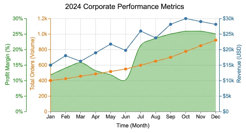
A sales dashboard provides a high-level view of overall sales performance. It helps users track key metrics such as revenue, growth, and sales targets across different time periods.
It is commonly used by sales teams and executives to monitor KPIs, analyze trends, and make data-driven decisions. A customizable layout also allows businesses to adjust visuals based on their specific reporting needs.
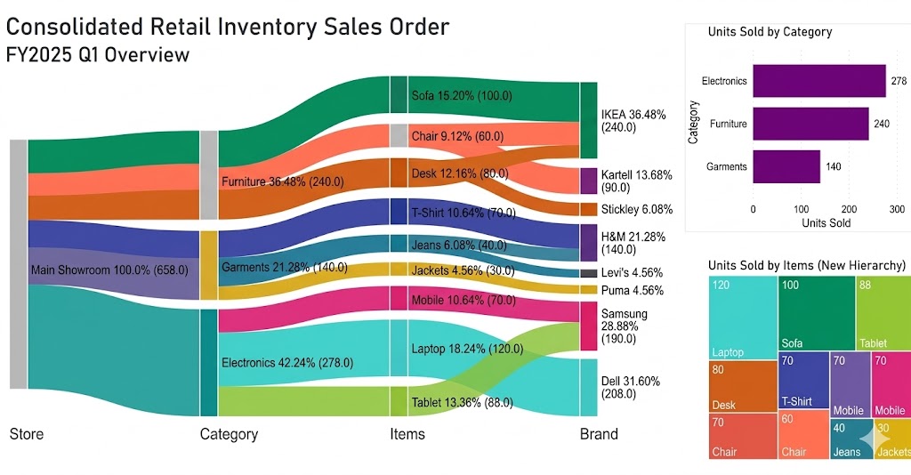
This dashboard tracks sales performance every month across regions, products, or teams. It highlights revenue trends and helps identify both high-performing and underperforming segments.
Users can filter data by time period, product category, or sales representative to focus on specific performance insights.
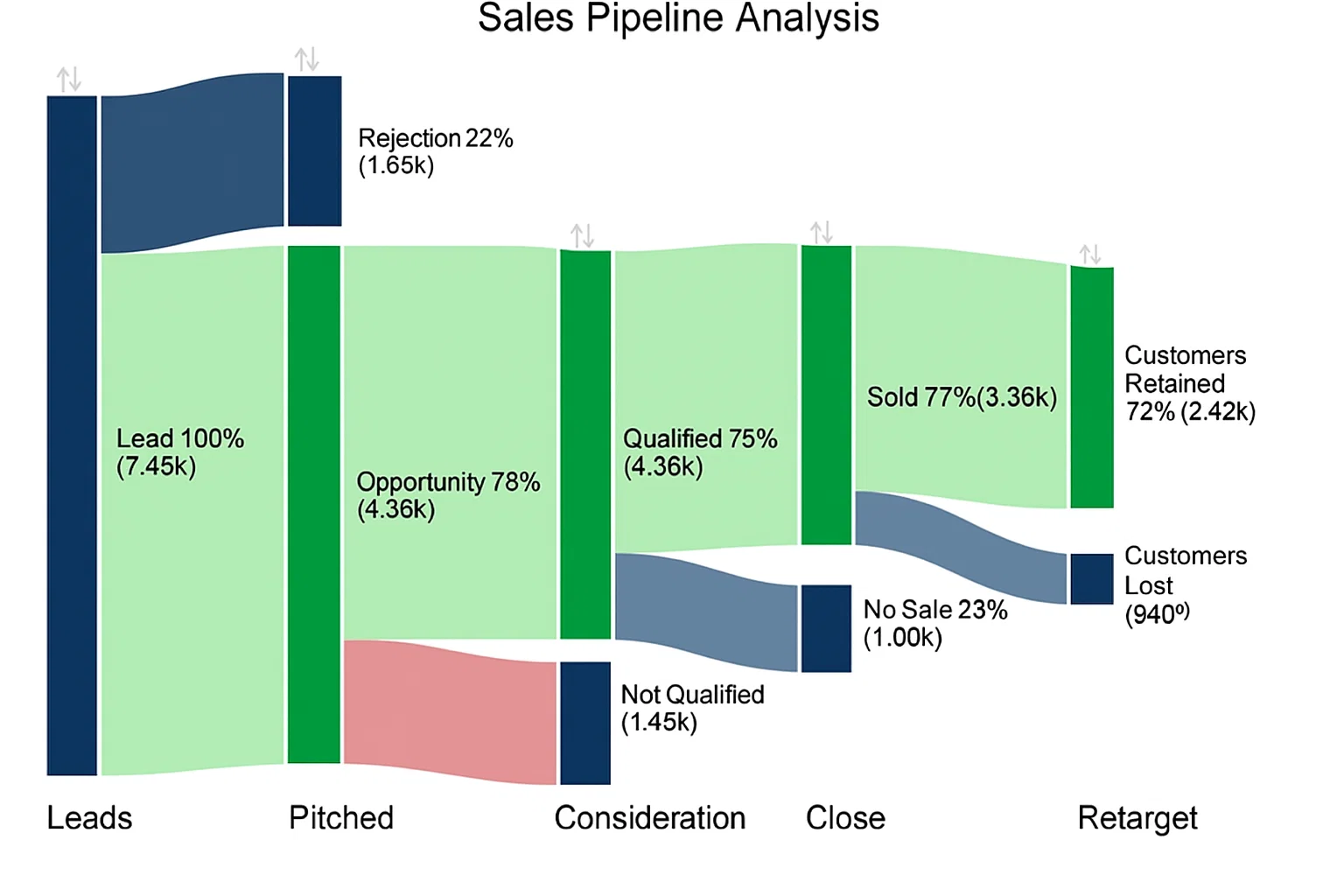
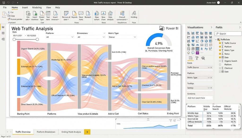
A sales pipeline dashboard visualizes the entire customer journey from leads to closed deals. It helps track deal progress, conversion rates, and forecast future revenue.
Sales managers use it to identify bottlenecks in the pipeline and improve conversion efficiency at each stage.
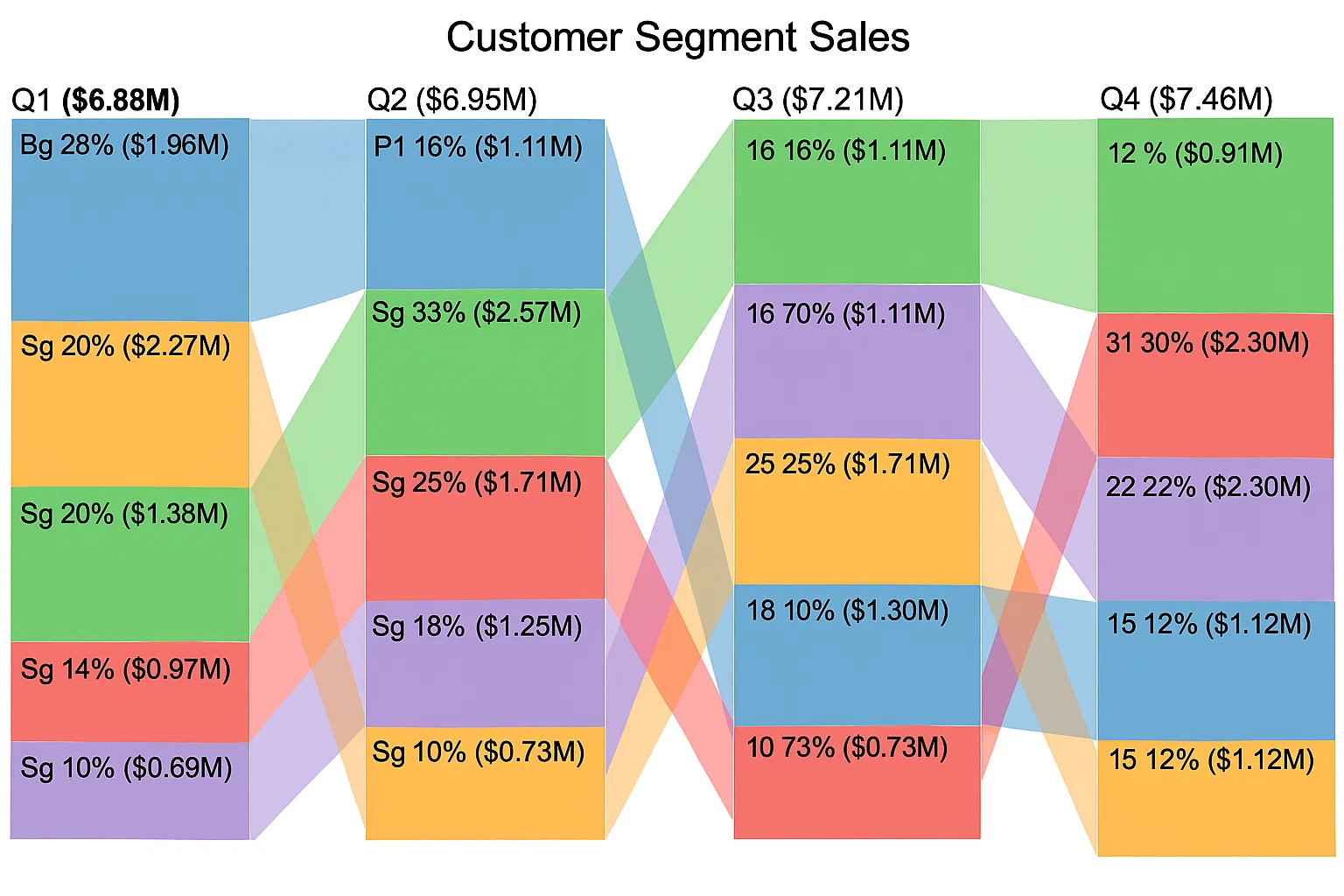
This dashboard breaks down sales based on customer groups, such as new vs returning customer segments. It helps identify which customer groups contribute most to revenue.
It also supports targeted marketing and upselling strategies by revealing high-value customer segments.
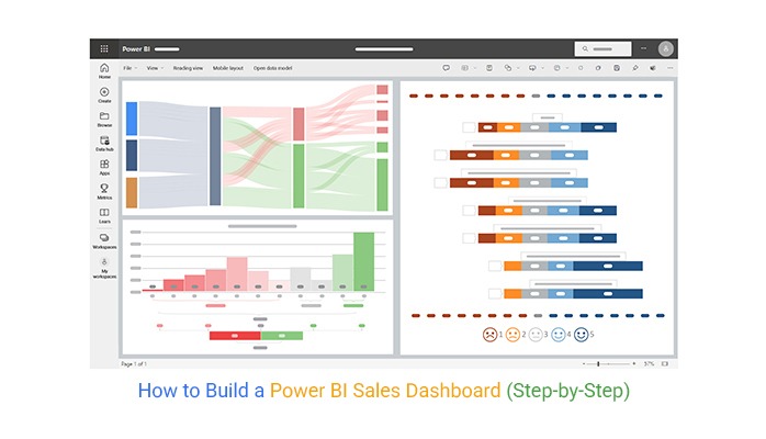
Below is a step-by-step process.
You can add more charts to this dashboard according to your needs.
A sales revenue dashboard in Power BI is an interactive report that visualizes total sales, revenue trends, and key performance metrics in one place to help track business performance and targets.
Yes, Power BI is widely used for sales because it helps teams analyze performance, track KPIs, monitor revenue, and make data-driven decisions using real-time dashboards.
A Power BI sales dashboard helps turn raw sales data into clear, structured insights that support better decision-making.
It brings key metrics like revenue, profit, and performance trends into a single view, making it easier to monitor business performance and identify opportunities for improvement.
Its interactive features allow users to explore data in detail, track changes over time, and understand what is driving sales results.
This makes it a practical tool for improving visibility and supporting data-driven sales strategies.
As shown in the examples above, Power BI sales dashboards can be adapted to different business needs, from regional sales tracking to pipeline analysis and product performance monitoring.
To take visualization further, ChartExpo can be used to extend Power BI’s default charting options and create more meaningful and easy-to-understand visuals for deeper sales insights.
How much did you enjoy this article?


Discover diverse and high-quality Power BI report examples for inspiration and insights. Elevate your reporting with strategic visualization techniques.

A Customer Relationship Management Dashboard centralizes data, tracks key metrics, and drives smarter business decisions. Discover now!

Explore Healthcare Dashboard Examples and learn how to turn complex healthcare data into clear, actionable insights for better decision-making.


