Categories
How to create a dashboard in Power BI?
In the age of information, where data reigns supreme, the ability to distill complex datasets into actionable insights is a skill that defines success.


The main point is how to create a dashboard in Power BI.
Microsoft Power BI, a formidable force in the realm of business intelligence, empowers users to not only analyze data but to present it dynamically through visually compelling dashboards. As organizations increasingly rely on data-driven decision-making, mastering the art of creating impactful dashboards becomes a valuable asset.
This guide serves as your compass through the intricate landscape of Power BI, offering a clear path to transform raw data into meaningful narratives and construct dashboards that speak volumes at a glance. Join us on a journey where data visualization meets innovation, and discover the art of crafting compelling dashboards with Power BI.
Creating dashboards quickly holds significant importance in the dynamic business environment for several reasons:
Fast dashboard creation empowers associations to respond quickly to changing business conditions, including cost-of-living comparisons by city. Decision-makers can access cutting-edge experiences and make informed decisions without delays.
Agile organizations thrive on adaptability. Rapid dashboard creation supports agility by providing timely analytics, allowing teams to adjust strategies, campaigns, and operations promptly.
Quick dashboard development ensures that metrics are monitored in real time. This is crucial for detecting trends, anomalies, and emerging opportunities or issues as they happen.
In fast-paced businesses, it is crucial to gain a competitive edge. Quick dashboards using Power BI for Mac enable associations to remain in front of competitors by swiftly adapting to market changes and making data-driven decisions.
Rapid dashboard deployment encourages collaboration among teams. Departments can share insights, align on goals, and work cohesively, fostering a culture of data-driven decision-making.
For customer-centric businesses, quick dashboards mean timely insights into customer behavior, preferences, and feedback. This responsiveness enhances customer satisfaction and strengthens relationships.
Streamlining the Power BI deployment pipeline reduces the time and resources needed for manual data compilation and analysis. This empowers teams to concentrate on strategic tasks, rather than getting bogged down in data preparation.
Preparing data for a dashboard involves several crucial steps to ensure that the information presented is accurate, relevant, and conducive to effective decision-making. Here’s a concise guide on preparing data for your dashboard, including considerations for Power BI dashboard vs. report:
Gather data from relevant sources, ensuring it aligns with the objectives of your dashboard. Sources may include databases, spreadsheets, APIs, or external systems.
Cleanse the data to address inconsistencies, errors, and missing values. This step enhances data quality, reducing the risk of inaccuracies in your dashboard custom visuals.
Transform the data to make it suitable for analysis. This involves tasks like aggregating values, converting data types, and creating calculated fields to derive insights.
Normalize and standardize data to maintain consistency. This is crucial when integrating data from diverse sources with varying formats.
Integrate data from different sources to create a unified dataset. Ensure that fields align, and establish relationships between tables if you’re working with relational databases.
If your dashboard involves time-based analysis, ensure that date and time fields are formatted correctly. Group data by relevant time intervals for meaningful insights.
Implement security measures to protect sensitive data. This may involve anonymizing or aggregating data to maintain confidentiality.
Validate the accuracy of your data against known benchmarks or expectations. This step is crucial for ensuring that your dashboard provides reliable insights.
Test your data against different scenarios and user interactions within the dashboard. Iterate as needed to refine the dataset based on user feedback and changing requirements.
Document your data preparation process, including the steps taken, transformations applied, and any considerations made. This documentation aids in transparency and future updates.
Plan a data refresh strategy if your dashboard requires real-time or periodic updates. Define how often the data will be refreshed to keep insights current.
If your dashboard is intended for a broader audience, provide user training on understanding and interpreting the data. This ensures that stakeholders can derive maximum value from the dashboard.
Monitor website traffic, user behavior, bounce rates, and conversion funnels in real time. This helps marketing teams identify what’s working, optimize content, and improve overall website performance.

Keep an eye on budgets, operating expenses, cash flow, profit margins, and financial KPIs in one place. Finance teams can quickly spot variances, track spending, and forecast future trends with greater accuracy.
Bring together key performance indicators from various departments, such as sales, marketing, and operations, to measure progress towards strategic goals. A well-designed KPI dashboard keeps everyone aligned and focused on what matters most, especially when using a KPI visual in Power BI for clear and quick performance tracking.
Gain visibility into sales pipelines, revenue trends, top customers, and product performance. Sales managers can track targets versus actuals, identify bottlenecks, and motivate teams with clear, up-to-date metrics.
Provide company leaders with a high-level snapshot of business health, combining financial, operational, and strategic metrics. This empowers executives to make fast, informed decisions and communicate insights clearly to stakeholders.

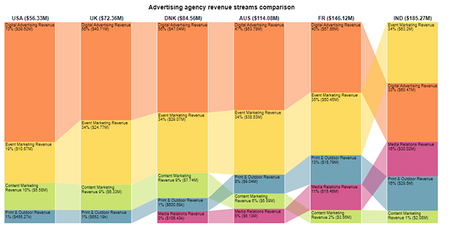
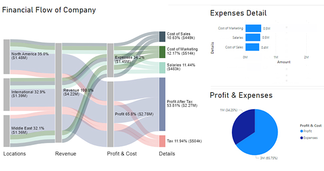
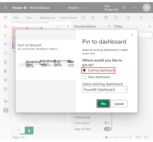
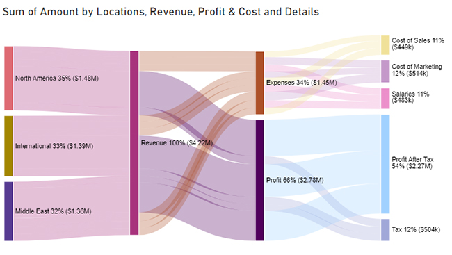
This is a Power BI dashboard tutorial that will help you create a Dashboard by using a Sankey Diagram in Microsoft Power BI.
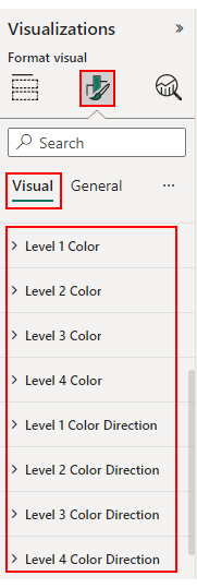
Here are the steps for Power BI Dashboard Customization:

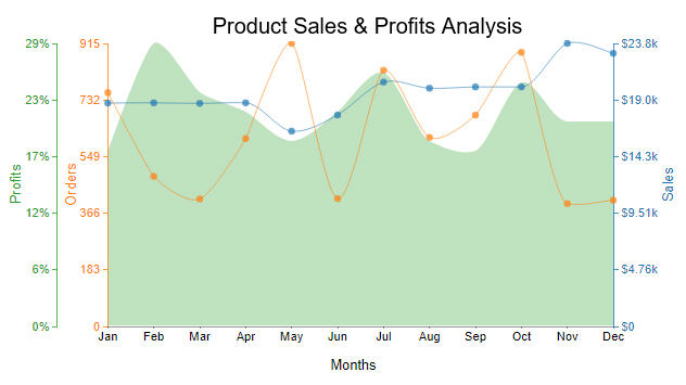
You can add more Power BI charts to enhance your Power BI dashboard ideas for stakeholder presentations.
Changing the theme of your Power BI dashboard is a quick way to give your reports a fresh, professional look that matches your brand or audience preferences. Power BI offers built-in themes and also lets you create custom ones.
Here’s how to change a dashboard theme:
Even a simple Power BI dashboard can benefit from extra features and smart tile settings. Here are some useful options to enhance usability and appearance:
Here are the benefits of using Power BI dashboards:
Refreshed with real-time data, so you can always see the latest information.
Power BI dashboards can be shared with multiple users. Everyone in the organization can see the same information.
Dashboards can be viewed on mobile devices, so you can access your data anywhere.
It can be altered to suit the unique requirements of your company.
This means you can choose the visualizations, data sources, and layouts that work best for you.
Dashboards can be secured with role-based access control.
Make better decisions by providing a clear and concise view of data.
Help businesses save time by automating the process of collecting and analyzing data.
It can help businesses collaborate more effectively by providing a central location for sharing data and insights.
Communicate their data more effectively to stakeholders inside and outside of the organization.
However, you can undoubtedly achieve considerable advancement with concentrated effort and the appropriate tools.
The following recommendations will assist you in achieving your goal:
Define the specific objectives for what you want to achieve with Power BI in a day. For example, you might aim to create a basic sales dashboard from a specific dataset.
Start by learning the foundations of Power BI, like:
You could start by watching introductory videos or reading getting-started guides. Microsoft’s Power BI documentation is also helpful.
Obtain a simple, well-structured dataset to work with. This could be an Excel spreadsheet, a CSV file, or a database connection. Having data readily available will allow you to focus on learning the Power BI tool.
Break down the process of creating a Power BI dashboard into smaller, manageable steps. For example:
Create your dashboard alongside the learning resources. Immediately apply the concepts you learn to help you understand and retain the newly acquired knowledge.
Learn about different visualization types:
Learn when to use them. Focus on creating visually appealing and informative visualizations.
Join online communities or forums dedicated to Power BI users. Engaging with fellow learners and experts can help you quickly resolve any doubts or challenges you encounter, especially when building complex dashboards similar to healthcare dashboard examples used in real-world reporting.
Creating a full-fledged dashboard in a day might be challenging. The above steps, however, can set you on the right path to mastering Power BI over time.
When building and sharing a Power BI dashboard, keep these key points in mind to ensure smooth performance and clear insights:
Data Source:
Data Preparation:
Data Connection:
Data Modeling:
Data Visualization:
Calculations and Measures:
Dashboard Interactivity:
Automation with Power BI Service:
Schedule Data Refresh:
Share and Collaborate:
Monitor and Optimize:
Additional Tips:
The time it takes to build a Power BI dashboard can vary widely. If your data is well-structured and requires minimal transformation, the dashboard creation process will be faster.
However, if your data needs extensive cleaning, shaping, and modeling, it will take longer.
Including many complex visualizations in your dashboard will make it take longer to design and configure them.
Simpler dashboards are easier and faster to build.
You’ll likely build the dashboard faster if you’re already familiar with Power BI and its features.
We have discussed how to create a dashboard in Power BI to monitor your data in real-time.
If you have yet to appreciate the Power of dashboards, you are making a grave error. Dashboards are not just for data nerds anymore – dashboards are the way of the future.
Think of a dashboard as if it were a sentient being. It can monitor anything from performance to trends to data organization in real-time.
Creating a dashboard in Power BI may seem daunting at first. But with the right guidelines and tools, anyone can create an engaging and interactive dashboard.
Use the right visualizations and pay attention to the interactive aspects when creating your dashboard.
If you’re struggling to create compelling dashboards with Power BI, ChartExpo is the solution. ChartExpo allows you to create insightful dashboards in a few clicks. No complex coding is required.
Why not try it to discover new insights?
Do not hesitate.
Start creating your dashboard in Power BI today and take your data visualization to the next level.
How much did you enjoy this article?


Discover diverse and high-quality Power BI report examples for inspiration and insights. Elevate your reporting with strategic visualization techniques.

A Customer Relationship Management Dashboard centralizes data, tracks key metrics, and drives smarter business decisions. Discover now!

Explore Healthcare Dashboard Examples and learn how to turn complex healthcare data into clear, actionable insights for better decision-making.


