• Home
  • Tools dropdown img
    • Spreadsheet Charts

      • ChartExpo for Google Sheets
      • ChartExpo for Microsoft Excel
    • Power BI Charts

      • Power BI Custom Visuals by ChartExpo
    • Word Cloud

  • Charts dropdown img
    • Chart Category

      • Bar Charts
      • Circle Graphs
      • Column Charts
      • Combo Charts
      • Comparison Charts
      • Line Graphs
      • PPC Charts
      • Sentiment Analysis Charts
      • Survey Charts
    • Chart Type

      • Box and Whisker Plot
      • Clustered Bar Chart
      • Clustered Column Chart
      • Comparison Bar Chart
      • Control Chart
      • CSAT Survey Bar Chart
      • CSAT Survey Chart
      • Dot Plot Chart
      • Double Bar Graph
      • Funnel Chart
      • Gauge Chart
      • Likert Scale Chart
      • Matrix Chart
      • Multi Axis Line Chart
      • Overlapping Bar Chart
      • Pareto Chart
      • Radar Chart
      • Radial Bar Chart
      • Sankey Diagram
      • Scatter Plot Chart
      • Slope Chart
      • Sunburst Chart
      • Tornado Chart
      • Waterfall Chart
      • Word Cloud
    • Google Sheets
      Microsoft Excel
  • Services
  • Pricing
  • Contact us
  • Blog
  • Support dropdown img
      • Gallery
      • Videos
      • Contact us
      • FAQs
      • Resources
    • Please feel free to contact us

      atsupport@chartexpo.com

Categories
All Data Visualizations Data Analytics Surveys
Add-ons/
  • Google Sheets
  • Microsoft Excel
  • Power BI
All Data Visualizations Data Analytics Surveys
Add-ons
  • Google Sheets
  • Microsoft Excel
  • Power BI

We use cookies

This website uses cookies to provide better user experience and user's session management.
By continuing visiting this website you consent the use of these cookies.

Ok

ChartExpo Survey


Home > Blog > Power BI

Finance Dashboard in Power BI: Precision in Data Evaluation

A wise man once said, “Money talks, but a finance dashboard sings.” Okay, maybe no one has ever said that before, but they should have.

finance dashboard in Power BI

If you’re looking to create a finance dashboard in Power BI, you’re in the right place. A Power BI finance dashboard is like a symphony of data. It brings together all the different notes and visualizations to tell a cohesive story.

With real-time update capabilities, these dashboards are like a financial GPS, guiding you to your financial goals.

But creating a finance dashboard isn’t easy. It takes a sharp eye for detail and a deep understanding of data.

Luckily, we’re here to help.

Table of Content:

  1. What is a Finance Dashboard in Power BI?
  2. Why are Finance Dashboards Important?
  3. Key Components of Power BI Finance Dashboards
  4. Uses of a Power BI Finance Dashboard
  5. Power BI Financial Dashboard Examples
    1. Revenue and Profit Analysis Dashboard
    2. Expense Tracking Dashboard
    3. Budget vs. Actuals Dashboard
    4. Financial Health Dashboard
    5. Sales Performance Dashboard
  6. Benefits of Financial Performance Dashboard
  7. Visualizing Success With Power BI Financial Reporting
  8. Best Practices and Tips for Power BI Financial Dashboards
  9. How to Download and Share Power BI Financial Dashboard?
  10. Wrap Up

What is a Finance Dashboard in Power BI?

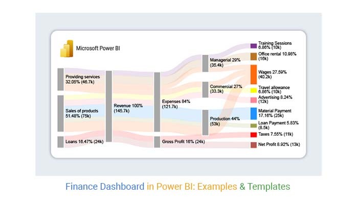
Definition: A finance dashboard in Power BI is a visual representation of financial performance metrics and KPIs. It offers a comprehensive view of your business’s financial health, updating all the data in real time.

Power BI’s advanced data analytics and visualization tools make it easier to identify trends and spot potential issues. Consequently, decision-making becomes quicker and more efficient.

Why are Finance Dashboards Important?

Finance dashboards in Power BI For Mac as well as in Windows play a vital role in providing visibility into key performance indicators, such as revenue, expenses, profitability, and cash flow. They enable stakeholders to monitor financial health, identify trends, and track performance against targets or benchmarks.

Additionally, finance dashboards, including Power BI Income Statements, streamline reporting processes, enhance collaboration among teams, and help ensure compliance with regulatory requirements. Overall, these dashboards empower organizations to optimize financial strategies, mitigate risks, and drive sustainable growth.

Key Components of Power BI Finance Dashboards

  1. Financial KPIs: Display essential metrics like revenue, expenses, and profit margins for a quick financial overview.
  2. Trend Analysis: Identify patterns and anomalies in historical financial data to inform future strategies.
  3. Budget vs. Actuals: Compare planned budgets with actual financial performance to track variances.
  4. Expense Analysis: Break down expenses to pinpoint areas of overspending and cost-saving opportunities.
  5. Cash Flow Management: Monitor cash flow trends using a 3-statement financial modeling to ensure liquidity and manage working capital effectively.
  6. Financial Statements: Present comprehensive statements like income, balance sheets, and cash flow for a holistic view.
  7. Drill-Down Functionality: Enable users to delve into specific data points for deeper analysis and insights.
  8. Forecasting and Predictive Analytics: Utilize predictive models to anticipate future financial trends and performance.
  9. Compliance and Regulatory Reporting: Ensure adherence to financial regulations with features for audit trails and reporting.
  10. Customization and Personalization: Tailor the dashboard examples and visuals to suit individual preferences and business needs.

Uses of a Power BI Finance Dashboard

A finance dashboard in Power BI has several uses that make it an essential tool for your business.

  • Financial Performance Tracking

A finance dashboard in Power BI allows you to monitor your business’s financial performance data visualization in real time. It provides a comprehensive overview of revenue, expenses, profits, and other essential metrics and KPIs like inventory turnover.

Thus, you can identify trends and patterns in your data and make informed decisions to optimize performance.

  • Budgeting and Forecasting

With the Power BI finance dashboard, budgeting and forecasting become a breeze. You can keep tabs on budgets, compare actual results against budgeted figures, and forecast future financial performance.

Additionally, you can perform a cost of living comparison by city to better understand how regional expenses impact your financial planning. This helps you plan for the future and make informed decisions based on accurate financial data.

  • Cash Flow Management

Analyzing cash flow is a critical aspect of any business’s financial performance. A Power BI finance dashboard can help you track your business’s real-time cash flow. It visually represents cash inflows and outflows, allowing you to identify potential cash flow issues.

Then take corrective action before they become a problem.

  • Financial Statement Analysis

Financial statement analysis informs strategic business decisions and helps with tax regulations compliance. Power BI is a useful tool for financial statement analysis. It features consolidated dashboards that provide a quick overview of a company’s financial health and performance.

This saves time and energy by providing all answers in one place.

Power BI Financial Dashboard Examples

1. Revenue and Profit Analysis Dashboard

  • Key Metrics: Total Revenue, Net Profit, Profit Margins, Revenue Growth.
  • Visuals: Stacked bar charts for revenue and profit comparison, waterfall charts for profit breakdown, and area charts for revenue trends.
  • Purpose: Detailed analysis of revenue streams and profit margins.

2. Expense Tracking Dashboard

  • Key Metrics: Total Expenses, Expense Categories, Expense Trends.
  • Visuals: Donut charts for category distribution, line charts for expense trends, and bar charts for monthly expenses.
  • Purpose: Monitors and manages expenses, identifying major expense areas and trends.

3. Budget vs. Actuals Dashboard

  • Key Metrics: Budgeted Amounts, Actual Amounts, Variance.
  • Visuals: Variance charts, bar charts comparing budgeted vs. actual expenses, and a gauge chart for budget adherence.
  • Purpose: Compares budgeted figures with actual results to track performance against financial goals.

4. Financial Health Dashboard

  • Key Metrics: Current Ratio, Quick Ratio, Debt-to-Equity Ratio.
  • Visuals: Ratio indicators, trend lines for financial ratios, and comparison charts.
  • Purpose: Assess the company’s financial stability and health.

5. Sales Performance Dashboard

  • Key Metrics: Sales Revenue, Sales Targets, Sales by Region/Segment.
  • Visuals: Heat maps for sales by region, line charts for sales targets vs. actuals, and bar charts for sales performance by product.
  • Purpose: Analyzes sales performance and identifies high and low-performing areas.

Benefits of Financial Performance Dashboard

Let’s see how a Power BI finance dashboard can revolutionize financial management.

  • Data Visualization

Power BI offers various data visualization tools. This allows you to present complex financial data in an interactive and visually appealing way. You can consolidate large data sets, identify trends and patterns, and create projections quickly and efficiently.

  • Real-Time Data Analysis

You can connect to live data sources and analyze your valuable data across touchpoints. Using Power BI’s real-time data analysis capabilities, you can make immediate decisions and respond quickly to metrics and insights. Consequently, improves overall responsivity.

  • Customization & Personalization

Power BI allows you to tailor the dashboard to meet your unique needs. You can easily generate your financial reports and craft bespoke views of financial data. This lets you perceive financial data in real time and draw valuable conclusions to facilitate informed decision-making.

Visualizing Success With Power BI Financial Reporting

Creating a finance dashboard in Power BI with Sankey Diagram can be daunting, but fear not; we’ve got you covered. We have broken down the process into five stages to make it easier for you to follow along.

Stage 1: Logging in to Power BI

  • Open the Power BI web service login page.
  • Enter your email address and click the submit button.
Logging in to Power BI
  • You will be redirected to your Microsoft account login page.
  • Enter your Microsoft password and click the “Sign in” button.
submit button
  • You have the option to stay signed in or not.
enter password to Power BI
  • Once done, the Power BI home screen will open.

Stage 2: Create a Data Set and Select it to Use in Your Sankey Chart.

  • Navigate to the left-side menu and click the “Create” button.
  • Select “Paste or Manually enter data“.
Manually enter data
  • We will use the cash flow data below for illustration.
Earnings Source Revenue Expenses & Profit Departments Categories Amount
Providing services Revenue Expenses Managerial Training Sessions            10,000
Providing services Revenue Expenses Managerial Office rental            16,000
Providing services Revenue Expenses Managerial Wages              9,400
Providing services Revenue Expenses Commercial Wages            11,300
Sales of products Revenue Expenses Commercial Travel allowance            10,000
Sales of products Revenue Expenses Commercial Advertising            12,000
Sales of products Revenue Expenses Production Material Payment            25,000
Sales of products Revenue Expenses Production Loan Payment              8,500
Sales of products Revenue Expenses Production Wages            19,500
Loans Revenue Gross Profit Taxes            11,000
Loans Revenue Gross Profit Net Profit            13,000
  • Paste your data table into the “Power Query” window.
  • Select the option “Create a dataset only“.
Create a dataset only
  • Go to the left-side menu and click the “Data Hub” option.
  • This will display a list of available data sets in Power BI (If you haven’t created a data set yet, refer to the section titled “Error! Reference source not found”).
Data Hub
  • To create a Sankey Diagram using Power BI, first select the data set you wish to use.
  • Power BI will populate the screen as below.
create report in power bi
  • It will display the data set and its corresponding fields on the right side of the screen.
  • You will find different reports and data set options in the middle area.
  • Click the “Create a report” dropdown and select “Start from scratch“.
Start from scratch
  • This will take you to the Report Canvas screen.
Report Canvas screen

Stage 3: Adding the Power BI Sankey Diagram Extension by ChartExpo

  • To create a Sankey Diagram in Power BI, we need to use either an add-in or a Power BI visual from AppSource.
  • Navigate to the right side of the Power BI dashboard to access the Power BI Visualizations panel.
  • Click the ellipsis symbol (…) as highlighted in the diagram below. This is to import the Power BI Sankey Diagram extension by ChartExpo.
Power BI visual from
  • Select the option “Get more visuals“. Then enter “Sankey Diagram for Power BI by ChartExpo” in the search box.
Get more visuals
  • The “Sankey Diagram for Power BI by ChartExpo” option will appear as shown below.
Sankey Diagram for Power BI by ChartExpo
  • Click the “Add” button.
create Sankey Diagram for Power BI by ChartExpo
  • Power BI will add the “Sankey Diagram for Power BI by ChartExpo” to the visualization panel.
icon in the visualization panel

Stage 4: Drawing a Sankey Chart with ChartExpo’s Power BI extension

  • Click the “Sankey Diagram for Power BI by ChartExpo” icon located in the visualization panel.
  • This action will result in a new window opening in the report section of your dashboard.
select-sankey-chart-in-power-bi
  • You can adjust the size of the visual as per your preference.
  • On the right-hand side of the Power BI dashboard, you will see the “Fields” section adjacent to “Visualizations“.
select fields
  • To create a Sankey Chart, you must choose the fields you want to incorporate.
  • It is essential to note that you must select the ChartExpo visual beforehand. Select the field in the following sequence:
    • Earnings Source
    • Revenue
    • Expenses & Profit
    • Departments
    • Categories
    • Revenue
select fields power bi
  • You will receive a request to enter your ChartExpo license key or email address.
ChartExpo license key

Stage 5: Activating your ChartExpo Trial or Applying a Subscription Key

  • When you select the ChartExpo visual, you will see three icons below the “Build visual” option.
Build visual
  • Click the middle icon labeled “Format visual“. The visual properties will appear on your screen, as depicted in the image below.
format visual

Follow these steps to get started as a new ChartExpo user:

  • Input your email address into the textbox provided in the “Trial Mode” section. This is the email address where the License key will be sent once you subscribe to the add-in.
  • It’s crucial to provide an accurate and up-to-date email address.
  • Click the “Enable Trial” button to activate your 7-day trial.
Enable Trial
  • You should then receive a welcome message from ChartExpo.
  • Note that any Sankey Diagrams you create during the trial period will contain the ChartExpo watermark.
ChartExpo watermark
  • If you have a license key;
  • Go to the “License Settings” section and enter your license key in the “ChartExpo License Key” box.
  • Turn on the “Enable License” toggle switch to apply the license.
License Settings
  • Your Sankey Diagram will then appear without a watermark.
sankey chart in power bi
  • To include the $ sign in the numerical data of the chart, expand the “Stats” properties. Then input the prefix value.
expand stats
  • To assign colors to individual nodes, expand the “Level Colors” properties and choose the colors.
sankey visual in power bi
  • Click the “Pin” icon at the top of the Sankey Chat.
sankey graph in power bi
  • Select the appropriate dashboard to pin the Sankey Chart and click the “Pin” button.
finance dashboards in Power BI
  • The final chart will appear below.
final finance dashboards in Power BI

Insights

  • The company’s revenue is generated primarily through product sales, accounting for 51.48% of the total.
  • At the second level, the company’s total revenue is $145.7K.
  • Expenses amounting to $121.7K make up 81% of the total revenue. The gross profit is $24K, representing 16% of the revenue.
  • The fourth level explains the managerial, commercial, and production expenses. These add up to $35.4K, $33.3K, and $53K, respectively.
  • The gross profit is then divided into taxes and net profit, which amount to $11K and $13K, respectively.
  • The managerial node is divided into training sessions, wages, and office rental. These total to $10K, $9.4K, and $16K, respectively.
  • The commercial node is divided into travel allowance, advertising, and wages. Travel allowance has the highest amount.

Best Practices and Tips for Power BI Financial Dashboards

Define Clear Objectives

  • Focus on key metrics that align with your financial goals to ensure the dashboard delivers relevant insights.

Simplify and Prioritize

  • Keep the design clean and prioritize important KPIs to avoid clutter and enhance usability.

Choose Appropriate Visualizations

  • Use the right charts and graphs to represent your financial data and highlight key trends.

Ensure Data Accuracy

  • Verify data sources and calculations to maintain reliability and make informed decisions.

Incorporate Interactivity

  • Add slicers and drill-through features to allow users to explore data and gain deeper insights.

How to Download and Share Power BI Financial Dashboard?

Downloading a Power BI Financial Dashboard

  1. Publish to Power BI Service: Click “Publish” in Power BI Desktop and select the workspace.
  2. Download Report: In Power BI Service, open the report, go to “File,” and choose “Download a copy” (if enabled).

Sharing a Power BI Financial Dashboard

  1. Open Power BI Service: Go to https://app.powerbi.com and find your dashboard.
  2. Click “Share”: Enter email addresses, set permissions, and click “Share” to send invitations.
  3. Optional – Publish to Web: Click “File” > “Publish to Web” for broader access (use with caution).

FAQs: Finance Dashboard in Power BI

What is a financial dashboard?

A financial dashboard is a management tool that helps track relevant financial KPIs. It allows for effective cash management and detailed expenses, sales, and profits tracking to meet financial objectives.

What is the use of a financial dashboard?

A financial dashboard helps to track relevant finance KPIs and manage cash effectively. Financial professionals and departments can use financial dashboards to understand and accurately measure all data in real-time. It also allows for faster validation of figures and drilling into financial details.

Can I create a finance dashboard in Power BI without any programming skills?

Yes, you can create a finance dashboard in Power BI without any programming skills. The platform offers features such as Power Query for data shaping and Power Pivot for analytics measures. This allows non-technical users to perform analytics without the need for coding skills.

Wrap Up

Beyond providing a glimpse into your business’s financial well-being, your Power BI finance dashboard can offer more. It can deliver real-time insights into financial performance to inform decision-making.

Moreover, it can help with budgeting, future financial performance forecasting, and compliance with tax regulations.

With the easy-to-follow guide above, crafting a finance dashboard tailored to your needs is a breeze. However, ensuring that your data set is reliable and precise is crucial before getting started. After all, incomplete or inaccurate data can significantly impact your business’s bottom line.

Now you know how to create a finance dashboard in Power BI. It’s time to take a step back and make informed decisions based on accurate financial data.

Power BI and ChartExpo provide a comprehensive toolset to ensure nothing goes wrong with data visualization and analysis.

Do not hesitate to leverage these tools to take your financial data management to the next level.

How much did you enjoy this article?

PBIAd2
Start Free Trial!
126654

Related articles

next previous
Power BI12 min read

Power BI Group By Guide for Effective Data Insights

Learn how Power BI Group By helps you aggregate data, clarify trends, and create reports by grouping values to make large datasets manageable & insightful.

Power BI12 min read

How to Create Sankey Diagram in Microsoft Power BI?

Learn How to Create Sankey Diagram in Microsoft Power BI using Desktop & Web Service. What they are and how to use them effectively.

Power BI8 min read

Power BI Artificial Intelligence: Insights Using Visuals

Discover all there is to know about the Power BI artificial intelligence. You'll also discover how AI is used in Power BI, and how to use it for analysis and more.

Power BI9 min read

Budgeting in Healthcare: Use Visuals to Spot Budget Gaps

This guide helps you discover what budgeting in healthcare is. You'll also discover the factors that affect hospital budgets and types of budgeting in healthcare.

Power BI9 min read

Predictive Analytics in Power BI for Making Insightful Visuals

This guide shows you everything you need to know about Predictive Analytics in Power BI. It also shows you how it works, and how to interpret the results.

ChartExpo logo

Turn Data into Visual
Stories

CHARTEXPO

  • Home
  • Gallery
  • Videos
  • Services
  • Pricing
  • Contact us
  • FAQs
  • Privacy policy
  • Terms of Service
  • Sitemap

TOOLS

  • ChartExpo for Google Sheets
  • ChartExpo for Microsoft Excel
  • Power BI Custom Visuals by ChartExpo
  • Word Cloud

CATEGORIES

  • Bar Charts
  • Circle Graphs
  • Column Charts
  • Combo Charts
  • Comparison Charts
  • Line Graphs
  • PPC Charts
  • Sentiment Analysis Charts
  • Survey Charts

TOP CHARTS

  • Sankey Diagram
  • Likert Scale Chart
  • Comparison Bar Chart
  • Pareto Chart
  • Funnel Chart
  • Gauge Chart
  • Radar Chart
  • Radial Bar Chart
  • Sunburst Chart
  • see more
  • Scatter Plot Chart
  • CSAT Survey Bar Chart
  • CSAT Survey Chart
  • Dot Plot Chart
  • Double Bar Graph
  • Matrix Chart
  • Multi Axis Line Chart
  • Overlapping Bar Chart
  • Control Chart
  • Slope Chart
  • Clustered Bar Chart
  • Clustered Column Chart
  • Box and Whisker Plot
  • Tornado Chart
  • Waterfall Chart
  • Word Cloud
  • see less

RESOURCES

  • Blog
  • Resources
  • YouTube
SIGN UP FOR UPDATES

We wouldn't dream of spamming you or selling your info.

© 2025 ChartExpo, all rights reserved.